
What do "Overprint" and "Knockout" mean, and what's the difference?
In my years of experience, misunderstandings between designers and printing houses often aren't about the creative work itself, but about details hidden within software settings. These can't be seen on screen, but once they hit the printing press, they become expensive waste. Today, let's talk about the three most common ones: Overprinting, Knockout, and Trapping
Overprint vs. Knockout: What do they actually mean?
Simply put, if you have two overlapping color blocks in your design—for example, a yellow circle on a blue background—there are two ways to process this for printing:
・Knockout: This is the default. It's like "digging a circular hole" in the blue color block, and then filling it with yellow ink. The two colors remain distinct and do not interact
・Overprint: This involves "printing directly" the yellow circle onto the blue background. The inks will mix, and you'll end up with a green circle (blue + yellow = green)
Most design software, to prevent thin white edges from appearing next to black text in case of misregistration, defaults to setting pure black (K100) text or lines to "Overprint". This is a thoughtful protective mechanism that makes font edges sharper and clearer. But when this setting is incorrectly applied to other colors, that's when disaster strikes
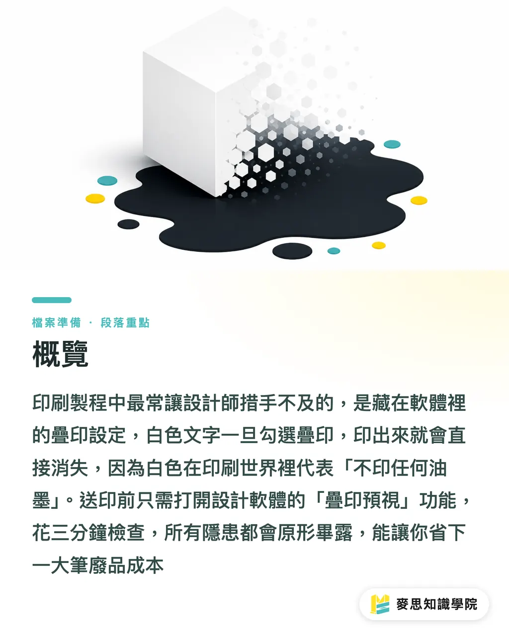
Why does my white or light-colored text disappear or look dirty when printed?
Why did my text disappear?
This is the most common disaster caused by overprint settings, especially in two scenarios: "light color overprinting on dark color" and "white overprinting":
Imagine you place beautiful white text on a black background. If you accidentally check the "Overprint" setting, what happens? In the world of printing, white isn't an ink color; it's "the color of the paper". White overprinting means "do not print any ink in this position". The result? The black layer under your white text is printed as usual, while the white text itself disappears entirely, leaving only a solid black area on the finished piece
The same logic applies if you overprint yellow text on a dark blue background. Yellow ink has low coverage, so the printed text will look dark, dirty, and almost invisible—definitely not the bright yellow you saw on screen. This is because the principle of screen light emission is completely different from ink layering
How can I avoid annoying "white gaps" at the edges of color blocks?
Where do these annoying white edges come from? Trapping is your insurance
As mentioned earlier, Knockout removes the lower color and fills in the upper one. However, as printing presses run at high speeds, paper stretches and shrinks, and machines have microscopic alignment errors. This error is called "Misregistration."
When misregistration occurs, a thin, unprinted white edge appears between the upper color block and the lower "hole". This is especially noticeable with reversed-out small text or fine lines on dark backgrounds, making the final product look defective. "Trapping" is the technology used to solve this
The principle is to deliberately make the lighter color at the junction of two adjacent colors "thicker," expanding it slightly into the area of the darker color by about:
・0.1 to
・0.5 pt, creating a tiny overlap zone. This way, even if the registration shifts slightly, it will be covered by this overlap zone, preventing the white base of the paper from showing through. It's like a "fault tolerance mechanism" for printing, an important insurance policy to ensure the quality and consistency of the final product
How should designers check their files before sending them to print to avoid costly errors?
How can designers protect themselves? Final checks before sending to print
Although these problems are troublesome, they can be prevented and checked on the design side. Developing good habits makes it less daunting:
・Use colors judiciously: Unless you intentionally want to play with overprint effects, don't just turn on overprint, especially for light-colored or white objects. Always double-check that their overprint settings are turned off
・Watch out for pure black: For small black text or lines that need to be overprinted, use C0 M0 Y0 K100 pure black. Only use "Rich Black" (mixed with CMY) to increase saturation when dealing with large areas of black
・Turn on Preview: All design software (Adobe Illustrator, InDesign, Acrobat Pro) has an essential "lifesaver" function called "Overprint Preview". It simulates the appearance of overprinted ink. Be sure to turn it on before sending to print, and take three minutes to check. All hidden overprint issues will appear. This can save you thousands in reprint costs
Once you understand these three concepts, you've cleared that important hurdle from being a "designer" to a "designer who understands printing."
Key Takeaways
・The default overprint for black text is to avoid white edges during misregistration, but applying this to light colors is a disaster
・White objects set to overprint will disappear directly on the printed material because white in printing represents "no ink printed."
・Trapping creates a tiny overlap at color boundaries to prevent unsightly white lines caused by registration errors
・Using the software's "Overprint Preview" function to check files before sending to print is an absolutely necessary insurance action
・Screens use light (RGB), while printing uses ink (CMYK). The principles are different; do not treat screen effects as the final finished product
Further Thoughts
These seemingly minor settings actually reflect the core difference between digital design and physical manufacturing, and are also a major source of communication costs. For designers, mastering this knowledge isn't just about "avoiding errors," it's a manifestation of professionalism, ensuring your work not only looks good on screen but can also be successfully produced
For print procurement and corporate clients, understanding these principles helps you evaluate design files and suppliers more accurately. A good printing partner doesn't just passively receive files but should also possess the ability to actively identify problems and provide professional advice. Teams like MINDS that provide one-stop integrated services find their value in our prepress engineers intervening to check files before they hit the machine, using their experience to catch such potential risks, building a bridge between design and manufacturing, and ensuring your hard work isn't washed away by a small, mistaken setting
FAQ
- What is Overprint?
- Overprinting refers to printing the upper color directly on top of the lower color during the printing process. The inks of both will mix to create a new color, and it is commonly used for black text to avoid white edges during misregistration
- Why does my white text disappear after printing?
- This is usually because the white object is incorrectly set to "Overprint". In printing definitions, white overprinting is equivalent to "do not print any ink in this position," causing the underlying color to show through directly, and the object naturally disappears
- How do I check if my file has overprinting issues?
- In Adobe Illustrator or InDesign, go to the "View" menu and turn on "Overprint Preview". This mode simulates the final printed ink overlay effect, making all hidden overprinting problems immediately appear
- Is Trapping absolutely necessary?
- For designs with clear color boundaries, especially small reversed-out text or lines, trapping is a strongly recommended process. It effectively prevents white edges caused by natural machine errors and improves the refinement of the finished product. However, this setting is usually handled by the prepress department of the printing house