
What's the Debate About Overprint vs. Knockout? Understanding the Physical Logic of Ink Coverage
From my years of hands-on experience, what causes misunderstandings between designers and print shops is rarely the creative design itself, but rather a gap in physical understanding of file settings
When you view a design on a computer screen, objects are luminous layers stacked together, and the top layer naturally blocks the bottom layer
But on a physical four-color (CMYK) printing press, it is a real process of ink layering
・Overprint: Allows the top ink to be printed directly over the bottom ink, physically blending the two colors on the paper
・Knockout: Also known as cutting out, this forces the printing process to cut a hole in the bottom layer matching the shape of the top object, allowing the top ink to print directly on the white paper to keep the color pure

Why Does White Text Vanish into Thin Air on Dark Backgrounds?
This is the most unfortunate and most common reprint disaster triggering customer complaints that I've ever seen
In standard CMYK printing, there is simply no such thing as "white ink"; all white is represented by the original color of the paper
When you set white text (C0 M0 Y0 K0) to "overprint," the digital instruction received by the press is "print 0% ink on the top layer."
Zero added to any background color still equals the original background color. As a result, the background color shows through completely, making your white object completely invisible on physical paper
Therefore, white text or white knocked-out areas on a dark background must always be set to "knockout" so that the background color is cut out to expose the paper's natural white
Why is Pure Black Text Set to Overprint by Default? The Registration Logic Behind Prepress Foolproofing
You might ask: if overprinting is so prone to issues, why does the industry mandate that pure black text must be set to overprint by default?
Because when a printing press operates at high speeds of tens of thousands of revolutions per minute, 100% precise registration of the four-color plates (C, M, Y, K) is extremely difficult to achieve
Physical paper stretching and machine vibrations cause tiny shifts. Even a registration error of just 0.1mm will leave a highly distracting white gap around the edges of knocked-out black text
Black ink (K100) has high opacity, so it won't noticeably shift color when printed on most light backgrounds
Therefore, the standard prepress practice is to set pure black text and thin lines to overprint, directly pressing them onto the background color. This foolproof mechanism perfectly avoids white gaps caused by mechanical tolerances
How to Inspect Your Files in Illustrator and Acrobat Before Printing
To catch errors at the source, make it a habit to check settings in your vector drawing software
・In Illustrator, open the "Attributes" panel from the "Window" menu, select your objects, and verify that "Overprint Fill" and "Overprint Stroke" are not checked by mistake
・However, I highly recommend that your most reliable final line of defense is exporting a PDF and running a health check with Acrobat Pro
・Open the "Print Production" toolset in Acrobat and click on "Output Preview."
This tool accurately simulates the physical effects of ink overprinting. By hovering the cursor over an area, the value panel tells you exactly which ink colors are layered at that spot. You can spot missing white text or accidentally knocked-out black text in a single glance
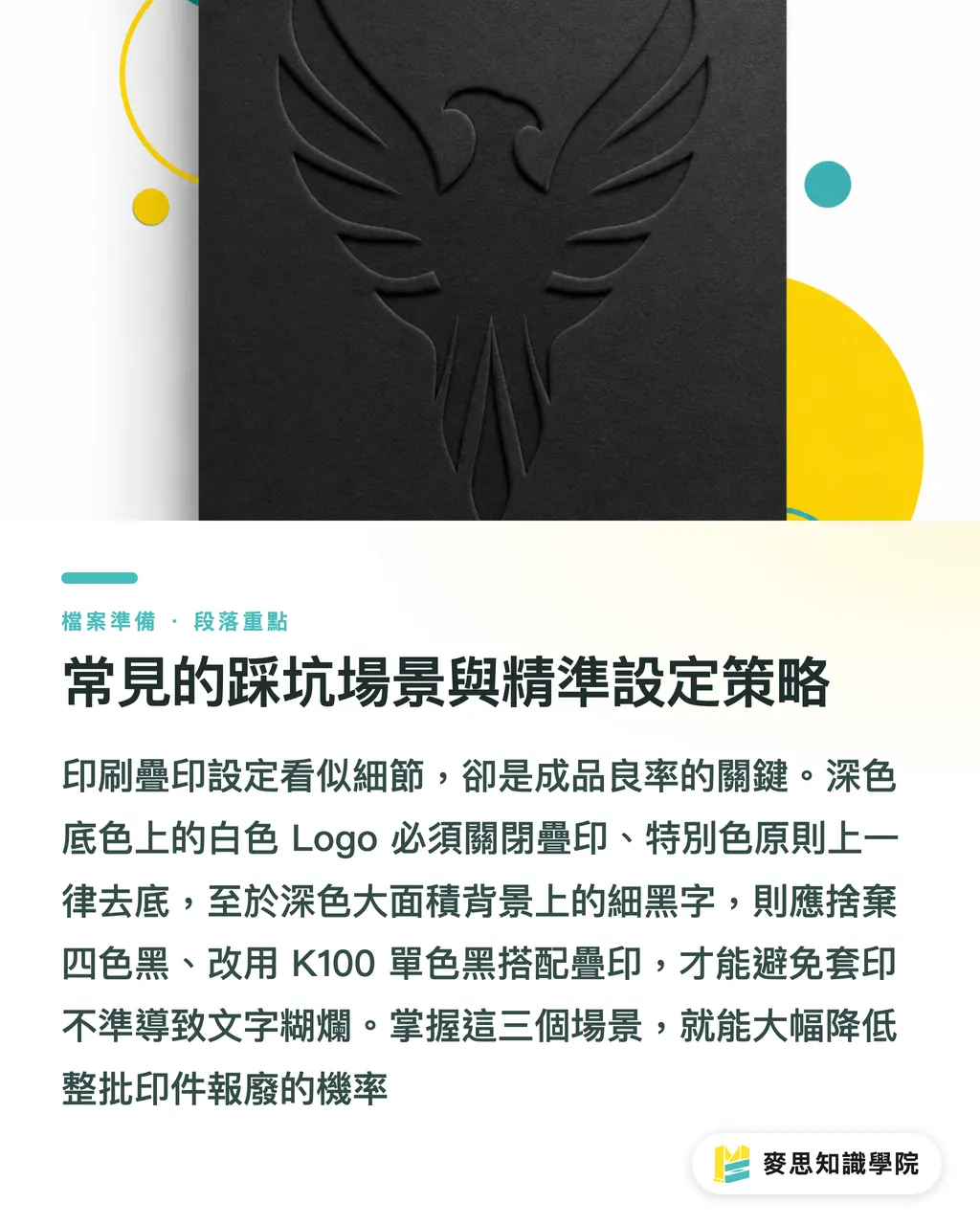
Common Pitfalls and Precise Configuration Strategies
To save you from paying expensive tuition fees, I've compiled these three most common print shop pitfalls
・Corporate Logos on Dark Backgrounds: If a logo contains white graphics or reverse-out text, be sure to inspect them one by one before printing to ensure overprint wasn't accidentally enabled. This is the number one reason for discarded business cards and catalogs
・Spot Color Combinations: If you use a custom Pantone color, the opacity of spot colors is vastly different from CMYK, making the color shifts after overprinting highly unpredictable. Unless you have a specific artistic color-blending goal, knockout is always recommended
・Fine Black Text on Large Dark Backgrounds: If you try to achieve a rich black look by using rich black (containing values for C, M, Y, and K) for fine text, it will easily turn into a blurry mess due to registration errors. The best solution is always K100 single-channel black set to overprint
Key Takeaways
・Overprinting blends inks, while knockout cuts out the bottom layer to reveal the paper's white. Understanding this is key to bridging the gap between digital screen rendering and physical printing
・Never check overprint for white objects on colored backgrounds; otherwise, the zero ink values will make the objects disappear entirely
・Setting pure black text to overprint by default is an industry defense mechanism to prevent white gaps caused by press registration errors
・Checking your PDF with Acrobat's "Output Preview" before sending it to print simulates real ink coverage and serves as the ultimate line of defense against costly mistakes
Further Thoughts
Prepress setup may seem like a tedious, traditional process, but it is the foundation that ensures creative designs land precisely as intended. For the MINDS team, which develops prepress SaaS software or introduces AI-automated file checks, rather than expecting users to manually check Illustrator's Attributes panel, it is far better to build automatic block lists directly into the file upload portal to "detect white overprints" and "black text without overprint." Stopping errors at the source not only drastically reduces customer support costs, but is also the fastest path to increasing custom printing yield rates
FAQ
- Why does my design look perfect in Illustrator, but the white lines disappear when printed?
- Because in Illustrator, you are viewing it through digital screen rendering logic. If "Overprint" is accidentally checked for the white lines, 0% ink is layered on top of the background color in physical printing, causing the white lines to show the background color and completely disappear
- What happens if pure black text is set to Knockout?
- The background color will be cut out in the shape of the black text. If the printing press shifts by even a tiny 0.1mm at high speed, a distracting white paper edge will show around the black text, severely ruining the detail and quality of the layout
- How can I guarantee that my design file's overprint settings are completely correct?
- The safest method is to export a PDF and inspect it using the "Output Preview" feature in Acrobat Pro. This accurately simulates the layering of print inks and is the industry gold standard for checking files