Why Do Files Look Perfect on Screen But Become a Disaster in Print?
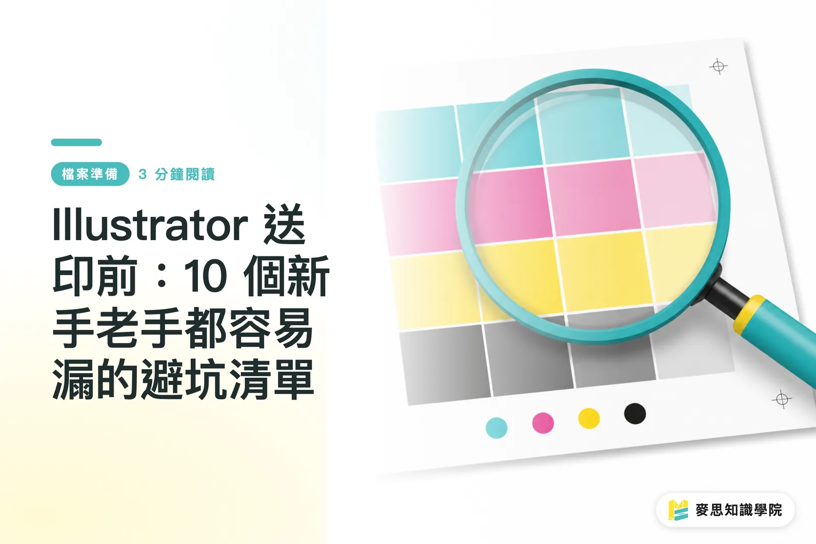
The principles of printing and screen display are entirely different, which is the most frequent communication gap I've observed on the print shop floor. Screens use RGB light, while printing uses overlapping CMYK inks. Many designers see brilliant colors on their computers that appear dull and lifeless once converted to print colors. Having worked in the industry for years, I've seen too many potentially exquisite projects having to be scrapped and reprinted just because of one overlooked color mode setting
File preparation isn't just a technical issue; it's a process of building trust between the print technicians and the designers. When the design side proactively avoids hidden 'landmines,' the production line runs more smoothly. This not only reduces the cost of back-and-forth communication but also ensures that the final printed product faithfully reflects the original design vision

The 10-Point Pre-Press Checklist: How Many Did You Miss?
Based on my long-term practical observations, the following 10 settings are frequently missed by designers. I recommend using this checklist as your final line of defense before every print job:
・Always select CMYK as your color mode when setting up your file; do not stick with the screen's default RGB
・Set a 3mm bleed; confirm it in 'Document Setup' to avoid annoying white edges caused by cutting errors
・Ensure all linked images are embedded. Go to 'Window > Links' to check them one by one and avoid the embarrassment of missing images
・Confirm that all images have sufficient resolution. Go to 'Effect > Document Raster Effects Settings' and set it to 300ppi
・Black text must be set to 100% Black (K:100) to avoid misalignment issues caused by four-color rich black
・Check overprint settings for small objects and black text to avoid trapping issues during printing
・When exporting a PDF, you must check the boxes for bleed marks and crop marks to provide the technician with the correct cutting positions
・Set the Transparency Flattener Preset to 'High Resolution' to prevent pixelation in areas with transparency
・Clean up the Swatches panel; delete all leftover RGB swatches to avoid them being mixed into your file
・For the PDF export preset, choose PDF/X-1a:2001; this is the most stable standard format in the industry
Achieving Efficiency and Precision Through Human-AI Collaboration
With the evolution of design tools, there are now many AI-assisted inspection features that are amazingly efficient at catching errors. However, I must emphasize that while tools are fast, they cannot understand design intent. Some fatal printing errors, such as overprint issues in text details or color rendering on specific paper types, still require final human judgment and intervention
We recommend establishing a 'AI first, human supplement' inspection workflow. Let the tools complete the basic checks of the 10 items listed above, delegating repetitive, mechanical tasks to the system. Once these basic errors are eliminated, designers can free up their energy to focus on more critical aspects like pre-press communication, fine-tuning details, and choosing the right paper, achieving a win-win for both efficiency and quality

Key Takeaways
・Bleed and color mode are the absolute basics before sending to print; never rely on automated conversion
・100% Black is the key to clear text; four-color black should only be used for large colored areas
・Automated tools can help you check for oversights, but final judgment on details still requires the designer's personal oversight
・Developing a habit of standardizing PDF/X-1a output can reduce file errors by over 90%
Further Reflections
In the fields of print manufacturing and graphic design, automation tools have indeed changed the pace of file processing. My advice is: do not abandon your fundamental understanding of printing knowledge just because AI exists. Tools are meant to amplify your expertise, not replace your professional judgment. For SaaS developers, when building pre-press tools, the focus should be on translating the experience of print masters into the logic of automated system checks, helping designers intuitively avoid print 'landmines' rather than simply providing a checklist
Further Reading
FAQ
- Why is there still a color discrepancy in my print even though I set it to CMYK?
- In addition to the color mode, the ink absorption of different paper types and the characteristics of the printing press will significantly affect the final color. CMYK on a screen should only be used as a reference; it's recommended to check against color swatches provided by a professional printing house or to create a proof
- Is it necessary to choose PDF/X-1a:2001 when exporting to PDF?
- This is the industry-standard format that has been verified over time to be the most stable and to significantly reduce compatibility issues. It forces all colors to be converted to print colors and embeds fonts, effectively reducing the risk of printing failures
- I have hundreds of images; do I really need to check the embedding for every single one?
- You absolutely must confirm the status of every image in Illustrator's 'Links' panel. To save time, form the habit early in the file creation process to avoid having to go back and handle it when finishing; that kind of risk and expenditure of effort is simply not worth it