

Overview
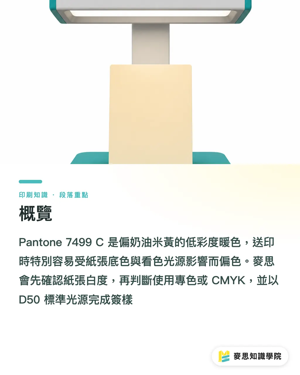
Pantone 7499 C is a low-chroma warm color with a creamy ivory-beige quality. In print, it's most easily thrown off by paper base color, ink transparency, varnish, and viewing light source. At MINDS Printing (MS, mid-to-high-end full-custom commercial printing), the three-gate submission process starts by locking down paper whiteness, then deciding between spot color or CMYK, and finally signing off under a D50 standard light source
What color is Pantone 7499 C, and why does it shift so easily in print?
Pantone 7499 C sits in the Pantone Solid Coated system as a warm color with a creamy, ivory, light-beige feel. The C stands for Coated, meaning its visual reference is coated paper. On the print floor, I'd put it in the 'low-chroma warm color' category, it's less like a bright yellow and more like the warmth that paper and ink produce together
A spot color is a pre-mixed single-ink color, applied on press with its own plate or ink fountain rather than built from four-color CMYK. It's the right call for brand colors, large light-color areas, and packaging that needs consistent results
The trouble with Pantone 7499 C is that it reads thin. Unlike deep blue or warm red, this ink has no strong coverage to lean on. Print the same color on gloss coated, card stock, and offset stock, and clients often see three different beiges, a bit whiter reads as cream, a bit yellower reads as aged paper, a bit grayer gets called dirty
Colors like this can't be judged on screen alone. Screens emit light; paper reflects it, those are two different things. If a designer tries to discuss Pantone 7499 C with a print shop using only an RGB preview, the floor's standard reply is usually: bring a physical swatch and a paper sample
Can Pantone 7499 C be converted directly to CMYK?
Pantone 7499 C can be converted to CMYK, but don't treat the conversion values as the final answer. CMYK is four halftone dot layers; Pantone spot color is a single ink. With light warm colors, the most common result of conversion is a beige that turns gray, green, or a lifeless pale yellow
When I handle a Pantone 7499 C to four-color conversion, I usually ask for three small color-patch proofs first, so clients aren't arguing about color difference by gut feel in a conference room
・The original Pantone-to-CMYK values, used as a comparison baseline
・Y nudged up 2–3%, to check whether the beige feel gets too heavy
・K held at 0–1%, to keep the black plate from muddying the light beige
Low-chroma warm colors are very sensitive to the black plate. A little extra K and the result on paper looks like it's picked up dust. When brand guidelines allow, I'd rather dial in the warmth with C, M, and Y than rush to add K to control lightness
For large background areas, packaging hero visuals, and brand identity backgrounds, spot color proofing is my first recommendation. If budget or gang-run conditions force CMYK, at minimum get a physical proof from the printer, don't use a PDF screenshot as your sign-off
Why does paper base color make Pantone 7499 C look dirty?
Spot colors like Pantone 7499 C have high ink transparency, which lets the paper base color show through from underneath. High-whiteness coated paper makes it look cleaner; warm-toned art paper makes it warmer; gray-toned recycled stock makes it look aged
Paper color affects the final piece. I've seen plenty of jobs where the client specified a 'premium ivory-white' paper while the design used Pantone 7499 C as the background. After proofing, the whole area turned a flat yellow-brown, the paper and ink together were just too close
When choosing paper, run at least two comparison proofs: one on a brighter-white coated stock, one on the actual production paper. If the final product will use offset, laid, or ivory card stock, Pantone 7499 C must be confirmed on that exact paper, don't use a coated-paper swatch to guarantee results on uncoated stock
Finishing moves the color too. Gloss laminate makes the warm beige look more saturated; matte laminate can dull it; aqueous coating changes how local reflections read. If Pantone 7499 C is a brand primary or packaging base color, the proof should always put an unfinished sheet next to the finished one
How to use MINDS Printing's (MS) three-gate submission process to control color shift before going to press?
MINDS Printing's (MS) three-gate submission process is well suited for a warm beige like Pantone 7499 C that drifts easily with paper color. The steps are simple, but each one needs a signable physical artifact, not just a note that says 'print to the swatch.'
・① Paper gate: lock down the production paper before setting the screen color. The same Pantone 7499 C on a different paper can look like a full color correction apart
・② Ink gate: decide whether to use Pantone spot color or CMYK. If going CMYK, have the printer provide at least three corrected color patches
・③ Light source gate: view color under a D50 standard light source. D50 is roughly 5000K, the neutral viewing environment standard in print inspection
At sign-off, keep one standard proof at the printer, one with the client, and one with design or purchasing. All three sheets should use the same paper batch and finishing conditions, disputes drop off significantly
If Pantone 7499 C will appear on brand packaging, gift boxes, or catalog covers over the long term, share the paper sample, swatch, and finishing specs with the Mai Strategy Knowledge Academy consulting team for a pre-press review. Color problems often surface on press day because design files, paper selection, and purchasing specs weren't aligned early enough
How to avoid pitfalls in finishing and AI/SaaS workflows?
In AI preview images, Pantone 7499 C typically gets beautified, screens render it as a clean, soft cream. On the print floor, you're dealing with paper fiber, ink transparency, varnish reflections, and batch variation. AI can help a designer quickly explore directions; it can't replace physical proofing
Design teams using SaaS to manage brand colors should store Pantone 7499 C with at least five fields:
・Color code: Pantone 7499 C
・Substrate: e.g., gloss coated, ivory card, offset stock
・Print method: spot color, CMYK, digital printing
・Finishing: gloss laminate, matte laminate, aqueous coating, or none
・Sign-off conditions: D50 light source, physical proof date, approver
On the print shop side, Pantone 7499 C should be treated as a 'light color that needs managing,' not just another pale yellow. Ink density, impression pressure, ink-water balance, and dry-back can all leave the client looking at a different color the next morning
Designers or buyers who regularly handle beige, warm gray, and light card tones can subscribe to the Mai Strategy Knowledge Academy newsletter to keep color management cases like these organized. There are no shortcuts in light-color printing, paper, color, and light source need to be documented every single run

Key Takeaways
・The main risks for Pantone 7499 C come from paper color, light source, and finishing all shifting the beige quality together
・When converting a light warm color to CMYK, prevent gray first, then work toward matching the Pantone swatch
・For large-area Pantone 7499 C use, sign off on a physical paper proof, don't finalize from a screenshot
・Managing warm beige variation means putting D50 light, three corrected color patches, and before/after finishing comparisons into the approval workflow
Further Reflection
For print manufacturers, light colors like Pantone 7499 C belong in high-risk color management. A designer can't just file the color code and call it done. For AI and SaaS teams, the color record needs to capture substrate, print method, finishing, and sign-off conditions, otherwise, no matter how good the preview looks, it's hard to match in production
FAQ
- Is Pantone 7499 C beige or yellow?
- Pantone 7499 C is closer to a creamy ivory-beige, a warm, low-chroma light spot color. On white paper it reads cleaner; on yellowish or grayish paper it shifts toward beige or aged paper
- Can Pantone 7499 C be printed in CMYK?
- Converted to CMYK, Pantone 7499 C as a light warm color tends to go gray, green, or muddy. Before signing off, proof three patches: the original converted values, Y adjusted up, and K reduced
- Will Pantone 7499 C shift color on offset stock?
- Pantone 7499 C on offset stock typically comes out warmer and more matte than on coated stock, and it picks up the paper base color more easily. If production is on offset stock, proof directly on that same paper to confirm
- What light source should be used to view Pantone 7499 C?
- Use a D50 standard light source, roughly 5000K, which is the standard viewing environment for print inspection. Don't sign off on Pantone 7499 C, a light beige, under warm office lighting or a phone screen
- What should I watch for when using Pantone 7499 C as a packaging background?
- When using Pantone 7499 C as a packaging background, confirm the substrate, whether you're using spot color or CMYK, and the final color after lamination or varnishing. Gloss laminate makes the color more saturated; matte laminate can dull the beige
Related articles

The Print × AI weekly
The print and AI know-how designers, brands and enterprises can use before they commit — one email, every week
Tool Library
RGB↔CMYK conversion, ΔE color difference and brand color print analysis — free color management tools, computed right in your browser.
MINDS Group
Need actual printing or gifting services?
From premium printing to online ordering and festive gifts — the MINDS Group sister brands take it from here.