
Print Color Management
ICC profiles, calibration and proofing — hold brand color consistent from screen to print
- Audience
- Designers・Print Production Staff・Brand Owners
- ICC Profile
- Color Correction
- Monitor Calibration
- Print Color Matching
- Color Consistency
- delta E
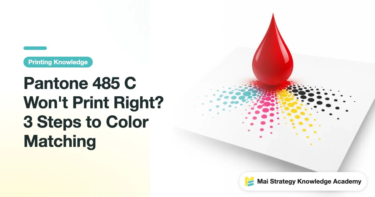
Pantone 485 C Won't Print Right? 3 Steps to Color Matching
Pantone 485 C turns darker when converted to CMYK, mainly because its vivid red falls outside the range that four-color inks can reproduce consistently. Use Mai Strategy's three-gate print check to decide when to keep the spot color and when to match it in CMYK, while keeping the paper stock, ICC profile, proof, and approval under control
Pantone Black 7C Printing Too Light? 3 Ways to Avoid Rework
Pantone Black 7 C printing lighter than expected is often not an ink failure. The real problem is that spot colors, K100, rich black, and paper stock are being judged by different rules. By checking separations, K overprint, and a proof on the actual stock, designers can catch black settings that would otherwise lead to rework before handoff
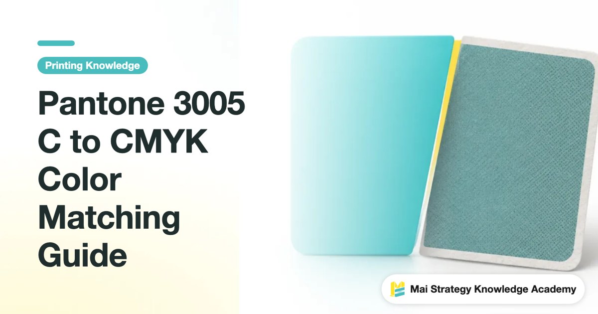
Pantone 3005 C to CMYK Color Matching Guide
Pantone 3005 C can be specified precisely, yet it may no longer look like the same blue once it enters CMYK. From gamut, paper stock, and ICC profiles to proof approval, learn where color shifts come from and how to judge them, so you can decide before sending the job to print whether to adjust the formula or use a spot color instead
Pantone Live Color-Matching Collaboration: 3 Key Points
Color differences between a design file and the printed piece are rarely caused by poor printing technique. More often, the two sides are not working from the same color reference. This article breaks down how Pantone Live connects the design side with the printing side from a production-line perspective
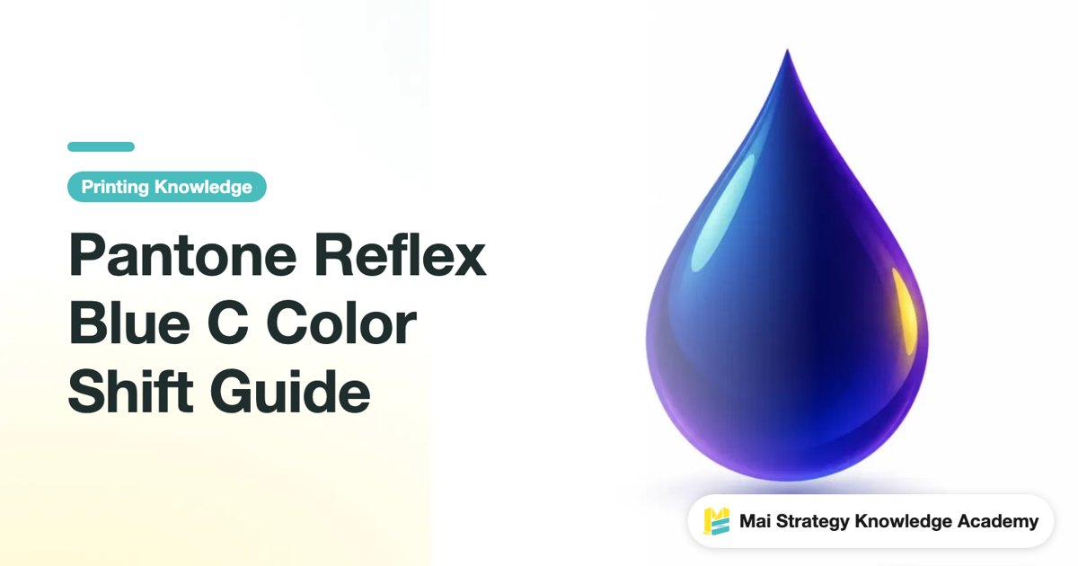
Pantone Reflex Blue C Color Shift Guide
Pantone Reflex Blue C is a deep spot blue that tends to shift toward purple during CMYK conversion You'll see where the color shift comes from and how to choose a workable alternative based on paper stock, cost, and brand requirements
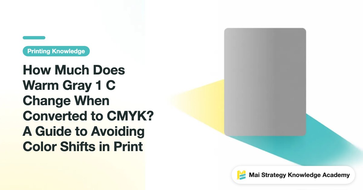
How Much Does Warm Gray 1 C Change When Converted to CMYK? A Guide to Avoiding Color Shifts in Print
Warm Gray 1 C is one of the most common light-gray reference colors in print, but the warm softness you see on screen often disappears in four-color printing. This article breaks down how it is approximated in CMYK and which steps to watch closely before sending a job to press
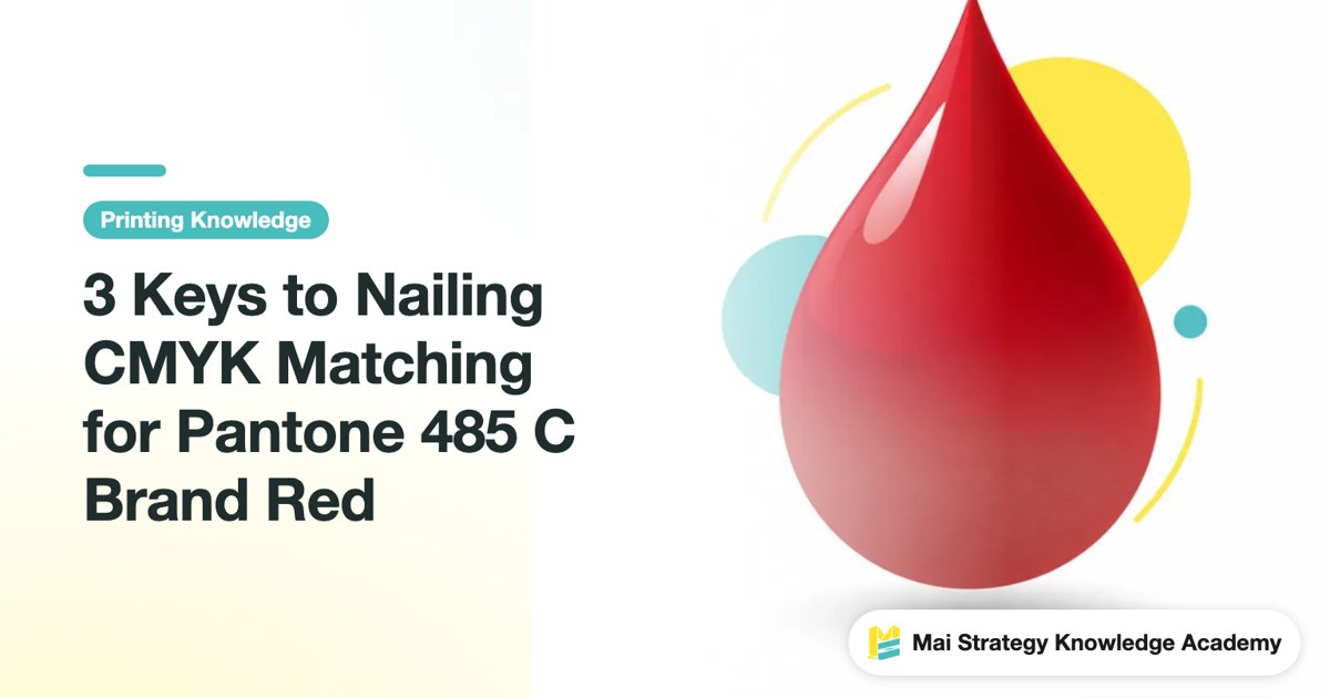
3 Keys to Nailing CMYK Matching for Pantone 485 C Brand Red
Pantone 485 C is a high-impact, vibrant red, but it easily turns dull once converted to CMYK process printing. Drawing from pressroom experience, this guide breaks down the most practical ways to match your color
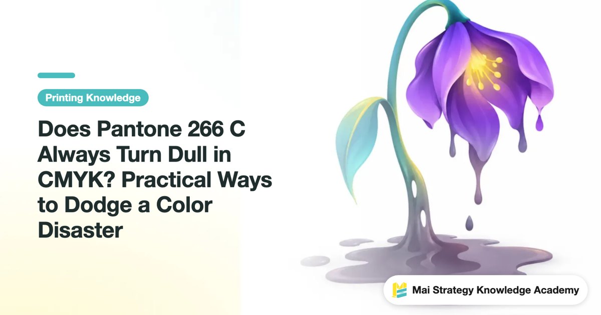
Does Pantone 266 C Always Turn Dull in CMYK? Practical Ways to Dodge a Color Disaster
That vibrant Pantone 266 C purple on your screen often turns into a murky, grayish taro paste once printed in four-color process. The print shop didn't mess up. It is an inherent gamut limitation. These notes walk you through the practical trade-offs right from the production floor

In-House Spot Color Mixing vs. Outsourcing: How Procurement Should Decide
Heidelberg launched CromaStar to bring ink mixing back in-house, claiming to break spot color supply chain bottlenecks. But does taking color mixing in-house guarantee more accurate brand colors? From a procurement perspective, this article breaks down the division of responsibilities and acceptance standards between in-house and outsourced mixing

Don't Let Toner Counts Fool You: Three Color Questions for Print Buyers
Is a seven-color press better than a four-color press? That is the wrong question to ask. Fujifilm's latest flagship digital press, the Revoria Press PC2120, adds a seventh specialty toner (green) and steps up automation. That makes it a great case study: here is how print buyers can evaluate their color needs before requesting quotes, putting money toward specs they actually need rather than toner counts

Speed Takes a Backseat: AI Color Management Is the New Benchmark for Print Procurement
Digital print vendors are running neck and neck on speed. Judging suppliers by turnaround alone no longer works. What buyers usually end up regretting is brand colors drifting quietly between batches. From a practical standpoint, this article breaks down why AI color management belongs in your core vendor evaluation
Why Does Pantone 289 C Print Purple? 3 Keys to Matching Dark Blue in Print
A client specifies dark navy Pantone 289 C, but the print comes out with a purplish tint or collapses into muddy blackish-blue. This is not sloppy work by the print shop, but an inherent gamut limitation of deep blues. From CMYK conversion logic and paper choice to press proofs, this guide breaks down the biggest color-matching pitfalls for 289 C so you can make the right call before sending files to press

Reject Thermal Color Shift: NIR Curing vs. Hot Air Drying, 5 Questions to Ask Before Buying
Color drift from hot air drying has long plagued quality control in premium packaging post-press: colors shift whenever changing jobs with large solid backgrounds, keeping scrap rates stubbornly high. Germany's adphos near-infrared (NIR) curing technology directs energy straight into the ink film instead of heating the air, matching line speed changes within 100 ms. From a procurement angle, this guide compares both technologies and provides an RFQ checklist and acceptance criteria
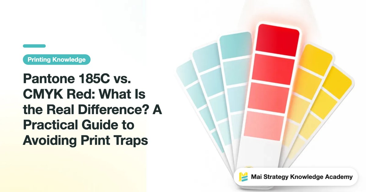
Pantone 185C vs. CMYK Red: What Is the Real Difference? A Practical Guide to Avoiding Print Traps
Pantone 185C is one of the most common bright reds in brand style guides. The print shop says "just convert it to CMYK," but once delivered, the color looks noticeably duller. The issue is not the printer's skill, but the physical gamut limits of CMYK process printing. Drawing from shop-floor practice, this article breaks down the real gap between the two and helps you decide when a spot color is absolutely worth the money
Stop Printing Pantone 446 C as Pure Black
Pantone 446 C is often mistaken for black, but it is actually a deep olive gray. If you print it straight as black, the color will drift. From prepress settings to press proofing, Mai Strategy Knowledge Academy breaks down how to convert and match this color the right way
How to Fix Pantone Yellow C Color Shifts: A 3-Step Proofing and Color Matching Process
The yellow on your screen looks as bright as a highlighter, but the printed version turns out dull and muddy. This is the most common pitfall with printed yellow. Here is a breakdown of why this happens from a pressroom perspective, along with a practical proofing checklist you can take straight to the print shop
Switching Printers and Still Getting Color Shifts? 3 G7 Certification Essentials You Need to Know
When the same packaging job moves to another printer, the colors just won't match. Almost everyone who has handled procurement has fallen into this trap. This article explains, in plain English, what G7 color certification actually covers, so you can replace 'choosing a printer by gut feel' with 'a standard you can verify.'

Why Do Spot Colors Always Shift? Lessons from Heidelberg's Automated Ink Mixing
Batch-to-batch color shifts are a nightmare in packaging print, leading straight to rejected shipments and angry client calls. Looking at how ink mixing is evolving, this article breaks down where color shifts come from, how print shops should control them, and what questions you need to ask before placing an order

Stop Printing on Gut Feeling: How Print Buyers Evaluate a Supplier's Scientific Quality Control
When dealing with demanding brand print jobs, relying on veteran press operators' intuition can no longer guarantee steady yields on volume orders. This guide offers a practical evaluation framework for procurement teams, showing you how to assess equipment maintenance and material data tracking to pinpoint a printer's real quality control capabilities
How to Print Pantone Cool Gray 7 C Without Color Shifts: A Field Guide to Cold Gray Pitfalls
Picked a sleek Cool Gray 7 C on screen, only to see it print out reddish or purplish? The cold gray family is notoriously sensitive to paper whiteness and ink balance. Drawing from actual pressroom experience, this guide walks you through protecting this premium gray from the design file all the way to the press
What's the Difference Between Pantone TCX and C? Textile vs. Print Spot Colors Explained
When colors on design files never match the final print, the problem often starts with picking the wrong swatch book. Drawing on direct pressroom experience, this guide breaks down the core differences between Pantone TCX and C, their intended materials, and the exact color-matching workflow to save you from costly reprints

When a Printer Claims They Have "Color Management," Don't Just Take Their Word for It
Print shops love to say, "We have color management." Whether they can actually deliver comes down to asking the right questions. Here are three practical follow-up questions anyone can ask, even on their first print job, to instantly tell if a vendor walks the talk or just tosses around buzzwords

Ignore Packaging Color Standard Upgrades, and Watch 'Close Enough' Eat Away Your Print Profits
Global brand requirements for packaging visuals are going fully digital and much stricter. The 'close enough' color once judged by a pressman's naked eye is now the biggest hidden cost behind rejected reprints. Understanding this wave of color management standard upgrades is the only ticket for small and mid-sized print shops to win major international orders
How to Use Pantone Color Finder: 3 Keys to Matching the Right Physical Swatch
Nothing causes more headaches in digital color selection than arguing with a print shop over what is on your screen. Here is how real print shops match color, from using online Pantone tools to physical swatch matching and file setup