
Print Color Management
ICC profiles, calibration and proofing — hold brand color consistent from screen to print
- Audience
- Designers・Print Production Staff・Brand Owners
- ICC Profile
- Color Correction
- Monitor Calibration
- Print Color Matching
- Color Consistency
- delta E
A Guide to Converting Pantone 200C to CMYK Without Losing the Color
Pantone 200C is a common brand red, but once it is converted to CMYK, it is especially easy for it to turn darker, muddier, and lose the solid feel of a spot color This article uses print-floor practice to walk through values, paper stock, ICC profile, proofing, and approval in one pass
Why Cool Gray 11C Shifts When Converted to CMYK
Designers pick the calm, solid Pantone Cool Gray 11C on screen, but on a four-color press it often comes out reddish or yellowish. This article breaks down the CMYK conversion logic for cool grays from a production-floor perspective, helping you avoid common traps in prepress setup and press-side color matching
Screen Calibration Guide for Designers: Getting Monitor Colors Close to the Final Print
A color palette that looks gorgeous on screen often comes back from the press looking muddy and dull. It is one of the most common headaches for designers and one of the hardest to explain to clients. Written from a prepress consultant's perspective, this guide ties monitor calibration, ICC profiles, and soft proofing into a single workflow so you can predict color shifts before going to press instead of relying on luck
What Is Color Rendering Index (CRI)? Understanding Print Colors at a Glance
Color rendering index affects whether printed colors look accurate under different lighting, especially for brand colors, skin tones, food packaging, and high-saturation color blocks, which are most prone to issues here. From a press-floor perspective, this article clears up CRI, light sources, paper substrates, proofing, and acceptance criteria all at once, so designers and buyers know what to ask the print shop and how to avoid talking past each other during proofing

How to Handle Pantone 4655 C in Print
For Pantone 4655 C, first confirm whether it is a specified brand color, a supporting color, or simply a visual request close to coffee beige. MINDS recommends three print handoff checks: first verify the paper-side version, then decide between CMYK and spot color, and finally lock the finished color with proofing This article uses shop-floor print practice to explain Pantone 4655 C from design files, printer ink inventory, paper ink absorption, to on-press color matching, so designers and purchasers know when a spot color is worth paying for and when CMYK is already enough
The Complete Guide to Pantone Color Lookup and Print Color Matching
The biggest risk with a Pantone lookup is getting a number without knowing whether it can be reproduced consistently in print. This guide walks through the official tools, alternative color charts, CMYK/RGB approximations, and proofing, using methods from the print floor
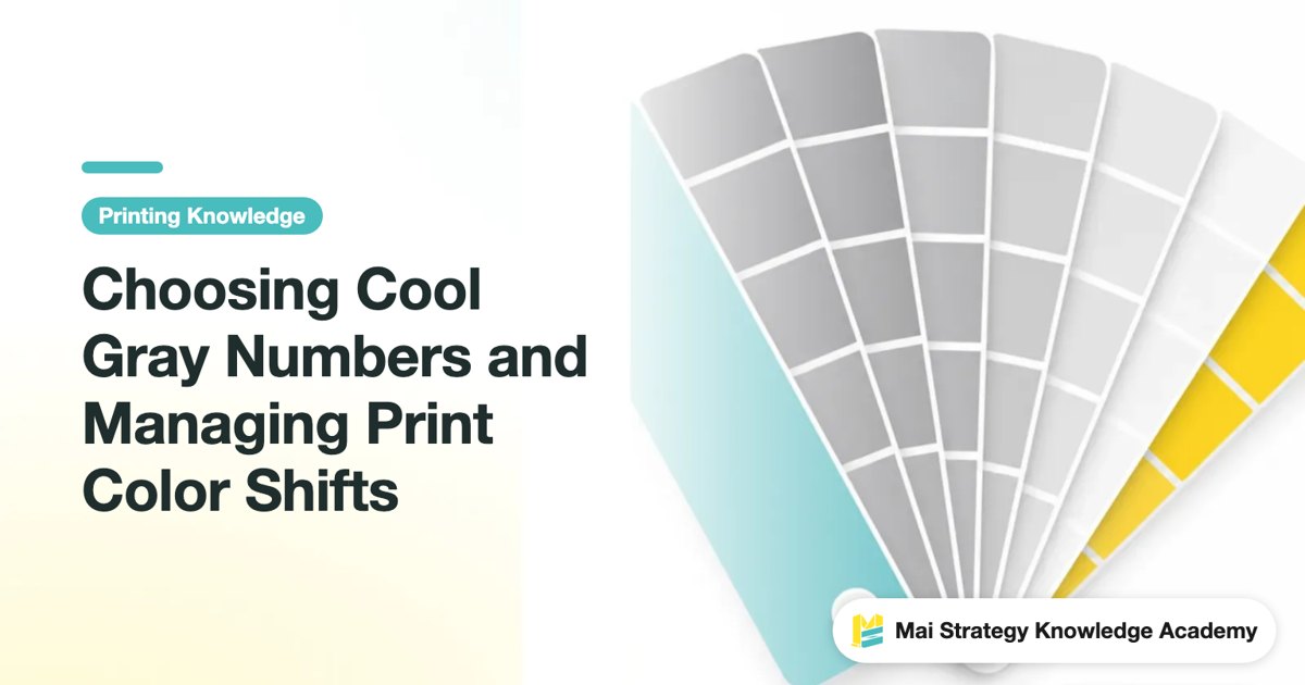
Choosing Cool Gray Numbers and Managing Print Color Shifts
From Cool Gray 1 C to 11 C, every step in the cool gray family has its own temperament. Drawing on hands-on experience from the production line and the proofing machine, this guide walks you through the visual differences between each number, the color-shift traps after CMYK simulation, and what to check before sending your design to print

What to Watch for When Converting Pantone Colors for Print: Avoid the Usual Traps from Design to Proofing
Having a Pantone color number does not mean you can print the exact same color. From software color conversion and paper-based color matching to proof approval and press setup, every step can throw the color off. Drawing on years of moving back and forth between production lines and design teams, this article breaks down the points where things most often go wrong

How Paper Whiteness and Coating Affect Print Color: A Paper Selection and Color Matching Guide
Paper isn't just a background for color; paper itself is part of the color. The color blocks on your screen and the CMYK values in Photoshop are all ultimately translated by the paper surface. This translation process hinges on three factors: whiteness, coating, and moisture content. In the color matching stage of the three pre-print checkpoints at MINDS, these three factors are what we explain to clients every day

Color Management Step 1 for Small and Mid-Sized Print Shops: Building a Calibration Workflow
Stuck on your first step toward color management? This guide breaks the calibration workflow into practical, actionable stages, smoothing out everything from monitors to presses. By the end, you'll know what to calibrate first, what gear to buy, and how to steer clear of the three most common traps small and mid-sized print shops fall into
Why Don't Proof Colors Match the Final Product? How to Choose Between Soft Proofing and Physical Proofing
Clients often complain that proof colors don't match the finished print. This isn't bad luck; it comes down to uncontrolled variables in the process. This article breaks down the reality of color shifts and shows you how to set clear boundaries between physical sample shipping and AI soft proofing
G7 and Print Standardization: A Practical Guide to Ending Batch Color Drift
Is every reprint a color gamble Batch-to-batch color drift is a chronic pain point for brand buyers and designers alike This piece breaks it down from the production floor, showing how to replace eyeball judgment with objective data to actually hold the line on brand visual consistency
What Is Delta E for Print Color Tolerance? How to Set Reasonable Acceptance Standards
Brand colors always drift between the screen and different print shops, it's not bad luck, it's a missing numeric language. Drawing from hands-on experience coaching clients, this piece walks you through Delta E and turns acceptance criteria into a scientific standard both sides can agree on
How to Print 2026's Trending Colors Without Color Shift: A Senior Production Consultant's Pre-Press Guide
Every year a new trending color drops, and the mockup looks amazing, then the printed piece is a disaster. This is ten-plus years of production floor experience distilled into one guide: how color conversion works from screen to press, and how to stop paying for reprints you never needed
Pantone 286 C Color Matching Guide: Avoiding CMYK Color Shifts
The vivid royal blue on your design screen goes to the print shop and comes back as a dull, purplish muddy color This article breaks down the color behavior of Pantone 286 C and real production practices, so you can avoid this irreversible disaster from the start of the design stage

Blue-Tone Printing: Pantone 293 C Color Matching Tips and Cost Breakdown
You pick a vivid, saturated Pantone 293 C on screen, but in four-color printing it often turns purple or dull gray This note walks from gamut conversion logic to production-floor practice, helping you sort out deep-blue color matching and cost choices so you can avoid color-difference disasters
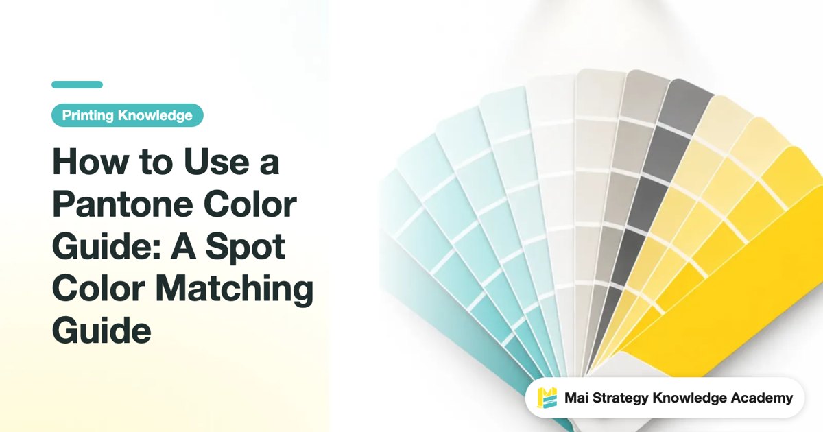
How to Use a Pantone Color Guide: A Spot Color Matching Guide
Use a Pantone guide the wrong way, and the press check turns into an argument over whose screen is more accurate This guide explains how to choose spot colors, set up files, and check proofs, so designers and print buyers can avoid one more painful round of back-and-forth
How to Convert CMYK to Pantone? Guide to Finding the Closest Match
Color values in your design files not converting to the spot colors you expected is the most common dispute on the print shop floor. This practical guide helps you move past software shortcuts and use physical swatch books alongside CMYK color charts to lock in precise brand colors
Pantone 032C Warm Red: Color Code Breakdown and Print-Ready Pitfalls to Avoid
You pick a beautiful Pantone 032C warm red on screen, then it prints as a dull liver red. On press, this is one of the most common disasters. This article draws on more than a decade of hands-on experience across production floors and client work to break down this classic red, where it works, and what to watch out for before sending files to print

How Do You Print Pantone 427C Gray? Color Conversion and Press-Matching Field Guide
Gray is the final boss on a printing press. Pantone 427C may look elegant on screen, but once converted to process color it often turns purple or dull. This note walks through the logic behind color conversion and practical press-matching tricks, so you can avoid the reprint disasters I have handled countless times
Pantone 871 C Metallic Ink: Color Value Conversion and Print Matching in Practice
The gold gleams on screen, but comes off the press looking like muddy ochre? From the RGB/CMYK color trap to choosing the right stock for the job, here's how to avoid the pitfalls that catch people out with metallic colors
Pantone 877 C Silver to CMYK in Practice
That gleaming Pantone 877 C silver on your design file turns into a flat, muddy gray when converted to CMYK, one of the most common prepress disasters. This piece starts from production-floor reality, walks you through the logic behind metallic spot colors, and gives you concrete color-matching and print-ordering solutions that won't blow up in your face
Pantone 9C to CMYK Without a Print Fail
Finding a color code but not knowing how to match it to CMYK values is where design and print conversations most often get stuck This guide walks through the logic of spot-color conversion and hands-on proofing methods, so you can avoid the gap where it looks great on screen but prints dull and muddy
Why Screen Colors Never Print Right: A Senior Consultant's Hands-on Guide to ICC Color Management
A perfect design on screen turns dark and muddy in print. This is the single most common pain point I see in the industry. Once you understand gamut differences and ICC settings, you can block 90% of reprint disasters before sending files to press. This guide takes you from color fundamentals to soft proofing, building a precise color matching workflow