
What exactly is Pantone 877 C?
Pantone 877 C is a metallic silver spot color widely used in logo and packaging design
The letter 'C' stands for Coated, meaning the color standard is based on how it looks on coated paper (such as gloss art paper)
It's not produced by overlapping halftone dots of the standard cyan (C), magenta (M), yellow (Y), and black (K) inks, it's a dedicated physical ink that print shops mix from actual metallic pigments (typically containing fine aluminum powder) and varnish
When you click Pantone 877 C in Illustrator, the shiny effect on screen is purely an RGB simulation. But on press, it's a genuine 'fifth color' that needs its own plate and its own ink station
Why does Pantone 877 C turn into gray mud when converted to CMYK?
After fifteen-plus years on the production floor, I've seen countless designers come in excited about a metallic sheen, only to fall apart when the finished pieces showed nothing but a lifeless gray slab
This isn't on the print shop's technical skill, the real problem is that the physical properties of metallic colors simply cannot be reproduced with standard transparent inks
CMYK works by layering four ink colors to absorb light. It has zero ability to reflect light the way metallic powder does
When you force-convert Pantone 877 C to CMYK (software usually just spits out something like C:0 M:0 Y:0 K:40), what comes off the press is plain 40% gray
If you genuinely run into a situation where the budget's been cut and you have to simulate a metallic feel with standard four-color printing, the standard three-gate approach at MINDS (MSI, mid-to-high-end fully custom commercial printing) is:
・First gate: At the design stage, switch to multi-step gradient blocks (e.g., dark gray fading to light gray to white) to trick the eye into reading the 3D metallic highlight-and-shadow effect
・Second gate: Choose high-gloss paper (such as premium art paper) to compensate for the brightness that the ink can't provide
・Third gate: During digital proofing, be upfront with the client, 'This is a simulation, there will be no real metallic reflection', and align expectations before the job goes to press
How should you set up files and place print orders to get the metallic 877 C effect?
Since CMYK conversion won't get you there, if you want real metallic color you have to do it properly and set up a spot color plate
Don't just drop a message in Line saying 'I want silver', the press isn't that smart, and skipping the key steps still wastes the job
The most fatal mistakes usually hide in layer settings and paper matching
・Set every object that needs metallic silver as a swatch with Pantone 877 C spot color attributes. Never just dial up some gray and name it 'silver.'
・Make sure these silver objects sit on top of the CMYK layer and are set to Overprint, otherwise the four-color ink beneath gets knocked out, and you'll almost certainly get white gaps at the edges
・Contact the Mai Strategy Knowledge Academy consulting team to confirm paper absorbency. Metallic ink on uncoated offset paper causes the powder to sink into the fibers and lose its sheen, you usually need a water-based or UV gloss varnish on top to lock in the reflective effect
How do you handle the digital color-matching traps with metallic spot colors?
These days plenty of clients hold up their phone screen and tell me 'I want that silver.' That's completely unrealistic as a briefing
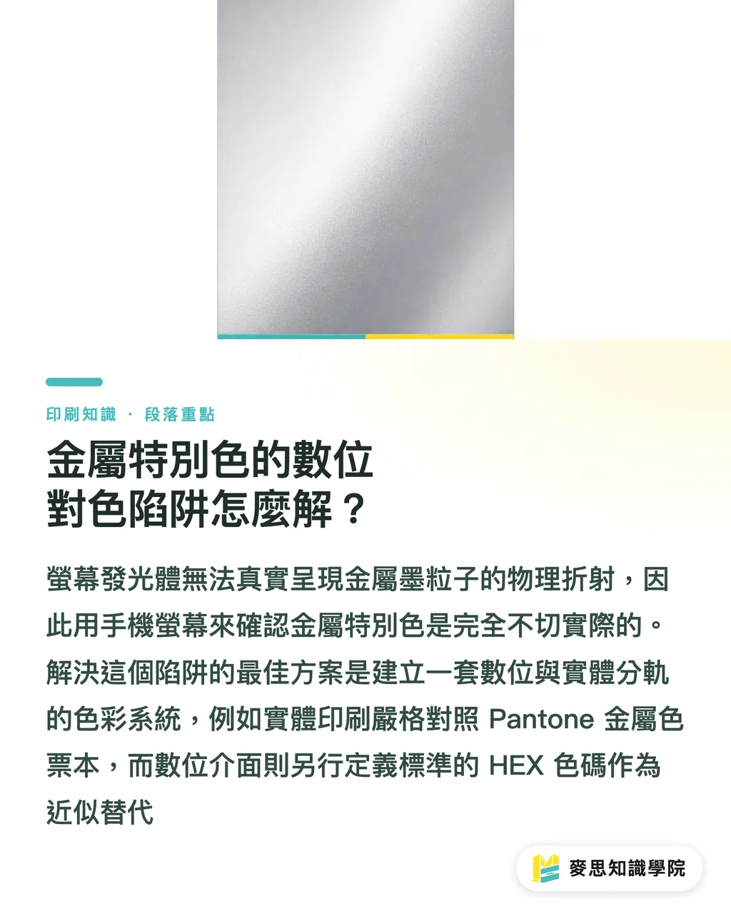
A light-emitting screen (RGB) can never fully replicate the physical refraction of metallic ink particles, bump your phone brightness up one notch and the color is already different
To see what Pantone 877 C actually looks like, the only reliable reference is a physical Pantone metallic swatch book, specifically the Coated version, and make sure it isn't so old the colors have faded
If your digital SaaS product or brand guidelines need to define this color, my recommendation is to build a 'fallback system':
・Physical print on press: specify Pantone 877 C spot color strictly
・Digital screen display (Web/App): define a standard HEX code (e.g., #8A8D8F) as the digital approximate gray
・Four-color print collateral: define a fixed CMYK gradient value spec
A color system that cleanly separates digital from physical at the source is the only way to keep your brand identity coherent across different media
Key Takeaways
・Pantone 877 C is a standalone ink containing metallic powder. It cannot be reproduced by overlapping transparent CMYK inks
・Force-converting to CMYK in software only gets you a flat 40% gray. When budget is tight, you need to switch to a 'gradient faux-metallic' design approach to fool the eye
・In the final artwork, metallic color objects must be set as independent Spot Color swatches, and you need to watch the overprint settings and the paper's coating characteristics
Further Thoughts
From years of helping companies build brand standards, metallic colors are consistently the biggest gap in the digital-to-physical handoff. When designers are freewheeling on screen without internalizing the cost implications of color management early on, the downstream communication costs with print production multiply fast. For teams building design-focused SaaS or AI image generation tools, rather than simply offering a static color code conversion feature, the smarter product move is to build a 'spot color alert system' at the platform level, one that automatically flags print plate costs and physical output risks whenever a user picks a metallic color. That's the product thinking that actually solves an industry pain point
FAQ
- What are the CMYK values for Pantone 877 C?
- Most design software defaults to something around C:0 M:0 Y:0 K:40, but that only prints as flat gray with no metallic sheen whatsoever, because the two have completely different physical color-producing properties
- What happens if you print Pantone 877 C on uncoated paper (like ivory or offset paper)?
- The metallic powder sinks straight into the rough paper fibers, drastically reducing the sheen. In person it looks like a dull, dirty pencil-lead gray. With uncoated paper like this, you usually need to first lay down a white base coat, or switch to a foil-stamping silver finishing process instead
- How do I find the Pantone 877 C swatch in Illustrator?
- Open the Swatches panel, click the menu in the top-right corner, and select Open Swatch Library > Color Books > Pantone+ Metallic Coated. In the search box that appears, type 877 to apply it directly
Related articles



The Print × AI weekly
The print and AI know-how designers, brands and enterprises can use before they commit — one email, every week
Tool Library
RGB↔CMYK conversion, ΔE color difference and brand color print analysis — free color management tools, computed right in your browser.
MINDS Group
Need actual printing or gifting services?
From premium printing to online ordering and festive gifts — the MINDS Group sister brands take it from here.