
Why does Cool Gray 11C so easily print reddish or yellowish after CMYK conversion?
To avoid a color-shift disaster when converting Pantone Cool Gray 11C to four-color CMYK, the key is not to trust the design software's default conversion values blindly. You need to adjust the color mix by hand: lower the magenta (M) and yellow (Y), then raise black (K) and cyan (C) to keep the cool tone stable
I'm a print technical consultant at Mai Strategy Knowledge Academy. After years working between production lines and client teams, I've handled more gray-tone reprint cases than I can count. The culprit almost always points to the same issue: gray balance has drifted
Gray Balance means using specific dot percentages of cyan, magenta, and yellow inks in four-color printing to create a visually neutral gray. Once the density or dot gain of any one ink shifts even slightly on press, the carefully set gray immediately leans toward a color cast
When you directly convert Cool Gray 11C to CMYK in Illustrator, the software usually gives you a mix containing values for all four channels: C, M, Y, and K
Because Cool Gray 11C is a dark cool gray, its software default often includes a fair amount of M (magenta) and Y (yellow)
Under ideal conditions, those four inks together can produce a beautiful deep cool gray
But production reality is harder to control than the numbers suggest. If the press runs a little hotter that day, or the paper absorbs ink in a way that slightly increases the dot gain of M or Y, the printed dark gray can quickly show a red or yellow cast and lose its crisp coolness
This is very similar to issues I've handled before with light grays like Pantone 427C, or with Pantone 293C deep blue turning purple. The problem is the same: there are unstable factors hiding in the formula
For Cool Gray 11C, what CMYK values are safest?
In this situation, what I most often recommend to designers and print buyers on the production side is to use the "MINDS (MS, mid- to high-end fully custom commercial printing) three-step print check" to review the file:
・① Simplify the four-color mix: instead of relying on unstable CMY gray mixing, remove M and Y or bring them down to a very low level. The safest approach is to build the base with black (K), then add a small amount of cyan (C) to bring out the "cool" feeling
・② Build a safe value range: to simulate the depth and cool tone of Cool Gray 11C, you can try manually setting the values around "K: 70~ 80, C: 15~ 20, M: 0, Y: 0." With this setup, the press operator only needs to control the black ink and a small amount of cyan ink, so you avoid strange grays that turn red or yellow
・③ Consider the risk of large solid areas: if your design uses Cool Gray 11C as a full background, I strongly recommend printing it as a spot color. Large flat tints built from four-color overprinting are already one of the hardest things to control. Printing directly with one custom-mixed spot ink gives you richer, more even color and saves a lot of painful press-side color matching time
If budget forces you to print in CMYK, and the artwork contains many gradients or small text, the "high K with low C" formula mentioned above, with no red or yellow component, is the best defense you can build in at the design stage
How does paper stock make gray color shifts worse?
Getting the values right only wins half the battle. The other half is hidden in the paper
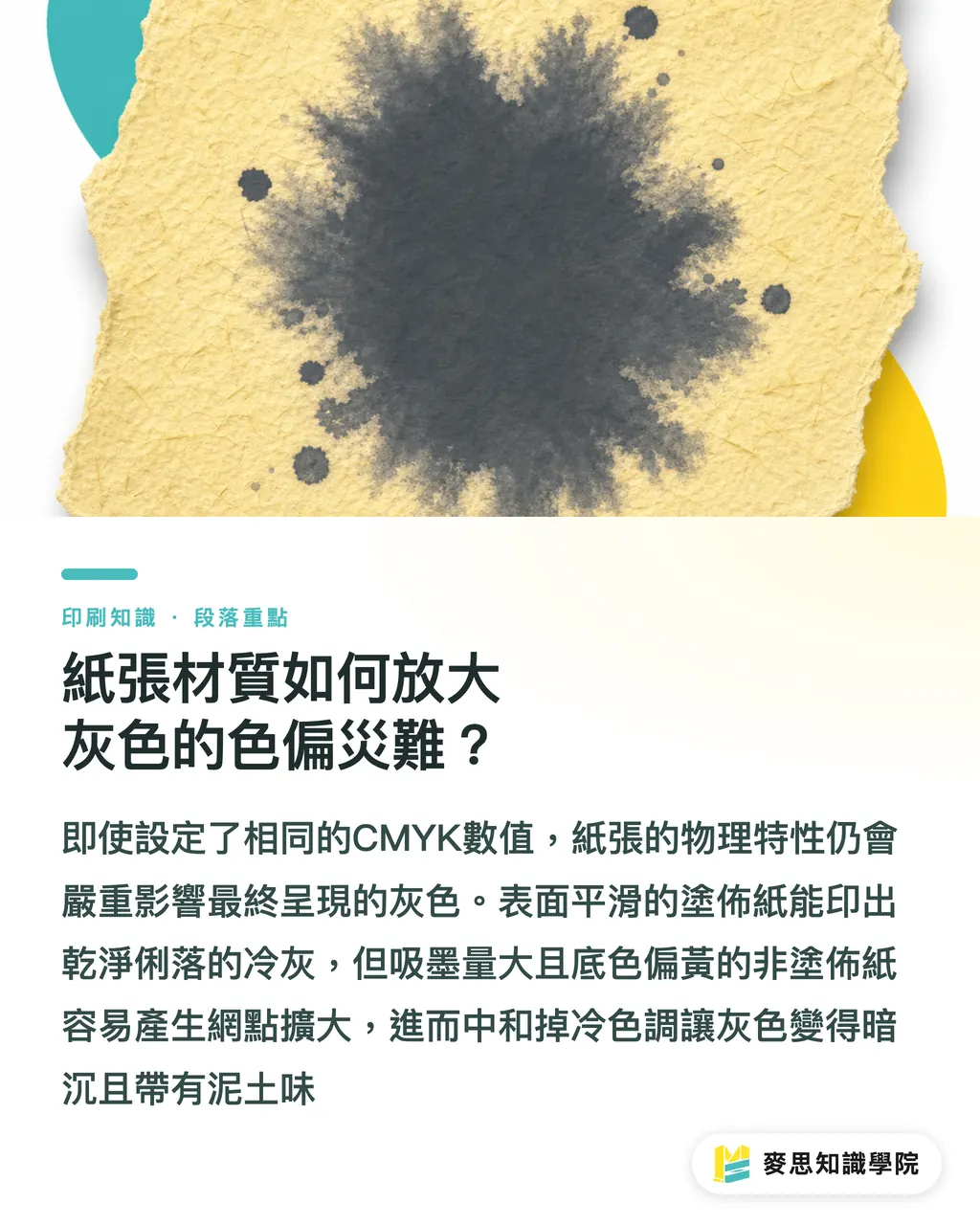
One client printed a catalog with coated paper for the cover and woodfree paper for the inside pages. The CMYK settings were exactly the same, but the cover looked cool gray while the inside pages looked like a slightly muddy warm gray
That was not bad presswork. It was the physical behavior of the paper
・Coated paper, such as art paper and matte coated paper: the surface is smooth, absorbs less ink, and lets dots keep a more complete shape. This type of paper responds well to a high-K, low-C formula, and the printed cool gray usually looks clean and sharp
・Uncoated paper, such as woodfree paper and fine art paper: the surface has larger pores and absorbs more ink. This makes dot gain more severe
・Base color interference: many uncoated papers lean yellow or beige in their paper white because they are made to feel natural. When cyan (C) is printed on a yellowish paper base, some of that cool tone is visually neutralized. If the ink also spreads as it absorbs, the color can look dull and grayish
For uncoated-paper print jobs, if you're unsure, you can contact the consultant team at Mai Strategy Knowledge Academy directly. We can offer practical value adjustments for your chosen paper stock, or arrange a partial digital proof to check the difference
How should you judge proofs before going on press?
Many designers bring printouts from a regular inkjet office printer and argue with the print shop about color. That does not really help
The color gamut of an inkjet printer is completely different from a printing press. You need to look at a digital proof or an actual press proof
When checking grayscale proofs, pay attention to a few on-site details:
・View under a standard light source: do not check color in a dim yellow-lit hallway or under harsh sunlight. Put the proof under a D50 standard color-matching light box, with a color temperature of 5000K. That is the only way to see the gray accurately
・Watch for color shift after drying, or dryback: the color may look right immediately after printing, but once moisture and solvents evaporate, it usually becomes a little duller or grayer, especially on woodfree paper. Experienced press operators usually account for this dryback difference when adjusting ink
・Compare with the Pantone swatch book: take out the latest Pantone Color Bridge guide, turn to the Cool Gray 11C page, and you'll see both the spot color and the official suggested CMYK simulation. Place the proof beside it and compare. You'll get a clear sense of what four-color printing can and cannot achieve
For gray tones, which react sharply to tiny fluctuations, front-line judgment and proper file preparation are the most effective defenses against the cost of rejected print runs

Key Takeaways
・Avoid directly applying the software's default four-color conversion values. Grays containing high amounts of M and Y can easily go out of control on press and turn reddish or yellowish
・Replacing CMY gray mixing with a manual "high black (K) plus small amount of cyan (C)" formula can greatly improve cool-gray stability on the production line
・Uncoated paper can eat away the crisp coolness of cool gray because of dot gain and yellowish paper white. You need to account for the paper's physical behavior before designing
・For a full-bleed large-area deep cool-gray background, printing Pantone as a spot color is the highest-yield and easiest approach if the budget allows
Further Thought
From the light gray of Pantone 427C to the deep gray of Cool Gray 11C, these colors that look highly refined on screen are always a stress test for coordination between design and print production. For small and midsize businesses building a brand identity, it is better to bring in a consultant with production-line experience at the visual identity stage and create safe CMYK value charts for different materials, instead of spending heavy communication time checking color differences every time something goes to print. This directly reduces production waste later on, and it is a key foundation for carrying design quality from the screen into the finished product
FAQ
- Why does the color come out wrong when I directly convert Cool Gray 11C to CMYK in Illustrator?
- The software's default conversion values usually mix in a lot of magenta (M) and yellow (Y) to balance the gray. But if the press has even slight dot gain or ink-density fluctuation, those two colors can immediately push the gray toward red or yellow
- If the artwork has a large Cool Gray 11C color block, what printing method is most recommended?
- If the budget allows, I strongly recommend mixing and printing it as a spot color ink. It gives better saturation and completely avoids the color shift and unevenness caused by four-color overprinting
- Is there a safer CMYK value setup for Cool Gray 11C?
- In practice, we often recommend setting M and Y to zero, then using K at about 70~80 with a small amount of C at about 15~20 to create the cool tone. This keeps unstable factors like printing pressure and temperature to a minimum
- Why does cool gray printed on woodfree paper look dirty and yellowish?
- Woodfree paper has a rougher surface and absorbs more ink, so dots expand easily and the color becomes duller. On top of that, most uncoated paper whites are naturally warm, which eats away the cool tone in the formula and makes the result look yellowish
Related articles

The Print × AI weekly
The print and AI know-how designers, brands and enterprises can use before they commit — one email, every week
Tool Library
RGB↔CMYK conversion, ΔE color difference and brand color print analysis — free color management tools, computed right in your browser.
MINDS Group
Need actual printing or gifting services?
From premium printing to online ordering and festive gifts — the MINDS Group sister brands take it from here.