
Why Do Screens Always Look More Vibrant Than Print?
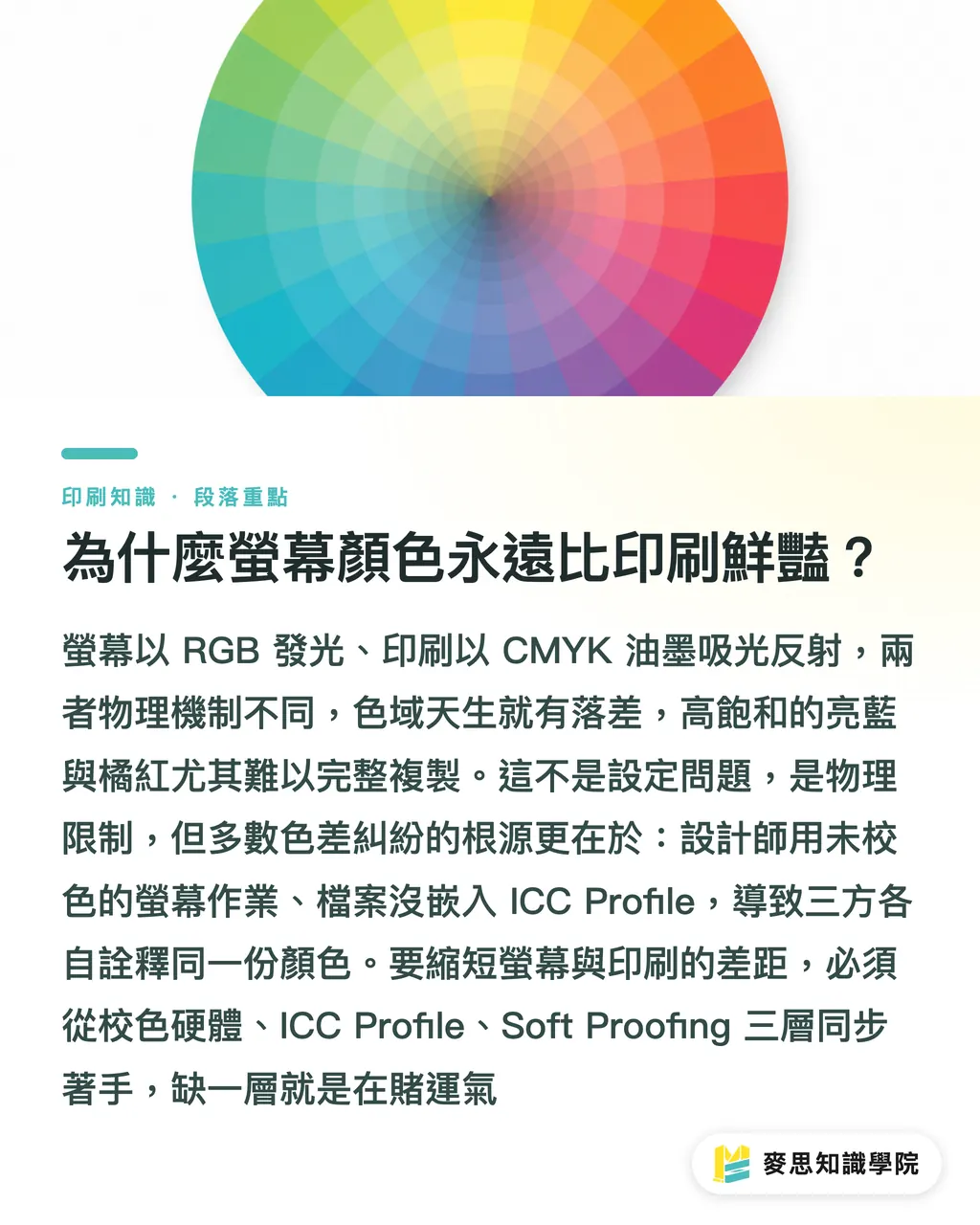
Screens emit light, while print relies on inks absorbing and reflecting light. Because the underlying physics are completely different, their color gamuts are fundamentally mismatched. If you want printed results to match your screen preview, Mai Strategy Knowledge Academy recommends aligning three layers at once: calibration hardware, ICC profiles, and soft proofing. Missing even one layer means you are leaving the outcome to chance
This is not a matter of incorrect settings. It is a physical limit. Monitors emit RGB light with color gamuts that easily cover sRGB or even wider spaces like Display P3, rendering intense neon blues and bright oranges. On the other hand, CMYK inks on paper have a much narrower gamut. Highly saturated electric blues and fiery oranges are almost impossible to reproduce faithfully in print
From years of working directly with clients, I have found that most color disputes share the exact same root cause: the designer works on an uncalibrated monitor, exports a PDF without embedded ICC profiles, and the print shop converts colors using its own RIP software settings. When everyone interprets the same file through a different lens, the final print will never match expectations
Once you understand this baseline reality, all the technical settings that follow will actually make sense
---
What Does Calibration Actually Do? Start with Hardware
Many people assume that tweaking monitor white balance by eye counts as calibration. That is a misconception. Proper monitor calibration requires two tools: a colorimeter and dedicated calibration software
Popular options include the Datacolor Spyder series and X-Rite i1Display, generally priced between NT$4,000 and NT$15,000. For designers with heavy print workloads, this is an essential investment rather than a luxury. The calibration software, usually bundled with the hardware, measures target RGB patches displayed on your screen, compares them against reference values, and generates an ICC display profile that loads automatically into your operating system's color management engine
Recommended target values for calibration:
・White point: D65 (6500K), the standard viewing illuminant in the printing industry, aligned with ISO 3664
・Luminance: 80–100 cd/m², since an overly bright screen tempts you to make artwork too light
・Gamma: 2.2 (Windows) or L* Gamma (newer macOS versions)
Recalibrate every two to three months. Backlights and OLED panels drift over time, so leaving an outdated ICC profile active will eventually introduce inaccuracies
---
How to Configure Settings Correctly in Illustrator and Photoshop
Hardware calibration is only step one. Your software configuration determines whether the colors you see while designing actually line up with the printing press
Unified Color Settings
Open Edit > Color Settings in Photoshop or Illustrator. Choose Japan Color 2001 Coated, the most widely used profile among print shops in Taiwan, or the specific ICC output profile specified by your printer. Set your RGB Working Space to sRGB IEC61966-2.1, and set your CMYK Working Space to the profile provided by your printer. If your printer does not supply one, Japan Color 2001 Coated is the safest fallback
Soft Proofing Is Your On-Screen Press
Once configured, go to View > Proof Setup > Custom in Photoshop. Set Device to Simulate to your printer's ICC output profile. For Rendering Intent, select Relative Colorimetric in most cases and check Black Point Compensation. Then press Ctrl/Cmd+Y to toggle the soft proof view
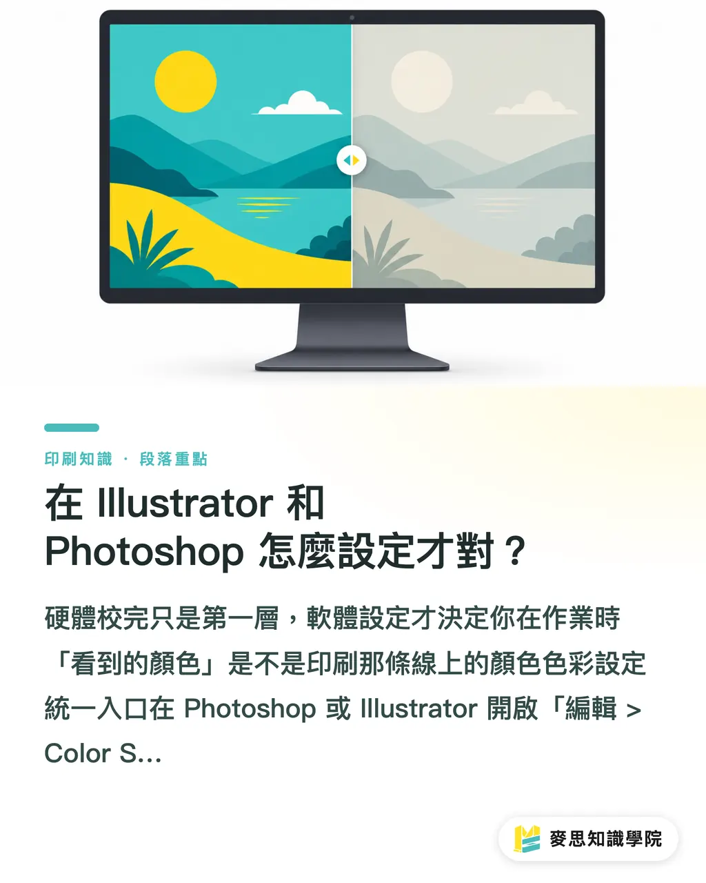
The difference before and after toggling is immediate. Colors that looked brilliant on screen will appear more subdued, closely reflecting how ink settles on paper. That muted shift is the real preview, not an optical illusion
The steps in Illustrator are slightly different. Configure your profile under View > Proof Setup, then check View > Proof Colors to activate soft proofing
---
Common Color Pitfalls to Avoid Before Sending Files to Press
Even after calibrating your screen and using soft proofing, things can still go wrong at press time. Here are the issues I check most often when reviewing final files for clients:
・PDF exported without embedded ICC profiles: When exporting a PDF in Acrobat or Illustrator, make sure Include ICC Profiles is checked. Otherwise, the printer's RIP will not know which color space your file was created in
・Exporting RGB images directly without converting to CMYK: If placed images in Photoshop remain in RGB, the printer's RIP will convert them using its own profile, which might not match what you intended. Convert them manually in Photoshop via Edit > Convert to Profile before saving
・Accidentally mixing RGB black (0, 0,
・0) into your artwork: This looks fine on screen, but it can print as a rich four-color black (C40 M30 Y30 K
・100) or turn into a washed-out gray. Body text should always be set to pure K100 black
・Using an ICC profile that does not match the actual paper: Coated paper and woodfree uncoated paper behave very differently. Soft proofing with the wrong profile gives you a completely misleading preview
---
How to Communicate Color Effectively with Your Print Shop
This is the most overlooked step in the entire workflow and the place where disputes happen most often
From years of watching both press operators and design clients, the most effective approach is simple: ask your printer for their output ICC profile before sending files. Competent print shops have custom profiles calibrated to their presses, inks, and standard paper stocks. Loading their profile into your soft proofing setup is the only way your monitor preview will closely resemble the actual output of that press
If a print shop tells you they do not have an ICC profile, your next best option is to request their color standard or a physical proof as a reference. Avoid telling them to make the print look like your screen. That statement gives the press operator zero actionable information
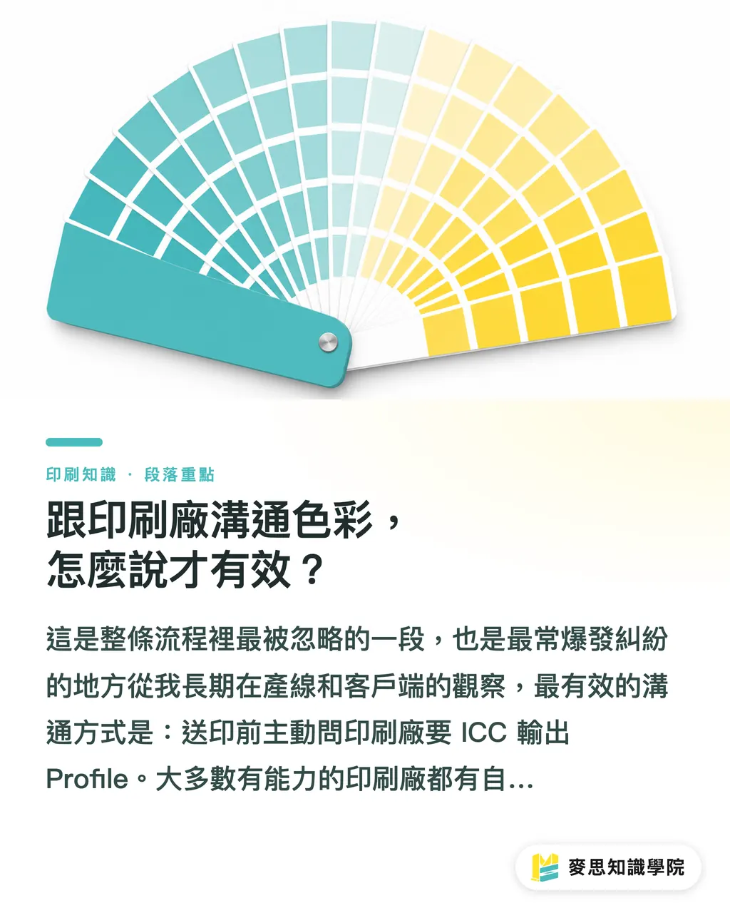
Another practical method is ordering a custom color swatch proof printed on the exact paper stock selected for your project. This confirms how your PANTONE or Hex values convert into CMYK. Keep that proof sheet on hand as the physical benchmark for full production runs. While PANTONE bridge guides offer CMYK conversion formulas, variations in inks and paper stocks can shift those numbers quickly. A physical proof remains the ultimate standard
If you handle print projects regularly and find yourself gambling on color every time, reach out to the consulting team at Mai Strategy Knowledge Academy. We can help you build a repeatable color verification workflow, saving you the time and frustration of starting from scratch on every job
Key Takeaways
・Monitor calibration requires a hardware colorimeter to build an ICC display profile. Adjusting color temperature by eye does not work
・Soft proofing is the only tool that lets you predict color shifts on screen before sending files to press. Working without it is like adjusting colors blindfolded
・Always embed ICC profiles when exporting PDFs so the printer's RIP has a clear color reference to follow
・Ask your print shop for their press-specific output ICC profile, which acts as the anchor for your entire color management process
・Set body text to pure K100 black so the RIP does not convert RGB black into a four-color mix that blurs small type
Further Thoughts
Monitor calibration is straightforward once you know the steps, yet many designers stop halfway. They calibrate the hardware but never turn on soft proofing, or they turn on soft proofing with a generic profile instead of the printer's specific profile. Every step in the chain must be in place for the entire workflow to deliver consistent results
For design studios, turning hardware calibration, Japan Color 2001 Coated defaults, and requesting printer ICC profiles into a standard operating procedure pays dividends. Beyond achieving accurate prints, it establishes a shared vocabulary with clients and printers, eliminating vague complaints about colors looking different than expected
For print shops looking to adopt color management, building custom ICC profiles for core presses and paper stocks is worth the initial effort. The long-term savings in press adjustment time and rejected jobs consistently outweigh the setup costs
Subscribe to the Mai Strategy Knowledge Academy newsletter for in-depth articles on prepress practices, color management, and print workflow optimization, saving you the trial and error of figuring it out on your own
FAQ
- What hardware do I need for monitor calibration, and how much does it cost?
- You need a colorimeter. The most common options on the market are the Datacolor Spyder series and X-Rite i1Display, which typically cost between NT$4,000 and NT$15,000 in Taiwan. Calibration software usually comes bundled with the hardware. Once connected, follow the on-screen prompts to generate and apply your ICC display profile
- Which ICC profile should I choose for soft proofing?
- Ideally, request the output ICC profile for the specific press from your print shop and load it into Proof Setup in Photoshop or Illustrator. If the printer cannot provide one, use Japan Color 2001 Coated as a reliable general alternative for coated paper stocks
- Which rendering intent should I choose?
- For print workflows, select Relative Colorimetric in most cases and make sure Black Point Compensation is checked. If an image has an unusually wide gamut with highly saturated colors, try Perceptual. Preview both with soft proofing to see which yields a result closer to what you want
- Why do identical CMYK values print differently at different print shops?
- CMYK values are simply instructions. The final color depends on ink formulations, press mechanics, paper absorbency, and ambient humidity. Because these variables differ across print shops, the same C80 M10 Y10 K0 formula can look sky blue at Shop A and slightly purple at Shop B. That is why communicating via press-specific ICC profiles is far more reliable than relying on raw CMYK numbers
- How close can a designer get to matching the final print on screen?
- Once you calibrate your monitor with a hardware tool, apply the printer's ICC profile for soft proofing, and embed ICC profiles in your exported PDF, the gap between screen preview and printed output becomes minimal. A 100% physical match is impossible due to the differences between light and ink, so final sign-off should always rely on a physical proof
Related articles


The Print × AI weekly
The print and AI know-how designers, brands and enterprises can use before they commit — one email, every week
Tool Library
RGB↔CMYK conversion, ΔE color difference and brand color print analysis — free color management tools, computed right in your browser.
MINDS Group
Need actual printing or gifting services?
From premium printing to online ordering and festive gifts — the MINDS Group sister brands take it from here.