

Why Does It Look Perfect on Screen but Turn into a Disaster in Print?
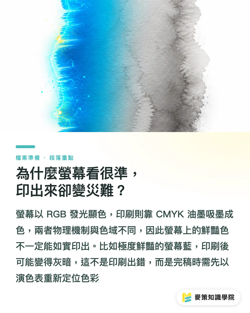
The physical mechanics of light emitted by screens versus ink absorbed by paper are fundamentally different. That is the core problem color management tries to solve. Screens use additive RGB color, getting brighter as colors stack up. Printing presses run on subtractive CMYK color, getting darker as inks layer over one another. A recent color theory clip from PostPress explains this clearly. When you pick an ultra-vivid blue on screen, CMYK inks hit their gamut limits and the printed result inevitably turns dull and grayish. This is not a pressroom error. The color mapping was disconnected right from the start. Many small and medium-sized brand clients in Taiwan show up with a phone screen and ask to match that color. In these moments, prepress production artists must immediately identify colors outside the printable gamut and remap them using color charts
How Do You Use Complementary and Analogous Colors in Packaging Design?
Whether your packaging blends in harmoniously on the shelf or pops right out depends on whether you choose analogous or complementary colors on the color wheel. Hue is simply the position of a color on the spectrum, and it is the starting point for every color palette decision
・Complementary Colors (Contrasting Colors): Colors located directly opposite each other on the color wheel, such as blue and orange or red and green. This combination creates high visual impact. If you are working on promotional packaging that needs to grab attention instantly, using complementary colors for the main headline and the background is the most effective approach
・Analogous Colors (Similar Colors): Colors that sit side by side on the color wheel, such as yellow and green. This combination looks gentle and cohesive. It works well for organic food or packaging that emphasizes subtle brand texture
Many novice designers cram high-saturation complementary colors everywhere just to grab eyeballs. In print, excessive total ink coverage makes the ink hard to dry and causes edges to bleed. If you need top-tier color results, work directly with experienced prepress and color management specialists like MINDS so these physical limits are factored in right at the proofing stage
What Checks Should Designers Run Before Handing Off Final Artwork?
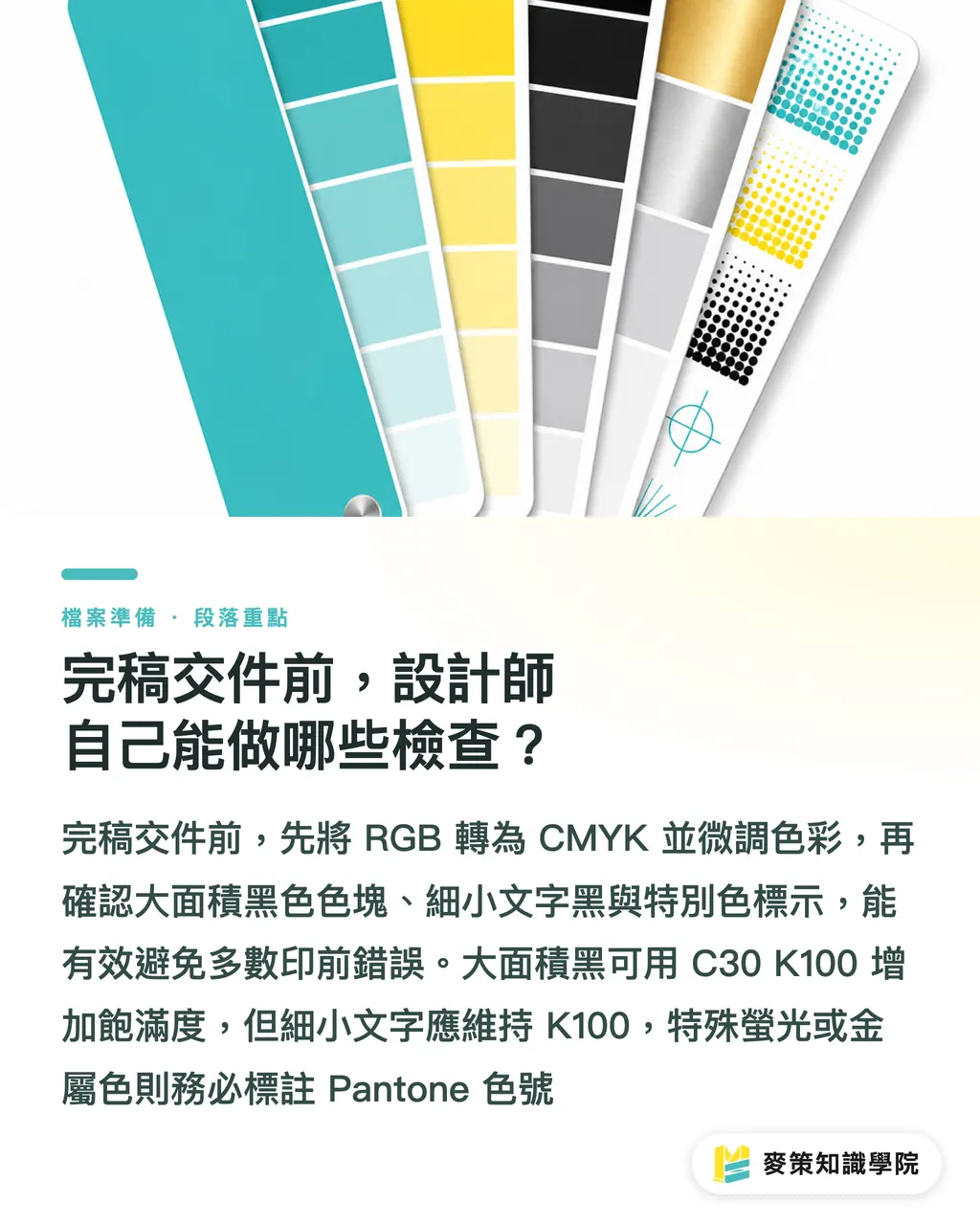
Before sending a project to press, converting color modes, checking black values, and labeling spot colors will catch most basic prepress mistakes. I always run through these quick steps before sending files to print:
1. Convert Color Modes: Switch your design files from RGB to CMYK. Colors will inevitably shift. What you need to do is manually adjust the CMYK values so they stay as close to your original design intent as possible, rather than ignoring the shift
2. Check Rich Black vs. 100% Black: Avoid using plain K100 for large solid black areas because it looks washed out in print. Usually you should add some cyan (like C30 K100). For small body text, stick strictly to single-color black (K100), or misregistration will make the edges blurry
3. Specify Spot Colors: If the brand's primary color is a neon or metallic shade outside CMYK capability, specify the Pantone code directly. Do not expect press operators to guess and adjust by eye based on a printout
This prepress logic applies to everything from bespoke custom jobs to routine commercial print runs. Even when using standardized online ordering platforms like MINDS, setting up your files correctly ensures the final print meets quality standards
Key Takeaways
・Screen RGB and print CMYK follow different physical laws. Converting files and fine-tuning values before handoff is the designer's responsibility
・Complementary colors create strong contrast, but watch your total ink coverage to prevent slow drying and ink bleeding
・Always set text to 100% K black and add cyan to large solid black areas. This is an unbreakable rule to avoid registration disasters
・Hue sets the first emotional impression of your packaging. Analogous colors bring harmony, while complementary colors grab attention. Pick based on your brand positioning
Further Considerations
I have worked with many traditional Taiwanese brands undergoing transformation lately. A recurring headache for them is that packaging colors drift whenever they change designers. Turning color theory from a designer's subjective aesthetic instinct into a checklist backed by real numbers is the only way to cut waste and errors. When designers maintain strict file standards and printers align with standardized proofs, both sides speak the same color language. That is how you free up energy to focus on true craft innovation
Further Reading
FAQ
- Why does my design look different across various screens?
- Every display has different panel materials, factory calibration, and brightness settings. To evaluate print colors accurately, you need a professional graphics monitor with hardware calibration and must compare against physical color charts under standard lighting
- What should I do if colors turn dull and grayish after converting from RGB to CMYK?
- This is a physical limitation. The CMYK color gamut is inherently smaller than RGB. Your best options are to turn on Gamut Warning in your design software, manually tweak CMYK values to recover saturation, or specify a Pantone spot color for that shade
- Why shouldn't I use 4-color black (C100 M100 Y100 K100)?
- Maxing out all four ink channels creates a total ink coverage of 400%. The paper cannot absorb that much ink, making it take forever to dry and causing ink set-off onto adjacent sheets. In practice, setting large black blocks to C30 M0 Y0 K100 gives you a deep, rich black without the mess
Related articles





The Print × AI weekly
The print and AI know-how designers, brands and enterprises can use before they commit — one email, every week
MINDS Free Tools
Imposition calculator and preflight file check — free prepress tools, right in your browser.
MINDS Group
Need actual printing or gifting services?
From premium printing to online ordering and festive gifts — the MINDS Group sister brands take it from here.