
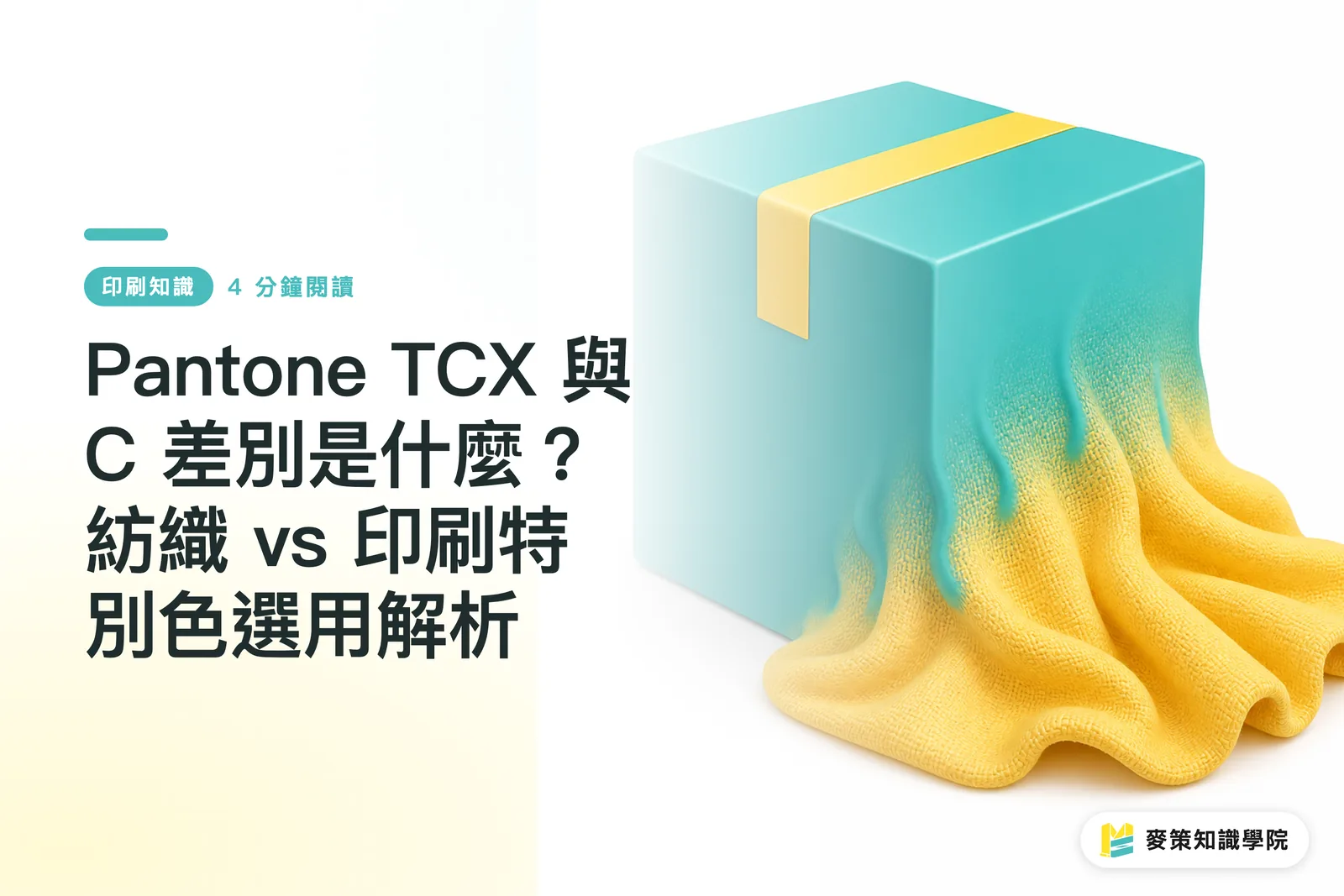
Why You Can't Use Pantone TCX for Paper Packaging
Pantone TCX is a cotton swatch library developed specifically for textiles, whereas paper packaging printing requires Pantone C (Coated)
If you hand a TCX code to a printer, the press operator has to flip through a physical C book and guess the closest match by eye
I've seen this exact customer complaint way too many times lately
A brand brings in a dyed piece of fabric and demands the printer replicate that exact same shade on a cardboard box
Physically, that is impossible
Cotton absorbs light, giving it a soft, deep matte finish. Coated paper (like standard art card) has a glazed or coated surface with high reflectivity, making printed colors look vivid and sharp
Because the two substrates reflect light differently, your eyes perceive different colors
TCX dye formulas and paper ink chemistry are entirely different worlds. Some colors achieved with textile dyes simply cannot be mixed with traditional printing inks
That's why cross-material color matching requires two distinct standards

How Should You Set Brand Colors Across Textiles and Print?
When a product spans both fabric and paper packaging, your core brand color should prioritize visual consistency, not blindly chasing the exact same Pantone number
TCX and C numbering systems are completely independent
My go-to workflow for these projects is to first decide which material serves as the main visual anchor
For an apparel brand where fabric matters most, lock in the Pantone TCX code first. Next, take that TCX swatch under D50 standard lighting (the standard viewing light specified by ISO 3664) and visually compare it against a physical Pantone C book to find the closest visual C match, then set that as the standard for your paper boxes
That's all it takes
Never rely blindly on software color conversion tools
I once saw a startup convert a web HEX code directly into TCX inside their software, and the sampled canvas tote came out two shades darker than the design mockups
Numbers calculated by an algorithm fall apart fast in the physical world
Color-matching rules for different materials:
・Textiles and fabrics: Refer to TCX (cotton) or TPG (textile paper-green / lacquer on paper, commonly used for leather goods)
・Glossy paper boxes: Refer to C (Coated), where ink looks most vivid
・Manuals or kraft paper: Refer to U (Uncoated), and expect colors to look darker and more muted
What's the Difference Between Pantone C and U?
Pantone C stands for printing on smooth coated paper, while Pantone U (Uncoated) is for printing on rough, absorbent uncoated stock
The exact same color number in C versus U will show massive differences in value and saturation once printed
This is by far the most common file setup mistake I catch on the production line
A designer selects Pantone 185 C (a rich, saturated red) in Illustrator, but the final specified stock is standard woodfree uncoated paper
Once ink hits uncoated paper, it bleeds and sinks along the paper fibers, instantly turning what was a vibrant red on screen into a dull, muddy shade
To avoid this trap, we run through the 'Mai Strategy 3-Step Pre-Press Checklist' before proofing:
・Verify paper surface properties: Check whether the stock is coated or uncoated
・Open the corresponding physical swatch book: Confirm final visual results with a physical C or U book
・Update your design file: Change the spot color swatch in your software to match the correct paper suffix
If you're unsure about paper behavior, reach out to the Mai Strategy Knowledge Academy consulting team to lay out physical paper samples and swatches together, which beats blind guessing on a screen every time
How Often Should You Replace Physical Swatch Books?
The moment a physical swatch book is unwrapped and exposed to air, light, and skin oils, it starts to fade. Industry bodies like FOGRA generally recommend replacing swatch books every 12 to 18 months
Past that window, the standard in your hands is no longer standard
A lot of small and medium business clients come to me for help when their colors drift after switching to a new printer
The first thing I do is ask both sides to bring out their Pantone swatch books side by side
More often than not, the client's book is four or five years old, yellowing at the edges and covered in fingerprints, while the printer is running off a brand-new copy bought this year
When your reference points don't match, how could the colors ever line up?
When a brand has a non-negotiable core color, I recommend buying Pantone tear-out Solid Chips
Tear one off, staple it directly to the proof sheet, and send it into production right alongside the artwork file
With a physical target in hand for ink mixing, there's no room for dispute
To learn more about prepress and production guidelines, subscribe to the Mai Strategy Knowledge Academy newsletter for hands-on solutions

Key Takeaways
・Choose TCX for textiles, C for glossy paper boxes, and U for uncoated stock. Your substrate dictates the color suffix
・Cross-material matching depends entirely on visual comparison under standard lighting. Never rely on automated software conversions
・Physical swatches fade with time and handling. For critical projects, staple an individual physical chip to the proof sheet before sending it to press
Final Thoughts
At its core, color management is expectation management
On a screen, glowing RGB pixels always look flawless, but once you step into manufacturing, substrate, ink, lighting, and time all warp that final result
Instead of chasing one universal color code, factor physical limitations into your initial design phase and prepare dedicated color equivalents for each material early on. That is how you reliably bring a brand identity into the real world
FAQ
- What should I do if I can't find the Pantone TCX swatch library in Illustrator?
- TCX is a physical fabric standard, while Adobe apps typically only bundle print-oriented C and U swatch libraries. If you need to simulate it in your design software, you generally have to use the Pantone Connect extension or enter color values manually, but the physical fabric swatch must remain your ultimate source of truth
- The printer told me this Pantone C color cannot be printed. Is that true?
- It's true. Some exceptionally vibrant shades in the Pantone system sit well outside standard four-color CMYK gamut limits and require custom spot inks mixed from scratch, which increases platemaking and press costs
- Can I snap a photo of a color swatch on my phone and send it to the printer for color matching?
- Absolutely not. Every phone camera processes white balance and sensor data differently, and screen calibrations vary widely from device to device, leading to massive color shifts in photos. The only reliable way to match color is for both sides to look at the exact same physical swatch
Related articles

The Print × AI weekly
The print and AI know-how designers, brands and enterprises can use before they commit — one email, every week
Tool Library
RGB↔CMYK conversion, ΔE color difference and brand color print analysis — free color management tools, computed right in your browser.
MINDS Group
Need actual printing or gifting services?
From premium printing to online ordering and festive gifts — the MINDS Group sister brands take it from here.