
Why Does 185C Turn Dull When Converted to CMYK?
The saturation of Pantone 185C sits outside the printable boundaries of CMYK. This is not a mistake by your print shop, it is a physical limitation of the inks themselves
CMYK process printing relies on overprinting three translucent inks: Cyan (C), Magenta (M), and Yellow (Y). To print red, you mainly combine M and Y. However, process magenta naturally carries a slight color shift, so mixing the two inherently lowers the saturation of the resulting red. Pantone 185C is a pre-mixed spot color ink formulated before it ever hits the press. Its pigment concentration and purity are far higher than any CMYK mix. When applied to paper, you get that exact red directly, without relying on ink layering
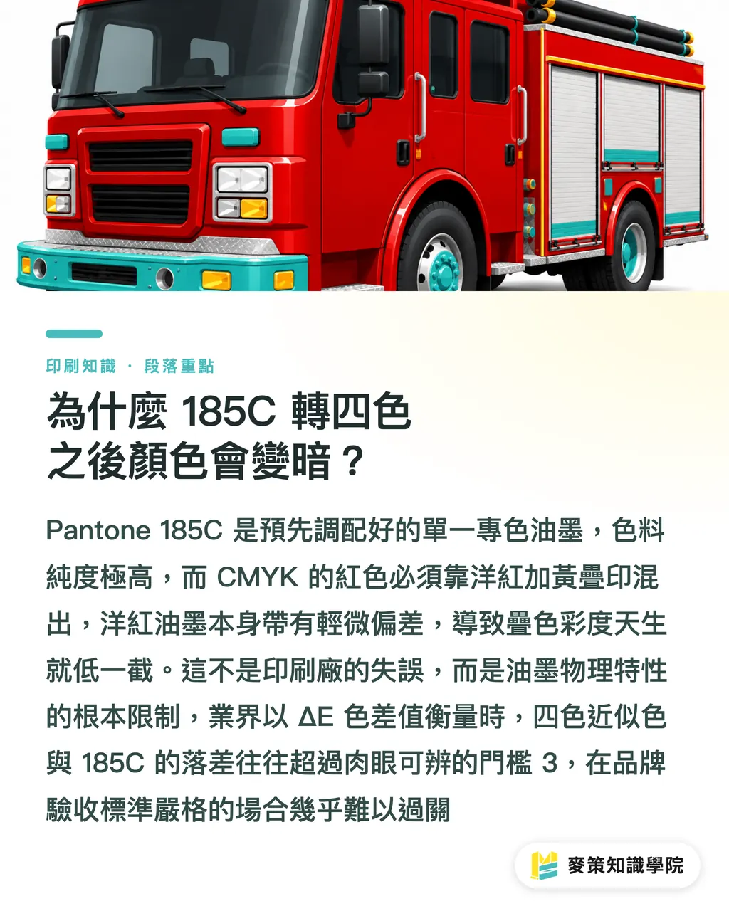
To put it in perspective: CMYK red looks more like a sun-faded rose, while 185C looks like a fresh fire engine straight from the factory. Put them on the same sheet of paper, and your eyes can tell immediately which one is brighter. From a color measurement standpoint, the industry generally considers a ΔE (color difference) above 3 to be a noticeable visual gap. In real print runs, the CMYK match for 185C often exceeds this threshold, making it tough to pass strict brand quality checks
What Does the "C" in 185C Stand For? What Happens If You Pick the Wrong Paper?
The "C" stands for Coated. This swatch is calibrated specifically for coated paper (gloss or matte coated stocks). If you print that exact same ink on uncoated woodfree or offset paper, the paper absorbs much more ink. As the ink spreads into the paper fibers, the tone deepens and saturation drops even further
The proper swatch for uncoated stock is Pantone 185U (U = Uncoated). If you specify 185C but print on uncoated paper, the press operator will match against the C swatch. The result on paper will look dark and muddy. The press operator believes they matched the swatch correctly, while the client feels the color is totally off, leaving both sides frustrated
Quick guide to common paper stocks:
・Coated paper, gloss, or matte coated stocks → Match with Pantone 185C
・Woodfree paper, offset stock, uncoated fine art papers → Match with Pantone 185U
・Fabrics, canvas bags, and specialty substrates → Physical material proofs required, swatch books serve only as a general guide
Many designers skip this detail on their print spec sheets, but leaving it out is often the spark that sets off a color dispute
When Must You Go with a Spot Color, and When Is CMYK Enough?
The answer is straightforward: it depends on whether the printed piece will be compared side by side with your brand's core colors
When you should definitely specify a spot color:
・Business cards, envelopes, and brand stationery, where every batch needs to match the last, and CMYK batch variance is too unpredictable
・Packaging boxes, where consumers might see products from different production runs sitting right next to each other
・Retail POP displays and brand posters, where multiple materials sit in the same space and any color mismatch stands out instantly
・OEM fabric tags and embroidery, where handing vendors a Pantone number gives them a clear target for color matching
When a CMYK approximation is usually good enough:
・Catalogs and user manuals meant primarily for reading, where no direct comparison with brand assets takes place
・Short-term event promotional materials that are quickly discarded and have low color accuracy requirements
・Short runs on a tight budget, since spot colors carry minimum run requirements and plate costs take up a big chunk of small orders
A quick rule of thumb: will this print piece end up inside a physical brand space, or be used alongside earlier batches of materials? If yes, invest in the spot color. If not, save your money and go with a CMYK match
How to Set Up Your Print Files to Prevent Costly Mistakes
The most common trap for designers is choosing the wrong swatch type in Adobe Illustrator. In your Swatches panel, Pantone 185C must be set as a Spot Color, not a Global Color or a Process Color. If set incorrectly, exporting to PDF may automatically convert it to CMYK. The print shop will receive four-color process values instead of a dedicated spot color specification
Here is the Mai Strategy three-step prepress checklist to run through before every file handoff:
① Verify the swatch type: In the Illustrator Swatches panel, a Spot Color swatch has a small triangle mark in the bottom right corner. If you see a plain square, it has been set as a process color and needs to be changed back
② Check with Output Preview after exporting the PDF: Use the Output Preview tool in Adobe Acrobat to inspect individual color plates. Pantone 185C should show up in the separations list as its own plate, separate from C, M, Y, and K. If you only see the standard four plates, your spot color was converted
③ Put your print specs in writing: State clearly in your email or handoff note: "Cover logo red: Pantone 185C, specify spot color printing, no CMYK conversion accepted." Verbal instructions often get dropped when sales reps write work orders, but written specs prevent your job from being treated as a standard CMYK run
If you are unsure, the Mai Strategy Knowledge Academy consulting team can review your print file settings to help you avoid a wasted print run
Hidden Traps in On-Site Ink Mixing
When press operators mix spot colors in-house, two common shop-floor issues deserve close attention
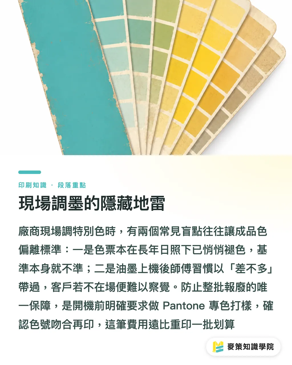
First is the condition of the swatch book. Under prolonged light exposure and air oxidation, Pantone swatch books begin to fade noticeably within three to five years. If an operator matches against an aged swatch, the benchmark itself is already off. Ask the printer about the publication year of their swatch book to make sure they are not using a guide that has been sitting in a corner for a decade
Second is the "close enough" mindset. The mixed ink might visibly differ from Pantone 185C, but once the press is running and the ink is loaded, the operator might just say "it is close enough." Without a client on-site, the job runs as-is. There is only one reliable way to prevent this: demand a spot color press proof before the full production run. This step costs a bit extra, but it is far cheaper than reprinting an entire batch
Key Takeaways
・Pantone 185C is a pre-mixed single-pigment ink with saturation exceeding the CMYK printable gamut, so process conversions will inevitably look darker and muddier
・The "C" indicates a coated paper standard, so switch to 185U when printing on uncoated stock, or your color reference will be flawed from the start
・Stick with spot colors for brand identity touchpoints (business cards, packaging, POP displays), while a CMYK match is usually enough for reading materials and short-term event promos
・Designers must confirm Spot Color settings in Illustrator and verify in Adobe Acrobat Output Preview that the spot plate exists independently after PDF export
・Put instructions in writing by stating "no CMYK conversion accepted" directly in your handoff communications rather than relying solely on file metadata
Final Thoughts
For growing businesses, you do not need to pay for a spot color every single time you print Pantone 185C. But there is one place where you should never cut corners: the very first print run of your brand identity assets. That inaugural batch of business cards, envelopes, and packaging sets the physical color benchmark for every future project. Even if you later compromise with CMYK, you can use that original spot color print to match the closest possible process formula, rather than guessing from a computer screen
If your brand guidelines still lack a clear print spec sheet listing your exact Pantone code, CMYK equivalent, and target paper stocks, now is the time to build one. Once this document exists, you have a solid standard to control color variance whenever you switch vendors or paper types, saving you from starting discussions from scratch every time. For a good starting point, Mai Strategy Knowledge Academy offers in-depth articles on brand color management workflows
FAQ
- What CMYK values should I use to convert Pantone 185C?
- Pantone's official CMYK equivalent is roughly C:0 M:91 Y:76 K:0 on coated stock. However, this is only an approximation and still lacks the saturation of genuine spot ink. Inks and press setups vary across print shops, which shifts the final printed tone, so requesting a press proof before full production is strongly recommended
- What is the difference between 185C and 186C, and does picking the wrong one matter?
- Pantone 185C is a classic vivid bright red, while 186C is slightly deeper with subtle wine undertones. Without seeing them side by side, telling them apart with the naked eye is difficult. When choosing your brand red, compare physical Pantone swatch books under your target lighting. Screen previews rarely match real physical prints. Once you pick one, lock it down and stick with it
- Is spot color printing always more expensive than CMYK?
- Generally, yes. It requires an extra printing plate and custom ink mixing, which incurs an additional plate and setup fee. On large print runs, the per-unit cost difference becomes negligible, but on small runs, the setup cost makes up a large share of the total. For short digital print runs (like HP Indigo), spot color options are often unavailable, leaving a CMYK match as the only choice
- How will a print shop handle a file submitted with RGB red?
- When a print shop receives an RGB file, the prepress team converts RGB into CMYK. The converted values depend on the specific ICC color profile they use, meaning different print shops will produce different results, and none of them will be a Pantone spot color. If you need 185C, the designer must submit vector artwork properly configured with a spot color swatch
- Can post-press finishes fix a red that was already printed in CMYK?
- Almost never. Applying a gloss or matte coating can slightly enhance the perceived richness of a CMYK red, but it cannot restore saturation that sits beyond the CMYK color space. The ΔE gap will not disappear under a coat of varnish. The only real solution is to reprint the job or specify genuine spot color ink on your next run
Related articles
The Print × AI weekly
The print and AI know-how designers, brands and enterprises can use before they commit — one email, every week
Tool Library
RGB↔CMYK conversion, ΔE color difference and brand color print analysis — free color management tools, computed right in your browser.
MINDS Group
Need actual printing or gifting services?
From premium printing to online ordering and festive gifts — the MINDS Group sister brands take it from here.