
Are Pantone 116C and CMYK the same printing method?
No. Pantone 116C is a yellow specified by a swatch. A print shop can reproduce it with spot-color ink. Once converted to CMYK, the press approximates it with dots of cyan, magenta, yellow, and black, so the result may differ in brightness and saturation
A spot color is a single ink mixed separately by the print shop and printed on its own plate. It doesn't rely on dots of cyan, magenta, yellow, and black, and is often used for consistent brand colors
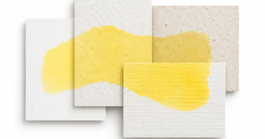
The C at the end of the color number stands for Coated. It identifies the swatch version based on coated paper. It doesn't guarantee the color will look the same on every stock. Cream paper, uncoated paper, and laminated finishes can all change the yellow's brightness and warmth
The mix-up I see most often is a design file that still says Pantone 116C, even though the color has already been converted to CMYK for print. The name hasn't changed, but the printing method has
Before asking for a quote, make it clear whether you want to "keep the spot color" or "convert to CMYK." Otherwise, the designer and print shop may each assume a different method

What CMYK recipe should you use for Pantone 116C?
A common CMYK starting point is C0 M16 Y100 K0. MINDS (a mid- to high-end commercial printer offering fully customized work) recommends treating it as a test-print starting point, not a guaranteed Pantone 116C match. Paper color, ink, print conditions, and color settings can all change the result
In CMYK, C, M, Y, and K stand for cyan, magenta, yellow, and black. The M16 in this recipe shifts the yellow toward a warmer orange. If cyan or black also gets into the file, the yellow will usually look duller. Don't judge the adjustment by a tiny swatch on your screen
For CMYK printing, ask the print shop which color settings to use for the job. Export the design file with those settings, then decide whether to adjust the color based on a printed proof. Screens emit light. Paper reflects the light that falls on it, so the yellow on screen can't serve as a print recipe
At a minimum, your print specification should list Pantone 116C, whether you plan to use spot color or CMYK, the paper name, and the lamination method. Once these details are clear, the print shop knows which finished product to check
Why does Pantone 116C print dark or look less saturated?
Pantone 116C often prints dark because the four-color result looks less vivid than the swatch after conversion. Paper color and surface finishing can also change how the color reflects light. A screen emits light, while paper shows color by reflection, so printed yellow loses the glow it has on screen
The same C0 M16 Y100 K0 can look different on white coated paper and on cream-toned uncoated paper because the paper white shifts the yellow in different directions. Matte or gloss lamination also changes how the surface reflects light. Check the paper and finishing together
If a proof looks too dark, first check the file recipe, proofing paper, and finished surface. If C or K in the file isn't zero, check whether a conversion or overprinting left it there. If the values are right, look at the paper white, ink coverage, and lamination. Don't just tell the print shop to "add more yellow."
Small yellow text needs attention too. C0 M16 Y100 K0 uses several plates, so slight misregistration can leave colored edges around the letters. For important small text, use a darker single color or request a proof at the actual size
How does Mai Strategy's three-check print process work?
To reduce color shift in Pantone 116C, Mai Strategy's three-check process goes through the file, the paper, and the approved production proof, in that order. All three checks need to match the same color target
・1. File check: Ask the print shop to confirm whether the spot color will be kept or converted to CMYK. If it's converted, label C0 M16 Y100 K0 as a test-print reference value
・2. Paper check: Make a proof on the production paper. If the finished product will be laminated or varnished, check a sample after finishing too. Don't substitute a proof made with a different paper
・3. Approval check: Compare the proof with the Pantone 116C swatch or approved sample for brightness and color cast. Have design, purchasing, and the print shop keep the same approved sample
I'd rather spend more time checking a proof on the same paper the first time than approve it based on a screen. Finding out after unpacking that the finished product isn't the yellow we approved is usually a much bigger headache
When should you use spot color for Pantone 116C?
If the brand requires a close match to the Pantone 116C swatch, or the same yellow will appear across several print runs, ask the print shop whether it can keep the spot color. If the layout already contains a lot of four-color images or you're using short-run digital printing, CMYK is usually easier to fit into the job, but you'll need to accept an approximate match
・Spot color: A yellow ink mixed separately. It suits print jobs where brand color accuracy matters. Confirm that spot-color printing is included when you request a quote
・CMYK: The color is built from four-color halftone dots. It suits standard four-color jobs, but isn't guaranteed to match the Pantone 116C swatch exactly
Make this choice before getting a quote. Asking for a CMYK yellow to match Pantone 116C exactly after the job has been printed means changing the original print specifications
If you already have the swatch, file, and paper specifications, bring them to the Mai Strategy Knowledge Academy consulting team with your target for the finished product. Then decide whether to request a spot-color or CMYK quote

Key takeaways
・The C in Pantone 116C identifies the coated-paper swatch version. It doesn't mean every paper stock will print the same yellow
・C0 M16 Y100 K0 is a CMYK starting point for a test print, not a guaranteed recipe
・If the yellow looks dull, check the recipe, paper white, and finishing first. Don't try to fix it just by adding yellow ink
・An approved sample made with the same paper and finishing is the right reference for matching future print runs
A few more things to consider
Design files should specify the color number, spot color or CMYK, paper stock, and surface finish. The print shop should carry those same fields through the quote, proof, and approval records. Then, if the paper or lamination changes, you can tell which condition changed. AI can help find a close color value, but it can't replace a physical proof on the specified paper. SaaS prepress collaboration workflows should also retain file versions and approval details, so color shifts can be traced back to the file or materials
FAQ
- What is the CMYK recipe for Pantone 116C?
- C0 M16 Y100 K0 is a common starting point for a test print. The actual color still needs to be checked under the print conditions and on the production paper
- Will coated paper print Pantone 116C exactly?
- There's no guarantee. The C in Pantone 116C identifies the coated-paper swatch version, but ink, print settings, and finishing still affect how the finished product looks
- Should I add more yellow if Pantone 116C prints too dark?
- First check the C, M, Y, and K values in the file, then check the paper white and lamination. Adding yellow ink alone may not fix the color shift
- How can I keep Pantone 116C consistent across print runs?
- Keep the paper, printing method, and finishing consistent, and save the approved physical sample as a reference for matching future runs
Related articles
The Print × AI weekly
The print and AI know-how designers, brands and enterprises can use before they commit — one email, every week
Tool Library
RGB↔CMYK conversion, ΔE color difference and brand color print analysis — free color management tools, computed right in your browser.
MINDS Group
Need actual printing or gifting services?
From premium printing to online ordering and festive gifts — the MINDS Group sister brands take it from here.