
Why Does Pantone 186 C Always Go Muddy and Dark When Converted to CMYK?
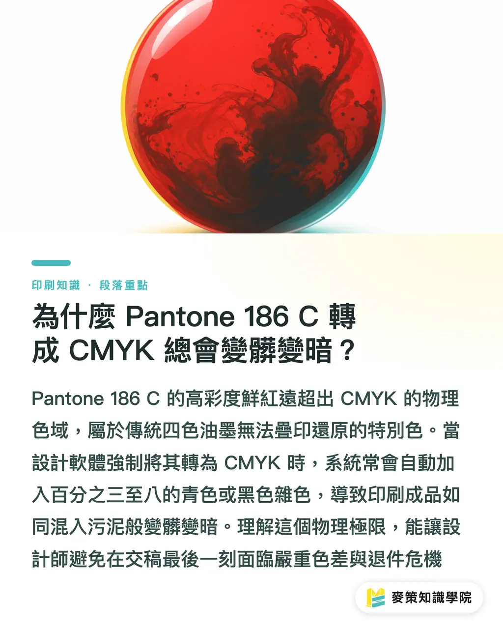
The spectral chroma of Pantone 186 C far exceeds what four-color CMYK overprinting can cover. That brilliant red your monitor shows with ease? On paper, it collapses into something flat
A Pantone spot color is a pre-mixed ink formulated to a specific pigment ratio, printed from its own dedicated plate. Compared to CMYK four-color overprinting, spot colors deliver far higher saturation and consistent results across print runs
After more than ten years running between press rooms and client offices, I can tell you: Pantone 186 C is the textbook case of 'looks amazing on screen, nightmare in four-color.'
Within the CMYK gamut defined by ISO 12647-2, the maximum chroma achievable by overprinting Magenta (M) and Yellow (Y) is quite limited
When you click to convert Pantone 186 C to CMYK in your design software, the conversion engine typically forces in 3% to 8% Cyan (C) or Black (K) to compensate for the lost density
Those few percent of contaminant colors are like dropping mud into clean red ink. Off the press, the result is an instant shift to a dull liver red or a grimy, purplish blob
Don't rush to blame the printer
I've seen too many designers walk into press rooms waving inkjet proofs and picking fights with the print shop. But the physics don't care
Pantone 186 C, like Pantone 032 C and Pantone 200 C, gets its vivid wavelength from pigments ground and mixed directly. That's a chroma range that Cyan, Magenta, Yellow, and Black simply cannot reproduce by overprinting
Understand this physical ceiling, and you won't be blindsided by a rejection or forced to accept a bad color match at the last minute
No Budget for Spot Color? How to Get an Acceptable Brand Red Out of CMYK
Simulating Pantone 186 C's vivid red in CMYK isn't something you can leave to Illustrator's automatic conversion. You need to manually adjust the values and pair them with the right ICC profile
Here's the short version
If the project budget is genuinely tight and adding a Pantone 186 C spot ink plate isn't on the table, the first step is to throw out the software's default automatic color conversion entirely
In a FOGRA39 or FOGRA51 standard printing environment, the default converted values almost always carry unwanted Cyan
On the production floor, we manually pull Cyan (C) to 0 and zero out Black (K), relying entirely on Magenta (M) and Yellow (Y) to keep the red clean
Common adjusted conversion values:
・Bright, warm red: C:0 M:100 Y:85 K:0, maximum saturation, slight warm shift
・Solid, corporate red: C:0 M:100 Y:80 K:5, a trace of Black adds weight, but ink volume needs tight control at the press
・Default auto-conversion (avoid): C:10 M:100 Y:80 K:0, that Cyan will turn the red gray and muddy fast
Beyond fine-tuning the values, the paper's ink absorption rate is an equally critical variable
Uncoated and coated papers differ by 15% to 20% in ink dot spread. The same CMYK values will always look lighter and muddier on uncoated stock
Before sending files to print, confirm the ICC profile settings your print shop is using. That's the only way to keep the gap between your software preview and the actual print from getting out of hand
How Designers and Buyers Can Use the 'Mai Strategy Three-Gate Print Submission Process' to Avoid On-Press Rejections
Brand red color shifts usually happen at the file handoff or during on-press communication. A standardized approval process can cut reprinting costs and dispute time by more than 80%
Printing isn't like hitting Ctrl+P. When brand identity colors are involved, sloppy file submission just puts you in a rejection loop
The most practical risk-control framework in the field is the Mai Strategy Three-Gate Print Submission Process:
① File gate, mark spot color channels and verify in software: designate Pantone 186 C as a standalone Spot Color swatch in your file. Automatic CMYK conversion is off-limits
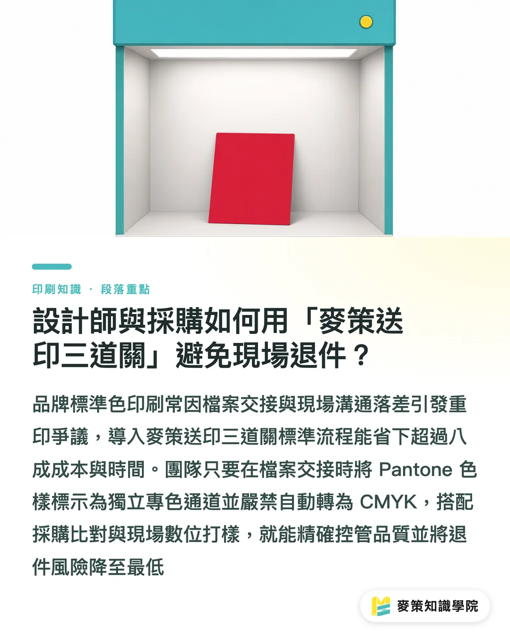
② Procurement gate, match against a physical Pantone swatch and check the paper's ICC profile: hold a physical Pantone Solid Coated swatch under D50 standard lighting and confirm the paper's coating level
③ Press gate, digital proofing and spot ink calibration on-press: before the run starts, always require a spot color digital proof or a signed press approval
If you still have questions about gamut conversion or on-press approval procedures, the Mai Strategy Knowledge Academy newsletter regularly compiles practical printing pitfall guides, a solid starting point for building your team's internal SOP
Get these three gates into your procurement contract and file submission checklist, and you shrink the risk of brand red going wrong to the smallest possible margin
How Big Is the Difference Between Coated and Uncoated Paper for Brand Red?
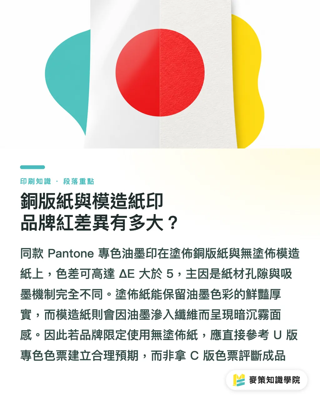
The same Pantone 186 C spot ink plate printed on coated art paper versus uncoated offset paper can produce a color difference of ΔE > 5. The paper stock determines the final look
A lot of first-time buyers assume one can of Pantone 186 C ink looks identical on any paper
The 'C' suffix means Coated; the 'U' suffix means Uncoated. The ink film forms completely differently on each
Here's how brand red actually performs across common substrates:
・Premium coated art paper (Coated): high gloss, ink sits on the surface forming a smooth film, Pantone 186 C looks its most vivid and solid here
・Ivory card / offset paper (Uncoated): large fiber pores absorb ink fast, saturation drops sharply once ink penetrates the fibers, colors tend to look dark and matte
・Art paper / lightly coated stock: textured surface with partial coating, saturation falls between the two extremes, watch for longer ink drying times and set-off issues
The physical difference in surface reflectance can't be fixed by laying on more ink. Heavy ink coverage just slows drying and causes set-off sticking
If your brand design requires uncoated paper, calibrate your expectations against the Pantone 186 U swatch, not the C version, when approving uncoated prints
Key Takeaways
・Pantone 186 C is outside the CMYK gamut, forcing it into four-color will always distort and muddy the color
・When there's no spot color budget, manually zero out the C value in CMYK (e.g., C:0 M:100 Y:85 K:0) to preserve purity
・The Mai Strategy Three-Gate Print Submission Process locks down brand color risk before the full production run
・Color difference between coated (C) and uncoated (U) paper can reach ΔE > 5, always evaluate brand colors using the matching paper swatch
Further Thinking
Looking at the integration from print manufacturing to brand design, spot color distortion isn't just a technical problem, it's a gap in the communication process. As AI-assisted design and automated color separation tools become standard, designers will eventually be able to preview the ΔE difference of a CMYK simulation of Pantone 186 C in real time, right inside the software. But no matter how accurate the algorithm gets, it won't replace optical measurement and paper-specific comparison on the press floor. When companies set up their VI guidelines, the first job is to define C, U, and CMYK fallback values in parallel, and to build a standardized press-approval process with their print partners, that's how you hold your brand's most fundamental visual asset while keeping costs in check
Further Reading
FAQ
- Why does my Pantone 186 C print come out like a dull liver red?
- Traditional CMYK can't cover Pantone 186 C's vivid red spectrum. When design software converts it automatically, it adds Cyan (C) or Black (K) that muddies the result. If it's printed on uncoated offset paper on top of that, the fast absorption tanks the color even further
- When there's no budget for a dedicated spot color, what CMYK values are best for converting Pantone 186 C?
- Manually pull Cyan (C) to 0 and use C:0 M:100 Y:85 K:0 or C:0 M:100 Y:80 K:5 to cut out contaminant colors. Then fine-tune on-press based on your print shop's ISO 12647 standard and ICC profile
- What's the difference between Pantone 186 C and Pantone 186 U?
- The C suffix is Coated (art paper); U is Uncoated (offset paper). The same ink produces a large color difference (ΔE > 5) across the two stocks due to differences in absorption and surface reflectance. You must use the physical swatch for the matching paper type when color-matching
- How do you judge whether Pantone 186 C is accurate during an on-press proof approval?
- Under a D50 standard light source in a color-matching booth, use a spectrophotometer to measure the color difference between the print and the physical Pantone swatch. Keep ΔE within 2.0, or do a visual comparison against the physical swatch as your acceptance check
Related articles
The Print × AI weekly
The print and AI know-how designers, brands and enterprises can use before they commit — one email, every week
Tool Library
RGB↔CMYK conversion, ΔE color difference and brand color print analysis — free color management tools, computed right in your browser.
MINDS Group
Need actual printing or gifting services?
From premium printing to online ordering and festive gifts — the MINDS Group sister brands take it from here.