
What color is Pantone Reflex Blue C, and why does it print with a purple-red cast?
Pantone Reflex Blue C often shifts toward purple-red in four-color CMYK printing because spot inks and four-color overprinting produce color under different conditions
Pantone Reflex Blue C is a blue spot color in the Pantone color system. The C stands for the Coated paper version. Spot ink is printed separately and is not the same as screen RGB or print CMYK
Screens emit light through RGB, while paper relies on ink absorption and reflection. When the design team converts Reflex Blue C to CMYK, the gamut, halftone overprinting, paper whiteness, and ink condition all change the visual result. Artwork may look vivid blue but print with a purple cast, often because the conversion conditions were not fixed in advance
The same CMYK file can produce a different blue tone and brightness on coated and uncoated paper. When matching color, view the Pantone swatch next to the target stock, not just the screen
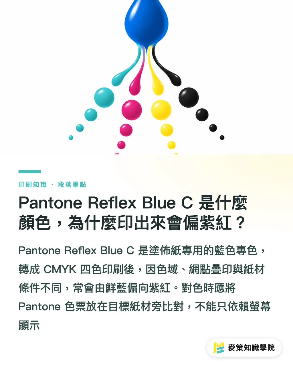
Why is there no universal CMYK formula for Pantone Reflex Blue C?
There is no single set of CMYK values that will look the same on every press and paper stock because color conversion has to account for the ink, paper, printing process, and viewing light at the same time
An ICC profile is conversion data that describes the color conditions of a particular device, ink, and paper stock. The ISO 12647 series from the International Organization for Standardization (ISO) is a shared standard for print process control, but it does not generate a Reflex Blue C formula that is permanently correct for every job
On press, the first question I usually ask is not "Which CMYK mix looks closest?" but "What stock are we printing on this time?" Until the paper is decided, any formula is still just a guess. A proof needs to be checked on the specified stock to confirm the color direction and acceptable range. Without a physical proof, demanding that it "match Pantone exactly" is like using a screen image to demand that the physical ink line up perfectly with it
How should printers and designers handle color shifts in Reflex Blue C?
The most reliable way to handle a Reflex Blue C color shift is to put the color code, paper stock, conversion rules, and physical proof into the print specifications together. That way, the designer, printer, and client are checking the same blue
・1. On the design side, state whether Pantone Reflex Blue C must remain a spot color or be converted to CMYK, and specify the paper stock. Do not submit only a screen capture
・2. When four-color printing is required, have the printer choose an ICC profile for the target stock, output the converted file, and then confirm whether the near-match is acceptable
・3. For a digital proof or press proof, keep the proof, paper stock, and file version together. The client signs off on this combination, not on an abstract color code
・4. Confirm the first sheet before the full run. If the pressroom can only chase the color by adding ink, go back and check whether the conversion conditions and proof match
For general clients, I turn this process into Mai Strategy's "Three Print-Ready Checks": define the color code first, lock the paper stock first, and approve the proof first. When it needs to become a company standard, the Mai Strategy Knowledge Academy Consulting Team can help organize it, so purchasing does not have to describe the same blue from scratch every time
How do you choose an alternative to Reflex Blue C while minimizing color difference?
When replacing Reflex Blue C, choose a path based on brand consistency, print volume, and process limits. Do not simply pick the blue that looks closest on screen
・Protect the brand color: Keep Pantone Reflex Blue C as a spot color. This suits brand identity work, packaging hero visuals, and printed pieces that need color matching across runs
・Control production costs: Use a CMYK near-match, accept that it will differ from the spot color, and proof it on the same stock. This suits interior pages or promotional materials
・For short runs or digital printing: Output using the color settings for the equipment and paper stock, keep the approved proof, and compare every later batch against the same reference
・Looking for a blue that is easier to print: Do not guess from the swatch name. Compare near-match colors on the target stock, then put the selected color into the brand guidelines
I put "near match" in the specification, not "exact match." If Reflex Blue C is the primary brand color, keep the spot color as the first choice. If it is only a general promotional background color, a CMYK near-match is usually more practical. Either way, let the client see a physical proof first
Key takeaways
・Pantone Reflex Blue C is a spot color. No CMYK formula should be expected to reproduce it perfectly
・A purple cast is usually related to the paper stock, conversion conditions, ink, and halftone overprinting
・For large areas of brand blue, proof on the target stock. The screen can only guide the direction
・Choose a substitute color based on brand tolerance and the process, not just on how similar it looks on screen
Further thoughts
The manufacturing side of printing can organize the signed proof for Pantone Reflex Blue C, paper stock, ICC profile, and approved files into a searchable color specification. Before sending files, the design side can state whether the color is a spot color or CMYK, while purchasing carries forward the same proof. If AI or SaaS is introduced, the most practical job is to check that the swatch name, paper-stock field, profile, and proof version are all present, then leave the judgment to a person. The software should not promise that the printed result will be identical based on a screen image. For the next job using the same color, reusing the approved proof is usually more reliable than chasing a magical set of values
Further reading
FAQ
- Can Pantone Reflex Blue C be replaced directly with CMYK?
- You can create a CMYK near-match, but it cannot be treated as exactly the same color. Convert it based on the paper stock, printing conditions, and ICC profile, then confirm it with a physical proof
- Why does Pantone Reflex Blue C print with a purple-red cast?
- After a spot ink is converted to CMYK, the gamut and overprinting conditions change. Paper whiteness and ink condition also affect the result. A purple cast is a common conversion risk
- To preserve Reflex Blue C, is spot color or four-color printing better?
- For a brand hero visual and large background areas, keep Pantone Reflex Blue C as a spot color. Use a CMYK near-match when cost or process limits make it necessary, and approve it with a physical proof
- What should a designer prepare before sending a job to print?
- State the color code, whether the intent is spot color or CMYK, the paper stock, the ICC profile, and the proofing requirements, and provide a proof that can be checked against the job. Do not submit only a screen capture
Related articles

The Print × AI weekly
The print and AI know-how designers, brands and enterprises can use before they commit — one email, every week
Tool Library
RGB↔CMYK conversion, ΔE color difference and brand color print analysis — free color management tools, computed right in your browser.
MINDS Group
Need actual printing or gifting services?
From premium printing to online ordering and festive gifts — the MINDS Group sister brands take it from here.