
Is Pantone 446 C Actually Black?
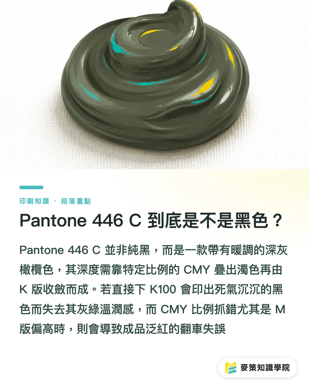
No. That is the first mistake most people make. On a swatch book, Pantone 446 C looks dark and nearly black, but it is actually a warm, deep olive gray. In the trade, people sometimes call it battleship gray or matte black. Designers picking colors on screen often eyeball it and assume, 'It looks so dark, it must just be black with a hint of gray.' So they set the prepress file straight to K100, or toss in a random sprinkle of CMY and call it a day
That is where the problem starts. The depth of 446 C does not come from piling on black ink. It comes from blending C, M, and Y in specific ratios to create a muted tone, with the K plate pulling back the brightness. If you only pump up the K plate, the print comes out as a dull, lifeless black, losing that warm, greenish-gray softness unique to 446 C. On the flip side, if the CMY balance is off, especially if M is too high, the final piece turns reddish. That is by far the most common way this color goes wrong
How Should You Set CMYK Values for Pantone 446 C?
No single formula works across the board, but hitting the right range matters far more than guessing. Starting values generated by most color conversion tools (like the official Pantone Color Bridge guide) generally land around C 40 to:
・50, M 25 to
・35, Y 35 to
・45, and K 85 to 95. The key is making sure the C plate has enough weight and not being greedy with M
This is only a prepress starting point, not the final answer. In practice, you run into three variables:
・The degree of dot gain on press, especially visible in darker areas
・Whether the ICC profile (a standardized color profile established by the International Color Consortium so screens, proofers, and presses speak the same color language) matches the actual paper stock and inks used on press
・The version of the built-in Pantone library in your design software, since different software releases can output different values
I have seen far too many jobs where the designer sent files using a five-year-old library built into their software, while the print shop was running an updated profile. The numbers never aligned, and both sides were convinced they were right
Why Do the Same CMYK Values Look Different at Another Print Shop?
Because the paper stock and printing method are what actually determine the final color. The numbers are just a starting point. A deep olive gray like 446 C is particularly sensitive because both its lightness and chroma are low, meaning any difference in paper whiteness or ink absorption gets magnified
Coated paper has a smooth surface and absorbs little ink. The ink sits on top, giving dark tones high saturation and crisp contrast, so 446 C comes out closer to a digital proof. Uncoated or woodfree paper has coarser fibers and drinks up ink, so the paper fibers swallow part of the ink density. The exact same CMYK values will print lighter and grayer, and dark patches noticeably lose their punch
The difference between digital and conventional offset printing cannot be overlooked either. Digital presses have a different color gamut and color reproduction logic than offset presses. Run the same PDF file on both, and the 446 C can show noticeable shifts in both depth and hue. It is not that one machine is worse than the other. Their underlying color technologies are simply different. Ask the printer which printing method they will use before submitting the job, so you know which proof to use as your benchmark
What Three Things Should You Do Before Press to Avoid Color Shifts?
Bottom line: proofing, profiles, and sign-offs. Skip any of these three checkpoints, and things can easily go sideways
・Checkpoint one: always ask the printer for a physical hard proof. Never rely solely on a monitor or a home desktop printer. Monitors emit light and will always look more vibrant than ink on paper. Home printers use an entirely different ink setup than production CMYK presses. Neither can accurately predict the final printed piece
・Checkpoint two: confirm that the ICC profile used for the proof matches the actual production run. Most print shops in Taiwan build their own press profiles based on ISO 12647 (the International Organization for Standardization standards for print color management). Asking upfront, 'Does this proof use the same profile as the live press run?' can save a mountain of disputes later on
・Checkpoint three: when signing off on the proof, inspect the 446 C sample under natural daylight. Do not sign off under decorative warm spotlights or right next to a phone screen. Deep olive gray shows far more dramatic visual shifts under different light sources than high-chroma colors do
Only after clearing all three checkpoints have you truly locked down the risk. Scrambling at the last minute and complaining about color midway through the run is usually too late for a reprint, leaving you stuck with whatever comes off the press
Should You Build 446 C with CMYK or Just Run a Spot Color?
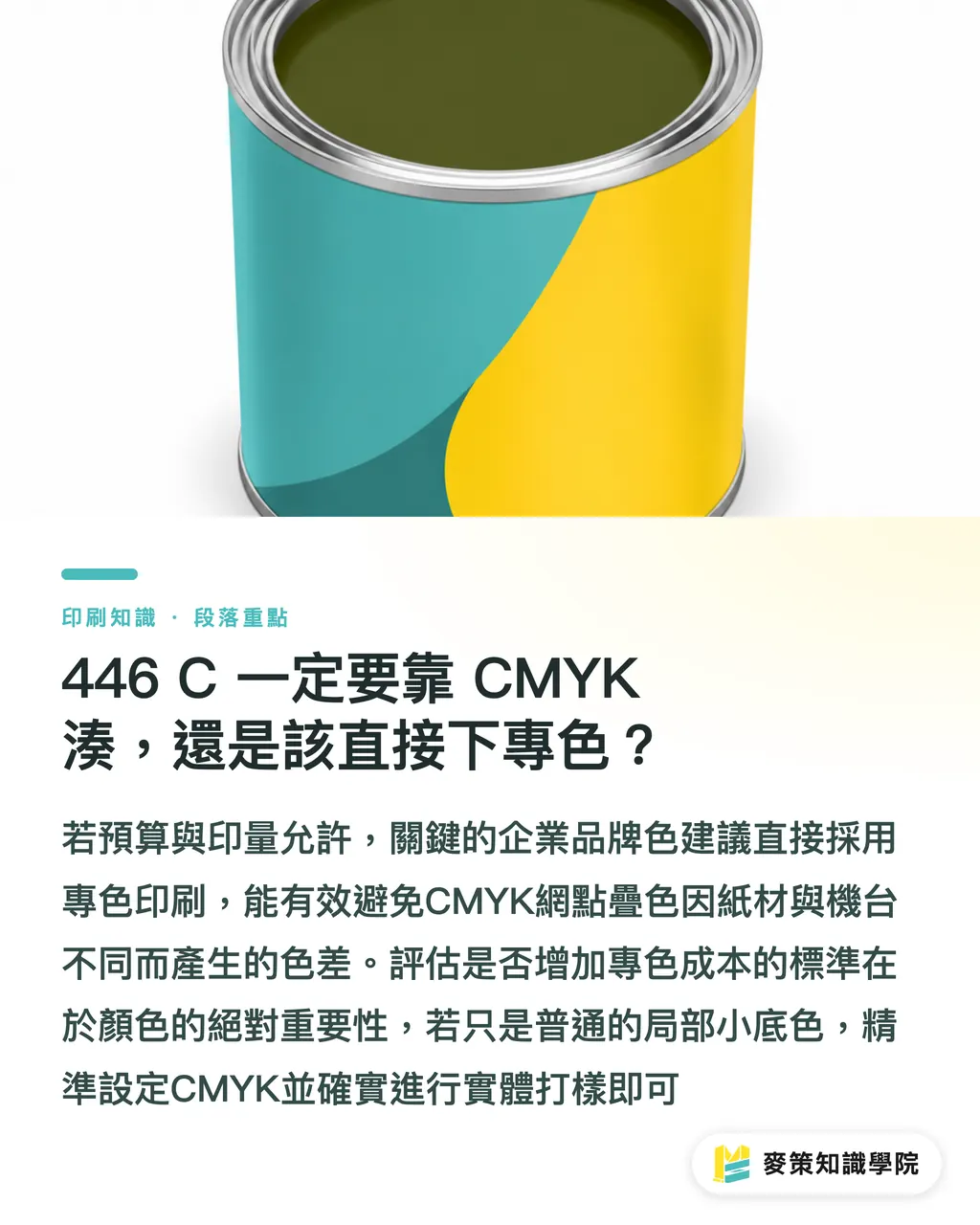
If budget and run length allow, running a Pantone spot color as a fifth color (printing with pre-mixed ink rather than screening four-color halftone dots) is the safest route. No guessing, and no gambling on how accurate the proof will be
Four-color CMYK works by layering tiny halftone dots to simulate a target color. No matter how precise your conversion formula is, different papers and presses can still cause color shifts. Spot ink, on the other hand, is custom-mixed by an ink technician directly against the color swatch. With the same batch of ink on the same batch of paper, color variation is naturally far smaller
Deciding whether to add a fifth color comes down to two things: is the print volume large enough to absorb the added cost, and is this color a brand identity color that cannot afford any deviation? For core corporate brand colors or critical packaging color blocks, I usually recommend going straight to a spot color. If it is just a small dark background inside body pages, dialed-in CMYK values combined with a physical proof are plenty good enough
Key Takeaways
・Pantone 446 C is a deep olive gray, not pure black. Do not just drop in K100 and call it done
・Getting your starting CMYK values in the right ballpark is only the first step. Paper stock and printing method are what truly determine the final color
・Coated paper renders colors close to the proof, while uncoated paper tends to make dark colors look washed out and gray
・Three checkpoints before press: a physical proof, profile consistency, and signing off under natural daylight. Skip one, and you risk a botched print run
・For brand identity colors or key packaging color blocks, stop gambling on CMYK. Specifying a spot color saves far more headaches
Final Thoughts
For designers, when dealing with colors like 446 C that look black but aren't, the most practical approach is clearly tagging the color space and target profile before sending files out, rather than leaving the print shop to guess. For print buyers, treating the proofing process as an essential investment rather than an extra expense saves reprint costs that far outweigh the price of a proof. If your company relies on recurring brand colors, consider building an internal print color reference card that logs tested values for your go-to papers and print processes, so you never have to waste time on trial and error for future runs. If you want to audit these finer points of color management together, reach out to the Mai Strategy Knowledge Academy consulting team to talk through real-world cases
FAQ
- Why does Pantone 446 C print with a reddish cast?
- Usually because the M (magenta) percentage was set too high during CMYK conversion, or because the ink absorption of the paper amplified warm undertones. Checking against a physical proof before the live run catches this issue early
- Can I just print Pantone 446 C as K100?
- Not recommended. K100 prints as a flat, lifeless black without the subtle greenish-gray olive tone of 446 C, and the visual difference between the two is striking
- When CMYK conversion values are off, is it the printer's fault or a problem with the design file?
- In most cases, both sides are using mismatched ICC profile versions. Rather than pointing fingers, ask upfront whether the profile used for proofing matches what will run on press
- For a dark color like 446 C, which paper holds color better without shifting: coated or uncoated?
- Coated paper has a smooth surface that absorbs little ink, keeping dark tones much closer to the proof. Uncoated paper has coarse fibers that absorb heavy ink, making dark shades like 446 C look muted and gray. When color consistency is your priority, coated paper is the safer pick
- If our brand color is Pantone 446 C, do we have to use spot color printing?
- It is not strictly required. But if this color is your primary brand identity shade or a prominent color block on packaging, adding a fifth spot color dramatically cuts down color variation, making it well worth weighing the extra cost against your print volume. To figure out the right call for your setup, you can also follow practical updates through the [Mai Strategy Knowledge Academy newsletter](https://mindsprt.dev)
Related articles

The Print × AI weekly
The print and AI know-how designers, brands and enterprises can use before they commit — one email, every week
Tool Library
RGB↔CMYK conversion, ΔE color difference and brand color print analysis — free color management tools, computed right in your browser.
MINDS Group
Need actual printing or gifting services?
From premium printing to online ordering and festive gifts — the MINDS Group sister brands take it from here.