
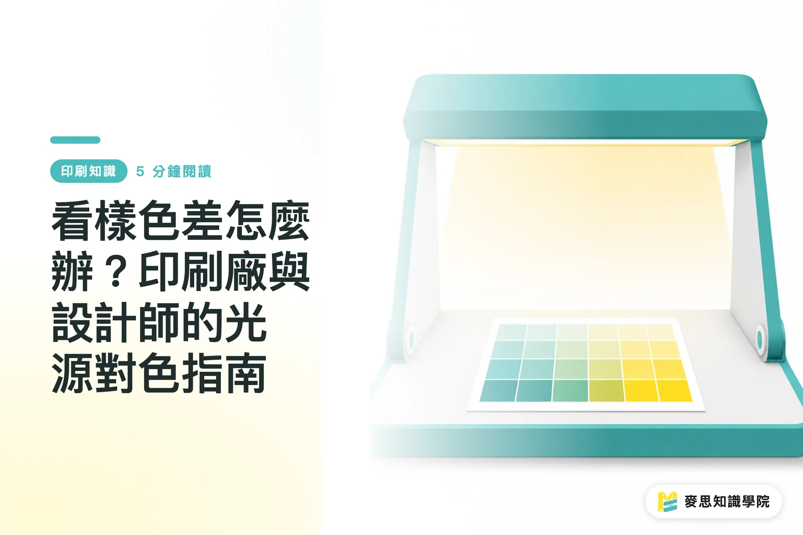
Why Do Prints Look Different in Offices versus Stores?
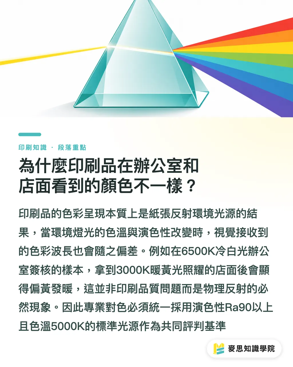
How color appears on paper comes down to ink reflecting the ambient light. Shift the light's color temperature or spectral makeup, and what your eyes see shifts too
Color Rendering Index (CRI, Ra, a measure of how faithfully a light source reveals true colors) is key to accurate evaluation. Standard print proofing requires an Ra of 90 or higher and relies on a 5000K D50 standard light source as a baseline. When CRI drops too low, gaps appear in the light spectrum, making accurate ink colors look muddy and distorted
The most common headache in the field? A client approves a proof in a cool 6500K office, takes it to a retail spot with 3000K warm yellow lighting, and suddenly finds their brand color turned noticeably yellow and warm
Hold on before blaming the press operator. This is pure physics
Paper absorbs ink and reflects light, operating on an entirely different principle than a backlit screen. Change the color temperature, and the wavelengths reflecting off the paper shift. Neutral grays, skin tones, and vibrant brand colors show this drift most clearly
What Lighting Traps Do Clients Fall Into During On-Site Proofing?
The biggest trap during on-site inspection is letting stray light and colorful backgrounds mess with your vision
Designers and buyers often grab a spot near a window or check proofs right on a brightly colored desk. These casual habits ruin your eyes' white balance
Grays, skin tones, and core brand colors are hypersensitive to lighting changes. Take neutral gray mixed from small amounts of cyan, magenta, and yellow, for instance. Drop the light quality or color temperature, and it shifts wildly
To keep colors accurate during sign-off, follow these viewing controls on-site:
・ No mixed light sources: Never mix indoor fluorescent lights with daylight through a window. Combining two color temperatures prevents your eyes from setting a true color reference
・ Keep backgrounds neutral: Desks and nearby walls should be neutral gray (like Munsell N7). This stops vibrant surrounding objects from casting reflected color onto your proof
・ Fix your viewing angle at 45 degrees: Position light 90 degrees directly above the proof and view it at a 45-degree angle. This eliminates surface glare
・ Test in the real environment: For food packaging or retail displays, check technical specs under standard light first, then bring the proof into the actual store under 3000K to 4000K lighting for a final double-check
How Do You Build a Standardized Proofing Workflow That Stops Arguments?
The best way to eliminate cross-department disputes is setting up a strict sign-off system that locks down lighting, paper stock, and color measurements
MINDS (MS, mid-to-high-end fully customized commercial printing) uses a three-tier proofing checklist:
① Step 1: Environment Lock. All physical proofs must be evaluated under a viewing station or light box that meets ISO 3664 standards, holding lighting strictly at 5000K with an Ra of 95 or above
② Step 2: Specification Matching. Make sure the proofing paper weight and coating match the final production stock exactly. For digital soft proofs, calibrate the monitor's ICC Profile beforehand
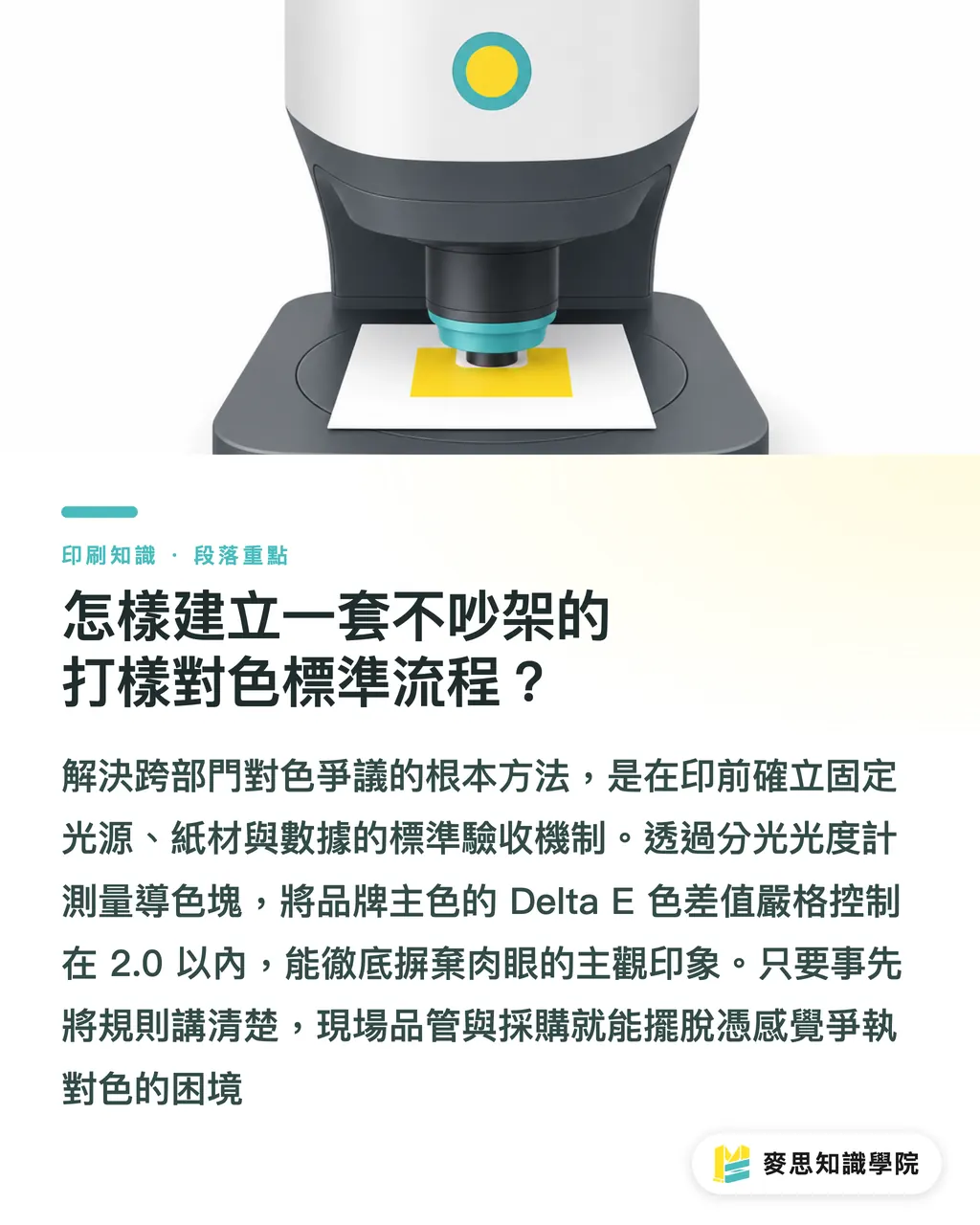
③ Step 3: Data Verification. Move past subjective visual judgment. Use a spectrophotometer to measure color bars and keep brand color Delta E values within an objective threshold of 2.0
It comes down to clarity. Set clear prepress rules upfront so QA and procurement stop arguing based on gut feeling
If your team frequently struggles with post-print color mismatches, consult the Mai Strategy Knowledge Academy Consulting Team to build color alignment standards for your production line, or subscribe to the Mai Strategy Knowledge Academy Newsletter for practical color management tips
How Should You Choose Between Hard Proofs and Soft Proofs?
Soft proofs and hard proofs do not exclude each other. They serve as complementary tools across different production stages and quality requirements
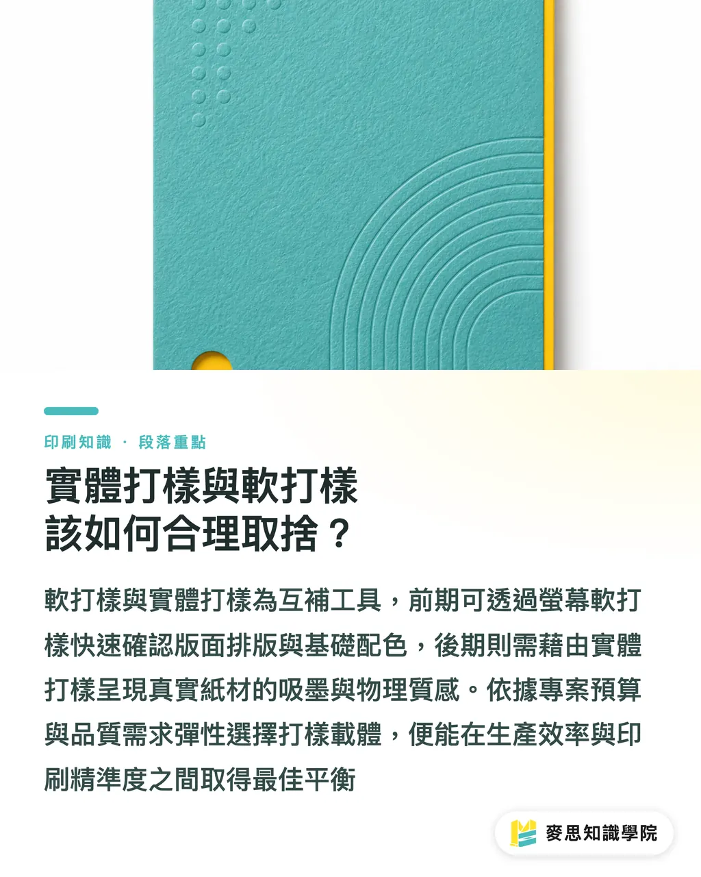
Soft proofing shows file colors on a calibrated professional display, ideal for early layout design, copyproofing, and basic color checks. Hard proofing reveals ink behavior on actual paper stock, making it an indispensable step for checking ink absorption, light refraction, and physical texture
Here is how common proofing methods stack up for different budgets and needs:
・ Screen Soft Proofing: Lowest cost and instant delivery. Best for urgent social media graphics or early layout checks. Drawback: cannot show paper texture or embossing reflections
・ Digital Inkjet Proofing: Fast with moderate cost. Simulates most CMYK process colors well. Best for standard book pages and promotional flyers
・ Press Proofing: Uses the actual press and target paper stock. Replicates final ink density and spot colors with 100% accuracy. Best for high-end rigid boxes and brand identity systems
Pick the right proofing method based on project budget and quality sensitivity to balance speed and accuracy
Key Takeaways
・ Keep your viewing environment locked down with ISO 3664 compliant D50 standard lighting and high-CRI bulbs (Ra 90+)
・ Eliminate mixed lighting and use a Munsell N7 neutral gray backing board to prevent color reflections from surrounding surfaces
・ Inspect proofs at a 45-degree angle and rely on a spectrophotometer to measure Delta E values for objective sign-off
・ For packaging and retail displays, verify basic specs at a viewing station first, then do a final check in the actual retail environment
Final Thoughts
Color management isn't about chasing impossible color perfection. It's about reaching clear specs across teams. Even with AI-assisted design and digital soft proofing everywhere today, paper reflection and ink behavior still demand a standardized environment for true verification. Building ISO 3664 viewing conditions into your procurement SOP cuts wasted proofing costs and brings design ideas to life with high quality
FAQ
- Why do colors approved under white office light change when brought into a warm shop?
- Light sources carry different spectral components. The wavelengths reflecting off inked paper change with color temperature, making grays and skin tones especially prone to visual color shifts when CRI or temperature changes
- How can a standard office evaluate proofs without a professional light box?
- Turn off mixed lighting and block outdoor daylight. Use a standalone high-CRI LED lamp (Ra > 90) and place a neutral gray card on the desk as a viewing surface
- What is an acceptable Delta E range for print color difference?
- Under a standard D50 light source measured with a spectrophotometer, general print quality should keep Delta E within 3.0. Brand colors or luxury packaging demand a tighter limit within 2.0
Related articles
The Print × AI weekly
The print and AI know-how designers, brands and enterprises can use before they commit — one email, every week
Tool Library
RGB↔CMYK conversion, ΔE color difference and brand color print analysis — free color management tools, computed right in your browser.
MINDS Group
Need actual printing or gifting services?
From premium printing to online ordering and festive gifts — the MINDS Group sister brands take it from here.