

Proof Colors Are Off? Step One: Lock Down Your Color Matching Conditions
When a client gets a proof and says the colors look wrong, my first move isn't to send the designer back to fix the file. Most color disputes aren't file problems, they're everyone looking under different light sources, on different substrates, against different reference samples
Get three things on the table first: the approved standard proof, the actual substrate for this job, and the digital proof or press sheet from the print shop
Color matching must happen under a standard light booth. Don't judge under office warm lighting, window daylight, or a phone flashlight, each of those shifts reds, blues, and grays in different directions
If the brand colors were converted from CMYK and Pantone, check the companion piece for the conversion logic. This article only covers what to do when color drifts after proofing or after press startup
My approach: establish which proof is the reference target before anything else. Without a named standard, every adjustment becomes a debate with no common ground
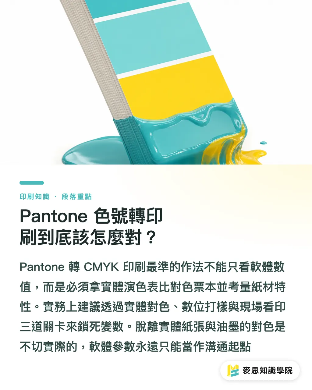
Color Drift on Press: Is It a Global Shift or a Localized Problem?
The most useless thing you can say during a press check is 'something feels off.' That description gives the press operator nothing to work with. Break the problem into actionable terms
If the whole sheet is pulling yellow, red, or gray, start by checking ink density, ink-water balance, paper batch, and press condition. That kind of problem affects the whole visual, adjusting one color block won't fix it
If it's only the brand color, skin tones, or a dark background that's wrong, look at dot percentage, overprint settings, local density, and paper absorption in that area. If needed, ask the shop to pull comparison sheets at different ink densities from the same plate
I always ask for the acceptable sheet to be marked on the spot, time, press unit, substrate, ink direction, and who signed off. Otherwise the production run has nothing solid to fall back on
Color matching isn't about calling out 'darker' or 'lighter' by gut feeling, it's about translating a color shift into correction instructions the press operator can actually execute
Define Color Tolerance Upfront, Don't Wait Until Finished Goods to Argue
A lot of print disputes aren't about colors being unfixable, they're about nobody agreeing on acceptable variance before the job goes to press. Then the finished product shows up and everyone's judging it by feel
At the proofing stage, I nail down three tiers with the client: whether the primary brand color can have any visible difference, whether secondary color blocks can tolerate slight shifts, and whether large solid backgrounds need a dedicated press check
If the corporate identity color is sensitive, get the tolerance range written into the sign-off record. At minimum, document which proof, which light source, and which paper batch is the reference for judgment
Acceptable under the light booth doesn't mean acceptable under trade show warm lighting or retail spotlights. If the final environment is unusual, the print shop needs to know that early
The earlier you put color tolerances in writing, the less you're handling print problems with emotions later
My On-Site SOP for Color Matching with the Print Shop
In practice, I break the color matching process into four steps to keep the design side, client side, and print shop from each working off a different standard
Step one: assemble the reference materials, approved proof, brand color guide, actual substrate, digital proof, and the latest print file. If any one of these is missing, on-site judgment gets dangerous
Step two: compare under a standard light source. Don't photograph and pass it around a group chat to decide on color. The lens, the screen, and the messaging app all process and compress the image. Fine for documentation, unreliable for color judgment
Step three: ask the print shop for concrete correction options, adjust ink density, slow the press, pull a new calibration sheet, or re-confirm substrate direction. Not just 'this color can't be printed.'
Step four: keep the signed-off proof and document the confirmation time, responsible contact, and production reference. That sheet becomes the shared language for final delivery inspection
Keep the light booth, the proof, the tolerance range, and the sign-off record under control, and color drift stops being a gamble, it becomes a step-by-step process you can actually work through

Key Takeaways
Stop chasing the perfect software conversion value. Comparing against physical color charts and swatch books is the only reliable standard
Paper absorption determines whether a color lives or dies. Matching coated stock swatches to uncoated paper will always end badly
Don't cut corners on digital proofing. Catching errors before the press starts is the cheapest point to catch them
Further Thoughts
Color management has never been a purely technical problem. It's a cross-department communication challenge
For designers, building substrate variables and print limitations into your thinking early is what lets a good screen idea land safely in print
For procurement and brand teams, building a standardized color matching and proofing process delivers more real value than obsessing over a number on a screen
No matter how advanced the SaaS systems or proofing tools get, when you're standing at the press watching ink hit paper, what you're relying on is trained eyes and professional judgment
FAQ
- Is there an exact conversion value from Pantone to CMYK?
- No. The same values print as two different colors on coated versus uncoated paper. Substrate conditions must be part of the equation, comparing against physical color charts is the safest approach
- What do I do when a client insists on matching a Pantone fluorescent color exactly in CMYK?
- Tell them straight: it can't be done. CMYK has a limited gamut by nature. For out-of-gamut spot colors like high-chroma oranges and fluorescents, the options are accepting a reasonable color shift or budgeting for a spot color run
- The digital proof looked accurate, why does color drift when we go to a full press run?
- Digital proofing uses inkjet technology, which works differently from the ink-water balance in offset printing. For color-critical jobs, ask for a press proof or be there in person to make adjustments on press
Related articles




The Print × AI weekly
The print and AI know-how designers, brands and enterprises can use before they commit — one email, every week
Tool Library
RGB↔CMYK conversion, ΔE color difference and brand color print analysis — free color management tools, computed right in your browser.
MINDS Group
Need actual printing or gifting services?
From premium printing to online ordering and festive gifts — the MINDS Group sister brands take it from here.