
What Problem Is Shelf Packaging Layout Really Solving?
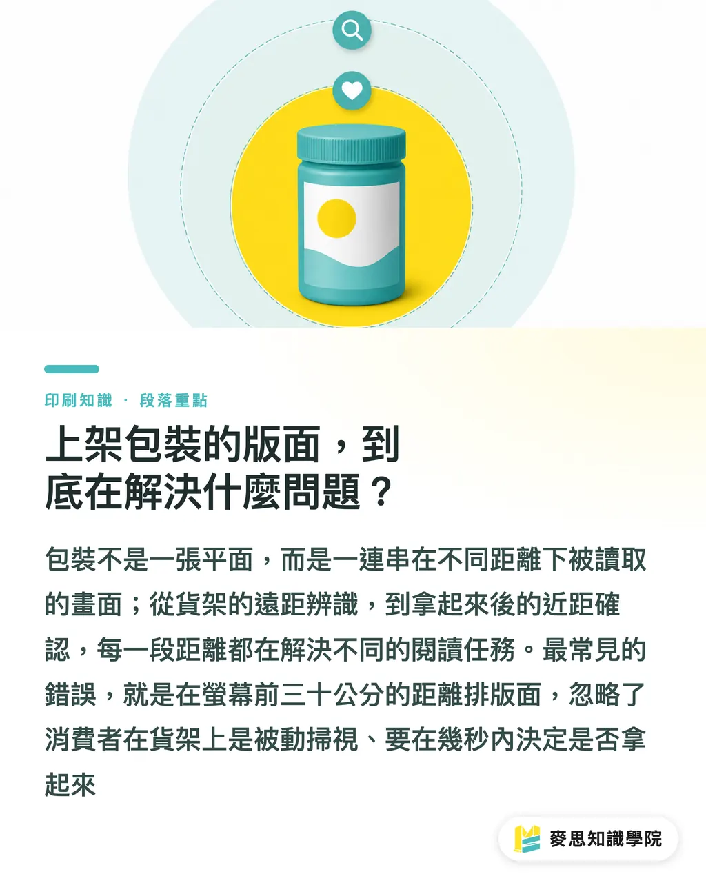
On the shelf, the front of the package has to catch attention first from the farthest distance, 1.5 to 3 meters. Then, at mid range, 30 to 60 cm, it has to make the product name and selling points clear. Finally, within 20 cm, once the shopper picks it up, it needs to provide specs, ingredients, and warnings. When MINDS Printing (MS), a mid-to-high-end fully custom commercial printing provider, helps clients work through packaging, we use this three-distance model as the frame for layout zones, then come back to arrange the order of brand, product name, and selling points
The most common packaging design mistake is laying out the front panel as if everyone will view it from 30 cm away on a screen. Sitting in front of a computer, you can click into every detail yourself. Shoppers on a shelf do not read that way. They scan passively, surrounded by similar products, and decide within 1 to 3 seconds whether to pick something up. That means the layout has to serve three very different reading tasks:
・From afar, 1.5 to 3 meters: recognize what category the product belongs to and which brand it is
・Mid range, 30 to 60 cm: understand the product name, flavor, capacity, and selling points
・Close up, within 20 cm, in hand: confirm ingredients, shelf life, warnings, and barcode match
Here are the three ideas in more formal terms, so you can discuss them with a designer later:
・Visual Hierarchy: the use of size, color, font weight, white space, placement, and other variables on a flat surface to guide viewers through your intended order of information at different distances and time spans
・Shelf Visible Area: the part of the package front that can actually be seen on the shelf after front-row blocking and vertical shelf compression are taken into account. Box packaging usually retains about 60 to 70% of the front. Bag packaging often leaves only 40 to 50%
・Brand Name Readable Zone: the area on the package front where the product name can still be clearly read from shelf distance. Areas blocked by front-row products, overhead price tags, or standing displays do not count
I often tell clients that packaging is not a flat graphic. It is a sequence of views read at different distances. Once you flip your thinking that way, the rest of the layout decisions start to make sense
How Do You Lay It Out? Work Backward from the Farthest Distance
Here is the short version: layout hierarchy should start with what needs to work at the farthest viewing distance, then add content layer by layer as the viewing distance gets closer
This order is not about taste. It is a physical limit. Think about it. If you first decide where the Logo goes, how large the product name should be, and only then ask, "Where do the selling points fit?", you usually end up with a product name that cannot be read from afar, crowded out by a pile of small claims. The right working order is:
・Step one: decide what must be seen from 3 meters away
This is usually the brand color block, the series identifier, or the product name in the largest type size. This layer decides whether the product can be "sorted" on the shelf
・Step two: decide what must be understood at 60 cm
The full product name, flavor or spec, and one or two main selling points. This layer decides whether the shopper stops
・Step three: decide which details are only read after the product is picked up
Ingredient list, nutrition facts, storage period, expiration date, manufacturer, notes, and barcode. These can use smaller type and sit near the edge, but they cannot be missing
In practice, there is a very useful self-check: set your phone camera to the 1x lens, step back 2 meters from your computer screen, and look at the packaging dieline. If you cannot read the product name at that distance, shoppers at the same shelf distance will not be able to read it either. I always do this when reviewing client artwork
A quick rule of thumb for type size:
・Long-distance main visual, such as brand color and product-name type: around 60 to 80 pt on an A4 dieline. After printing, roughly 1.5–2.5 cm high
・Mid-distance selling-point type: around 18 to 28 pt. In print, roughly 0.5–0.8 cm
・Close-range regulatory information: no smaller than 8 pt, which is the readability floor for most mandatory items under Taiwan's packaged food labeling rules. In print, roughly 0.2–0.25 cm
Type size is the frame. Color contrast is the amplifier. Light type on a dark background is 1.5 to 2 times easier to recognize from afar than the same type size on a light background. That is common sense on the print floor, not a lab number. It is what ink on paper actually does to the eye
How Do Boxes, Bags, and Labels Differ in Layout Logic?
These three packaging types have completely different visible areas and display orientations on the shelf, so their visual hierarchy cannot be copied from one to another
Box packaging: all four sides need design, but the front is where the fight happens
The front of a box is the main battlefield. The sides and back carry the information people read after picking it up. But in practice, a few problems show up often:
・Display orientation: boxes are often displayed lying down, especially supplements and small appliances. In that case, the "front" is actually the side, and the artwork has to account for that face as well
・Blocking: front-row products can cover about 20 to 30% of the lower edge, so important product names and selling points should not sit in the bottom third of the front panel
・Barcode placement: the barcode must be on the back or side, not the front. This is not a design taste issue. It is a physical workflow limit at POS, since checkout scanners read from the back or side of the product. The barcode also needs a Quiet Zone around it, with at least 3 mm of white space on both left and right sides, or scan success will drop
・Series color management: different flavors or specs under the same brand should follow the logic of a consistent main visual plus secondary colors for distinction. When MINDS Printing (MS) handles these projects, we ask clients to define a series color palette first, including CMYK and Pantone references, so each flavor is not adjusted separately at print time, which would leave the same brand looking inconsistent on the shelf
Bag packaging: the visible area is smallest, and upright display is the key
The biggest issue with bag packaging, such as cookies, snacks, and drink mixes, is that it does not stand steadily. In practice, though, most channels require upright display. Otherwise, shoppers only see the top seal line
・The visible area is concentrated in the upper half: when displayed upright, the lower half is often blocked by the front row or shelf board. The product name and main visual should sit in the area above the top 60% of the front
・The bottom 30% is usually for secondary information: ingredient list, nutrition facts, barcode, and company information
・Hang-hole design: if the product is displayed on hooks, which is common for snacks and supplements, the 5 to 8 cm area above the hang hole will be blocked by the hook. Do not place key information there
Labeled products: layouts constrained by the container
For bottles, cans, tubes, and similar containers, the label has to follow the container shape. Common issues include:
・Curved-surface distortion: after a label is applied to a cylindrical bottle, text on the left and right sides will distort because of the curve. Keep important text within the central 60% flat visible area. Put images or decorative elements that can tolerate distortion in the 20% areas on both sides
・Cap color: the cap is often the first cue for flavor recognition from afar, especially for shampoo, sauces, and supplements. Series color management needs to include the cap, not just the label paper
・Front and back seam: when a label is applied, there will be an overlap area. Do not place continuous patterns or important text there, or they may break or get swallowed after application
Run a Shelf Simulation Before Final Artwork
This is the step I most want to stress: artwork that passes on screen does not automatically pass on the shelf
There are several ways the industry checks for problems before final artwork:
・Physical white mockup: print a 1:1 white sample with an output device, either without label paper or using regular paper, then place it directly on the actual retail shelf for observation. This is the most accurate method, but also the most expensive. It suits main products that are already headed for mass production
・Digital mockup: use a PDF to simulate on screen, though it cannot reproduce material reflection or curved surfaces
・AI shelf simulation: before formal proofing, use an AI mockup to place the package into retail shelves, ecommerce thumbnails, and competitor lineups. Filter out versions that are unclear, hard to distinguish, or weak in purchase appeal before deciding whether to spend money on a physical white mockup. This is especially helpful for small test runs or design projects with tight budgets
When MINDS Printing (MS) helps clients make packaging decisions, the three checks before print run like this: structure, print, and the front after folding. The first check confirms whether the dieline and folding sequence are correct. The second checks whether CMYK conversion, paper stock, and post-processing will eat into the layout. The third folds the white mockup, steps back 2 meters, and checks the front to confirm that the visual hierarchy really holds up. If you skip the third check and go straight to mass production, the odds of a shelf failure go way up
One last reminder: series color management should be set at the first checkpoint. For multi-flavor and multi-spec products under the same brand, CMYK values must be written into the design spec, and even paper whiteness should be standardized. Otherwise, you will find product A from the same brand leaning yellow and product B leaning blue on the shelf. Shoppers may think they are different brands. I have seen this kind of disaster more than once
What Should You Do Next?
If you are planning a new shelf-ready package, I suggest this order:
・Define the content list for the three distances first: write down what needs to be seen from 3 meters away, what needs to be understood at 60 cm, and what details are only read after pickup. Do not rush into layout software
・Observe 2 or 3 competing products on the shelf: go to the actual channel, stand in front of the shelf, crouch down, and look from the shopper's eye level to see how they arrange their packaging. Your design has to be seen among them. It is not there to admire itself in isolation
・Run an AI shelf simulation before final artwork: place the main visual, product name, series colors, and promo messages into a real purchase context. First identify versions that are invisible, hard to tell apart, or weak in purchase appeal, then decide whether to move into proofing. This step can save you the cost of at least one white mockup
There is no standard answer in packaging design, but there is a process you can test. Get the distances clear first, and the layout will start to form on its own
If your project is already close to final artwork and you want a professional print shop to help review the pairing of layout and materials, MINDS Printing (MS) can support custom commercial printing, including CMYK conversion, paper stock proofing, and post-processing integration. If you want to understand the overall packaging decision framework and print-prep process, you can contact the Mai Strategy Knowledge Academy consulting team directly and clarify everything from structure to final artwork in one pass
Key Takeaways
・Packaging layout has to serve three distances: 3 meters for category recognition, 60 cm for understanding, and 20 cm for confirming details
・Build visual hierarchy backward from the farthest distance. Do not decide the Logo first and add selling points afterward
・Type size is the frame, and color contrast is the amplifier. Light type on a dark background is much easier to recognize from afar
・Boxes, bags, and labels have different visible areas and display orientations, so their layout logic cannot be copied from one to another
・Always run a shelf simulation before final artwork. Passing on screen does not mean passing on the shelf
Further Thinking
For print manufacturers, visual hierarchy decisions directly affect which colors need to go on press and which post-processing steps are required, which then shapes plate costs and working time. If clients run shelf simulations before final artwork, the files sent to the print shop are much more stable, and reprint rates can drop. For designers, writing the three-distance model into the design brief can save a lot of back-and-forth later. For SaaS and AI tool developers, shelf simulation still has plenty of room to grow, especially for the fast, low-cost workflows Taiwanese small and midsize clients need, where real channel photos can be used directly. That direction is worth building for
Further Reading
FAQ
- What is the most important information on the front of a package?
- It depends on viewing distance. From 3 meters away, shoppers should see the brand color and product name. At 60 cm, they should understand the full product name and main selling points. Only after picking it up do they read ingredients, dates, and the barcode
- How is visual hierarchy different for box packaging and bag packaging?
- Box packaging needs design on all four sides, but the front is where the fight happens. Key content should avoid the lower third, which is often blocked. Bag packaging has its visible area concentrated in the upper half, and the 5 to 8 cm area above a hang hole should not contain key information
- What should I do if text distorts on a round bottle label?
- Keep important text within the central 60% flat visible area. Use the 20% areas on both sides for images or decoration that can tolerate distortion, and include cap color in the series color management system
- Do I always need a white mockup before final artwork?
- For main products going into mass production, a 1:1 physical white mockup is recommended for validation. If the budget is tight or the print run is small, you can first use AI shelf simulation to filter out clearly weak versions, then decide whether to move into physical proofing
- How should color management be handled for different flavors under the same brand?
- Define a series color palette first, including CMYK and Pantone references, and write it into the design spec. Paper whiteness should also be standardized, so products from the same brand do not show color differences on the shelf
Related articles

The Print × AI weekly
The print and AI know-how designers, brands and enterprises can use before they commit — one email, every week
MINDS Free Tools
Imposition calculator and preflight file check — free prepress tools, right in your browser.
MINDS Group
Need actual printing or gifting services?
From premium printing to online ordering and festive gifts — the MINDS Group sister brands take it from here.