

Overview
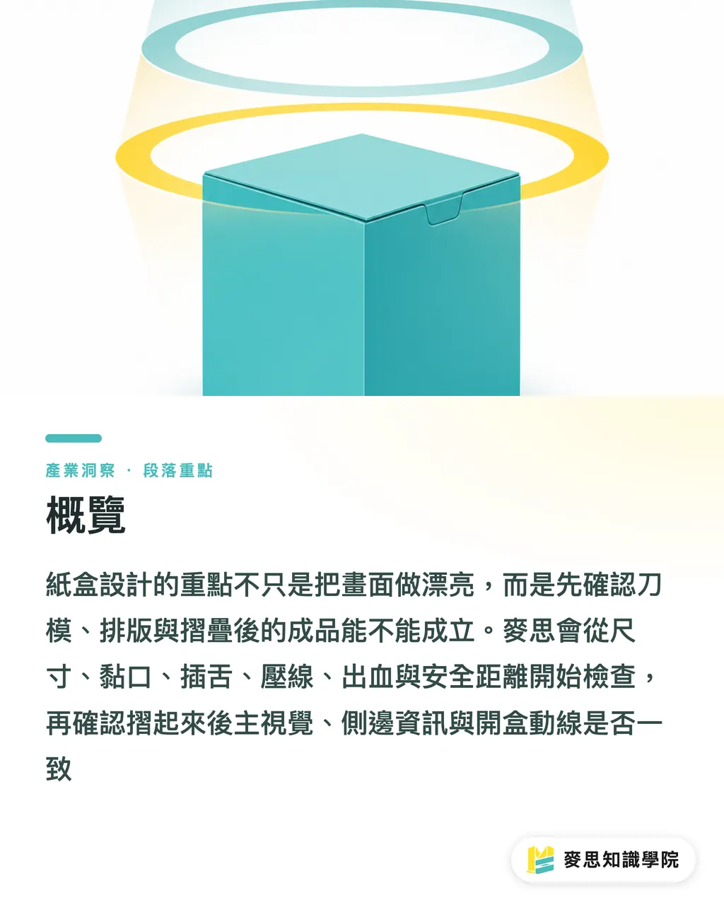
Folding carton design is not about drawing pretty graphics first. It starts with confirming how the box gets die-cut, creased, and folded. When MINDS (MS, high-end fully custom commercial printing) reviews packaging artwork, we apply the "MINDS (MS) Three-Stage Pre-press Inspection": whether the dieline is structurally sound, whether the layout will shift, and whether the visual balance holds once folded
・① Dieline stage: Check dimensions, glue flap, tuck flap, crease lines, bleed, and safe margins
・② Layout stage: Check front and back orientation, graphics spanning fold lines, and barcode and text placement
・③ Folding stage: Check that the main visual, side details, and unboxing sequence stay consistent once the box is assembled
Should You Create the Dieline First in Folding Carton Design?
The first step in box design is not creating the hero graphic, but setting the box style and dieline logic. The dieline is a flat structural blueprint showing cut lines, crease lines, glue flaps, tuck flaps, and the exact dimensions of every panel. Designers must build their artwork directly on this framework
I usually ask three questions upfront: What goes inside the box? How heavy is it? Which panel does the consumer see first? These three answers dictate paper stock selection, box structure, opening orientation, and main graphic placement
You cannot judge a dieline solely by flat appearance. Top, bottom, left, and right on a flat template often flip once folded. A common mistake happens when designers align side text upright on the flat sheet, only for it to end up upside down when the box stands up. Catching this error during sample proofing is already a step too late
In practice, I recommend making at least one unprinted structural sample (blank sample). It skips printing and focuses purely on structure, crease folds, glue joints, and hand feel. For small and medium enterprises, the time spent on a blank sample is far cheaper than reprinting an entire production batch
How to Safely Plan Cut Lines, Crease Lines, and Bleed?
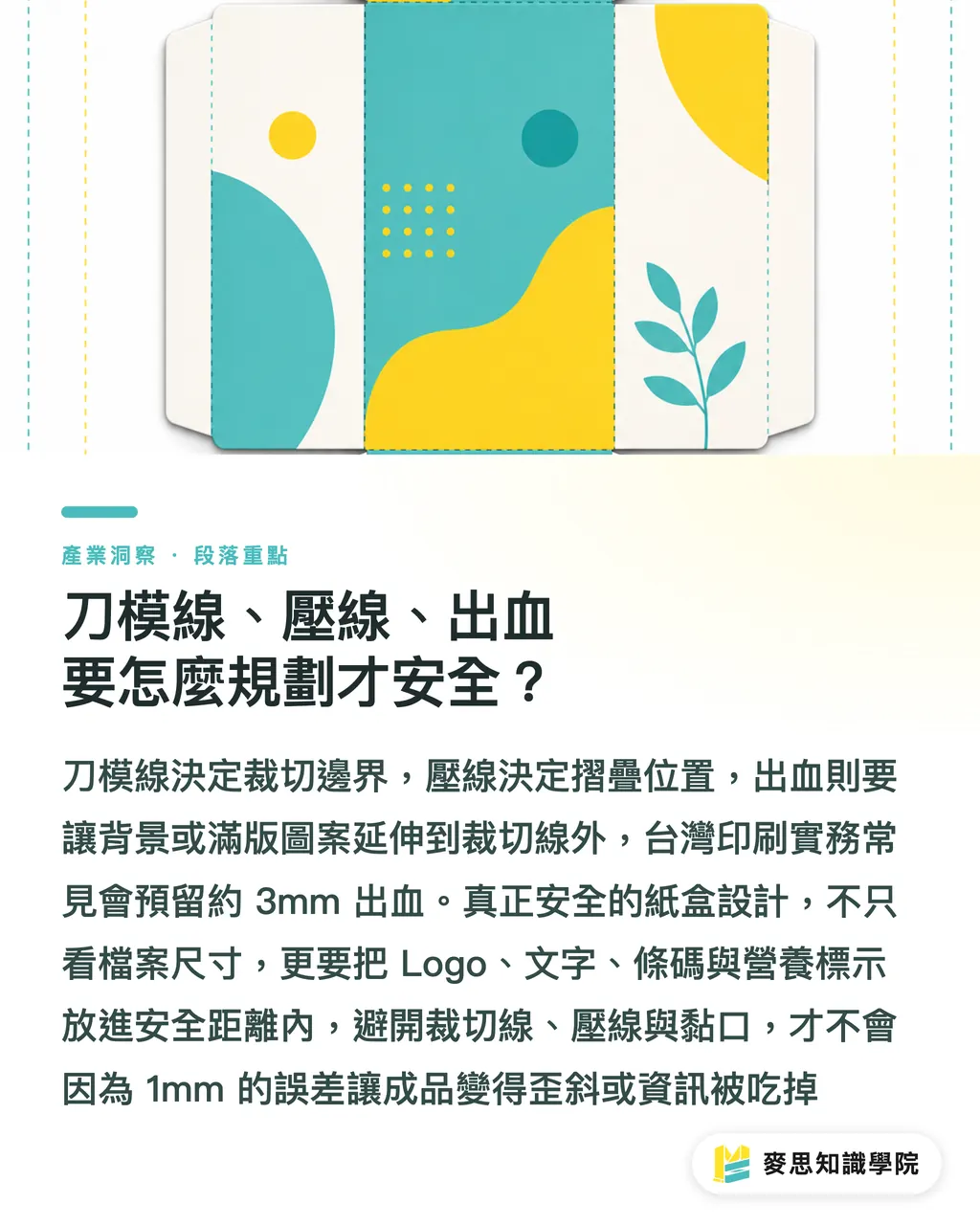
Cut lines define trimming boundaries, crease lines mark fold positions, and bleed is the printed area extending beyond cut lines. In standard Taiwan print practice, we keep roughly 3mm of bleed. Key text and barcodes must maintain safe clearance from both cut lines and fold lines so trimming shifts or creases do not clip information
・Cut line: Indicates the outer border trimmed off by the die cutter
・Crease line: Marks where the paper is creased for folding, not cut
・Bleed: Background colors, base patterns, and full-bleed artwork must extend beyond the cut line
・Safe distance: Keep logos, text, barcodes, and nutrition facts well away from edge lines
・Glue flap: Avoid placing critical graphics or text here, as it gets glued or overlapped
The worst enemy of folding cartons is design where "1mm off ruins the look." Examples include thin borders flush against the box edge, color blocks barely straddling a fold line, or a logo riding right on a crease. These look crisp on screen, but shift out of alignment during trimming and folding
When the consulting team at Mai Strategy Knowledge Academy reviews a folding carton dieline, we step back to evaluate the artwork structurally: Which side is the main front? What gets folded away? Where do fingers touch it? What catches the eye first on a retail shelf? This mindset gets much closer to the finished product than simply checking file dimensions
Why Layouts Can't Be Judged on Flat Templates Alone?
You cannot judge box layout using only a flat template. The flat layout is production language, whereas the assembled box is consumer language. A logo centered on a flat sheet might look too high, too low, or end up pushed onto a side panel after folding
When evaluating box layout, I focus on four visual panels: front, back, left and right sides, and top opening. Each panel needs a clear job. The front drives recognition, the back explains details, the sides extend shelf presence, and the top guides unboxing
・Front panel: Brand name, product title, and main graphic should sit firm, uninterrupted by fold lines
・Back panel: Leave ample breathing room for ingredients, specifications, and precautions
・Side panels: Ideal for collection accent colors, flavors, net weight, and quick selling points
・Top panel: Make opening direction obvious, and leave space for seal stickers or hang tabs
・Bottom panel: Suitable for batch codes, recycling symbols, and manufacturing details, subject to regulatory and client needs
A classic mistake is treating the entire flat template like a single poster. A box is not a poster. It is a 3D communication tool built from six panels. Each side must stand on its own while flowing smoothly into adjacent panels
How to Judge Visual Balance After Folding?
Judging folded visual balance is straightforward: Imagine the box sitting on a retail shelf. Does the front look grounded from 1 meter away? Does rotating all four sides in your hands feel natural? Is the opening method intuitive the moment you start unboxing?
Once a box folds up, its visual center of gravity often shifts. For instance, on a small box with a front height of just 80mm, placing the logo too high near a crease line cutting through the background color creates a top-heavy look. You can rarely spot this on a computer screen
I use three checks to assess folded balance:
・Check front view: Is the main graphic distracted by crease lines, tuck flaps, or seals?
・Check corners: Do graphics spanning across panels align as intended? If not, don't force them across seams
・Check unboxing: When consumers open the box, does text orientation align with hand motion?
If a box requires high-end commercial printing or special finishing, MINDS (MS) usually jumps into dieline and proofing discussions early. Processes like spot varnish, foil stamping, or embossing carry far higher risk when crossing crease lines, making it impossible to fix at final artwork sign-off
What to Check Before Finalizing Folding Carton Artwork?
Before finalizing artwork, check at least ten items: dimensions, dieline, bleed, color, resolution, typography, barcodes, crease lines, glue flaps, and proofing. These ten items prove far more practical than any vague aesthetic descriptions
・Dimensions: Confirm inner dimensions, outer dimensions, and paper thickness match the actual product
・Dieline: Keep cut lines, crease lines, partial-cut lines, and perforation positions on separate layers
・Bleed: A 3mm bleed is standard practice, though specialized dielines should follow print shop specs
・Color: Use CMYK for print files and confirm spot colors with the printer in advance
・Resolution: Raster images should be 300dpi so they don't turn blurry when scaled
・Typography: Ensure fine print, reversed text, and thin line fonts can withstand the chosen print method
・Barcodes: Avoid placing barcodes on fold lines, curved surfaces, glue flaps, or highly reflective areas
・Crease lines: Be prepared to tolerate slight registration shifts on graphics spanning across fold lines
・Glue flap: Keep logos, regulatory details, QR codes, and essential copy away from glue joints
・Proofing: Review at least one blank sample or digital proof before mass production to verify structure and visuals
Many packaging errors stem not from poor design talent, but from skipping a 3D sanity check. Thinking of your flat artwork as a folded box before sending files to press eliminates most mistakes

Key Takeaways
・Packaging design centers not on pretty visuals, but on whether artwork works across dieline, press, and final folding
・Flat templates speak the language of manufacturing; only the assembled box speaks to the consumer
・A 3mm bleed, safe typography margins, and keeping key content off glue flaps form the basics of final artwork prep
・Stay conservative with designs spanning fold lines, as trimming and folding tolerances amplify alignment issues
・Inspecting a single blank structural sample before mass production often saves the cost of reprinting an entire job
Further Considerations
From a manufacturing perspective, dieline review should happen before visual artwork sign-off. For designers, the habit to build is reviewing artwork against front, side, top, and unboxing perspectives after every revision draft. For teams adopting AI or SaaS tools, software speeds up ideation and layout variations, yet dielines, paper stock, fold lines, glue flaps, and post-press finishing still require professional print judgment. The consulting team at Mai Strategy Knowledge Academy helps teams establish effective pre-press review protocols during this exact stage
FAQ
- Does folding carton design always require a dieline first?
- It is best to start with a dieline, as it dictates panel positioning, fold lines, glue flaps, and trimming boundaries. Designing graphics without a dieline often leads to upside-down text, logos split by crease lines, or artwork that fails to fit the box dimensions
- How much bleed should be allowed for folding carton design?
- In standard Taiwan print practice, a 3mm bleed is common, extending background colors or images past the cut lines. For custom box structures, heavy cardstock, mounted paper, or complex dielines, adjust according to the printer's prepress specifications
- Why does the printed box differ so much from the layout on screen?
- The screen shows a flat 2D template, whereas the finished product is a 3D box. Crease lines, corners, glue joints, trimming tolerances, and paper caliper all introduce variations in visual placement
- Where are mistakes most commonly made in box layout?
- The most common mistakes occur with graphics spanning across folds, text set too close to edges, upside-down side panel text, poor barcode placement, and details printed on glue flaps. These elements look normal on a flat sheet, but reveal flaws once folded
- Is proofing mandatory before mass producing folding cartons?
- Making at least one blank sample or digital proof is strongly advised. A blank sample verifies structure and fold assembly, while a digital proof checks visual layout and text placement. Going straight to mass production based only on a PDF carries excessive risk
Related articles




The Print × AI weekly
The print and AI know-how designers, brands and enterprises can use before they commit — one email, every week
MINDS Free Tools
Imposition calculator and preflight file check — free prepress tools, right in your browser.
MINDS Group
Need actual printing or gifting services?
From premium printing to online ordering and festive gifts — the MINDS Group sister brands take it from here.