
Overview
Text proofreading on a packaging dieline has to be checked by asking, "How will this read after the finished product is assembled?" In MINDS' three prepress checkpoints for print submission, the team first checks structure, then print production, and finally the front-facing effect after folding. A flat file that looks upright does not mean the direction will be correct once it becomes a box. The most common failures are upside-down side-panel text, glue flaps covering instructional copy, and barcodes placed on curved surfaces or too close to fold lines
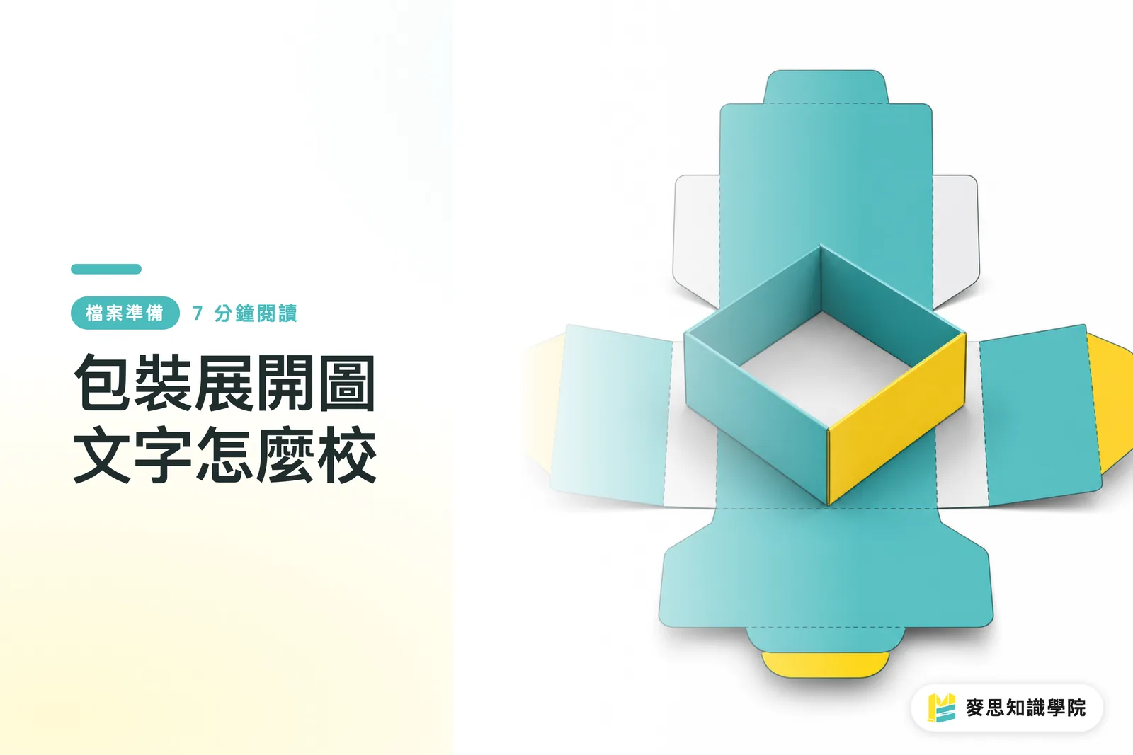
A packaging dieline unfolds a paper box, hang tag, or label into a flat layout while keeping the die-cut lines, fold lines, bleed, and text placement, so design, printing, and finishing teams can all check the same file
What Are You Actually Proofreading on a Packaging Dieline?
When proofreading text on a packaging dieline, you need to check at least 3 things: whether the text itself is correct, whether the text direction is correct, and whether it can still be seen normally after assembly
I have seen plenty of jobs on the production floor where typos were not the biggest problem. The real problem was, "The words are right, but they are on the wrong panel."
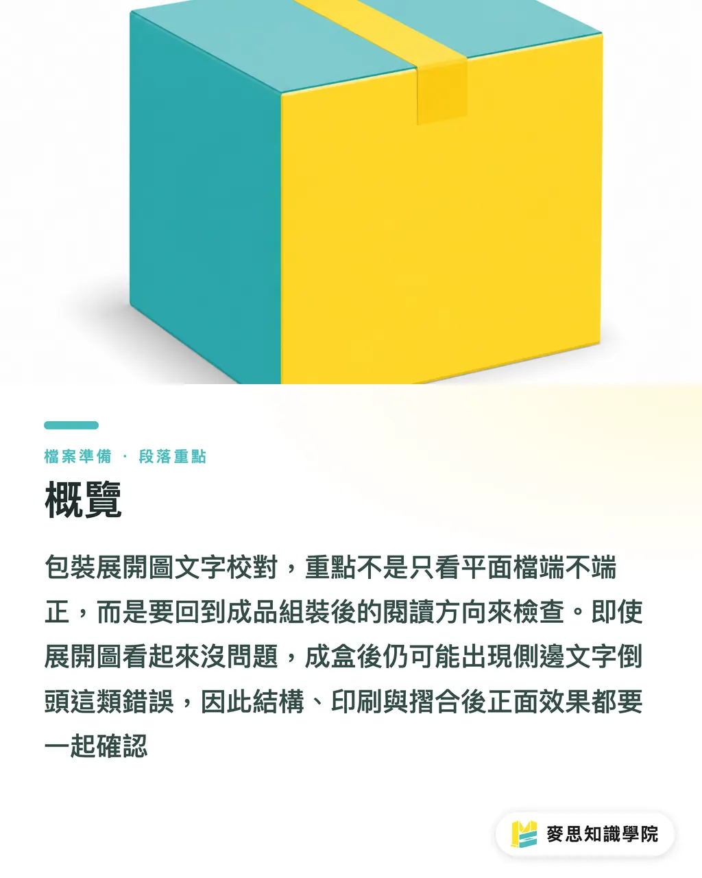
Take a 6-sided paper box, for example. The front, back, left side, right side, top lid, and bottom lid may be spread across the flat file in every direction. The designer may think everything looks nicely arranged on screen, only to find after assembly that the side-panel product name reads from bottom to top. On a shelf, it looks like the label was applied upside down
MINDS' three prepress checkpoints can be used for text proofreading this way:
・① Structure checkpoint: Confirm the dieline, fold lines, glue flap, top and bottom lids, and visible panels first. Text placement should not be decided before the structure is clear
・② Print checkpoint: Check black text, reversed-out text, fine text, barcodes, ingredient panels, and the dieline layer, so required print elements are not missing and non-print elements do not go on press
・③ Finished-product checkpoint: Imagine the dieline as a folded box, then check each panel for reading direction, visible area, and the consumer's line of sight when holding it
The same applies to hang tags and packaging labels
Hang tags often have hanging holes, fold areas, and back-card instructions, so text needs to stay clear of hole positions and fold lines
Labels are often applied to bottles, box corners, or seals. A straight line on the flat file may become a curved surface after application, and text placed too close to the edge can be swallowed by the corner
Why Does Text Turn Upside Down After Boxing When the Flat File Looks Fine?
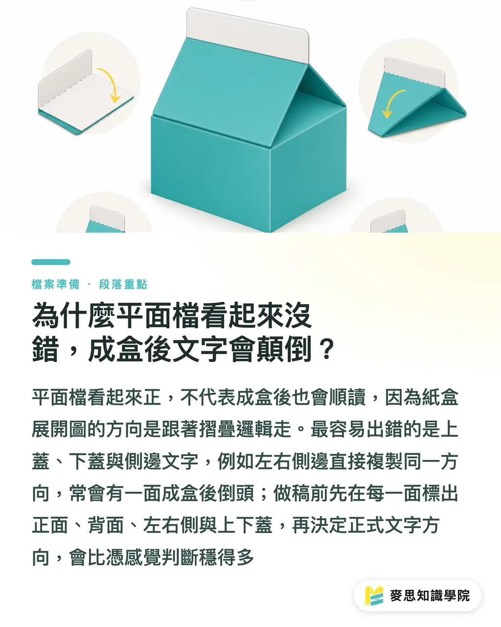
The direction of a paper box dieline follows the folding logic, not the direction of the screen
A single dieline may contain text rotated at 0, 90, 180, and 270 degrees. That is not messy layout. It is done so every side can read correctly after the box is folded
There are 4 areas where mistakes happen most often:
・Top-lid text: It may look upright on the dieline, but when the consumer opens the lid from the front, it may turn upside down
・Bottom-lid information: Batch numbers, storage instructions, or recycling marks on the bottom are often set in the wrong direction. The problem only appears when someone flips the box over
・Side-panel product names: If both left and right side panels copy the same text direction, one side usually ends up upside down after assembly
・Back of hang tags: If the front and back share the same visual direction, the back may not match the hanging direction after the tag is flipped
My method is very low-tech, but it works: first label each panel with 6 positioning words, "front, back, left side, right side, top lid, bottom lid," then decide the final copy direction
Delete those positioning words after confirmation. It is much steadier than guessing the direction directly
For export packaging, mixed English, Japanese, and Chinese copy needs one more check
English on side panels is often set vertically or rotated 90 degrees. Vertical Chinese brings in punctuation, numbers, and units, such as 250 ml, 30 g, and Made in Taiwan. If the direction is wrong, the whole package feels rough
How Much Space Should Text Keep Away from Glue Flaps and Fold Lines?
Do not place key text next to glue flaps or fold lines. This is the line you should be strict about when proofreading packaging dielines
For a typical paper box, keep a safety margin around glue flaps, fold lines, and cut lines. The actual distance depends on the box structure, paper thickness, finishing method, and the printer's specifications. A common starting point is 2 to 3 mm or more, then adjust based on the final product
Text near a glue flap has 2 risks:
・It may be covered by glue, the glue application area, or overlapping paper, especially side-panel instructions and small brand text
・After folding, it may land right on the box corner, distorting the letterforms and making fine text look broken
Text near fold lines also fails easily
After creasing, paper fibers deform. This is more obvious with thick stock, laminated paper, spot coating, and foil stamping. If 6 pt small text is placed right against a fold line, it may still pass in a proof, but readability can vary once mass production starts
I suggest designers treat these areas as "no important text" zones:
・Do not place ingredients, warnings, expiration dates, barcodes, or customer service information on glue flaps
・Do not place long text under 7 pt on either side of a fold line unless the printer confirms that the paper and finishing can handle it
・Outside the cut line, place bleed artwork only. Do not put any readable text there
・For round-corner hang tags and irregular labels, move text inward to prevent cutting tolerance from eating into strokes
If the client is budget-sensitive, online-order retail printing such as Mai Printing is suitable for small-batch packaging labels or hang tags with clear specifications. If the job involves special paper, box structures, foil stamping, spot gloss, or multiple finishing processes, it is better to have a fully custom commercial printer such as MINDS review the file and production method first
Which Panel Should Barcodes and Ingredient Tables Go On?
Barcodes should be placed on a flat, scannable area that will not be blocked after assembly. Ingredient tables should be placed where consumers can read them steadily
An EAN-13 barcode has 13 digits. The barcode itself, left and right quiet zones, and print contrast all affect scanning. Do not treat it like a regular graphic and tuck it into a corner
I usually judge barcode placement by 4 points:
・Do not cross a fold line. Once the barcode deforms, scanners may fail to read it
・Do not place it on a glue flap. Paper overlap, glue, and creasing can all interfere with the black-and-white bars
・Do not place it tight against a box corner. The corner curvature after assembly can turn the barcode into an arc
・Do not place it where glossy film reflects the most light, especially on small boxes, curved labels, and gold or silver card stock
Ingredient lists, nutrition labels, warnings, origin, and storage instructions are better placed on large areas on the back or side panel
If the package has top and bottom lids, also check whether any information will be covered after opening. For hang tags, keep key words away from the area under the hanging hole, because punching and hooks often block that space
Some design drafts shrink the ingredient table very small and place it on the box bottom for the sake of appearance
I will ask the client to imagine one scene: a consumer picks up the box in a store and is only willing to spend 3 seconds looking for ingredients, capacity, or storage instructions. If they cannot find it within 3 seconds, the layout is not easy to read
How Can You Catch Errors with a Blank Mockup or Digital Proof Before Printing?
A blank mockup uses unprinted stock or similar stock, cut, creased, and folded into a physical box first to confirm structure, size, opening and closing, and reading direction
A low-cost digital proof is useful for confirming text position, the general color direction, and visible panels after assembly, especially for a new box structure, small trial run, or first-time collaboration
Before printing, I run a 5-step check:
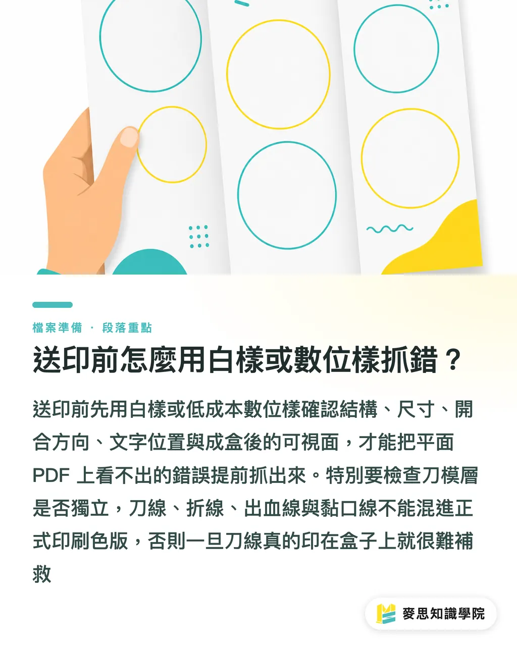
・Open the dieline layer separately and confirm that cut lines, fold lines, bleed lines, and glue-flap lines have not been mixed into the final printing separations
・Print 1 paper mockup at 100% size and fold the front, back, side panels, and top and bottom lids by hand
・Circle all text on each panel with a red pen and confirm that every panel reads correctly after assembly
・Scan the barcode with a phone to confirm there are no obvious issues with position, size, or black-and-white contrast
・Take 4 photos for internal review or the client: front, back, side, and open-box state, so people are not only looking at a flat PDF
The dieline layer must not be printed by mistake. This deserves extra attention
Dielines should usually be an independent layer, spot color, or finishing mark. They should not be output together with CMYK artwork as printed content. If a red dieline is actually printed on the box, no finishing step afterward can save it
When reviewing packaging files, the consulting team at Mai Strategy Knowledge Academy usually asks clients for 3 types of materials: the dieline PDF, the dieline file, and the final product use case or packed-box photos
With these 3 types of materials, text proofreading moves from "checking whether the words are wrong" to "checking whether the finished product will be wrong."
Key Takeaways
・When proofreading text on a packaging dieline, think of the folded box first. A good-looking flat layout is only the first checkpoint
・Text direction should follow how the finished product is read, not the direction of the screen
・Do not place key words near glue flaps, fold lines, or cut lines. The money you save is the cost of a reprint
・Barcodes and ingredient tables need to sit where they can be read reliably. Appearance cannot override the use case
・A blank mockup or low-cost digital proof is the cheapest way to catch wrong directions, dieline mistakes, and visible-panel errors
Further Thoughts
For print manufacturers, text proofreading on packaging dielines should be built into the fixed prepress workflow, not left to sales, design, or the client remembering to take a quick look at the last minute. For designers, AI can help organize product names, ingredients, warnings, selling points, and multilingual copy, but the final check still has to return to the dieline, fold lines, glue flaps, and the finished product's line of sight. For SaaS teams, the tool with real value is not one that only catches typos. It is one that can connect text objects, dieline layers, fold-line zones, barcode placement, and assembly panels, turning proofreading from a flat-file check into a packaging-context check
FAQ
- What should you check first when proofreading text on a packaging dieline?
- First, check the dieline and folding direction. Confirm the front, back, side panels, top and bottom lids, and glue flap positions, then check the text content. MINDS' three prepress checkpoints look at structure first, then print production, and finally the visible panels of the finished product
- Why is side-panel text on paper boxes so often printed upside down?
- Different panels in a paper box dieline may use 0, 90, 180, and 270 degree directions. If the same text direction is copied directly across side panels, one side often ends up upside down after assembly. During proofreading, fold a blank mockup or a 100% paper sample and check it physically
- Can a barcode on packaging be placed near a fold line?
- It is not recommended. If a barcode is near a fold line, glue flap, or box corner, deformation in the finished product may affect scanning. An EAN-13 barcode has 13 digits, and placement, quiet zones, contrast, and flatness all need to be checked together
- Why should the dieline layer not be placed together with printed artwork?
- The dieline layer marks finishing operations such as cutting, creasing, and glue flaps. It is not final printed content. If the dieline is mixed into the CMYK artwork output, red or spot-color dielines may be printed directly on the package
- If there is no budget for a formal proof, how can text direction still be checked?
- Print 1 paper mockup at 100% size or make a low-cost digital proof. Fold the front, back, side panels, and top and bottom lids by hand, then check each panel for reading direction, barcode placement, and ingredient-table visibility
Related articles

The Print × AI weekly
The print and AI know-how designers, brands and enterprises can use before they commit — one email, every week
MINDS Free Tools
Imposition calculator and preflight file check — free prepress tools, right in your browser.
MINDS Group
Need actual printing or gifting services?
From premium printing to online ordering and festive gifts — the MINDS Group sister brands take it from here.