

Overview
When the budget is tight, I start with six questions: does the brand need to be remembered, how many times will the customer touch it, how far away will it be displayed, how long does it need to last, can the unit price absorb the cost, and will it be reordered. Running the job through Minds (MS, our mid-to-high-end fully custom commercial printing) and its three checkpoints, the rule is: ① lock down structure and paper first, ② then protect the most-seen spots, ③ only after that add the expensive finishes
Post-press finishing refers to the steps done after printing, lamination, foil stamping, spot UV, embossing, die-cutting, binding upgrades, that change how the piece feels, where the eye lands, how long it lasts, and how it gets used
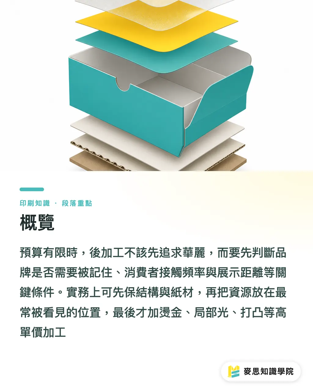
If the budget only covers one finish, which one comes first?
Lamination is almost always my first pick, especially for outer boxes, menus, catalog covers, and skincare cartons that get handled over and over. Matte or gloss laminate isn't the flashiest option, but it directly affects scuff resistance, dirt resistance, and hand feel. For anything the customer touches more than three times, protecting the surface beats chasing a shinier effect
Spot UV usually takes the second slot. Once the hero visual is locked and the brand color blocks are clean, spot UV can pull out the logo, product name, illustration linework, or a texture zone. It doesn't carry the heavy luxury tone that foil does, but at the typical shelf viewing distance of 30 to 80 cm, the gloss-matte contrast catches the eye fast
Foil stamping depends on the brand personality. Don't slap it on just because someone said it looks high-end. Gold, silver, and holographic foils pull attention hard, but if the identity is meant to feel quiet, professional, natural, or clinical, a large foil area will actually push the tone sideways. More often I'd suggest keeping the foil to one spot, logo, product name, or a seal sticker
Hold on
When the budget only allows one finish, my order usually runs like this:
・High touch, long shelf life: laminate first, menus, membership cards, catalog covers, outer boxes
・High display, low touch: spot UV first, display boxes, DM covers, hang tags
・High unit price, strong gifting feel: then consider foil, boutique boxes, gift boxes, limited-edition wraps
・Needs an unboxing hook: fix structure or die-cut first, drawer boxes, window boxes, special tuck tabs
・Lots of inside pages, long reading time: upgrade the binding first, catalogs, manuals, brand books
When a quote gets stuck, I tell the buyer to bring the spec to Minds Printing and have the workflow re-broken down. The worst thing about mid-to-high-end custom printing is looking at line-item prices in isolation, because finish order, paper stock, imposition, and quantity all shift the cost together
Foil, spot UV, lamination, embossing, which one actually pulls its weight?
Foil's strength is first-glance recognition. When the logo is small and the package has to stand next to 20 competitors on a shelf, the metallic reflection lifts the brand name out of the crowd. But foil is picky about registration and stock: lines that are too thin, areas that are too broken up, or a base color that's too dark, and the effect turns muddy
Spot UV's strength is visual layering. It works especially well on black cards, dark floods, and matte-laminated grounds. I've seen plenty of skincare cartons that look clean on the front with nothing but matte laminate and spot UV, easier to control the cost than a big foil area, and the tone stays restrained
Lamination tends to be underestimated because it doesn't pop in photos the way foil does. But anyone who's run a retail channel knows the box goes through the factory, shipping, warehousing, and shelf stocking, and the corners and surfaces take friction the whole way. Dark-flood boxes without lamination are usually the first to show wear
Embossing and debossing belong where the hand pauses, the front of the lid, the center of a sleeve, the name on a card, the brand seal. The payoff isn't seen from a distance; it's the moment of confirmation when the piece gets picked up. That's why I don't recommend burying an emboss on the back corner where no one will ever touch it
Here's how I read the return on the common finishes:
・Lamination: cost feels steady, scuff resistance and hand feel are the most direct payoff, good for pieces that need to last over a week
・Spot UV: creates focus through gloss-matte contrast, good for package fronts viewed at 30 to 80 cm
・Foil: strongest brand recognition, but higher unit cost and registration risk, good for high-margin or gift items
・Embossing: strong tactile memory, good for spots where the hand lingers for more than a second
・Die-cutting: changes the silhouette and unboxing path, but die cost needs volume or shared sizes to spread across
・Binding upgrade: good for catalogs, manuals, and portfolios, where page count and lay-flat behavior matter more than surface effect

When should you fix the paper or structure first?
When the paper or structure is wrong, finishing just shines a light on the problem. A box that's too soft, a tuck tab that doesn't catch, paper without enough stiffness, a display piece that won't stand on its own, slapping foil on top of any of these won't help, and the customer's first read is cheap or unreliable
Skincare cartons are a textbook example. A 30ml essence and a 100ml lotion both look like small boxes, but the bottle weight, inner support, and shipping shock are completely different. If the carton crumples when squeezed, I'd adjust the paper basis weight, lamination, inner liner, or box style before talking about spot UV or foil
Die-cutting is also a cost watershed. A new die adds a tooling charge; a shared die brings the cost back down, but the design has to give up some freedom. On a tight budget, a quality look usually doesn't come from a weird silhouette, it comes from a standard box style with precise proportions, well-handled white space, smart opening direction, and a clean pick-up motion
Simple rule
Four situations where paper and structure come first:
・Product has real weight and the box deforms when picked up, add stiffness or an inner tray first
・The outer box is heading to retail display and won't stand, or the front warps, fix the box style first
・The design uses a large dark flood, handle lamination and scuff resistance first, then think gloss effects
・There will be reorders, lock the dimensions, die, and imposition now so each future batch has room to negotiate
For small and mid brands that haven't pinned down a box spec yet, I'd suggest sitting down with the Mai Strategy Knowledge Academy consulting team to walk through structure, paper, and finish order. Having a consultant block the wrong spend upfront is cheaper than adding one more finish at the end
How should procurement tier the finish budget into three levels?
The sentence I dread hearing on the floor is, "Quote all of these finishes first." The quote sheet gets thicker; the decision doesn't get clearer. Procurement should split finishes into must-do, can-add, and can-cut tiers so design, sales, and the printer are all speaking the same language
Tier one is survival finishing. Without it, durability, reading flow, or structure takes a hit, lamination, binding method, box strength. Tier two is conversion finishing. It helps the customer recognize the brand faster on the shelf or in a pitch deck, spot UV, partial foil, window die-cuts. Tier three is emotional finishing. It adds memorability but shouldn't crush the unit price, embossing, large-area foil, special foils, complex custom dies
I use six questions to set priority:
・Brand recognition: can the finish make the logo, product name, or hero visual identifiable within three seconds?
・Touch frequency: will the customer keep picking it up, flipping through it, opening it, or keeping it?
・Display distance: is the main viewing distance 30 cm in hand, 80 cm on the shelf, or 2 m at a counter?
・Shelf life: is the piece read once and tossed, used for a week, or kept for half a year?
・Price sensitivity: can the margin absorb an extra 1 to 3 per piece?
・Reorder potential: can the die, binding, and paper spec carry over to the next batch?
Once you treat finishing as a business decision, the answer gets a lot clearer. A low-priced, high-volume DM shouldn't run the same finish logic as a high-margin gift box, the two get looked at, touched, and kept for completely different amounts of time
How do you avoid finish waste before the artwork goes to press?
Before artwork goes to press, I check whether each finish has a positional reason. Foil that's just sprinkled evenly across the layout, spot UV that doesn't align with the hero visual, embossing that no hand will land on, none of that reads as premium, it just burns budget
The artwork also decides the yield. Foil lines that are too thin, spot UV edges that are too broken up, emboss areas that are too small, all of those push up registration difficulty. I often remind designers that post-press isn't a Photoshop layer. On press there's pressure, heat, paper stretch, and machine tolerance
Run through at least five checks before sending the file:
・Finish position: every finish should map to a logo, product name, finger-resting point, or unboxing path
・Finish count: one highlight on the hero is enough, on a tight budget, don't stack foil, spot UV, and emboss at the same time
・Paper compatibility: rough paper, dark paper, and high-absorption paper need a foil and spot UV test first
・File separation: foil, spot UV, and emboss layers should be separate files, with clean lines and bleed
・Proof judgment: for high-value packaging, look at a physical sample, don't judge brightness and feel from the screen alone
I'm blunt on purpose here, because finishes usually don't fail after printing, they're already wrong while the artwork still looks pretty on screen. Everything glows on the monitor; on paper you're left with the workflow and the bill

Key Takeaways
・When the budget only covers one finish, pick the one that affects durability, touch, and shelf life
・Lamination protects the surface, spot UV catches the eye, foil carries the identity, embossing leaves the touch, they're not interchangeable forms of premium
・When the paper is too weak or the box style is unstable, adding more finishes just makes the cheap feeling louder
・Reusable dies and locked specs are how a tight budget keeps its quality into the next batch
・Finishes need to land where the customer looks, touches, and remembers, otherwise they're just decoration on the quote sheet
Going Further
On the manufacturing side, finish priority has to be reasoned backward from line yield and reorder potential. On the design side, landing one visual focus accurately looks more professional than packing four effects onto the same panel. For AI and SaaS teams, the print tool that actually earns its keep isn't one that generates more mockup variations, it's one that lays out paper, die, finish files, quantity tiers, and cost risk clearly before the order is placed, so procurement can skip a round of wrong proofs
FAQ
- For a tight-budget package, foil first or lamination first?
- If the package will be picked up repeatedly or kept, lamination comes first. If the unit price is high, the gifting feel matters, and the logo needs to be seen at first glance, then bring in a small foil area
- Does spot UV work for low-budget printing?
- Spot UV works well for low-budget printing, as long as the design has a clear hero visual. A matte laminate base plus spot UV can usually deliver a more stable look than large-area foil, just through gloss-matte contrast
- When should you not add more finishing?
- When the box is too soft, the style won't stand, the tuck tab doesn't catch, or the paper doesn't match the finish, don't add finishing first. Fix the paper or structure first, or the finished piece will look like premium held on with tape
- Can embossing and foil be combined?
- They can, but a tight-budget job shouldn't stack that many effects from the start. Embossing plus foil adds registration and yield pressure, so it's best kept to a small focal area like the logo or main product name
- How should procurement talk finish trade-offs with the designer?
- Procurement can split finishes into must-do, can-add, and can-cut tiers, then work through the six questions, brand recognition, touch frequency, display distance, shelf life, price sensitivity, and reorder potential, to decide together
Related articles




The Print × AI weekly
The print and AI know-how designers, brands and enterprises can use before they commit — one email, every week
MINDS Free Tools
Spine width and imposition calculators — skip the manual math, free in your browser.
MINDS Group
Need actual printing or gifting services?
From premium printing to online ordering and festive gifts — the MINDS Group sister brands take it from here.