

How far can finishing actually push the feel?
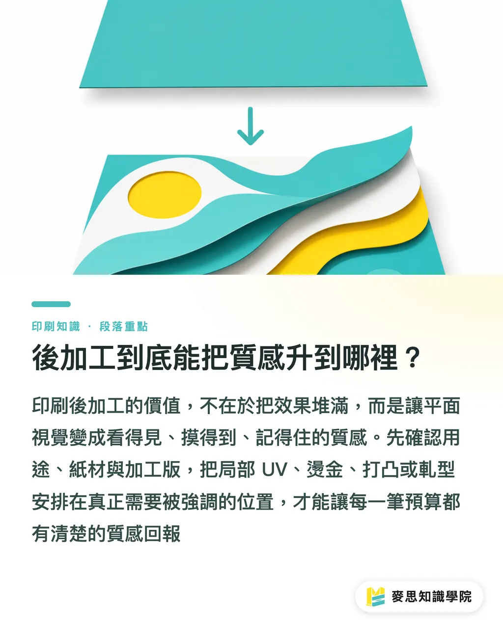
The smartest place to spend on print finishing is turning flat visuals into something you can see, touch, and remember. At MINDS (MS, mid-to-high-end fully custom commercial printing), we lean on the 'MINDS (MS) Three Checks Before Sending to Print', use case, paper, and finishing plates, so every line of budget comes back as a clear tactile payoff
Print finishing means extra surface treatments, foil transfer, dimensional impression, or cut paths added after printing. You'll see it on business cards, packaging, invite cards, and hangtags, its job is to layer up the visual focus
I usually start with three questions:
・Does this print piece need to be seen, or picked up and touched again and again?
・Does the main visual need to land through gloss, metallic shimmer, dimensionality, or an unusual outline?
・Is there room in the budget for one more finishing plate? Spot UV, foil stamping, embossing, and die cutting almost always need their own plate or path
Feel isn't about piling on more finishing, it's about every finishing step having a job
A 350 gsm business card with matte film plus a spot UV on one element will read cleaner than the same card stacked with foil, embossing, and a custom cut all at once
How do you pick between varnish, gloss P, matte P, and UV?
Varnishing adds a protective or glossy layer to a printed surface, done with film, water-based coating, or UV cure. It changes the reflection, the hand-feel, and the scuff resistance, and it's the most common doorway into 'feel' for business cards, catalog covers, and outer packaging
A quick way to choose:
・Gloss P: strong reflection, colors look more saturated, good for food packaging, promo cards, anywhere the visual needs to pop
・Matte P: low reflection, calm hand-feel, good for brand business cards, premium packaging, invite cards
・Water-based varnish: gentle protection, common on long runs or paper goods needing basic scuff resistance
・UV varnish: high gloss, obvious film layer, great for highlighting logos, headlines, or product images
・Soft-touch film: a fine, almost rubbery resistance under the fingers, suited to high-end business cards, premium sleeves, and membership-style cards
On business cards and packaging, the most effective combo I keep seeing is full matte film with one spot UV, say, a black card where only the logo and name light up
You don't have to rework the layout for it, but both finger and eye pause
Spot UV files need their own spot color or layer; for thin lines I hold at 0.3 mm or above and confirm with the shop's plate specs first
The mistake designers make most often is putting spot UV over photo detail, the highlights lose focus and the whole card starts shouting instead
Why does foil stamping go wrong so often?
Foil stamping (hot stamping / hot foil) uses heat and pressure to transfer a metallic or specialty foil onto the paper surface. Effects cover gold, silver, matte gold, and holographic foils, common on logos, brand names, seal stickers, and the main title of an invite card
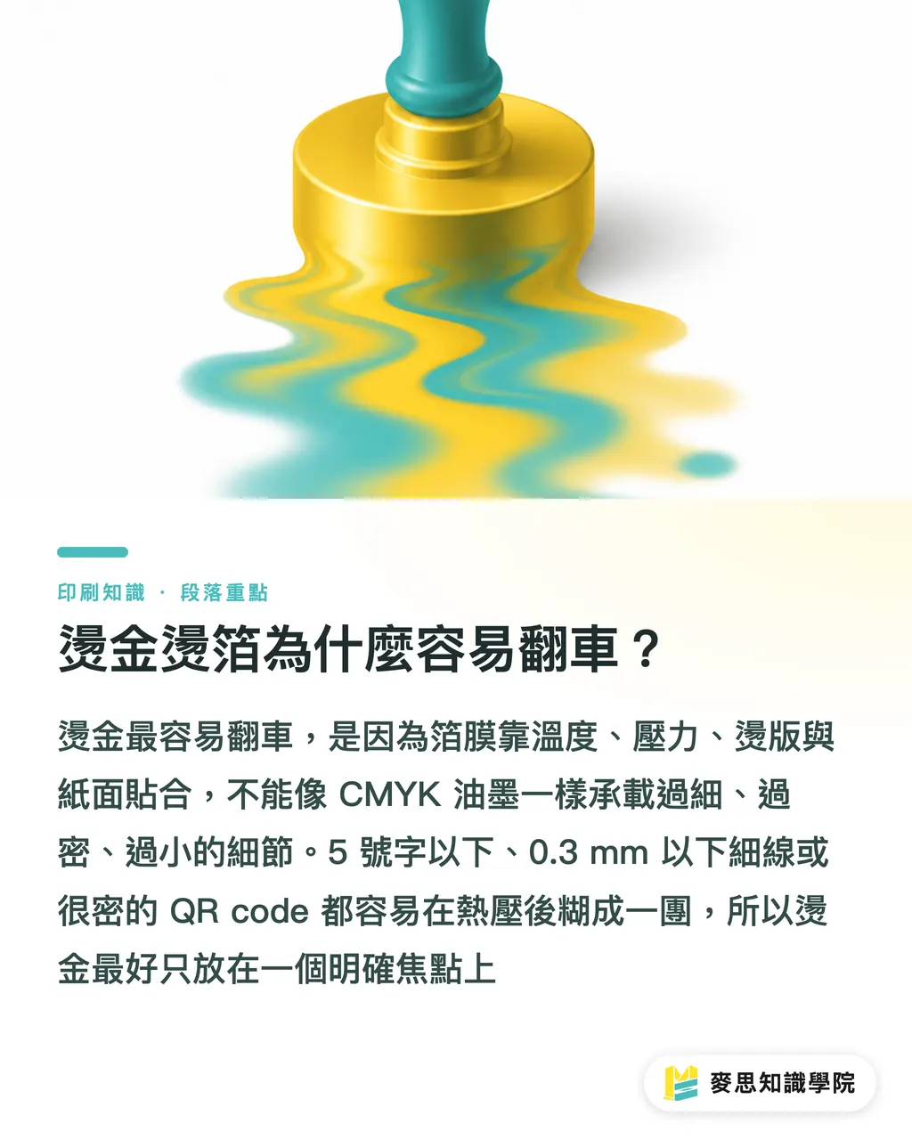
The fastest way to wreck foil is designing it like CMYK ink
Ink can hold fine halftone dots. Foil relies on temperature, pressure, the die, and how it bonds to the paper surface, too fine, too dense, or too small and it smears into a blob
When I'm costing it out, I split it into three cost drivers:
・Die: bigger area or more complex die means higher plate cost
・Foil: gold, silver, matte gold, and holographic foils differ in price and consistency
・Registration: foil needs to line up, and when it stacks with printing or embossing, you need to leave room in the schedule
I usually don't recommend foil on type below 5 pt, lines under 0.3 mm, or dense QR codes
It's not that designers can't go fine, it's that metallic foil spreads and fills at the edges after heat and pressure
Foil works best on a single focal point: the business card logo, the outer box brand name, the invite card title, a certificate seal
If you want to foil the whole surface, the budget climbs and the visual loses its anchor
How do you get real dimension from embossing and debossing?
Embossing and debossing use matched male/female dies to push the paper up or press it down, leaving a tactile impression. Embossing pushes up, debossing presses down, common on logos, crests, cover titles, and premium packaging
The feel of embossing comes from the paper actually changing shape under the die, not from a screen shadow
So paper weight, grain direction, and impression area all decide whether the final piece reads as dimensional or just a faint ring
Three common approaches:
・Blind emboss: dimensional impression only, no ink, quietest feel
・Printed emboss: printed artwork registered to the emboss, suited to logos, crests, motifs
・Foil emboss: foil plus emboss, strongest visual and tactile combo, hardest registration
In practice I default to 300 gsm or heavier card or mounted box stock for dimensional impressions
On thin paper the impression collapses into a crease and you're left with just a hard edge under the finger
Embossing files should be solid vector shapes, no halftones, no drop shadows, no overly fragmented detail
If the emboss sits close to the cut edge, I hold at least 3 mm of safety margin and have the converter check whether the die and the impression will fight each other
How do you prep files so the print shop doesn't kick them back?
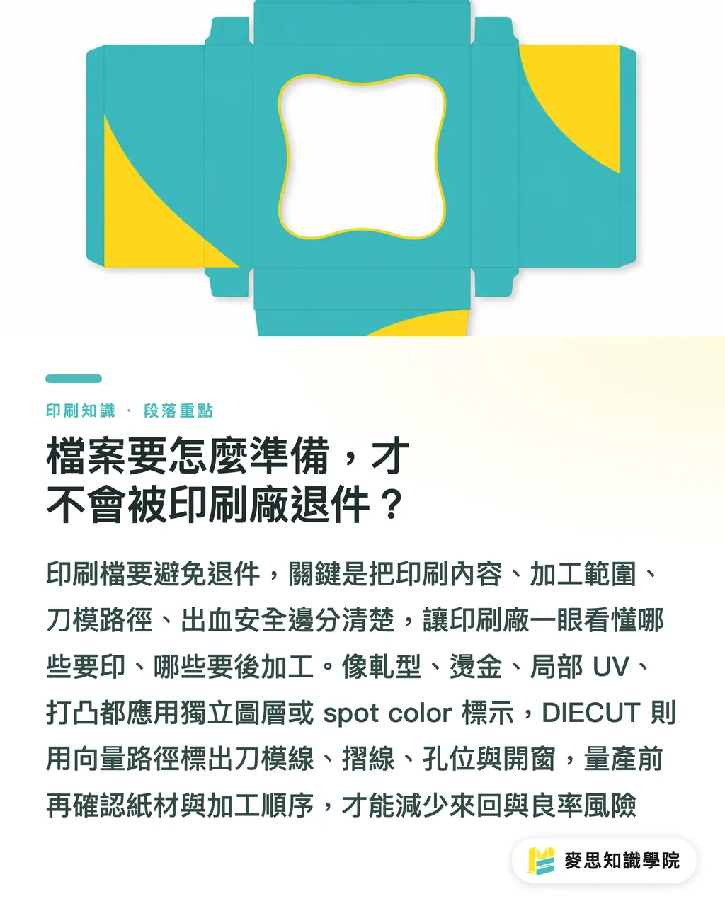
Die cutting uses a cutting die to follow a set path and punch out custom outlines, windows, or hang holes, rounded business card corners, packaging tongues, label shapes all fall under this. Files usually need a separate die line marked out
On the MINDS (MS) Three Checks Before Sending to Print, here's how I get designers and procurement to walk through them together:
・① Use case: business card = feel in the hand; packaging = shelf distance; invite card = ceremony
・② Finishing plates: spot UV, foil, embossing, die cutting each need their own plate or path
・③ Paper: thin stocks, check crush resistance and curl first; thick stocks, check impression, scoring, and mounting stability
When handing off files, I require at least four pieces of information kept clearly apart:
・CMYK print art: normal print content, no finishing marks mixed in
・UV_SPOT / FOIL_GOLD / EMBOSS: spot color or separate layer marking the finishing area
・DIECUT: vector path marking the die line, score lines, hole positions, and windows
・Bleed and safe margin: keep bleed outside the trim edge; keep text and key artwork off the edge
For a premium business card or outer box, get MINDS (MS) involved on paper and finishing sequence before costing
Whether the same logo gets foil before emboss, or film before spot UV, the order changes yield and hand-feel
Before mass production, what the Mai Strategy Knowledge Academy advisory team can do is translate your design language into finishing-plate language
Take 'make it feel more premium' and break it into one main effect, one supporting effect, and one printed proof, the round-trips drop fast
Key Takeaways
・Finishing isn't extra decoration, it's how you pin down a brand's visual focus and tactile memory
・Varnish sets the surface mood; foil stakes out the first-glance focal point; embossing gives the finger a reason to linger
・Foil and spot UV each need their own finishing plate; if the files aren't separated, the best design still gets kicked back
・Embossing and debossing live or die on paper weight and die conditions, dimensional on screen doesn't equal dimensional in hand
・With a tight budget, pick one main effect. It's more likely to feel premium than stacking three finishes at once
Worth Thinking Through Next
On the print production side, finishing can be treated as pre-quote risk control, confirm paper, plate paths, sequence, and a proof first. On the design side, the feel needs to be written into the file structure, not left at the mockup. AI and SaaS teams can turn 'is the finishing plate separate, are line widths sufficient, is the die path closed' into online proof-checking fields, so the digital workflow starts to match what happens on the press floor
FAQ
- If I want my business card to feel premium, which finishing should I start with?
- On a business card budget, I'd start with matte film plus one spot UV, or a single small-area foil. Both create a focal point within the limited space most easily
- Does a foil file need its own layer?
- Foil files usually need their own spot color (something like FOIL_GOLD) or a separate layer, with the area marked as a solid vector shape. Don't mix the foil artwork into the CMYK print art
- Does embossing need foil to feel premium?
- Embossing doesn't need foil. Blind emboss, pure paper relief, carries its own feel, especially on thick card, sleeves, premium packaging, and low-key brand marks
- How is spot UV different from gloss P?
- Gloss P is usually a full-surface gloss film effect; spot UV lights up only the areas you choose. Matte film plus spot UV gives the strongest contrast and is common on logos, headlines, and main visual focal points
- What's the most common mistake in die-cut files?
- The most common die-cut mistakes: the die line isn't on its own path, the line isn't closed, and the score and cut lines aren't clearly labeled. Die-cut files need to let the print shop see at a glance what gets cut, what gets scored, and what stays
Related articles



The Print × AI weekly
The print and AI know-how designers, brands and enterprises can use before they commit — one email, every week
MINDS Free Tools
Spine width and imposition calculators — skip the manual math, free in your browser.
MINDS Group
Need actual printing or gifting services?
From premium printing to online ordering and festive gifts — the MINDS Group sister brands take it from here.