

Overview
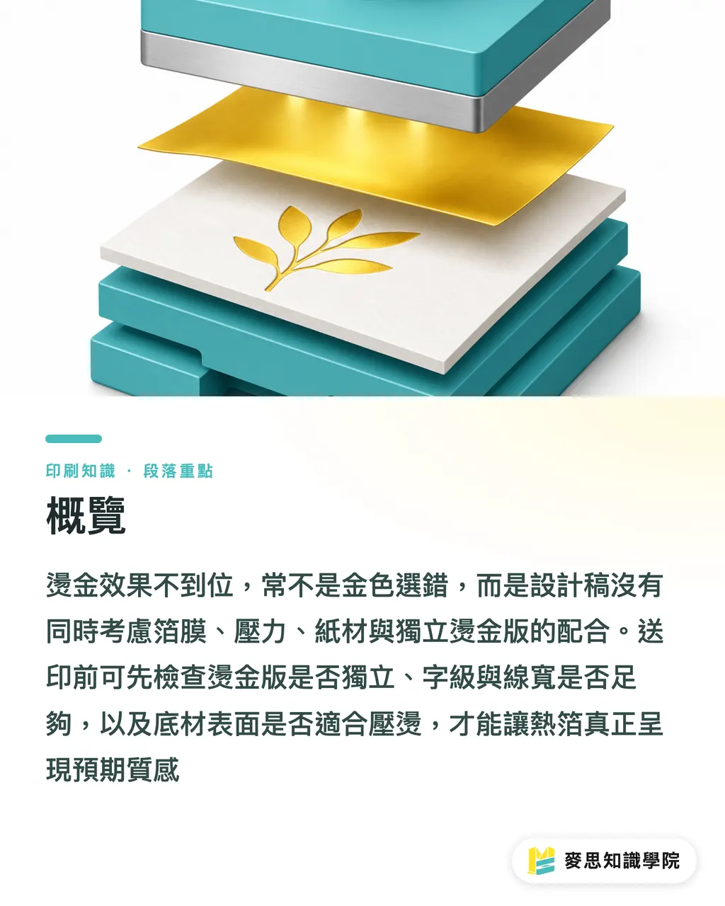
When hot foil stamping fails to deliver expected results, the most common reason is designing for 'gold' on screen without considering how foil film, pressure, paper stock, and the stamping die interact. When reviewing artwork at MINDS (a custom commercial printing specialist), I run files through the MINDS Prepress Three-Point Checklist: Is the stamping plate separate? Are font sizes and stroke widths wide enough? Is the substrate suitable for hot stamping?
Hot foil stamping uses heat and pressure to transfer metallic or colored foils onto paper, stickers, or packaging substrates. It is a common finishing technique for business cards, wine boxes, gift boxes, and premium labels. Final results depend on the foil film, die plate, pressure, temperature, and substrate surface
Why Does Screen Gold Look Nothing Like Actual Foil Stamping?
On screen, designers see a simulated gold color built with RGB or CMYK. On the press floor, foil stamping is about physical light reflection. They are entirely different things. When handling business card and packaging artwork at MINDS, our biggest headache is seeing gold gradients, transparency overlays, or foil texture images used to indicate stamping areas, because prepress software cannot turn those into stamping dies automatically
Choose common foils by application rather than just how shiny they look:
・ Gloss Gold: Delivers the strongest reflection. Great for logos, brand names, and gift box hero visuals, but large coverage areas can look overwhelming
・ Matte Gold: Soft sheen. Ideal for skincare, tea, and boutique packaging when you want a premium feel without aggressive shine
・ Silver Foil: Cool and clean. Often used for tech products, medical aesthetics, and luxury business cards, delivering sharp contrast on dark paper stocks
・ Holographic Foil: Produces rainbow reflections. Well-suited for streetwear brands, event tickets, and limited editions. It looks cleaner in small accents than across large areas
・ Colored Foil: Red, blue, green, and black foils build unique brand identity, but you must check in-stock availability and substrate compatibility with the printer beforehand
My rule of thumb is simple: foil stamping is not about making the design brighter, but creating visual anchors for the brand. If 90% of a business card is foiled, the eye has nowhere to focus. Limiting foil to one to three targeted elements, like a logo, brand name, or key symbol, usually works much better than full-coverage gold
If you are unsure which foil to pick, MINDS can help cross-check physical foil swatches before sending packaging or business cards to print. That is far more reliable than tweaking gold shades on screen ten times
Why Small Text and Thin Lines Bleed in Foil Stamping
Hot stamping is not ink printing. It relies on mechanical pressure to bond foil to the substrate. When type is too small, strokes are too thin, or counter spaces are too narrow, the foil will bridge together into a solid blob or fail to transfer cleanly. The standard prepress rule of thumb is to keep body text at 8pt or larger and line width at 0.5pt or thicker, though final limits depend on press equipment, foil chemistry, paper texture, and die material
Designers commonly run into four types of problems:
・ Foiling Chinese characters or dense text under 6pt, where tight strokes quickly fill in and become illegible gold blocks
・ Using hairline serifs or ultra-thin serif typefaces for stamping, where fine details either break apart or bleed together
・ Drawing borders or patterns with 0.25pt strokes. They show up on the die engraving, but rarely hold up under physical heat and pressure
・ Setting kerning and line spacing too tight. Foil stamping thickens visual weight, closing up fine negative spaces
I recommend treating foiled text as production artwork rather than standard typography. A logo can be detailed, but you must zoom in and inspect the thinnest strokes, smallest knockout holes, and tightest gaps. If your design includes 8pt text, 0.5pt lines, or knockout gaps under 1mm, check with your printer before finalizing
You can check your files using the MINDS Prepress Three-Point Checklist:
・ 1. Type Size: Keep text at 8pt or larger. Foil only key highlights, never long paragraphs
・ 2. Stroke Width: Keep fine lines at 0.5pt or thicker. Avoid dense line patterns that resemble halftone screens
・ 3. Spacing and Clearance: Leave clear, visible spacing between strokes. Enlarge knockout text slightly compared to regular ink printing
On the shop floor, I always say: Just because you can print it does not mean you can stamp it. It sounds blunt, but it is true

How to Set Up Spot Colors for Hot Stamping Artwork
Foil stamping artwork requires a dedicated spot color plate using a single solid color to define the foil area. Never use transparency, blending modes, drop shadows, or gradients to simulate foil effects. When reviewing stamping files at MINDS, the first thing we check is whether the stamping plate can be isolated, output, and engraved on its own
Here is the most reliable prepress setup:
・ Place the stamping artwork on an isolated layer named clearly, such as Hot Foil, Foil, or Stamping Die
・ Set all foil objects to a dedicated Spot Color rather than a CMYK gold breakdown
・ Use 100% solid fill for foil elements. No transparency, no gradients, and no drop shadows
・ Review the stamping plate and color print plate separately to confirm alignment, bleed, and overprint registration
・ Convert all fonts to outlines before exporting your PDF to prevent font substitution and registration shifts
The most common mistake is overlaying a nice gold swatch in Illustrator or InDesign with Multiply blending, reduced opacity, or layer effects. It looks like shiny foil on screen, but during prepress plate separation, it turns out to be nothing more than CMYK ink or transparent raster effects. The die maker cannot find a clean vector path to cut the die
I suggest providing a low-res mockup image alongside the final production PDF. The mockup lets account managers and clients confirm the visual look, while the production PDF allows the prepress team to separate plates cleanly. Keeping their purposes distinct cuts out half of all communication errors
Which Paper Stocks Work Best for Hot Stamping?
The smoother the paper surface, the sharper the stamping edges. Deeply textured stocks make it easier for foil to break over valleys or adhere unevenly. Business cards commonly use 300gsm to 400gsm stock, while packaging uses heavier paperboard or laminated board depending on structural needs. Basis weight is only a gauge of thickness; surface smoothness determines stamping clarity
Here is how to evaluate substrates:
・ Smooth Coated Paper: Even surface with solid foil adhesion. Fine typography and thin strokes stamp cleanly
・ Lightly Textured Specialty Paper: Offers tactile appeal and stamps well, but small text and fine lines must be enlarged so texture does not swallow details
・ Heavy Textured Specialty Paper: Best for bold logos and heavy strokes. Avoid forcing delicate text or intricate details onto deep grain
・ Dark Stock: Gold and silver foils deliver dramatic contrast, but keep an eye on indentation marks, surface powdering, and visible paper fibers
・ Synthetic Materials and Stickers: Verify heat resistance, adhesive stability, and surface coatings rather than judging solely by appearance
When combining embossing with hot stamping, you must decide between a combination die and separate dies. A combination die handles foil and emboss in a single pass using the same graphic shape, keeping production straightforward for logos, crests, and simple icons. Separate dies use one plate for stamping and another for embossing, allowing finer dimensional layers at the expense of higher die costs, longer setup times, and extra proofing runs
For high-ticket packaging, physical prototyping is non-negotiable. A monitor cannot preview foil reflectivity or how paper tooth grips the foil. Holding a physical sample, running your fingers across it, and tilting it under both cool and warm lighting reveals issues immediately
When producing custom commercial print runs at MINDS, we always advise discussing paper stock, foil film, and embossing methods in the same conversation. Each choice might seem fine on its own, but you only know if they work when evaluated together
Prepress Checklist for Hot Stamping Projects
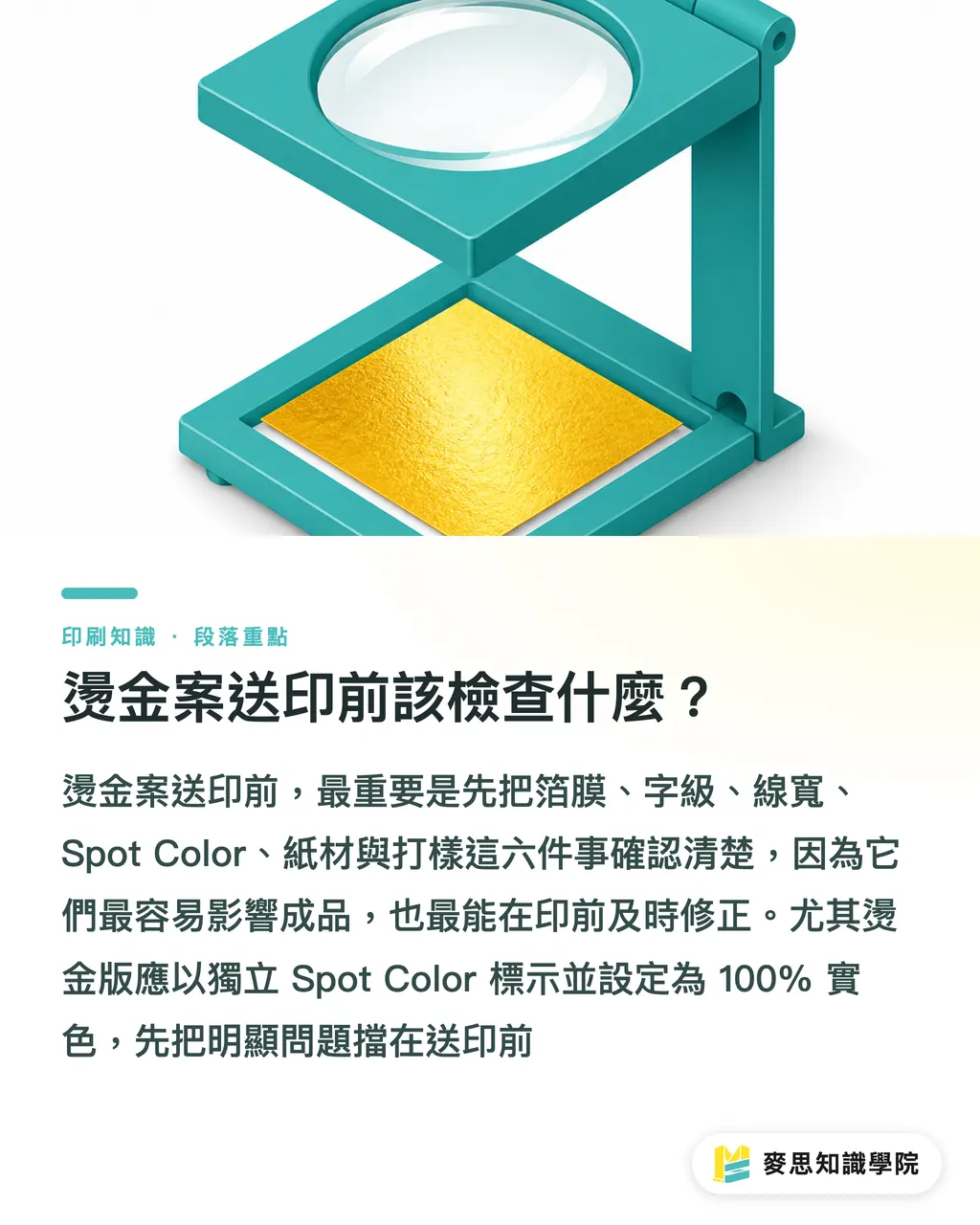
Before releasing a hot stamping project to print, focus on six key points: foil film, font size, stroke width, spot color, paper stock, and proofing. When the consulting team at Mai Strategy Knowledge Academy reviews design files, we target these six areas first because they have the biggest impact on finished results and are the easiest to correct in prepress
Run through this checklist before submitting files:
・ Foil Selection: Lock down gloss gold, matte gold, silver foil, holographic foil, or colored foil early so clients do not mistake on-screen gold for the real product
・ Type Size: Keep body text at 8pt or larger. Do not force tiny text or footnotes into foil
・ Stroke Width: Keep fine lines at 0.5pt or thicker. Zoom in to double-check ornate borders, patterns, and knockout lines
・ Plate Setup: Mark the stamping plate with an isolated spot color at 100% solid fill, free of transparency or blending modes
・ Stock Verification: Smooth paper holds sharp details, while textured paper provides tactile depth for bold graphics. Do not expect to get both extremes simultaneously
・ Physical Proofing: Run at least one physical proof for high-value cards, packaging, and gift boxes, especially with dark stocks, rough textures, or combo stamping and embossing
If your design team uses AI or SaaS intake pipelines, convert this checklist into automated validation gates: Does the file have a Hot Foil layer? Is it defined as a spot color? Are fonts below 8pt? Are strokes under 0.5pt? Software does not need to replace a master pressman's tactile intuition, but it can catch obvious errors before files reach the press
Key Takeaways
・ Foil stamping relies on physical light reflection, not on-screen gold fills
・ An 8pt font size and 0.5pt stroke width are safe starting baselines, not guarantees of perfection on every stock
・ An isolated spot color stamping plate matters far more than a pretty mockup. Die making only reads clean production data
・ Smooth paper preserves fine detail, while textured paper emphasizes tactile feel. You cannot force the exact same artwork settings onto both
・ Plan your sequence and registration before combining embossing and hot stamping. Late changes almost always mean added tooling costs and production delays
Looking Ahead
For print manufacturers, hot stamping projects require absolute clarity on die feasibility, stamping execution, and quality acceptance criteria. For design teams, prepress means shifting from visual layouts to production artwork. For AI and SaaS builders, the real value is not rendering shinier gold previews, but building ingestion checks for spot colors, 8pt minimum font sizes, 0.5pt stroke widths, substrate notes, and proofing requirements. A practical next step is turning the MINDS Prepress Three-Point Checklist into an internal SOP, eliminating basic mistakes before quoting every job
FAQ
- What is the minimum font size for hot foil stamping?
- As a rule of thumb, keep text at 8pt or larger and fine lines at 0.5pt or thicker. Actual limits depend on paper stock, foil film, die material, and press specifications. Never apply standard offset ink printing tolerances to hot foil stamping
- Do I need to set up a spot color for foil stamping artwork?
- Yes. Foil stamping artwork should always use a dedicated spot color to mark the stamping area with 100% solid fill. Transparency, gradients, drop shadows, and CMYK gold swatches cannot replace a proper stamping plate
- Can you hot stamp on textured specialty paper?
- Yes, but deeper textures reduce foil adhesion consistency and edge sharpness. Textured paper works best for bold logos, thick strokes, and simplified graphics. Small text and delicate lines should be enlarged or validated with physical proofs first
- Should embossing and hot stamping use a combination die or separate dies?
- Simple logos and emblem shapes can use a combination die, which keeps the process straightforward. If the foil and embossed areas do not align identically or require layered depths, use separate dies, which will increase die tooling costs, registration setup, and proofing time
- Why is physical proofing necessary instead of relying on screen mockups?
- Screens only display flat color values. They cannot simulate foil reflectivity, paper tooth adhesion, indentation depth, or tactile embossing. For high-ticket business cards, packaging, and gift boxes, always run a physical proof before committing to full production
Related articles




The Print × AI weekly
The print and AI know-how designers, brands and enterprises can use before they commit — one email, every week
MINDS Free Tools
Imposition calculator and preflight file check — free prepress tools, right in your browser.
MINDS Group
Need actual printing or gifting services?
From premium printing to online ordering and festive gifts — the MINDS Group sister brands take it from here.