

Why Does Foil Stamping Keep Filling In or Breaking?
When foil stamping is misaligned, breaks, or fills in, nine times out of ten it is not a machine issue, but a trap set during final artwork prep. Foil stamping (the process of transferring metallic foil onto paper using heat and pressure, which requires a separate metal die and artwork marked in solid K100 black) is an unforgiving physical process
When reviewing files on the press floor, my biggest worry is seeing designers treat foil stamping like a standard color fill. Lines might look razor-sharp at 500% zoom on a monitor, but on the production line, dozens of tons of pressure press heated foil onto paper. If lines are too thin, font sizes too small, or paper texture and absorbency are overlooked, the heat and pressure will push the hot-melt adhesive out past the edges to blur the details, or fail to seat into the paper texture and break lines. That ruins the job. Foil stamping is not just about color, it is about the physical battle between foil, pressure, and paper substrate

What Line Width in Millimeters Is Actually Safe for Foil Stamping?
Standalone lines need at least 0.15mm to 0.2mm, while reversed-out lines need to be thickened to 0.3mm or more. These numbers represent physical limits on the production line, not print shops trying to make your life difficult
・Standalone fine lines: I usually recommend a safe threshold of 0.2mm. If your design has very fine decorative lines, 0.15mm is the absolute edge. Anything thinner will break intermittently on paper
・Chinese and English font sizes: Chinese characters have complex strokes, and serif Song/Ming fonts have stroke contrast where the thinnest sections break easily. Keep Chinese characters at 8pt or above (roughly 2.8mm tall), while English sans-serif fonts can go down to 6pt
・Reversed-out (knockout) settings: This is where most jobs fail. Knockout areas are meant to stay unfoiled, but when the die presses down, the foil edges bleed slightly outward. If knockout lines are too thin, that slight spread fills the gaps and turns everything into a muddy smudge. Reversed-out line widths must be greater than 0.3mm, and reversed-out Chinese text needs to be at least 10pt to stay safe
How Paper Stock Changes Your Line Width Settings
The rougher and deeper the paper texture, the thicker your foil lines must be. The 0.2mm rule only applies to smooth stocks. Change the paper, and you have to adjust the formula
Designers love rich tactile textures when picking paper, but that tactile feel often works against foil stamping
・Smooth coated paper (such as art paper or C1S board): With a smooth surface and excellent foil adhesion, fine lines down to 0.15mm usually pass cleanly
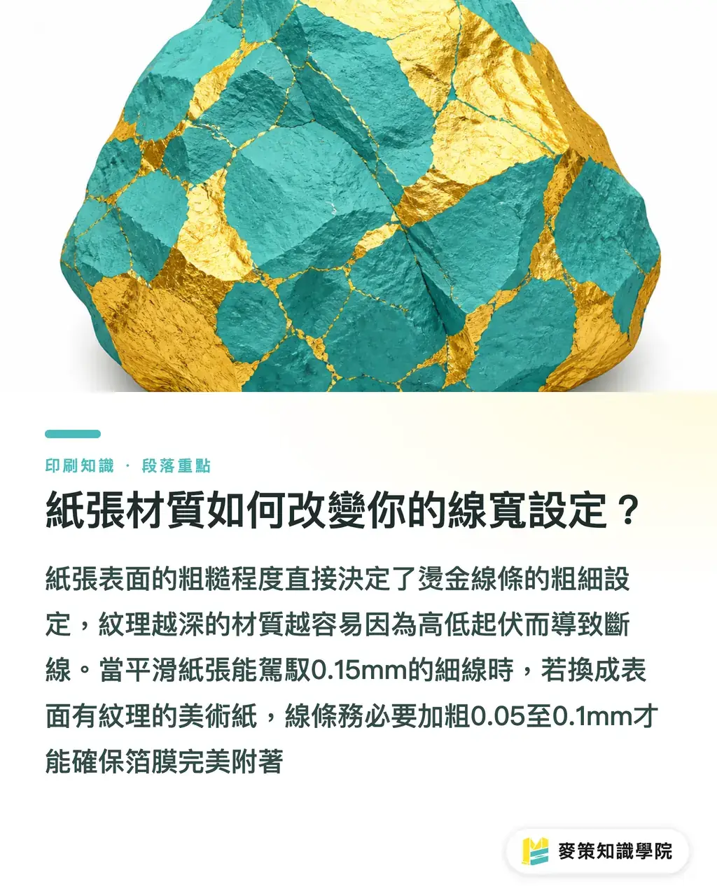
・Textured fine art paper (such as linen or watercolor paper): The surface has peaks and valleys. If pressure only hits the ridges, foil cannot grip the valleys and lines snap. For foil on textured stock, automatically add 0.05mm to 0.1mm to your line widths
・Specialty finishes (such as soft-touch or velvet lamination): These films have different surface tension, making it harder for foil to bond and causing ragged edges. Here, widening your lines is not enough. You also need to confirm with the printer that they are using matching specialty foil
How to Prepare Final Artwork and Black Dies in Illustrator
Foil stamping requires a separate solid K100 black die layer (Spot Color), along with checking that underlying graphics are properly set to knock out or overprint. This is the "Mai Strategy Three-Gate Pre-Press Check" I regularly ask pre-press teams to run. Open Illustrator and run through this yourself before handing off files:
・Confirm 100% process black: Foil artwork must never contain CMY values or grayscale tints. Select every object to be foiled, set the fill to K100, and remove all strokes
・Turn on Overprint Preview: This is the best tool for spotting prep errors. If other colors are printed beneath the foil, verify whether your foil overprints or knocks out. Opaque foil generally covers the base without needing a knockout, but if you are using translucent foil or combining it with embossing, registration with underlying artwork becomes extremely tight
・Check vector anchor points: After converting text to outlines (Create Outlines), zoom in to check for stray anchor points or overlapping paths. The stamping die is engraved directly from your vector paths. Messy paths make bad dies
When dealing with intricate graphics or specialty proofs, instead of guessing in the dark, bring your files to the pre-press team at MINDS or ask the Mai Strategy Knowledge Academy consulting team for a production assessment. Asking early saves you the cost of scrapping an entire run
How to Talk Proofs with Your Print Shop Before Press
Instead of just asking "Can you foil stamp this?", ask "Can we apply enough pressure for this font size on this paper?" When reviewing proofs at the shop, I always check these three specifics:
・Foil shade and paper matching: Gold comes in dozens of shades. Bright gold, pale gold, and matte gold show completely different contrast across background colors. Black foil on black cardstock looks understated, but if lines are too fine, they disappear entirely into the stock
・Pressure testing: On deeply textured art paper, ask the press operator to test-stamp a corner of scrap sheet to see if your line widths hold up without breaking
・Fill-in risk check: Point directly at the densest areas of your design, such as small address text or logo marks, and ask the press operator whether it will fill in. An experienced press manager can tell at a glance whether to thicken the lines or drop them. It is that straightforward

Key Takeaways
・Keep the baseline line width for foil stamping at 0.2mm, and make reversed-out lines wider than 0.3mm to avoid filling in
・On deeply textured art paper, widen all foil lines by 0.05mm to 0.1mm so the foil presses cleanly into the paper grain
・Build a separate solid K100 black die layer during artwork prep, and use Overprint Preview to verify relationships between background artwork and foil placement
・Before going to press, do not just pick colors. Point out the tightest details on your artwork and have the press operator evaluate fill-in risks directly
Looking Ahead
For SaaS platforms and AI pre-press automation tools, the real opportunity lies in factoring paper texture into system parameters. When a pre-flight system can go beyond checking whether PDF lines are under 0.2mm and automatically flag that linen paper needs a line width compensation to 0.25mm to avoid line breaks, that physical-aware error proofing is what truly cuts return rates and keeps designer clients loyal to web-to-print platforms
FAQ
- My English font is very thin. Will foil stamping definitely break?
- Measure the thinnest stroke of your font. If it falls below 0.15mm, it risks breaking even on smooth paper, and it will almost certainly snap on textured art paper. Switch to a heavier font weight or add a subtle stroke
- Can I export the black die for foil stamping directly using black (K) from CMYK?
- No. Foil stamping requires a separate layer or file page with the foil areas filled in 100% solid black (K100). This marks the exact area for die-making and must never mix in other CMY colors
- Are artwork setup rules the same for foil stamping and spot UV?
- The concept is similar, as both require a separate K100 black die layer. But spot UV uses a liquid varnish that tends to spread outward, so spot UV artwork is typically choked inward by 0.1mm, whereas foil stamping uses direct registration
Related articles





The Print × AI weekly
The print and AI know-how designers, brands and enterprises can use before they commit — one email, every week
MINDS Free Tools
Spine width and imposition calculators — skip the manual math, free in your browser.
MINDS Group
Need actual printing or gifting services?
From premium printing to online ordering and festive gifts — the MINDS Group sister brands take it from here.