

Overview
To keep foil area under control, run every job through the MINDS (MS, mid-to-high-end fully custom commercial printing) three-gate check: does the brand's hero element actually land, can the paper surface hold the foil, and will pressure and finishing positions fight each other? My approach is to tier the logo, key visual, and critical info instead of foiling the entire panel
What hot foil is: a finishing technique that transfers foil onto paper or packaging using heat, pressure, and a metal die. Whether the result holds up comes down to image area, paper flatness, die detail, and pressure distribution
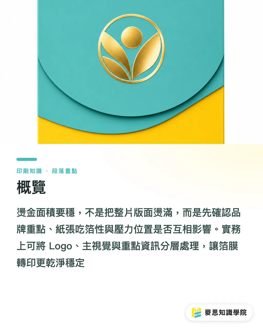
Does a bigger foil area mean more premium?
The most common mistake with large foil areas is confusing bright with expensive, and full-bleed with refined. Looking at the packaging jobs MINDS handles, the foils that actually age well usually pick just one hero element, like a logo, brand wordmark, bottle label illustration, or the front-of-box identifier
Once the foil area grows, on-press problems scale with it: uneven pressure causes mottling, incomplete foil transfer causes flaking, and large metallic reflective surfaces tend to expose seams and press marks. On the same 300 gsm+ heavy cardstock, a smooth coated sheet and a textured art paper can give wildly different results
I ask designers to cut the layout into three tiers first. That question gets you further than 'how big can we foil?'
・Tier 1: brand must be seen, e.g. logo, brand name, series name
・Tier 2: visual memory anchor, e.g. main illustration silhouette, badge, bottle motif
・Tier 3: supporting info, e.g. volume, flavor, year, short tagline
The MINDS (MS) three-gate logic is blunt: foil tier 1 first, pick the right spots in tier 2, and leave tier 3 in print color or spot UV unless the type is large and the lines are thick. If all three tiers get foiled, the box starts shouting and the cost climbs with it
How does paper surface affect foil?
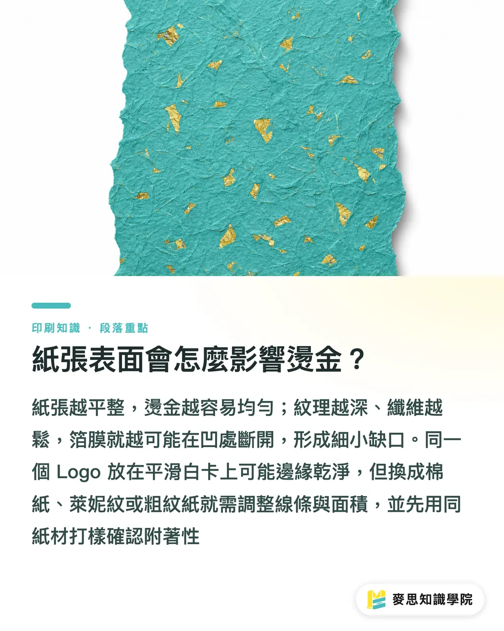
The flatter the paper surface, the easier foil lays down evenly. The deeper the paper texture, the more likely the foil breaks over the low spots, something MINDS flags constantly on art paper, eco paper, and specialty paper jobs
The same logo can come out with crisp edges on smooth white card and pick up tiny gaps on cotton, laid, or rough-textured stock. That doesn't mean the printer is bad; it's the combined effect of heat, pressure, and paper fiber surface variation
Designers can run three pre-flight checks before sending files
・When the paper has obvious texture, pull back on large solid foil areas and switch to localized logos or graphics
・When the paper is ink-absorbent or loosely formed, thicken fine foil lines and enlarge knockout type
・When the paper has a laminate, coating, or specialty surface treatment, confirm foil adhesion first instead of assuming it works
For brand gift boxes, cosmetics cartons, or food packaging, MINDS usually recommends sampling on the same stock before production. Sampling isn't a formality; it's swapping one small risk for the risk of a full-batch reject, especially on high-contrast pairings like dark paper with gold foil or matte stock with gloss foil
How to handle fine line type and knockout details?
To keep foil detail stable, start conservative on line weight and type size. Following the MINDS (MS) three-gate file habit, I check small type, fine lines, and knockout type separately instead of just eyeballing whether the whole layout looks pretty
Foil dies can't reproduce ultra-fine gradations the way regular printing can. Lines that are too thin go muddy, knockouts that are too small clog up, and tight stroke spacing merges together. Small English type on a business card, volume info on the back of a package, or fine ingredient copy on a cosmetic box shouldn't be forced onto the foil plate
At handoff I'd recommend doing at least these four things
・Mark the foil plate with a clearly named Spot Color, e.g. HotFoil Gold
・Output foil graphics as 100% solid black with no gradients or transparency
・Check fine lines, small type, and knockout copy separately instead of trusting thumbnails
・Save key logos with outlined type to avoid stroke shifts from font substitution
Knockout details are especially risky. Cut a 6 pt word out of a gold foil block and it looks high-end on screen, then shows up on press as a smudged gold edge. MINDS usually suggests pulling the knockout out of the foil area entirely or enlarging and bolding the type so the paper and foil keep enough separation
Can foil cross fold and crease lines?
The fold area is the most overlooked piece of foil-area planning. When MINDS works on cartons, we check the die line, crease, glue flap, and opening direction first, because if the foil lands right on a fold, it can crack, flake, or show white stress marks once the box is formed
A box isn't a flat poster. It gets creased, folded, glued, stacked, and shipped. If gold foil sits close to a fold line, the paper bends and the foil takes the stress with it. Cracks show up hardest on dark stock
Designers can use three distance rules for a first pass
・Keep main foil graphics clear of creases and folds; don't park a logo on a corner
・Don't run large solid foil across the boundary between the main panel and a side panel; the visual seam will show
・Minimize foil on glue flaps, tuck-in tabs, and high-friction spots so transit wear is less of an issue
For corporate buyers planning a new product carton, hand the die, paper sample, and foil plate to MINDS together before finalizing the artwork. That step is practical: the same gold logo centered on the front panel and the same logo tucked near a folded corner will give very different yields and very different perceived quality
How should buyers and designers set the foil scope?
The safest foil area isn't the cheapest quote and it isn't the brightest layout. The MINDS (MS) three-gate approach starts with three questions: who needs to be remembered, where will the package take stress, and which spot is actually worth the finishing cost
I break foil planning into five actionable steps so buyer, designer, and printer end up talking about the same thing
・Circle the brand hero first: lock the logo, brand name, and series name before talking about any decoration
・Swap large blocks for focused accents: use print color or varnish for big shapes and save foil for the focal point
・Lock the paper choice early: smooth stock, textured stock, and dark stock each need their own call, not one shared spec
・Review the die at the same time: keep fine foil away from folds, creases, glue flaps, and tuck-in tabs
・Use samples as decision tools: for high-value gift boxes or long-run retail packaging, sample first, then produce
For SMEs, foil budget should land where the consumer's eye lands first. An 8 cm wide box panel often needs just one clean brand foil mark to be more memorable than a wall of gold pattern

Key Takeaways
・Bigger foil area doesn't mean more luxury; the more you focus on the brand hero, the easier it is to produce consistently
・Paper surface decides whether foil lays down clean; rough paper and large solid foil are naturally a bad match
・Stay conservative on fine lines, small type, and knockout copy; on-screen detail doesn't equal plate-level clarity
・Avoid foil near folds, creases, and glue flaps; the real risk only shows up after the box is formed
・Buyers should treat foil as a brand accent, not a fill-the-space tool
Further Thinking
For teams in print manufacturing, design, AI adoption, and SaaS, foil-area judgment can be productized into a file-handoff check: after uploading the artwork, the system flags the Spot Color, fine lines, small type, knockout zones, die fold lines, and large foil areas, then a prepress or consultant makes the final call. When the Mai Strategy Knowledge Academy consulting team rolls out workflows like this, I put 'can this run at scale' ahead of 'does this look good', because good print design has to clear the machine, the paper, and the logistics line before it counts
FAQ
- How large a foil area is considered safe?
- There's no single formula for a safe foil area. MINDS looks at paper surface, graphic size, line weight, and box position. As a rule, concentrate the foil on the logo, brand name, or main visual first instead of starting with a full-panel solid foil
- Why does large-area foil tend to mottle?
- Large foil areas demand more uniform heat and pressure. Any texture, unevenness, or coating variation on the paper surface can throw the foil transfer off. Mottling, visible seams, and flaking usually trace back to pressure distribution once the area scales up
- Can foil handle very small type?
- Foil isn't a good fit for very small type, very fine lines, or tightly packed knockouts. MINDS usually suggests leaving small type in regular print color and saving foil for larger logos, headline type, or clearly readable graphics
- Can a foil design cross a fold line?
- Foil designs shouldn't cross fold lines, creases, or box corners. Cartons flex and take stress during forming, so the foil tends to crack or flake. The flaw is especially visible on dark stock with large gold foil areas
- What should designers watch most when sending foil files?
- Foil files should be separated with a clearly named Spot Color, graphics output as 100% solid black, and die lines, creases, and foil placement reviewed together. The MINDS (MS) three-gate check starts with brand priority, paper condition, and finishing risk
Related articles





The Print × AI weekly
The print and AI know-how designers, brands and enterprises can use before they commit — one email, every week
MINDS Free Tools
Spine width and imposition calculators — skip the manual math, free in your browser.
MINDS Group
Need actual printing or gifting services?
From premium printing to online ordering and festive gifts — the MINDS Group sister brands take it from here.