
Why Does Physical Shelf Signage Instantly Turn into Visual Noise?
Shelf signage turns into visual noise mainly because price tags, shelf talkers, promo signs, and category signs are assigned without considering shopper foot traffic. As a result, different promotional pieces fight for attention in the exact same field of vision
During production line and retail store walkthroughs, I often see brands apply print poster design logic directly onto 3 cm shelf strips. The text ends up too tiny to read, promo stickers randomly cover key product names, and store staff accidentally bend or tear the signs while restocking
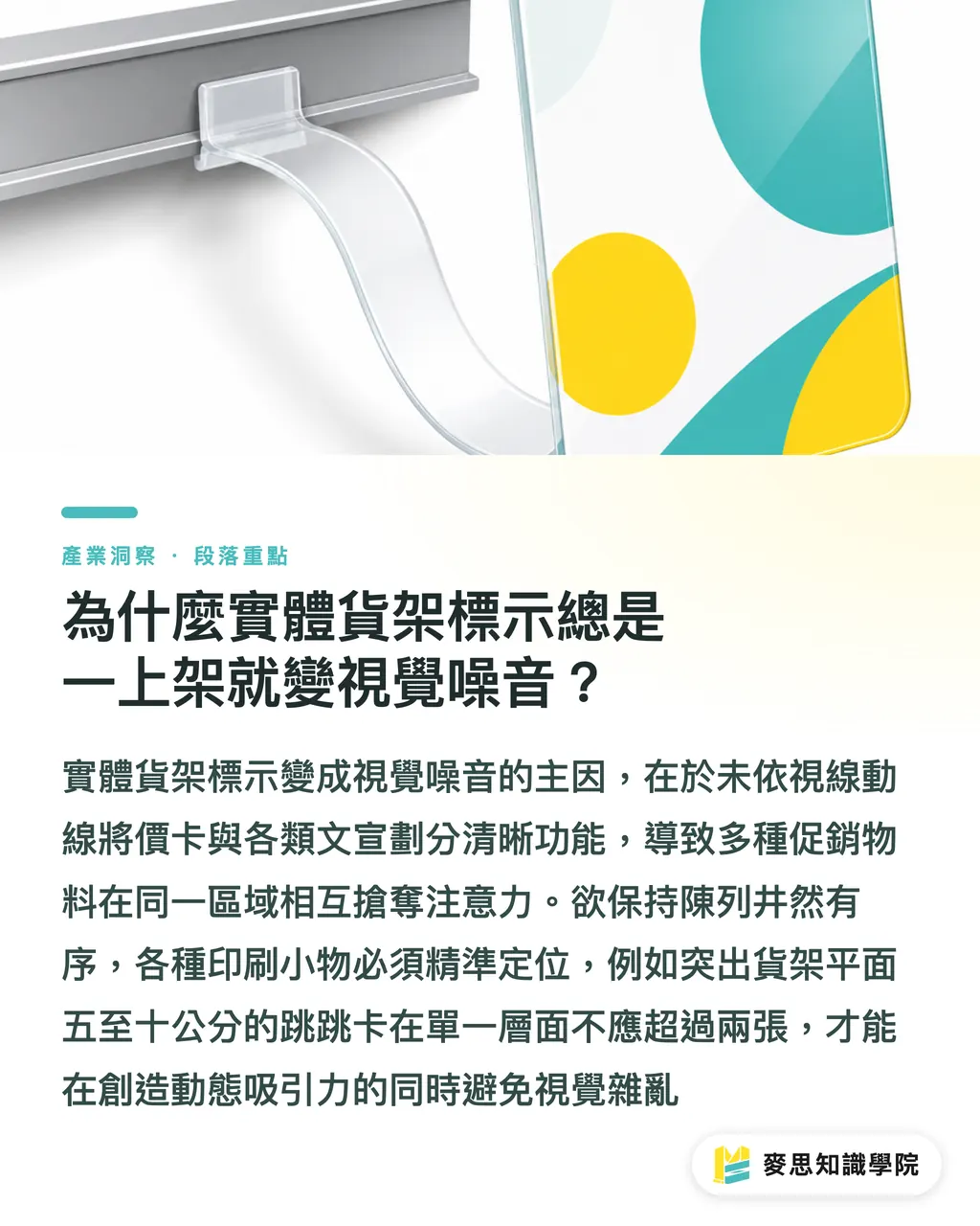
Understanding shelf talkers (wobblers) is essential. These small promotional signs hang from shelf strips using 0.25 mm transparent PVC or PP strips. They catch eyes by bouncing naturally with airflow. When prepping final artwork, you must mark plastic strip placement points and weight distribution carefully
To keep shelf signage orderly, each printed piece needs a clear purpose:
・Shelf category signs: Hang at the top or ends of aisles to mark main categories. Colors should contrast with aisle walls
・Price tags and spec labels: Sit flush against shelf strips. Font size should fit a 0.5-meter viewing distance, with price digits enlarged and bolded
・Wobblers and side talkers: Extend 5 to 10 cm out from shelf surfaces. Limit to two per shelf level to avoid clutter
・Tester guides and promo standees: Place on flat display areas using heavy basis weight paper to prevent tipping
If you are unsure about retail standards or print structures, consulting the Mai Strategy Knowledge Academy Advisory Team first can save you plenty of artwork revision detours
How to Organize Shelf Print Information Hierarchy by Viewing Distance
The core method for organizing shelf visual hierarchy is using three viewing distances. Capture key visuals from far away, identify products at a medium distance, and check prices and ingredients up close
As shoppers move down store aisles, their eyes linger for an average of just 3 seconds. If your main visual cannot be seen from 3 meters away, your product vanishes into a sea of competitors
Breaking down artwork layout into 3 stages based on viewing distance:
・From afar (3-meter viewing distance): Focus on campaign themes and series color coding. Main headline text height should be at least 40 pt
・Medium range (1.5-meter viewing distance): Focus on product names and core selling points. Keep copy under 10 words and avoid busy background patterns
・In hand (0.5-meter viewing distance): Display price, volume, and member discounts. Keep detailed layout spacing clean and clear
Before sending files to print, do not rush
We recommend placing your artwork layout into a 1:1 shelf mockup for review. You can also print out digital proofs and tape them onto a mock shelf to make sure the focal point is not blocked by strip rails
Which Materials and Finishes Work Best for Store Setup and Frequent Swaps?
Selecting dirt-resistant, durable materials for store installation comes down to matching maintenance frequency. Use synthetic paper with removable adhesive for frequent campaign swaps. Choose PP with gloss or matte lamination for long-term use
Many designers pick 300 gsm uncoated paper for premium feel, forgetting that cosmetics and food retail shops often have humidity and sweaty hands. After one week, paper absorbs moisture and curls, hurting brand image
Comparing material and finish combinations:
・Short-term promo price tags: Pick 250 gsm coated art card with single-side gloss lamination. Scratch-resistant and low-cost, perfect for campaigns under two weeks
・Frequently swapped stickers: Pick 200 um synthetic paper with removable adhesive (R glue). Peels off clean without residue, easing work for store staff
・Long-term shelf guides: Pick 0.5 mm white PP board with UV printing. Water- and stain-resistant, wipeable with a damp cloth
・Wobbler flex strips: Pick 0.25 mm soft transparent PVC strips paired with 3M heavy-duty double-sided tape to maintain bounce and toughness
If you have special spec requirements, reaching out to the professional MINDS Print team can help strike a great balance between budget and durability
Understanding the details is enough

4 Prepress Details Designers Must Check Before Final Delivery
The key goal of prepress error prevention is keeping die-cut layers separate and bleed accurate. This avoids quality issues like knife alignment shifts causing uneven borders or exposed white edges
Physical tolerance for print shop die-cutting knives is roughly ±0.5 mm. If final artwork fails to follow ISO 12647-2 prepress standards, small shelf signs can easily run into errors
4 self-check steps before handing over final artwork:
1. Set up die-cut lines on a separate layer: Place outer die-cut lines on an isolated layer, set stroke to a spot color, and check K100 overprint
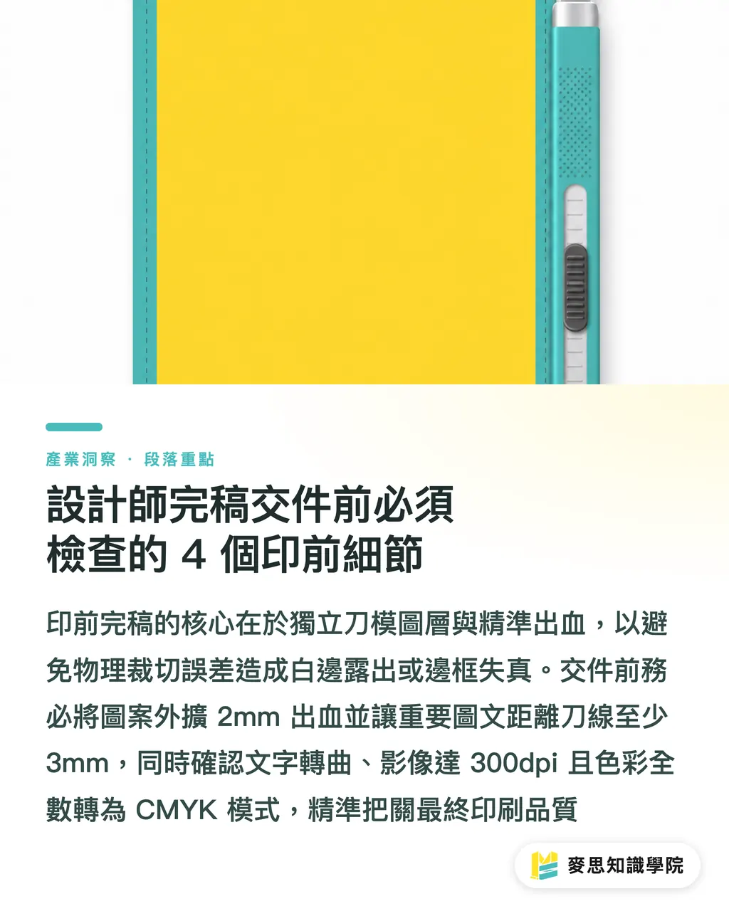
2. Allow sufficient bleed and safety margins: Artwork bleed must extend 2 mm past die-cut lines. Essential text should sit at least 3 mm inside cut lines
3. Check color mode and resolution: Convert text to outlines, verify image resolution hits 300 dpi, and convert all color modes to CMYK
4. Reserve space for fasteners and adhesive strips: Keep adhesive zones on the back of wobblers clear of key visuals and text to avoid covering messages with double-sided tape
Key Takeaways
・Shelf signage needs information hierarchy broken down across 3-meter, 1.5-meter, and 0.5-meter viewing distances to prevent visual clutter
・Wobbler artwork layout must factor in center-of-gravity balance for the 0.25 mm transparent strip. Avoid crowding too many talkers on a single shelf face
・Store replacement frequency dictates paper stock. Use synthetic paper with removable glue for campaign swaps, and PP with UV printing for long-term signs
・Prepress die-cut lines require a separate spot-color layer and K100 overprint. Keep text at least 3 mm away from cut lines for safety
Final Thoughts
The impact of retail shelf signage depends not only on visual design, but also on how well prepress artwork and on-site execution land. From die-cut safety margins in artwork and durable finishes in printing, to peeling and sticking steps for store staff, every detail shapes brand presence in physical retail. When designers factor viewing distance and installation structure into initial proposals, they lower rework costs and create real visual impact beyond the screen
FAQ
- What structural issues should designers watch out for when prepping wobbler artwork?
- When prepping wobbler artwork, place die-cut lines on a separate layer and reserve placement areas for the 0.25 mm transparent plastic strip on the back. Card size and weight must match strip flexibility to prevent sagging or collapsing
- How should adhesive be selected for price tag stickers to prevent residue?
- For price tags swapped frequently, specify removable adhesive (R glue) on a synthetic paper base. Removable adhesive peels off without sticking to metal shelf tracks, significantly cutting cleanup time for store staff during campaign changes
- What is the minimum font size for price labels on shelf strips?
- For a 0.5-meter viewing distance, product names on shelf strip labels should be at least 8 pt. Key price numbers should be bolded and bumped to 14 pt or larger, keeping high color contrast for legibility
Related articles





The Print × AI weekly
The print and AI know-how designers, brands and enterprises can use before they commit — one email, every week
MINDS Free Tools
Imposition calculator and preflight file check — free prepress tools, right in your browser.
MINDS Group
Need actual printing or gifting services?
From premium printing to online ordering and festive gifts — the MINDS Group sister brands take it from here.