

Overview
A client drops off a brand manual packed with logos, brand colors, typefaces, and mockup examples. It looks complete. Yet the moment the print shop opens the files, their first question is almost always: 'Do we match this green to CMYK, Pantone, or the screen proof?' That marks the single most common handoff error design agencies make: mistaking brand visual identity guidelines for Brand Print Guidelines
When brand standards fail to cover paper stock, color conversion, font licensing, image resolution, and post-press finishing limits, print buyers and prepress teams have to fill in the blanks on gut feeling alone. Brands are built and maintained through printed materials, but reproducing brand identity reliably on the press floor takes more than aesthetic language. It requires verifiable production specifications
What Should Brand Print Guidelines Actually Include?
Brand print guidelines should not deliver design preferences. They must supply concrete criteria that printers can use to quote, proof, print, and verify deliverables
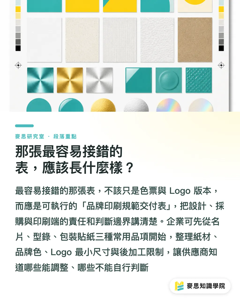
An actionable set of Brand Print Guidelines needs at least six core categories of information. First is paper specification, covering paper grade, basis weight, whiteness, surface finish, and rules for acceptable paper substitutions. Second is color rules, detailing CMYK breakdowns, matching Pantone or spot colors, rich black formulas, reverse-out versions, and whether adjustments are permitted across different substrates. Third is logo clear space and minimum print size, backed by measurable dimensions rather than polished layout mockups
Fourth is the print scope of font licensing. Many brand guides list font names without stating whether the print vendor is permitted to embed, outline, substitute, or output variable weights. Fifth is image resolution standards, specifying the minimum resolution at final trim size instead of just requesting 'high-res.' Sixth is post-press finishing limitations, such as foil stamping line weights, minimum spot UV areas, embossing registration tolerances, and die-cut safety margins
These details matter because print standards are never meant to make aesthetic choices for designers. Their real job is to give everyone on the production line a shared language to apply specs, compare proofs, and prevent misunderstandings. [3][4]
Why Aren't CMYK Values Enough on Their Own?
Providing only CMYK values falls short because the exact same formula produces drastically different visual results depending on paper stock, press conditions, and color gamut strategies
Designers often set a brand color as C80 M20 Y60 K0, assuming that provides full control. The reality is that the printer sees a barrage of unanswered questions: Which ICC profile should be used? Is the substrate coated or uncoated? Does the brand color have a Pantone equivalent? If CMYK cannot hit the target color, should the press run the closest possible match or switch to a dedicated spot ink?
Expanded color gamut printing has made this even more complex in recent years. CMYKOGV adds Orange, Green, and Violet to the standard CMYK set to reproduce a wider spectrum of brand and packaging colors. The technical standards behind this focus on press characterization and repeatable conditions across multi-color setups, not merely listing extra ink names. [1][2] This underscores a critical reality: a brand color chart limited to a single CMYK column fails to address how color actually gets put onto paper
A more practical approach splits the color chart into three distinct tiers: the ideal target color value, standard CMYK production values, and spot color or expanded gamut values. If a brand relies on a signature hero color, the guidelines must explicitly state when a Pantone spot ink is mandatory, when a CMYK simulation is acceptable, and when press proofs are required
Why Must Logos, Fonts, and Images Be in Print Guidelines?
Logos, typography, and imagery belong in print guidelines because production errors rarely stem from color alone. They happen when output conditions are quietly taken for granted
Minimum logo size is a textbook example. When a brand guide only showcases business cards, envelopes, and presentation covers, printers cannot tell if the mark remains legible when scaled down for packaging side panels, hangtags, stickers, or manual footers. An actionable guideline uses concrete rules like: 'The horizontal logo must not be printed narrower than 18 mm. Below this threshold, use the simplified mark.' The 18 mm figure is not a universal rule, but a brand-specific control value determined after testing fine logo details against paper stocks and printing processes
Typography follows the same logic. If brand font licenses allow installation by the design studio but not third-party vendors, the print shop must receive outlined artwork or a certified, embeddable PDF. Without clear instructions, vendors might swap in an unapproved lookalike font, distorting the brand's tone of voice at the very finish line
Image specifications must tie directly to final printed dimensions. An image that looks sharp on a phone screen will fall apart across an A4 catalog spread. Guidelines should define minimum resolution at 100% output scale, required color spaces, image bleed margins, and clear rules on whether AI-generated image expansion is permitted. These are not trivial details. They dictate whether brand consistency survives prepress
What Should the Print Handoff Sheet Actually Look Like?
This document should be structured as a Brand Print Specification Handoff Sheet, not a one-page summary of swatches and logo variations
I recommend dividing this sheet into eight distinct sections:
・Basic Brand Information: Brand name, version date, key contact person, and applicable project scope
・File Delivery Specifications: PDF/X standard version, font outlining rules, bleed settings, trim marks, and color modes
・Paper Stock Specifications: Specified paper stock, approved alternative stocks, and whether substitutions trigger a mandatory reproof
・Color Specifications: CMYK formulas, Pantone spot matches, monochrome versions, reverse-out rules, tolerance thresholds, and proofing requirements
・Logo Specifications: Clear space, minimum print dimensions, distortion restrictions, and alternative versions for small-scale applications
・Typography Specifications: Licensing boundaries, embedding methods, outlining rules, and conditions for fallback fonts
・Image Specifications: Resolution at final print size, color space, crop safety zones, and disclosure labels for AI-generated images
・Finishing Specifications: Foil stamping line limits, embossing/debossing tolerances, spot UV minimums, die-lines, gluing areas, and fold-line constraints
The real value of this sheet is not to make a company look polished, but to draw clear lines of responsibility across design, procurement, and print production. When print production adopts standardized rules, what matters is establishing a common framework for specs, testing, and press conditions. Vendors then know exactly where they have flexibility and where decisions cannot be made on the fly. [3][4]
In practice, organizations can start by auditing their three most frequently printed items, such as business cards, catalogs, and packaging labels. Working through the paper stock, brand colors, minimum logo sizes, and finishing constraints for just these three items quickly reveals the missing technical details in a brand guide. Early-stage brands exploring visual identity do not need an exhaustive sheet right away. Once a company manages multiple vendors, regional branches, or high-volume print runs, upgrading Brand Print Guidelines from a visual guide into an executable prepress specification becomes essential
Key Takeaways
A brand manual cannot replace Brand Print Guidelines. Press operators need practical production specs to quote, proof, print, and sign off on jobs
The most common handoff mistake is providing only logos and color swatches without addressing paper stocks, color conversion, font licenses, image resolutions, or finishing constraints
Never define brand colors solely by CMYK values. Signature brand colors must define Pantone formulas, CMYK simulation values, proofing conditions, and acceptance tolerances
Minimum logo sizes, font licensing terms, and image resolutions are real prepress operational risks, not decorative design footnotes
When rolling out brand print specifications, start by creating actionable templates for the three most common and error-prone printed items
Further Considerations
For commercial printers, Brand Print Guidelines replace guesswork with spec-driven collaboration, standardizing quoting, proofing, and quality acceptance. For design agencies, this framework extends brand strategy directly into procurement and production, preventing visual guidelines from being altered at the prepress stage. For AI and SaaS platforms, the next frontier goes beyond automated layout generation: it means structuring logos, color recipes, licenses, paper stocks, and finishing specs into a machine-readable brand print data layer accessible to print vendors, MIS platforms, Web-to-Print portals, and preflight systems. The lingering challenge is that equipment, paper inventories, and finishing capabilities vary widely across print shops. For brand guidelines to work on the ground, they must be calibrated against real-world supply chain capabilities
References
[1] Graphic technology. Guidelines and recommendations for multicolour (CMYKOGV) print characterization. DOI: 10.3403/30409810
[2] Graphic technology. Guidelines and recommendations for multicolour (CMYKOGV) print characterization. DOI: 10.3403/30409810u
[3] Graphic technology. Guidelines for the use of standards for print media production. DOI: 10.3403/30314674u
[4] Graphic technology. Guidelines for the use of standards for print media production. DOI: 10.3403/30314674
FAQ
- Can we send our corporate brand manual directly to the print shop?
- It is not recommended to use it as a print specification on its own. Brand manuals typically define visual design language, whereas printers need specifications for paper stock, CMYK and Pantone conversions, minimum logo dimensions, font licensing, image resolutions, and finishing constraints
- What is most frequently missed in brand print guidelines?
- Color conversion rules and vendor execution criteria are the most common omissions. Listing core brand colors is not enough. Guidelines must specify behavior across different substrates and print processes, establish when to use Pantone spot inks, and define when a reproof is required
- Why do printers need logo clear space specifications?
- Logo clear space and minimum dimensions prevent trimming, folding, foil stamping, die-cutting, or small-scale printing from compromising brand legibility. Without quantified rules, press operators are forced to guess
- How does font licensing affect print vendors?
- Font licensing determines whether a print vendor is legally permitted to install, embed, edit, or output artwork files. If font licenses prohibit vendor installation, designers must supply properly embedded or outlined files
- Do small and mid-sized businesses need full brand print guidelines?
- Smaller businesses do not need an exhaustive manual right away, but they should set up a one-page handoff sheet for their most common print jobs. Business cards, sales catalogs, and packaging labels are usually the best three items to standardize first
Related articles




The Print × AI weekly
The print and AI know-how designers, brands and enterprises can use before they commit — one email, every week
MINDS Free Tools
Imposition calculator and preflight file check — free prepress tools, right in your browser.
MINDS Group
Need actual printing or gifting services?
From premium printing to online ordering and festive gifts — the MINDS Group sister brands take it from here.