
Overview
Pantone 294C (deep blue spot color): a standard bright deep blue in the Pantone color system, widely used as a corporate identity brand color. Spot Color refers to a specific ink that a print shop premixes from base inks, then prints directly as a single color on paper, delivering more saturated and stable color than four-color CMYK
Why does Pantone 294C change color when printed on woodfree paper?
Pantone 294C can look dramatically different on coated paper, such as gloss coated paper, versus uncoated paper, such as woodfree paper or bond paper. The main reason is that ink penetration and the optical reflection mechanism of the surface coating are completely different
Gloss coated paper has a kaolin coating on the surface. After ink is printed, it stays on top and forms a smooth ink film, so reflected light returns to the eye as a saturated, rich, slightly glossy bright blue. Woodfree paper has no surface coating. Its plant fibers have larger pores, so the ink quickly sinks deep into the fibers. The ink film becomes thinner and reflected light scatters, causing the perceived density to drop sharply. The originally saturated deep blue suddenly turns into a dull, matte gray-blue
On press, I often see designers holding a C card (Coated) swatch and asking the printer to match it on woodfree paper. Physically, that simply cannot be done. If the brand specifies uncoated paper, the design team must switch to the U card (Uncoated), using Pantone 294U as the color-matching reference from the start. The ink absorption difference between coated and uncoated paper can exceed 20%. Forcing the same ink formula onto both stocks only leads to trouble
Why does CMYK simulation of 294C so often turn purple or gray?
Simulating Pantone 294C with four-color CMYK is highly prone to color shifts because deep blue sits near the edge of the CMYK gamut. A small error in the balance between cyan (C) and magenta (M) can throw the color completely off
When a print shop tries to simulate 294C with values like C100 M85 Y0 K30, a mere 3% excess in magenta (M) on the production line can push the blue straight toward purple, making the print look like purple grape juice. On the other hand, if the press operator raises black (K) or lowers magenta to suppress the purple cast, the blue instantly loses chroma and clarity, turning into a muddy, gray, dirty color
Some small and mid-sized businesses choose CMYK printing to save the cost of an extra spot-color plate. If you need a professional assessment of whether paying for a spot plate makes sense, consult the Mai Strategy Knowledge Academy consulting team for prepress imposition analysis. CMYK simulation can reduce upfront costs, but for a difficult deep blue like 294C, the tolerance for color error is extremely low. One small mistake can create a return risk
How should spot-color matching be handled on coated and uncoated paper?
The core solution to cross-material color variation is not finding one universal CMYK value. It is strictly following the standardized workflow of the "Mai Strategy Three Print-Submission Gates"
・Gate 1 Confirm the swatch first: clarify the final paper category for the printed piece. Match coated paper against Pantone 294C and uncoated paper against Pantone 294U. Never mix standards across paper types
・Gate 2 Then choose the paper and ICC Profile: for high-absorption materials such as woodfree paper, prepress output must apply an uncoated-paper color profile under ISO 12647 standards to correct dot gain
・Gate 3 Finally approve with a physical proof: when the production operator mixes the spot ink, uncoated paper requires a moderate increase in the base cyan ink concentration. An on-site wet proof from the actual press must be the only basis for three-party approval
This process keeps designers, buyers, and the print shop recording standards in the same color language, instead of imagining how the color should look
How can the production line keep brand blue consistent across materials?
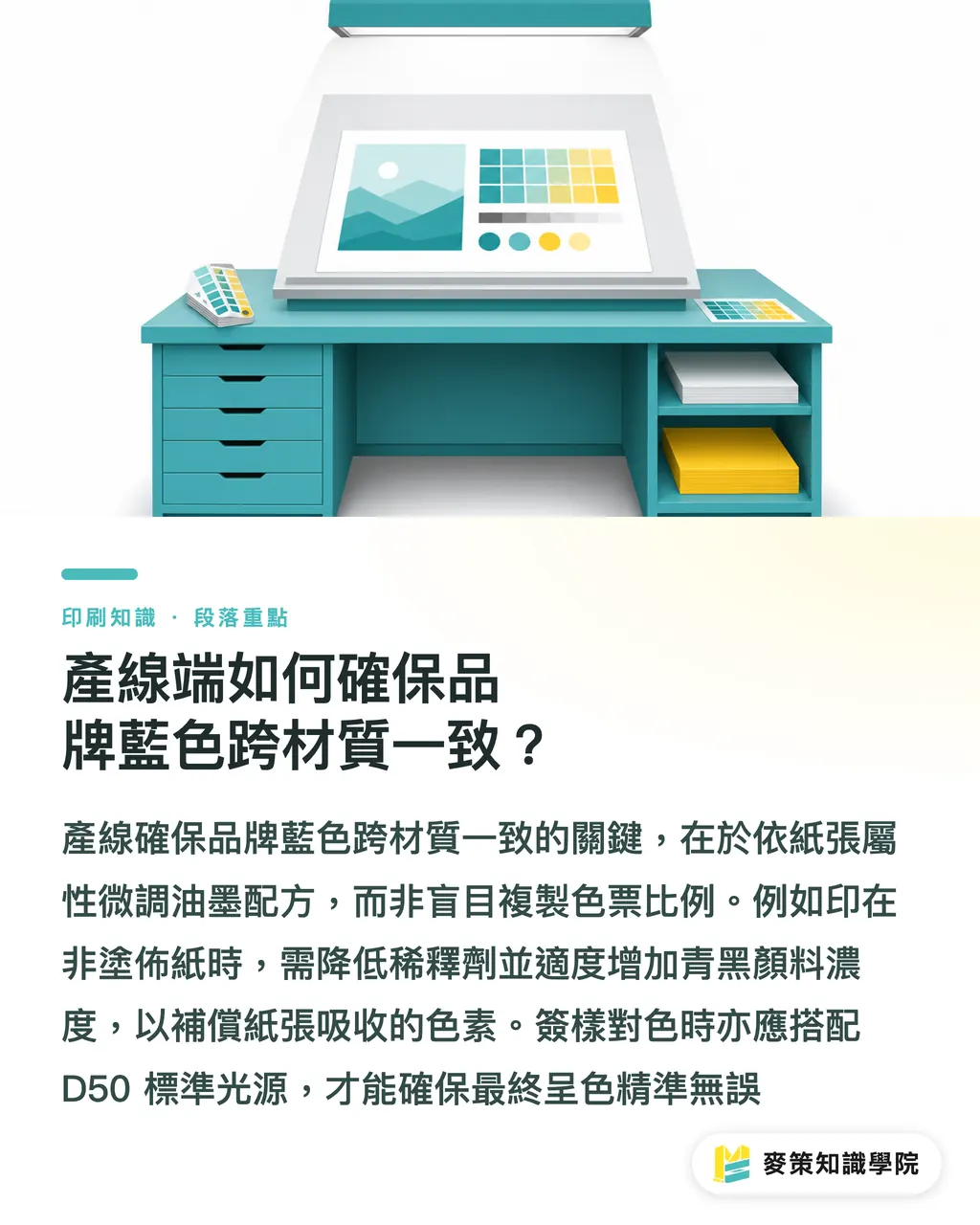
When handling Pantone 294C, the ink-mixing operator must fine-tune the base ink formula according to paper characteristics, instead of simply copying the formula ratio from the swatch guide
When printing on coated paper, keeping press impression and ink-water balance at standard values is enough to reach the target DENSITY (reflection density). But when printing on uncoated paper, the ratios of transparent white and thinner in the ink must be reduced. The concentration of cyan (Transparent Cyan) and black pigments should be raised moderately to compensate for the pigment absorbed by the paper
To track print quality over the long term and learn the latest color-management techniques, subscribe to the Mai Strategy Knowledge Academy newsletter for practical guides. During color matching, always compare under a standard 5000K (D50) viewing light. Traditional fluorescent tubes contain too much blue-violet light, which seriously interferes with objective judgment of whether a deep blue has shifted toward purple
Do not rush to print. Before signing off on the proof, confirm the lighting and the paper properties. That is enough
Key Takeaways
・Use the C card for coated paper and the U card for uncoated paper. Never use the same color standard to match across paper stocks
・CMYK simulation of Pantone 294C is highly prone to turning purple or gray. Important brand colors should be printed with a dedicated spot-color plate
・Uncoated paper absorbs more than 20% more ink than coated paper, so cyan pigment concentration needs to be increased moderately during ink mixing
・Follow the Mai Strategy Three Print-Submission Gates to control quality layer by layer, from swatches to paper ICC to physical proofs
・Color approval must be done under a standard D50 5000K light source to prevent ambient light from causing color-matching errors
Further Thinking
For designers and print professionals, color management is never limited to screens and file export. As AI-assisted design tools become widespread, visual image generation has become extremely fast, but the physical limits of manufacturing still exist. Future print SaaS and color-communication systems must include paper-fiber diffusion rates and the optical physics of ink in their automatic prediction models, helping designers accurately preview how Pantone 294C will really appear on woodfree paper and coated paper directly in the software, reducing wasted proofs and communication costs
FAQ
- Can Pantone 294C be converted directly to CMYK for printing?
- It can be converted to CMYK, but because Pantone 294C sits near the edge of the color gamut, CMYK simulation is highly prone to turning purple or dirty gray. If the brand requires high color accuracy, printing with a dedicated spot-color plate is recommended
- Why does Pantone 294C look much duller on woodfree paper than on gloss coated paper?
- Woodfree paper has no surface coating, so plant fibers quickly absorb the ink, making the ink film thinner and scattering reflected light. On gloss coated paper, the ink film stays on the coating surface, so reflected light is concentrated and saturation is higher
- If a designer used Pantone 294C in the file, does the file need to be changed for uncoated-paper printing?
- The swatch label in the file can remain Pantone 294C, but the designer must bring out the Pantone 294U swatch and confirm the actual color effect on uncoated paper with the client to avoid approval disputes
Related articles
The Print × AI weekly
The print and AI know-how designers, brands and enterprises can use before they commit — one email, every week
Tool Library
RGB↔CMYK conversion, ΔE color difference and brand color print analysis — free color management tools, computed right in your browser.
MINDS Group
Need actual printing or gifting services?
From premium printing to online ordering and festive gifts — the MINDS Group sister brands take it from here.