
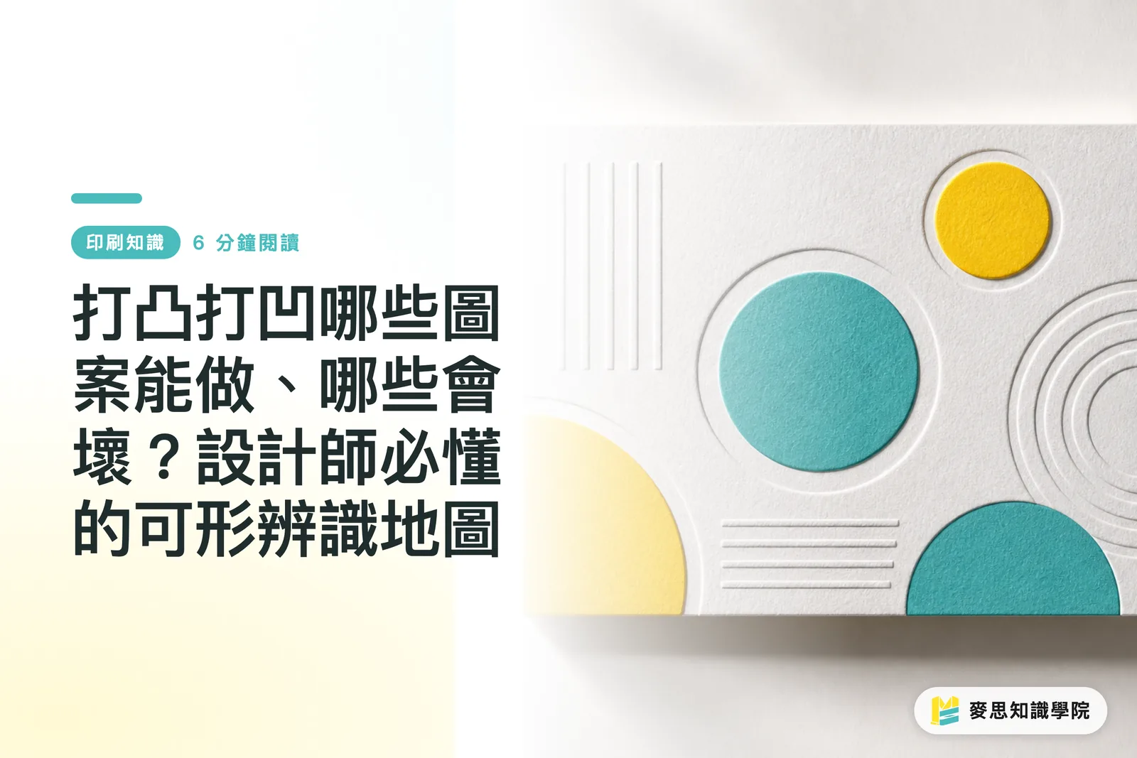
Why Does It Look Amazing on Screen But Disappear After Pressing?
Many designers hit approve after looking at their screens, only to receive physical proofs where the 3D effect is barely visible, text blurs together, paper edges tear, or the pattern becomes a muddy mess. This is rarely the factory cutting corners. More often, the design itself hit the physical limitations of tactile embossing
Embossing and debossing work by clamping paper between male and female metal dies under heavy pressure. Paper fibers compress or stretch to create a tactile 3D effect. This mechanical action imposes three natural requirements on paper: fibers must be long enough to endure stretching, sheet thickness must handle the indentation, and artwork details need a minimum width to support the die. Blind embossing uses no ink or foil, relying purely on light, shadow, and touch. It is popular on business cards, invitations, and premium book covers. Because it demands perfect paper quality and precision embossing at the same time, its failure rate is higher than combination foil embossing
When figuring out whether a design will emboss cleanly, ask three questions right from the start: can the paper handle it, are the lines wide enough, and is the depth setting reasonable?
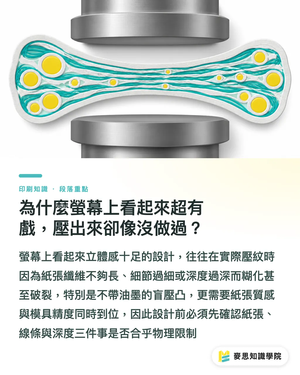
Pick the Wrong Paper, and No Die Can Save It
Paper carries the embossed impression, and it is where things go wrong first. In my experience, specialty papers with long fibers and high basis weight give the best results. Thin coated paper and heavily coated stocks almost always crack under pressure or spring right back
The underlying principle is straightforward: thicker paper with longer fibers provides more room for deep impression and resists snapping during stretch. Conversely, coated paper has a surface coating that snaps open as soon as the core paper moves. Thin paper simply lacks the depth needed for an impression
Common paper selection traps in practice:
・Coated paper and light coated paper (80-120g): Edges tear as embossing height increases, bounce-back is severe, and 3D depth fails to show up
・Fine art paper, cotton paper, long-fiber paper (over 200g with textured surfaces): Embossing delivers rich 3D depth, low bounce-back, and solid detail retention
・Kraft paper and uncoated eco paper: It depends on thickness, though short-fiber sheets still split at the edges under high pressure
Do not pick paper based solely on color and texture. Treat your chosen embossing stock as a primary technical specification. Reviewing paper samples and embossing test sheets with the factory before printing saves far more trouble than reworking design files later
Which Patterns Work and Which Will Fail? Line Weight, Font Size, and Geometric Limits
This is what designers want to know most. Here is a practical reference list of manufacturing limits gathered from years on the production floor:
・Fine lines: Line weight recommended ≥ 0.5mm. Below this threshold, die edges dull during etching, turning the impression into a blurry smear
・Text: Base font size recommended ≥ 8-10pt. Chinese fonts with thin strokes (such as Mingti or Light Sans) should go up one size. Tiny text under 5pt ends up as nothing more than a faint blob
・Raster and halftones: Virtually impossible. Tactile embossing requires clear boundaries between solid shapes and negative space. Gradients and halftone dots collapse into messy blotches
・Ultra-thin knockouts: More sensitive than positive lines. Because female dies leave only a narrow slit, pressure concentrates on sharp edges, making paper split even faster
・Sharp corners and pointed tips: Stress concentrates where two lines meet at less than 90°, leading to torn edges or chipped dies. Round off corners or scale up the shape instead
・Large solid areas: Not impossible, but costs scale with surface area and die depth must be redesigned, driving quotes significantly higher
・Full-coverage fine halftones (like a 30% halftone): Totally unworkable. Pressing them yields wrinkled paper without any clean 3D definition
Regarding bevel depth, a dimension that often gets overlooked: high relief (depth over 1mm) packs a strong visual punch, but long die-engraving times make tooling costs nearly double shallow embossing. Shallow embossing ( 0.3–0.6mm) delivers great results at budget-friendly rates, which is plenty for most business cards and covers
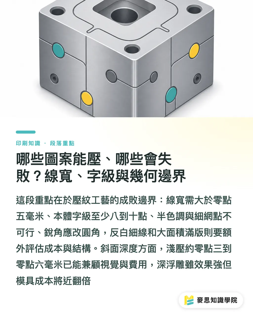
Get the Finishing Order Backward, and Earlier Work Is Wasted
Post-press processes like foil stamping, printing, embossing, and debossing do not happen in isolation. Getting the sequence wrong means damaging the results of earlier steps
The standard sequence on the production line is:
・Foil stamping then embossing: Embossing over transferred foil requires precise registration. Excessive pressure causes fine hairline cracks in the foil
・Printing then embossing: Ink layers rub against the die under heavy pressure, which can shift or peel color. Always wait until ink dries completely before embossing
・Embossing then spot UV: Works fine, though UV lamp distance and paper thickness affect how 3D depth appears visually
・Blind embossing with no additional finishing: Demands the highest registration accuracy, requiring flat paper free of stress marks left by earlier steps
Tooling Cost Structure and Final File Specs
Tooling is a key variable affecting quotes and finished quality, with two common options:
・Zinc plates (etched zinc): Lower cost, press life around 50,000 to 100,000 impressions, average detail precision, commonly used for low to medium runs
・Copper plates (engraved brass): High hardness, crisp detail, press life exceeding 500,000 impressions, but unit cost is 1.5 to 2 times that of zinc
・Large-area high relief: Requires carving a master plaster mold first before casting zinc or copper dies, adding extra tooling fees
Actual quotes step up based on surface area and relief height. Check with your factory for exact pricing. The guidelines here give a sense of relative cost rather than fixed market rates
The two places where file delivery specs go wrong most often:
・Dedicated spot color plate: Mark the embossed area using a separate spot color (like PANTONE 871C gold or solid black) so plate makers identify it instantly
・Bleed and safety margin: Keep embossed areas at least 3-5mm away from paper edges and trim lines. Otherwise, cutting blades slice through the raised pattern, leaving broken visuals
When getting electronic prepress files, if the embossed area overlaps with the printed area, ask your designer to save a dedicated embossing file that contains only the raised elements. This saves prepress operators the most registration time
How to Decide if a Design Is Worth Tooling?
When evaluating embossing or debossing for a client, I ask three questions:
・Who is the visual lead? If embossing plays the lead, go with blind embossing or a simple foil background. If it plays a supporting role, shrink the area and pair it with shallow embossing
・Can the paper handle it? If the chosen sheet cannot support the impression, change papers before discussing embossing. Reversing this order wastes effort
・Where does the budget sit? Shallow embossing for business cards (low unit cost, quick tooling turnaround) versus high relief for packaging (high unit cost, long tooling lead time) offer completely different returns on investment
Answering these three questions clearly eliminates over 80% of rejection risks upfront

Key Takeaways
・Before embossing or debossing, use line weight 0.5mm and font size 8-10pt as your baseline. Thinner strokes tear edges or blur
・Paper is your primary technical spec. Coated and light coated papers are ill-suited for tactile embossing, while fine art and long-fiber papers carry the workload
・Embossing depth directly impacts tooling fees. Shallow embossing ( 0.3–0.6mm) is enough for most business cards and covers, while high relief is a budget upgrade option
・Place embossing as the final step in the finishing chain so pressure does not ruin earlier printing or foil stamping
・Always deliver final files with a dedicated spot color plate for embossed areas, and leave a 3-5mm safety margin
Further Reflections
Looking at collaboration between production lines and design teams, the biggest failures in post-press projects rarely come from poor aesthetics. They stem from a lack of dialogue between design and manufacturing. Internalizing formability boundaries into a pre-press self-check workflow (covering paper suitability, line weight, font size, layer order, and tooling budgets) filters out most rejection risks early on. That saves reprinting costs, time, and mutual trust. For mid- to high-end bespoke commercial projects, such as brand books, invitation suites, or limited packaging, consulting a team with practical post-press experience before final file lock is far safer than evaluating mockups on screen
Further Reading
・No external links; this guide compiles practical production line experience and general manufacturing rules
FAQ
- What is the difference between embossing and debossing, and when should I pick each one?
- Embossing pushes artwork outward, relying on light, shadow, and touch to read. Debossing presses artwork inward, creating a low-key, carved feel. Embossing grabs visual attention and works well for brand logos or main cover art, while subtle debossing suits hardcover book spines and background accent patterns
- Does embossing always require foil stamping or printing?
- Not necessarily. Blind embossing skips ink and foil entirely, relying solely on paper texture, light, and shadow for a higher-end look. However, it demands better paper quality and higher die precision, raising failure rates
- Can coated paper be embossed?
- It is not recommended in practice. Coated paper has a surface coating and a thin core, so embossing easily causes cracked edges, peeling coatings, and weak 3D depth. Switch to fine art paper, long-fiber paper, or cotton paper over 200g instead
- What are the minimum line weight and font size for embossing?
- Line weight should be ≥ 0.5mm, and text size should be ≥ 8-10pt, while delicate Chinese fonts need to go up one size. Fine lines blur and small fonts flatten into raised dots, making this a common reason for job rejections
- Can foil stamping and embossing be done together, and what is the proper sequence?
- Yes. The standard sequence is foil stamping or printing first, followed by embossing as the last step. Placing embossing at the end prevents heavy pressure from cracking the foil or ink layer. Confirm registration tolerances with your factory beforehand
Related articles




The Print × AI weekly
The print and AI know-how designers, brands and enterprises can use before they commit — one email, every week
MINDS Free Tools
Imposition calculator and preflight file check — free prepress tools, right in your browser.
MINDS Group
Need actual printing or gifting services?
From premium printing to online ordering and festive gifts — the MINDS Group sister brands take it from here.