

Why Do Images That Look Great on Screen Turn Out Dull and Muddy in Print?
Screen-emitted color and paper-reflected color work on fundamentally different physical media, so missing color conversion controls leads to severe color shifts
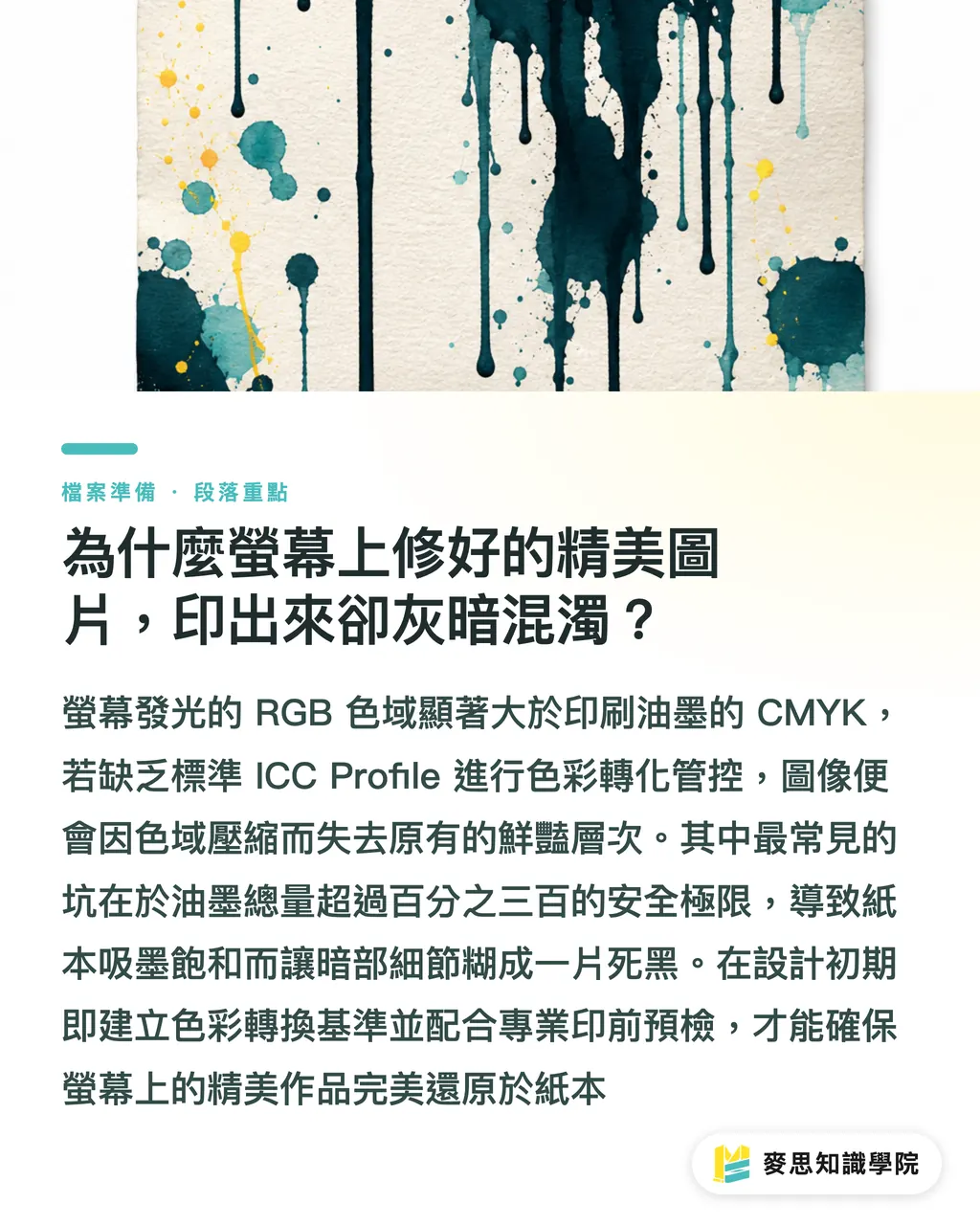
Designing on screen in RGB allows for bright, saturated light and shadow, but press CMYK ink spaces are noticeably smaller than RGB. Without applying a standard ICC Profile early in retouching and passing the prepress color checks of MINDS (MS, mid-to-high-end fully custom commercial printing), files sent to the printer often lose tonal depth due to excess ink coverage or harsh color compression
An ICC Profile is a standardized digital file that defines the color gamut and conversion rules for a monitor or printing press, keeping color delivery consistent and precise across devices
I've seen it far too often on the production line: designers spend hours fine-tuning fashion-magazine shadow details on their display, only for the final print to turn into a flat, muddy black. This usually happens when Total Area Coverage (TAC) exceeds the 300% safe limit, causing the paper to oversaturate with ink. Under ISO 12647-2 international standards, coated paper (like coated art paper) should keep ink limit between 300% and 320%. To avoid this trap, get prepress color tech support directly from MINDS and establish color conversion standards during design
How Do You Handle Non-Destructive Retouching and Skin Tone Correction in Affinity?
Using Affinity Photo's Live Adjustment Layers and HSL curves lets you adjust skin tones and fine-tune tonal gradations precisely without destroying original pixel data
Editorial portraits demand intense color precision, especially since Asian skin tones are sensitive to CMYK ink ratios. When retouching skin tones and editorial imagery in Affinity, keep these core steps in mind:
・Use a non-destructive workflow: Apply Live Adjustments over the original image so you can tweak values anytime without overwriting source pixels
・Correct skin tone ink ratios: Check CMYK values on the Info Panel. Standard East Asian skin tones work best when Yellow (Y) stays roughly 10% to 15% higher than Magenta (M), while Cyan (C) remains below one-quarter of Yellow
・Set up spot colors cleanly: If your layout includes metallic or Pantone spot inks, assign objects to dedicated spot channels in Affinity and enable Overprint
・Check resolution and bleed: Keep image resolution at 300 dpi and extend a 3mm bleed around the document edge to stop white borders after trimming
That's where the trick is
These little details are where prepress runs into trouble most often. Every time I spot tiny text set in rich 4-color black on the press floor, my spine tingles a bit, because even a hair of misregistration leaves rainbow ghosting along letter edges
How Do You Set Up Proper CMYK Conversion and Soft Proofing in Affinity?
Proper CMYK conversion relies on Affinity's Soft Proofing feature to simulate how specific paper stocks and ISO-standard Profiles display color
Soft proofing isn't just toggling color modes in the app. Algorithms calculate contrast loss and color shifts after the paper absorbs ink
Soft Proofing uses ICC Profiles on a calibrated monitor to simulate printed results on target paper, letting designers preview color shifts without pulling physical proofs
When running soft proofing and CMYK conversions in Affinity, follow this order:
・Load target print profiles: Import ISO 12647-2 compliant profiles, such as FOGRA51 for coated papers or Coated FOGRA39 for offset print
・Add a Soft Proof adjustment layer: Create a Soft Proof layer at the very top of your layer stack, choose your profile, and turn on Black Point Compensation
・Compare rendering intents: Switch between Perceptual and Relative Colorimetric modes. Perceptual preserves continuous gradients in photos, while Relative Colorimetric keeps brand colors precise
・Check ink coverage warnings: Turn on total ink warnings, then use curve layers to reduce Cyan or Magenta ink in shadow areas exceeding 300% TAC
If you aren't sure which profile fits your chosen paper stock, check in with the Mai Strategy Knowledge Academy consulting team or your prepress specialist to finalize profile parameters before exporting a standard PDF. It saves the most cost when sending files out
What Checklist Should Designers Complete Before Handing Off Files for Print?
Designers need to run a full prepress audit using a checklist before file handoff, verifying vectors, images, and color specs
This cuts down back-and-forth revisions with the print shop straight away
This part is key
Run through this sign-off standard as your final line of defense before sending files:
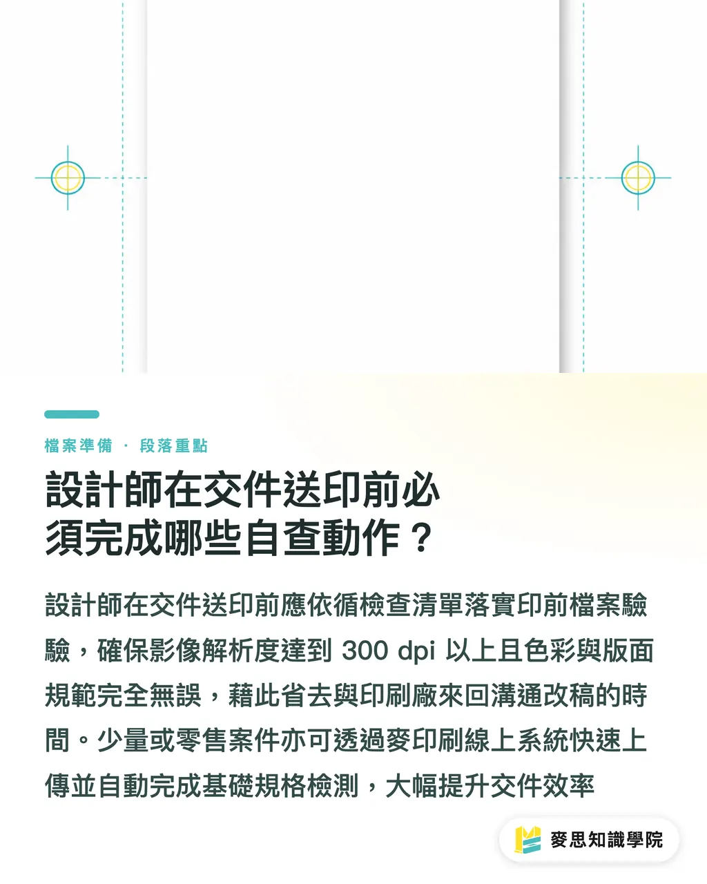
・Resolution check: All images meet or exceed 300 dpi, with no scaling distortion or raster pixelation
・Bleed and safe margins: Include a 3mm bleed around layout borders, keeping text and key elements at least 3mm clear of trim lines
・Fonts and line weights: Convert vector fonts to outlines, and keep thin line weights at 0.25 pt or thicker
・K100% black text setup: Set small text and thin lines strictly to 100% Black (K100%) with Overprint enabled. Never use 4-color rich black
・Color space and profiles: Convert files from RGB to your target CMYK space, ensuring spot color (Pantone) counts match finishing specs
For short runs or retail projects, upload files through MINDS's online system for automated spec checks, cutting turnaround times significantly
Key Takeaways
・Preview color shifts with soft proofing: Load standard ICC Profiles in Affinity for screen soft proofing to preview printed paper colors accurately before output
・Keep Yellow higher than Magenta for skin: When tweaking East Asian skin tones, keeping Yellow (Y) 10% to 15% above Magenta (M) yields the best balance
・Cap shadow TAC ink limits: Keep Total Area Coverage within the 300% TAC safe ceiling to prevent paper oversaturation and distortion
・Use pure black and overprint: Set thin text and vector lines to K100% with Overprint enabled to stop registration ghosting
Further Thoughts
Evolving design tools give designers greater creative freedom, but physical print realities never change. In my years consulting on prepress, I've seen many creators invest endless hours into stunning retouching, only to fail at the finish line because of an incorrect profile or ink overload. Print quality isn't luck; it rests on standardized prepress control workflows. I recommend design teams confirm profile standards and paper traits with print shops right at project kick-off, bringing color management into retouching early to unlock the real power of digital tools
Further Reading
FAQ
- Why does switching directly to CMYK in Affinity make colors look muddy?
- Converting RGB to CMYK shrinks the gamut. Without an ICC Profile and proper intent modes (like Perceptual or Relative Colorimetric), the app applies hard compression that muddies colors and distorts tone
- What should you do if you aren't sure how to set up the printer's ICC Profile before submission?
- Ask the printer which standard Profile they use (such as ISO Coated v2 or FOGRA51), or reach out to [MINDS](https://www.mindscmyk.com/) to get the right prepress color settings
- What happens if text is printed in 4-color black (100% of C, M, Y, and K)?
- Four-color black pushes total ink to 400%, leading to heavy ink set-off on paper. On top of that, minor press misregistration creates rainbow ghosting along fine lettering
- Can Soft Proofing in Affinity completely replace physical proofing?
- Soft proofing catches 90% of color and tone issues, but for specialty paper textures, surface finishes, or Pantone spot colors, physical digital proofs remain essential
Related articles


The Print × AI weekly
The print and AI know-how designers, brands and enterprises can use before they commit — one email, every week
Tool Library
RGB↔CMYK conversion, ΔE color difference and brand color print analysis — free color management tools, computed right in your browser.
MINDS Group
Need actual printing or gifting services?
From premium printing to online ordering and festive gifts — the MINDS Group sister brands take it from here.