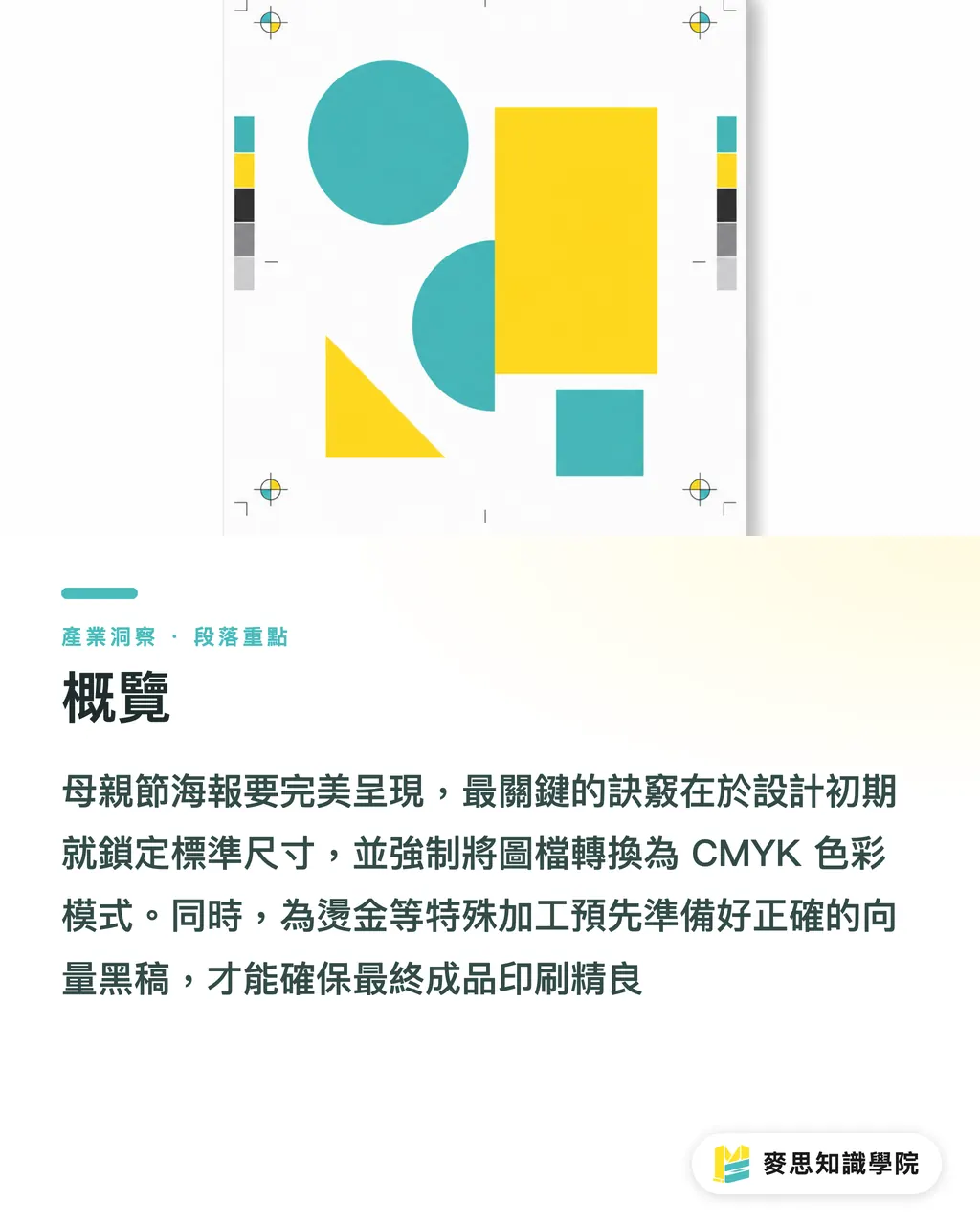
Overview
To ensure a perfect Mother's Day poster, the fastest solution is to lock in standard dimensions during the early design phase, force images into CMYK color mode, and prepare accurate vector black-plates for post-processing like gold foil stamping
How to Choose the Perfect Mother's Day Poster Size?
I often see clients creating files that are excessively large or small, only to find the proportions are wrong once they reach the factory
In practice, you must first decide where the poster will be displayed, as this directly dictates your canvas size
・Store windows and main visual walls: I strongly recommend A2 (420x594mm), the golden ratio for maximum visual impact in physical stores
・Indoor bulletin boards and columns: If space is limited, A3 (297x420mm) is a versatile choice that balances size and visibility
・Key finalization parameters: Regardless of the size chosen, make sure to set the resolution to 300dpi and reserve a 3mm bleed on all sides to avoid white edges caused by cutting errors
Why Do AI-Generated Prints Always Have Color Shifts?
In the past six months, my desk has been piled with AI-generated drafts from clients—stunning on screen, but disappointing in print
The core issue lies in the fundamental difference in color structure; AI tools produce files in the light-emitting RGB color space, while printing presses use CMYK inks
・Convert modes early: Don't wait until the last minute to switch; you should toggle to CMYK preview within your software during the early design stages to pull back fluorescent and high-saturation warm colors that exceed the printable gamut
・Watch shadow details: AI tends to generate over-saturated shadows. These areas have too much ink during printing, resulting in a muddy "dead black" blob; remember to manually brighten the shadow layers
・Brand color calibration: If the poster features corporate standard colors that absolutely cannot shift, don't leave it to chance—request a digital proof from the manufacturer for confirmation
Which Paper Best Fits a Warm Festive Feel?
Paper is the carrier of visuals; choosing the wrong material will significantly degrade the texture of a well-designed image
Mother's Day campaigns usually aim for warmth, elegance, or a premium feel; the ink absorption of the material directly affects the atmosphere
・For a warm tactile feel: Choose uncoated fine art paper (such as Linen or Ivory paper). These papers absorb ink, creating a steady matte finish—perfect for soft watercolor or illustration styles
・For sharp and vivid results: If you're using real photos or high-contrast 3D visuals, choose coated or matte-coated paper over 150g to faithfully reproduce the sharpness and saturation of the image
・Grammage recommendations: Posters need a certain level of stiffness. Generally, it's recommended that paper thickness falls between 120g and 150g. Too thin leads to waviness; too thick makes it hard to roll and paste
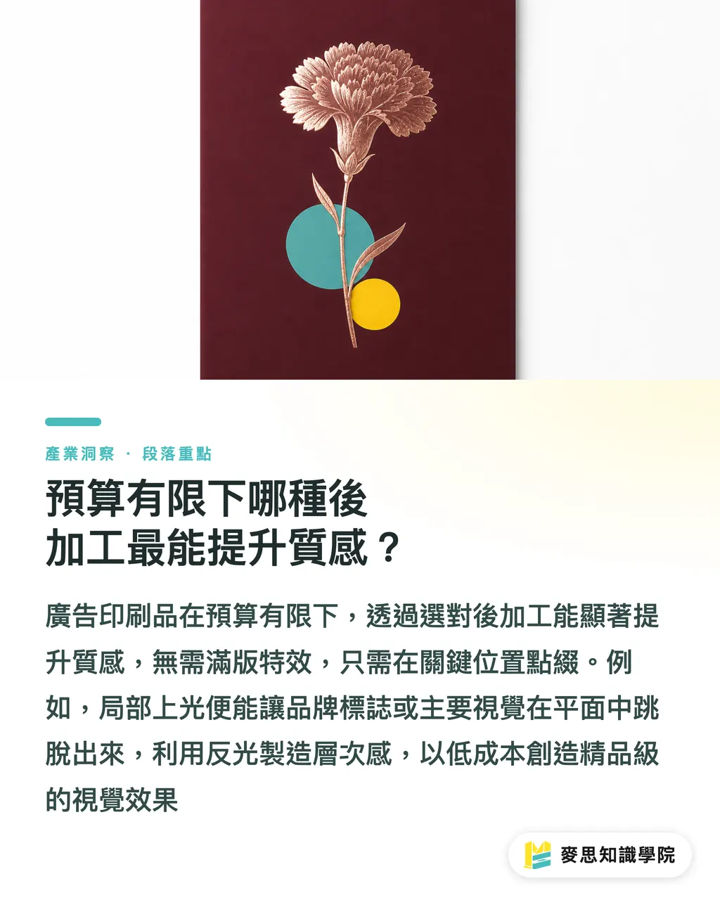
Which Post-Processing Best Enhances Texture on a Limited Budget?
To grab attention within a second, besides color, appropriate post-processing is undoubtedly the key contributor
You don't need to spend a fortune on full effects; just adding accents in key locations can upgrade a poster from flat to premium
・Spot UV: Overlaying a transparent glossy layer on the brand logo or main visual flowers uses reflections to create depth. It's low-cost but makes key points pop
・Rose Gold Stamping: Mother's Day is perfect for rose gold or matte gold foil, instantly elevating the sense of luxury
・The Pitfall of Special Effect Finalization: To outsource these effects, you can't just provide one image; you must create an additional vector layer in pure black (K100) to clearly indicate where the effect should be applied
Key Takeaways
・A2 and A3 are the most practical, zero-waste standard poster sizes. Always set 300dpi with a full 3mm bleed
・AI-generated RGB files must be converted to CMYK before production, with extra checks to ensure shadows don't turn into a muddy dead black
・Warm illustration styles prefer tactile fine art paper, while realistic photography relies on coated materials to support color vividness
・Gold foil and Spot UV effectively focus visual attention, but require an extra K100 vector black-plate for the printer
Further Reflections
Design and printing should never be two disconnected stages
Looking at recent clients and projects, those who understand how to consider paper characteristics and post-processing limitations while sketching are the ones who deliver truly impactful work
Finding a printing factory that understands design language and provides a full service from proofing to delivery can save you countless hidden costs of back-and-forth communication. Let MINDS Printing be the stable backbone for realizing your creativity
FAQ
- What is the most common size for Mother's Day posters?
- For general physical store displays, A2 (420x594mm) is most recommended. If the indoor space is smaller or for bulletin board use, A3 (297x420mm) is suggested
- Why do the colors of the posters I made with Midjourney look so dark when printed?
- AI tools default to the light-emitting RGB color space, while printing uses CMYK inks. Vivid colors outside the printing gamut will automatically be downgraded and darkened during conversion. It is recommended to convert and fine-tune brightness when finalizing the file
- How should I prepare files if I want Spot UV or gold foil stamping?
- In addition to the original design, you must provide an extra vector layer in pure black (K100) to accurately mark the positions and shapes where the special effects should be applied
- What format should I use to send poster design files to the printing factory?
- The industry standard is to provide a PDF with all text converted to outlines, ensuring all embedded images have a resolution of at least 300dpi