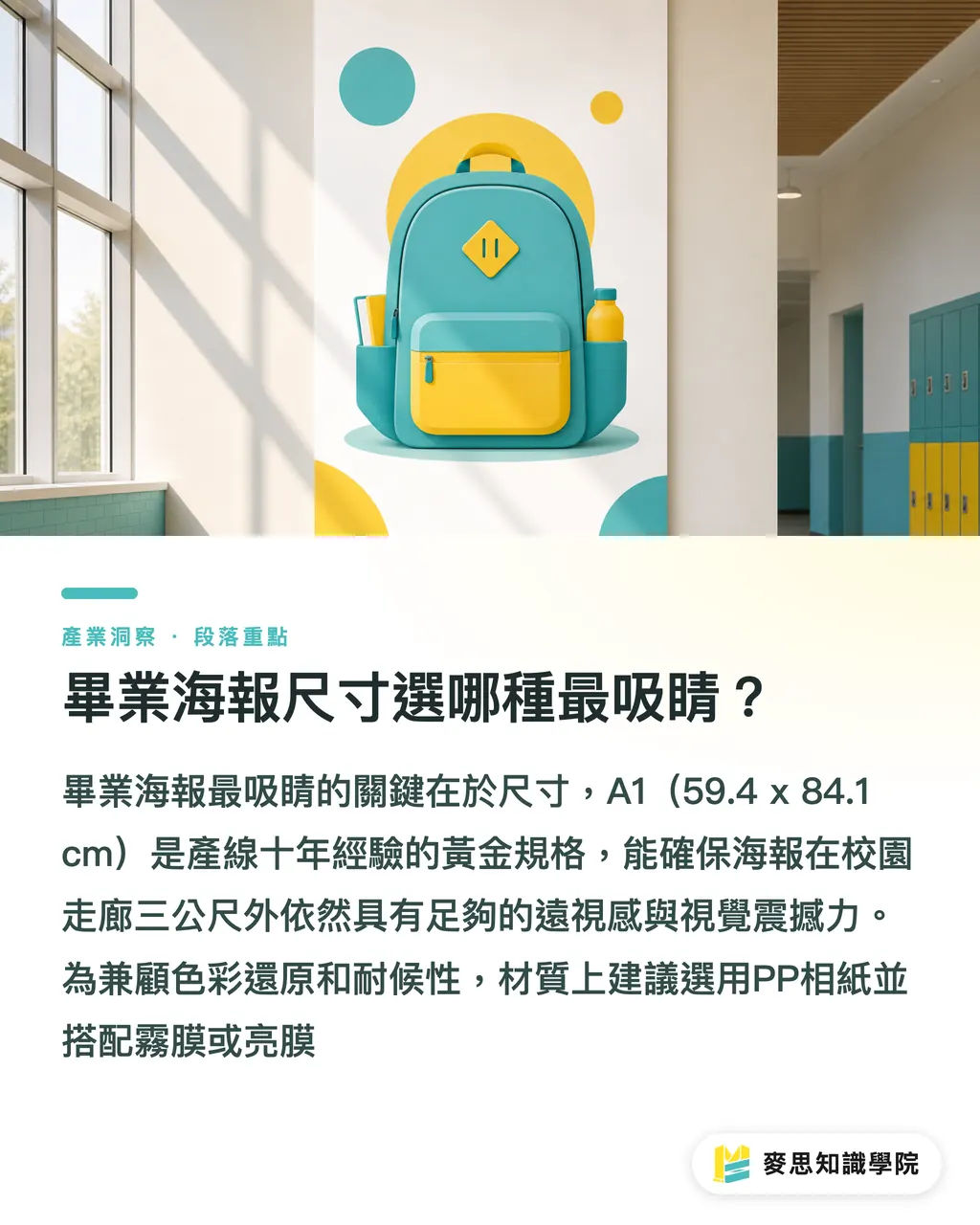
Which graduation poster size is the most eye-catching?
Every graduation season, campus hallways are filled with posters, but I've found the most common issue isn't poor design, but choosing the wrong specifications, which undermines visual impact. Based on my decade of production-line observation, the golden standard for graduation posters is the A1 size (:
・59.4 x
・84.1 cm). This size provides sufficient 'long-distance visibility' in hallways or large auditoriums, ensuring the main subject can be clearly identified from three meters away
・A1 size:
・59.4 x
・84.1 cm, balancing visual impact with ease of display
・A2 size: 42 x 59.4 cm, suitable for smaller spaces like bulletin boards or classroom doors
・Material recommendation: Use PP photo paper with matte or glossy lamination. This synthetic material offers excellent color reproduction, tear resistance, and basic waterproofing, preventing curling even when hung in semi-outdoor spaces
Why emphasize 'visual hierarchy' in layout design?
Many teachers and students try to make every class photo the same size during layout, resulting in a design without a focal point that looks more like a crowded newspaper than a poster. In the cases I've handled, successful graduation posters usually follow the '3-second principle,' ensuring passersby can grasp the key information within 3 seconds
・Title priority: Use strong font contrast (e.g., bold sans-serif paired with light serif) to highlight the 'Nth Graduation Ceremony' or theme name, with a font height occupying at least 1/6 of the poster's total height
・White space and breathing room: Always reserve at least 3-5 cm of space around the edges, ensuring important text or faces aren't too close to the borders. This isn't just for aesthetics; it prevents elements from being obscured during subsequent mounting or taping
・Image layers: For the main visual, I recommend using a representative campus scene or a large group photo as the background. Other photos can be arranged irregularly or framed with geometric shapes to add dynamic movement
How to avoid color shifts and blurriness before printing?
This is the most common trap designers fall into: a design that looks vibrant on screen but turns out dark and murky when printed. This happens because screens use RGB, while printers use CMYK four-color process. As a consultant, I always advise clients to force their color mode settings the very second they open their design software
・Color mode: The file must be set to CMYK. If you print directly from an RGB file, the fluorescent tones on your screen will become dull due to color gamut exceeding, especially with the blue skies and green landscapes common in graduation posters, which are most prone to color casting
・Resolution settings: Ensure your resolution reaches 300 DPI when saving files. Many campus photos scraped from the web are only 72 DPI; they might look fine when shrunk down, but will appear noticeably pixelated when enlarged to A1
・Final check: Text must be converted to outlines (Create Outlines) to prevent garbled characters or skipped text due to missing fonts at the printing facility. Also, set black text to 100% black (K100) and avoid using a 'rich black' with high total ink coverage, which can cause registration or backing issues
How can AI tools accelerate graduation poster creative brainstorming?
In the past year, I've seen more designers incorporating AI tools to optimize their preliminary workflows. AI isn't meant to replace human design, but to act as a tireless creative assistant
・Style exploration: Use AI to generate background illustrations in various styles (e.g., hand-drawn, collage, or 3D-modeled) to quickly determine a design direction
・Image optimization: For old photos with insufficient resolution, use AI Upscaling technology to improve image detail—this is particularly useful when handling photos of old campus buildings or early daily life shots
・Layout reference: AI can generate dozens of layout sketches based on a 'graduation poster' theme, allowing designers to select the most suitable proportions for refinement, saving hours of brainstorming from scratch

Summary
・Choose A1 size with laminated PP photo paper for graduation posters; it is waterproof, durable, and eye-catching from a distance
・Setting the color mode to CMYK and ensuring an image resolution of 300 DPI are the technical cornerstones to avoiding color shifts and blurriness
・Visual layout should follow the 3-second principle; title font size should take up 1/6 of the poster ratio to reinforce key information
・Before finalizing, always check that text has been converted to outlines and leave a 3-5 cm margin to avoid cutting off critical content during trimming
・Leverage AI tools for image enhancement and style exploration to significantly shorten the production cycle from concept to final print
Further Reflections
For the printing industry, a graduation poster isn't just an output; it's a carrier of emotion. Future opportunities for SaaS platforms lie in integrating 'standard die-cut templates' with 'AI automated layout.' By using standardized templates to resolve anxiety regarding sizing and bleed, combined with AI for quick resolution adjustment and color management. For designers, the focus should be on how to tell the graduates' story well, while leaving the tedious resolution checks and color conversion to automated tools. As technical barriers lower, the value of print media will return to its purest essence: creativity and commemorative significance
Further Reading
・How to design elementary school graduation posters? A complete guide to size, material, and prepress safety
・Mother's Day poster design and printing: A guide to sizes, colors, and special effect precautions
・How to choose a business card design template? Practical starting points to avoid prepress traps
・Designer Essentials: How AI tools accelerate the printing design process?
FAQ
- What size is most recommended for graduation posters?
- The A1 size (59.4 x 84.1 cm) is highly recommended. This specification achieves the best balance between visual impact and ease of posting, making it suitable for most campus spaces
- Why does the printed poster color look so dark?
- This is usually because the file used the RGB color mode. Printing requires CMYK color reproduction; it is recommended to convert the color mode to CMYK early in the design phase and avoid using excessively high total four-color black values
- What if the poster is hung in a semi-outdoor area and I'm worried about rain or fading?
- I recommend choosing PP photo paper with a lamination finish (cold mounting). PP material possesses synthetic paper properties that are waterproof and tear-resistant, and lamination significantly slows down the fading caused by UV exposure
- Can I print a poster if the photo resolution isn't high enough?
- If the resolution is below 150 DPI, printing an A1 poster will result in noticeable blurriness. It is recommended to use AI image enlargement tools to improve quality, or present lower-resolution photos by scaling them down and incorporating them into a collage, avoiding forced enlargement
Related articles
- How to Design a Primary School Graduation Poster? A Comprehensive Guide to Sizes, Materials, and Print-Ready Best Practices
- Ultimate Guide to Mother's Day Poster Design and Printing: Size, Color, and Special Effects Troubleshooting
- Lunch Box Design and Printing: A Complete Guide to Food Safety, Oil Resistance, and Branding