

Overview
The proper flyer design workflow goes: 1. Goal and main message, 2. Information hierarchy, 3. Layout structure, 4. Color and imagery, 5. Call to action, and 6. Prepress checks. The core idea behind the MINDS (mid-to-high-end custom commercial printing) 6-step flyer framework is simple: make it understandable first, make people want to take action second, and make sure the file can actually be printed third
I have seen too many flyers fail, not because designers lack layout skills, but because clients cram event details, brand intros, selling points, QR codes, maps, and phone numbers onto a single A5 page right from the start. When every word is shouting, readers end up remembering nothing
What Should You Think About First in Flyer Design?
The first step in flyer design is not opening Illustrator or looking for templates. It is writing down 1 main purpose, 1 primary audience, and 1 core action. The MINDS 6-step flyer framework starts with these three questions because without a clear purpose, whatever layout follows is just pretty chaos
・Main purpose: New product launch, store traffic, trade show handouts, course enrollment, or promotional discount. Pick just 1 primary theme
・Primary audience: Passersby, existing members, corporate buyers, parents, or designers. Different audiences require completely different text densities
・Core action: Scan a QR Code, redeem in-store, make a call, add on LINE, or fill out a form. A flyer works best when driving just 1 main CTA
A4 size is 210 × 297 mm, ideal for content-heavy needs like service lists, event agendas, or product comparisons. A5 size is 148 × 210 mm, perfect for street handouts, counter displays, and single-event promos. Size is not just about aesthetics, it dictates how many seconds a reader is willing to stop
In my experience, never expect readers to sit through 8 paragraphs on an A5 flyer. People who get handed a flyer on the street usually scan just 3 areas: the headline, the image, and the offer or action button. If those three spots fall flat, printing more copies will not save it
If you are unsure where to start, the consulting team at Mai Strategy Knowledge Academy usually helps you clarify who reads it, what they see, and what they do before deciding between A: ・4, A ・5, double-sided, or folded. That is far more reliable than jumping straight into a template
How to Structure Layout Without Making It Messy?
Flyer layouts use visual hierarchy to guide attention. A common order is headline, core benefit, supporting points, event info, and CTA. The MINDS 6-step flyer framework organizes these 5 layers before setting font sizes, margins, and image proportions
・Headline: State clearly what readers get in under 12 words, like 'Grand Opening Special: Buy 1 Coffee Get 1 Free'
・Core benefit: Add conditions in 1 sentence, like 'Valid weekdays before 2 PM throughout July'
・Supporting points: Include up to 3 key details, such as items, location, and expiration date
・Event info: Address, dates, phone, and social handles. Keep it complete without stealing focus from the headline
・CTA: QR Code, button-style text, or redemption steps, placed where the reader's eyes land last
A flyer is not a newspaper. You cannot slice the page into 6 equal-weight blocks, because equal weight means zero focus. In practice, I suggest giving the key visual or message at least 30% of the layout so readers catch the point instantly
White space must be designed too. Keep safe margins of at least 3 mm around the edges, keeping important text away from trim lines. For full-bleed backgrounds or photos, set 3 mm bleed. That is standard practice across printing factories in Taiwan
QR Codes cause trouble most often. Never shrink a QR Code down to look like a tiny graphic. On the printed piece, keep it at least 15 × 15 mm with quiet margins around it, or ink absorption, matte lamination, spot UV, and trimming offsets will hurt scan rates

How to Choose Flyer Colors That Fit the Brand and Print Well?
Flyer colors should be divided into brand color, functional color, and background color. The MINDS 6-step flyer framework typically caps the main color at 1, secondary colors at 1 to 2, and uses a contrasting color for the CTA. Too many colors instantly make a flyer look cheap
・Brand color: Maintains identity consistency, such as a restaurant's signature shade or an education brand's primary color
・Functional color: Used to separate offers, dates, prices, or steps
・Background color: Provides contrast for text without sacrificing readability for atmosphere
・CTA color: Serves the call to action exclusively, such as 'Book Now' or 'Scan to Get Coupon'
Print files require a CMYK mindset. Electric neon green, bright blue, or vibrant pink on screen often turn dull or muddy on paper. That is not the printer cutting corners, it is just the physical difference between screen light and ink layering
Check image resolution early. 300 dpi is the standard baseline for printing. A 72 dpi web image might look fine on a phone screen, but scaling it to a full A4 page often ends up blurry, especially on product shots, portraits, and fine line art
Paper stock shifts color character. Coated paper renders vivid colors and sharp details, making it great for promos, food, and product flyers. Woodfree paper offers a plain touch with low glare, fitting courses, forms, and instructional guides. Fine art paper brings texture, but dark background fills and fine text need extra caution
For mid-to-high-end brands, exhibition catalogs, or commercial flyers calling for specialty paper, MINDS can assist with stock, color, and post-press evaluations. Printing the exact same artwork on 100 gsm coated paper versus 220 gsm fine art paper delivers a completely different brand perception
How to Write Calls to Action That Get People to Scan or Visit?
A flyer CTA must be specific enough that readers know what to do next. The MINDS 6-step flyer framework formats CTAs as 'Action + Benefit + Condition', like 'Scan to get a $50 coupon', 'Show this flyer for 50% off your second cup', or 'Book a free consultation before July 31'
・Action: Scan, join, book, show, visit, or fill out
・Benefit: Discount, trial, spot reservation, freebie, consultation, or signup
・Condition: Date, store location, specific item, time slot, or quantity limit
'Inquiries Welcome' is usually too weak because readers do not know what they gain by reaching out. 'Scan to See Menu' is not strong enough either, unless the menu itself is the main draw. A CTA must spell out the value exchange to give readers a reason to pull out their phones
The CTA block should feel like a clear entry point. Place it in the bottom right, bottom center, or where the visual path ends, using button color blocks, arrows, or short phrasing to catch attention. On an A5 flyer, keeping CTA text between 8 and 14 words keeps it punchy
Always state the purpose next to a QR Code. A standalone black-and-white code gives readers no clue where scanning leads, driving down scan rates. Phrases like 'Scan for Coupon', 'Scan to Book', or 'Scan for Portfolio' work far better than just labeling it 'QR Code'
What File Details Should You Check Before Sending to Print?
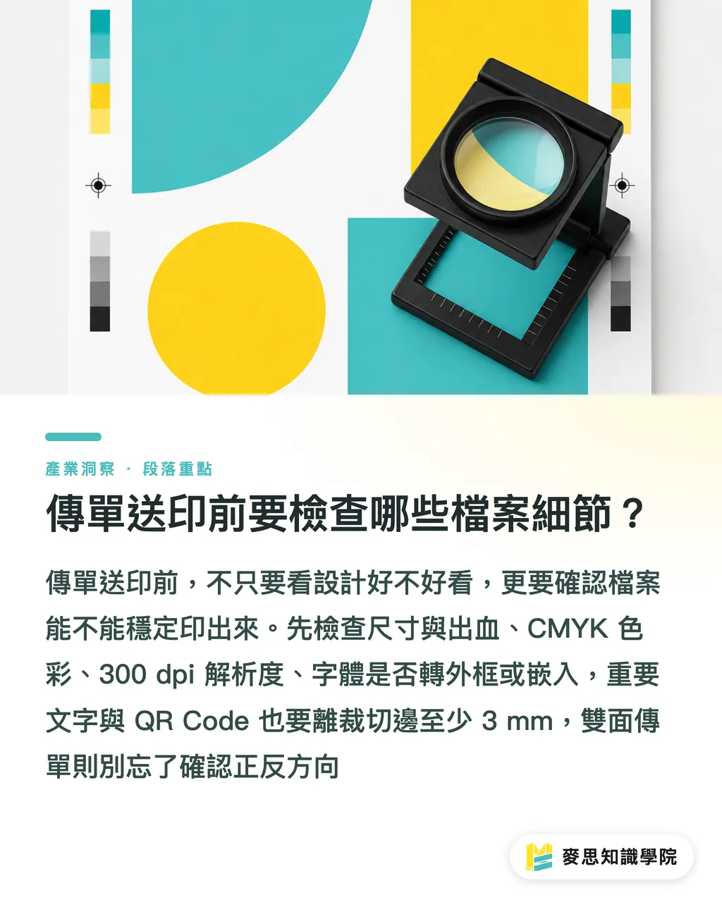
Before sending a flyer to print, check dimensions, bleed, colors, resolution, fonts, black settings, fold lines, and safe trim margins. The prepress review at MINDS condenses into 3 checkpoints: 1. Specifications, 2. Visual layout, and 3. Output file
・Specifications check: Confirm A4, A5, or custom sizes, marking finished dimensions and bleed dimensions separately
・Visual layout check: Keep critical text at least 3 mm from trim edges, verifying QR codes, phone numbers, dates, and addresses word for word
・Output file check: Ensure images are 300 dpi, color mode is CMYK, and fonts are outlined or embedded. Reopen exported PDFs to double-check
Pay attention to black settings. Small black text is cleanest set to K100. Large black background fills can use rich black based on printer recommendations, but avoid pushing total ink coverage too high. Heavy ink buildup on dark backgrounds causes drying issues, set-off, and dirty cut edges
Double-sided flyers require checking front-to-back orientation, especially for horizontal A5 layouts, coupons, and ticket-style flyers. A front layout might look fine, but if the back prints upside down, the entire batch becomes an awkward mistake. Catching this takes 30 seconds, but reprinting hurts everyone
In the end, flyer design is not about asking 'does it look good?' It comes down to 3 things: can readers understand it in 3 seconds, is the reason to scan or visit strong enough, and can the print shop output the file reliably? When those three pass, the flyer is truly finished
Key Takeaways
・A flyer is not an information dump, it is a tool to deliver 1 primary message straight into the reader's line of sight
・Establish information weight before arguing over aesthetics, otherwise even beauty loses focus
・Colors should serve brand identity and call to action. Do not treat color palettes like display cases
・Spell out action, benefit, and condition in your CTA so readers understand why they should scan right now
・Prepress checks for 3 mm bleed, CMYK, 300 dpi, and QR codes directly determine whether the finished prints work
Further Thinking
For print manufacturers, specifying size, paper stock, color, and finishing early makes quoting and scheduling much more reliable. For designers, AI helps brainstorm headlines, organize copy variants, and generate layout drafts, but final files still come down to print specs, reading flow, and client goals. For SaaS teams, the highest-value feature is not offering 100 extra templates, but turning purpose, sizing, CTA, bleed, and file checks into guided workflows that keep users from making costly reprinting mistakes
FAQ
- Do flyers have to be designed in A4?
- Not necessarily. A4 suits content-heavy layouts needing tables or full event details. A5 works better for street handouts, store counters, and single-offer promos. Decide the reading context before choosing a size
- How much bleed should be added to a flyer design?
- Standard printing practice in Taiwan calls for 3 mm bleed. Full-page images or background colors must extend past the bleed line, while essential text should stay at least 3 mm away from trim edges to prevent miscuts from clipping content
- How do you write an effective flyer CTA?
- Structure flyer CTAs as 'Action + Benefit + Condition'. For instance, 'Scan to get a $50 coupon' is far clearer than 'Inquiries Welcome' because readers know the next step and what they gain
- What image resolution is required for printing flyers?
- 300 dpi is the standard baseline for print. Low-resolution web images blur when blown up to A4 or A5, so product shots, portraits, and fine line art need original dimension checks first
- What files should be delivered to the printer once flyer design is complete?
- Supply a print-ready PDF and verify dimensions, bleed, CMYK color, image resolution, and outlined or embedded fonts. If special paper stock, folding, die-cutting, or post-press finishing is required, state it clearly in the file name or production notes
Related articles


The Print × AI weekly
The print and AI know-how designers, brands and enterprises can use before they commit — one email, every week
MINDS Free Tools
Imposition calculator and preflight file check — free prepress tools, right in your browser.
MINDS Group
Need actual printing or gifting services?
From premium printing to online ordering and festive gifts — the MINDS Group sister brands take it from here.