
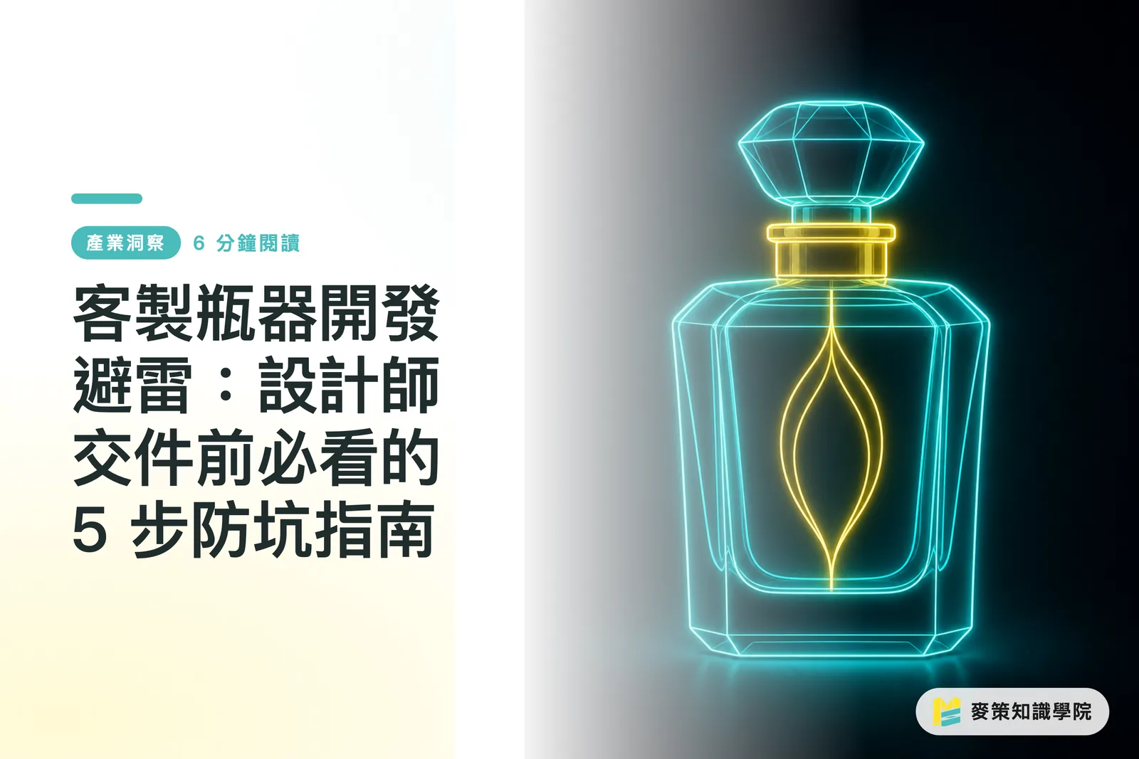
Why Do Custom Bottle Projects by Emerging Brands Often Get Delayed or Scrapped?
The root cause is a lack of early integration among shape design, label materials, and mass production supply chains
I recently saw a fragrance brand on Reddit looking for a custom perfume bottle designer, which reminded me of several new brand projects I worked on recently
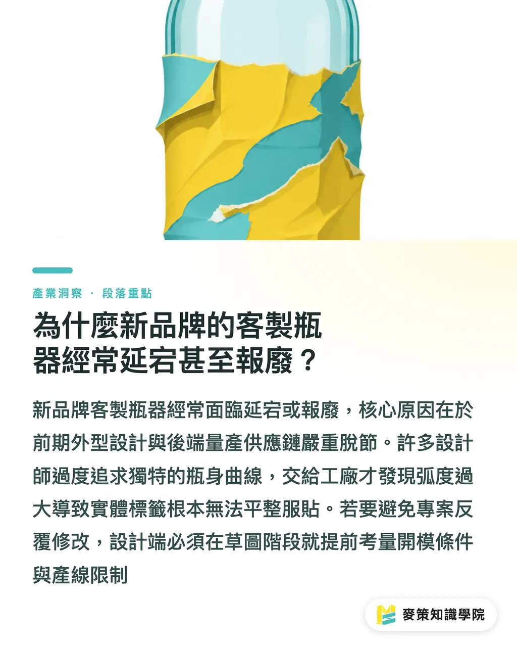
Many designers focus entirely on 3D bottle shapes and aesthetics, spending hours sculpting unique curves while overlooking basic tooling requirements, finishing limits, and label flatness
Once those polished 3D renderings reach the factory, they realize the compound curves make it impossible for labels to sit flat, or standard off-the-shelf caps cannot seal the custom neck finish
Failing to define the packaging system early is almost always the main culprit behind project delays and endless revisions
Look at the custom Heinz cap case study. An easy-to-squeeze, leak-proof cap requires precise dimension tuning and material choices
From squeeze feel to suck-back valves, material and physical constraints must enter the conversation during the sketching phase. It is never just about changing a shape. Designers need to understand logistics and production line realities early on
Mai Strategy's Three Pre-Press Gates: How to Build a Pre-Production Checklist
Building a checklist means covering container spec cross-checks, material and printing method verification, and transit protection testing
To keep artwork from falling apart in mass production, I usually ask design and procurement teams to run through the three pre-press gates recommended by the Mai Strategy Knowledge Academy consulting team before issuing orders
This framework catches overlooked physical limits early, aligning artwork directly with real production lines
1. Gate 1: Verify physical dimensions and tolerances. Request physical samples or accurate 2D engineering drawings directly from your supplier instead of relying on absolute proportions in 3D software. Real-world shrinkage and tolerances often eat up your safety margins
2. Gate 2: Evaluate post-press finishing and material compatibility. Check whether alcohol in the perfume will dissolve label adhesives, or if hot stamping foil will peel due to static on the bottle surface. You cannot spot these chemical reactions on a screen
3. Gate 3: Run transit and packaging system tests. Pack bottles into final e-commerce shipping cartons to verify dimensions, test lightweighting goals, and ensure transit vibrations will not cause glass bottles to collide and shatter
How Should You Set Pre-Press Specs for Labels and Direct Bottle Printing?
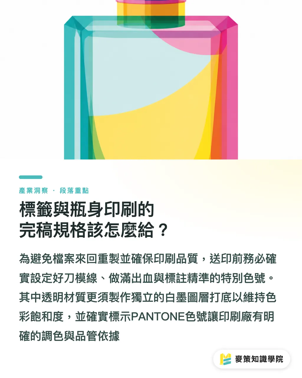
Specifications must include clear dielines, bleed settings, a dedicated white ink layer, and exact spot color codes
The biggest headache for production artists is sending files that fail factory requirements, triggering endless back-and-forth file re-exports
To keep finished colors accurate and alignment on point, run through these file checks before final handoff
1. Dielines and bleed: Bleed (the safety margin extending beyond the trim line, typically set to 3mm to prevent white edges from cutting shifts) must be fully extended. Set dielines on a dedicated spot color swatch with Overprint enabled so background artwork does not get knocked out
2. White ink and embossing: Clear stickers and direct bottle printing require a separate White Ink underbase layer. Without it, process inks on transparent substrates turn translucent, losing color saturation and looking muddy
3. Color standards: Never trust what you see on an illuminated monitor. Clearly specify PANTONE color codes or request proofs referenced against FOGRA data (the German Graphic Technology Research Association responsible for strict international print color standards and PSO certification)
This gives mid-to-high-end fully custom commercial printers like MINDS clear benchmarks for ink mixing and quality control, keeping color variance to a minimum
How Can Independent Brands and Designers Avoid Supply Chain Blind Spots?
The best approach is bringing designers, packaging suppliers, and printers into the same conversation early, sharing physical mockups with everyone
From my years on production floors and client meetings, custom projects go wrong when everyone works in silos
The glass container vendor does not know your label substrate, and the printer does not know whether the label goes on a complex curve or a flat surface
I strongly recommend printing a 1:1 paper label on a desktop printer, cutting it out with scissors, and sticking it onto your sample bottle before ordering production proofs
You will instantly spot severe wrinkling on compound curves or distorted barcodes that cannot be scanned
Different printing and finishing methods carry distinct physical limitations, so weigh your budget against visual expectations before placing orders
・Screen printing: Great for direct printing on glass bottles, offering saturated, scratch-resistant, and durable color. The downside is that each color needs its own screen, driving up setup costs, and it cannot handle subtle gradients
・Digital label printing: Plate-free prototyping keeps costs low, making it ideal for short runs and variety. The catch is that curved applications can easily bubble or lift at the edges without the right flexible adhesive
・Hot foil stamping: Delivers high-gloss metallic sheen and a luxury look. The drawback is that large stamped areas tend to trap air bubbles, requiring extra attention to foil adhesion and substrate bonding
Factoring in these real-world use cases and physical constraints is what turns your concepts into production-ready designs instead of screen-only mockups
How Do Lightweighting and Recycled Materials Impact Printing?
When switching to recycled plastics or lightweight packaging, you have to retest ink adhesion and structural rigidity
Industry signals over the past few years point to one clear trend: packaging systems are being redefined
When a client asks to swap acrylic bottles for recycled or modified polymers, designers cannot treat it as just a simple material change
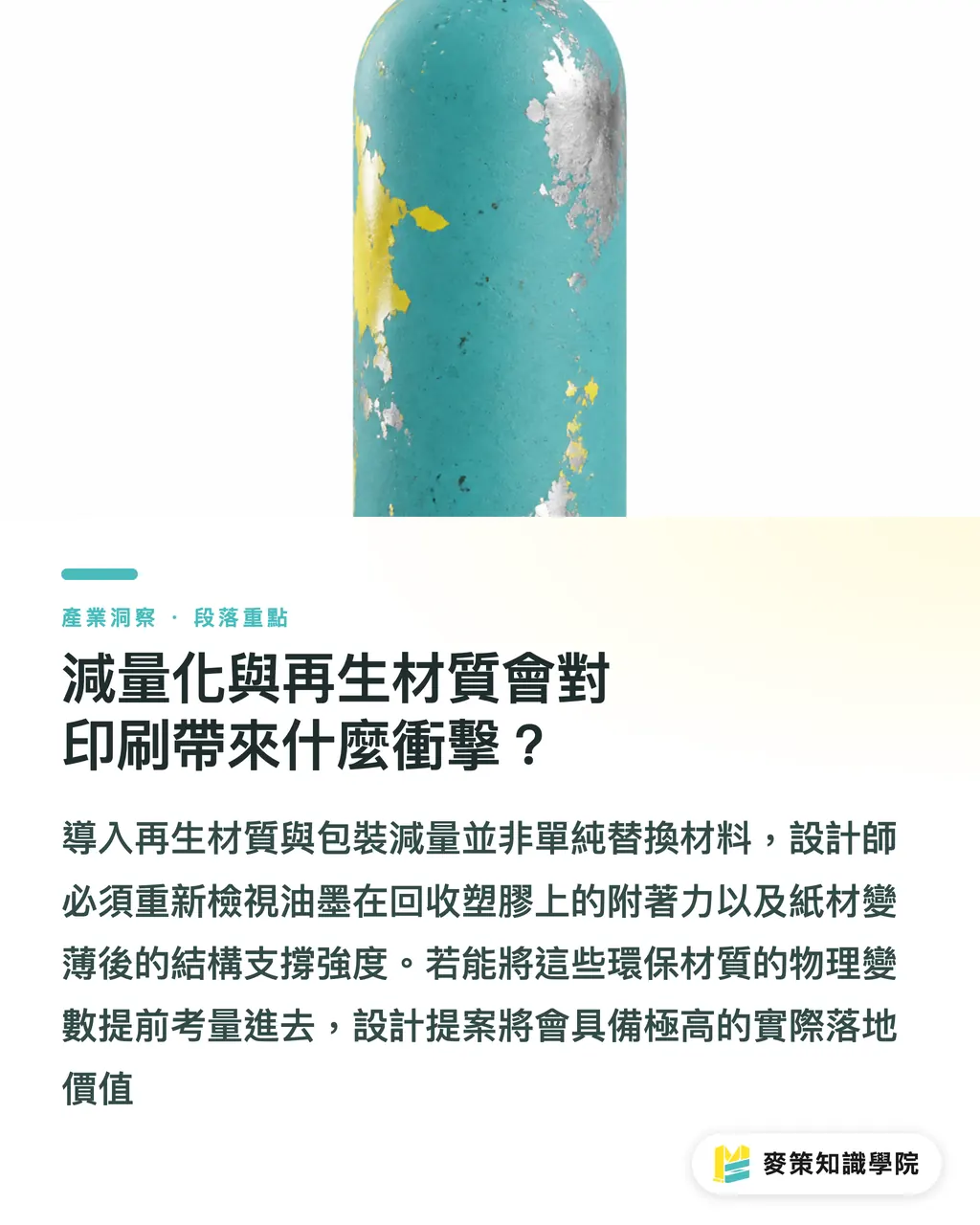
PCR (post-consumer recycled) plastics have different surface energy than virgin resins. Inks and foils that clung tightly before might scratch off easily on recycled surfaces
Under lightweighting pushes, lower paperboard basis weights mean thinner cushioning, which puts more load-bearing demands on the bottle itself
If you pick reusable lightweight glass bottles, you must also check whether label adhesives wash off cleanly during recycling without leaving stubborn residue
Factoring in these sustainable material variables ahead of time gives your design proposals immediate credibility with brands
Key Takeaways
Early structural design must be planned in sync with downstream labeling and tooling constraints
Verify bleed, white ink layers, and dieline overprint settings before pre-press handoff to avoid tedious file rework
Cutting out a 1:1 paper label and pasting it onto a physical sample is the fastest way to catch curved distortions and dimensional errors
Further Thoughts
As packaging systems grow more complex, designers cannot stop at visual aesthetics. Stepping into materials and logistics early is essential. When integrating automated layout and generative AI tools in the future, these physical tolerances and material properties must be baked into system rules to generate designs that can actually be manufactured
Further Reading
FAQ
- Why do colors look muddy on clear stickers?
- Without a dedicated white ink underbase layer, CMYK inks turn translucent on clear substrates, losing their original saturation
- Why do dielines need to be set as spot colors with overprint enabled?
- This allows RIP systems to recognize and separate dielines, preventing cut lines from being printed onto the final product
- What should you do if perfume bottle labels keep lifting or peeling?
- Test adhesive compatibility with the container and cap surface during prototyping, paying close attention to whether evaporating alcohol from the fragrance weakens the glue bond
Related articles
The Print × AI weekly
The print and AI know-how designers, brands and enterprises can use before they commit — one email, every week
MINDS Free Tools
Imposition calculator and preflight file check — free prepress tools, right in your browser.
MINDS Group
Need actual printing or gifting services?
From premium printing to online ordering and festive gifts — the MINDS Group sister brands take it from here.