
Why Has Beverage Packaging Become a Sales Interface?
Beverage packaging has become a sales interface because the decision in front of the shelf is compressed into a few seconds. The front of the bottle has to explain ingredients, credibility, and the next point of interaction all at once
Packaging Digest, a packaging industry publication under Informa Markets, placed mocktails, home delivery, reusable packaging, protein drinks, Internet of Things (IoT), QR code, and sustainability in the same roundup, mid-2026 beverage packaging trends, published on August 7, 2026. In the end, all of these things crowd onto the same label, so prepress has to set the reading order first
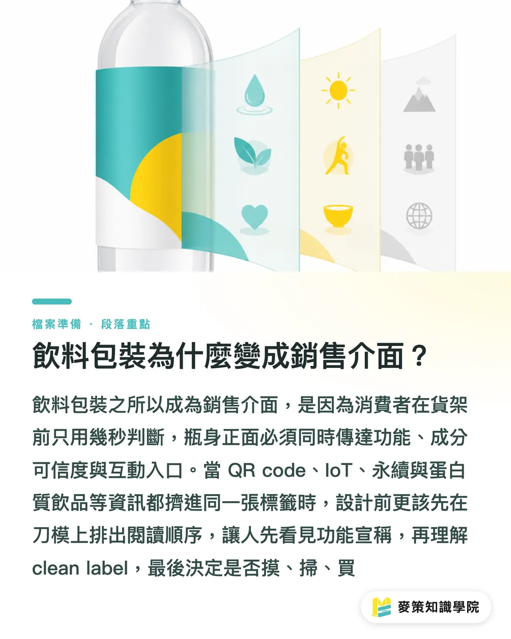
I divide the front of a beverage package into three layers: the first glance catches the functional claim, the second understands the clean label, and the third decides whether to touch, scan, or buy
Slow down first
Mark those three layers on the dieline before choosing typefaces. That helps more
How Large Should Functional Claims Be Without Making the Layout Messy?
Functional claims need to be large enough for the main promise and credibility cues to be recognized at a glance. Protein grams, flavor, sugar-free, and organic should not all speak at the same volume
The data cited by Packaging Digest says 42% of consumers see protein as the most important ingredient. The same article mentions Protean Tea labeling 15 grams protein and Protein Pop labeling 22 grams protein. That is where the pressure on layout hierarchy comes from
I recommend that designers use Mai Strategy's three print-handoff gates to handle functional claims:
・1. Keep only one main claim, for example protein, zero sugar, or organic, and let that be the front-panel lead
・2. Place supporting claims in the same sightline, so nutrition, clean label, and flavor do not fight for space separately
・3. Keep regulatory and nutrition text in the information area. At handoff, provide both editable text and outlined versions
Whether the finished piece feels orderly is often decided right here
What Is the Difference Between Clean Label and Minimalist Design?
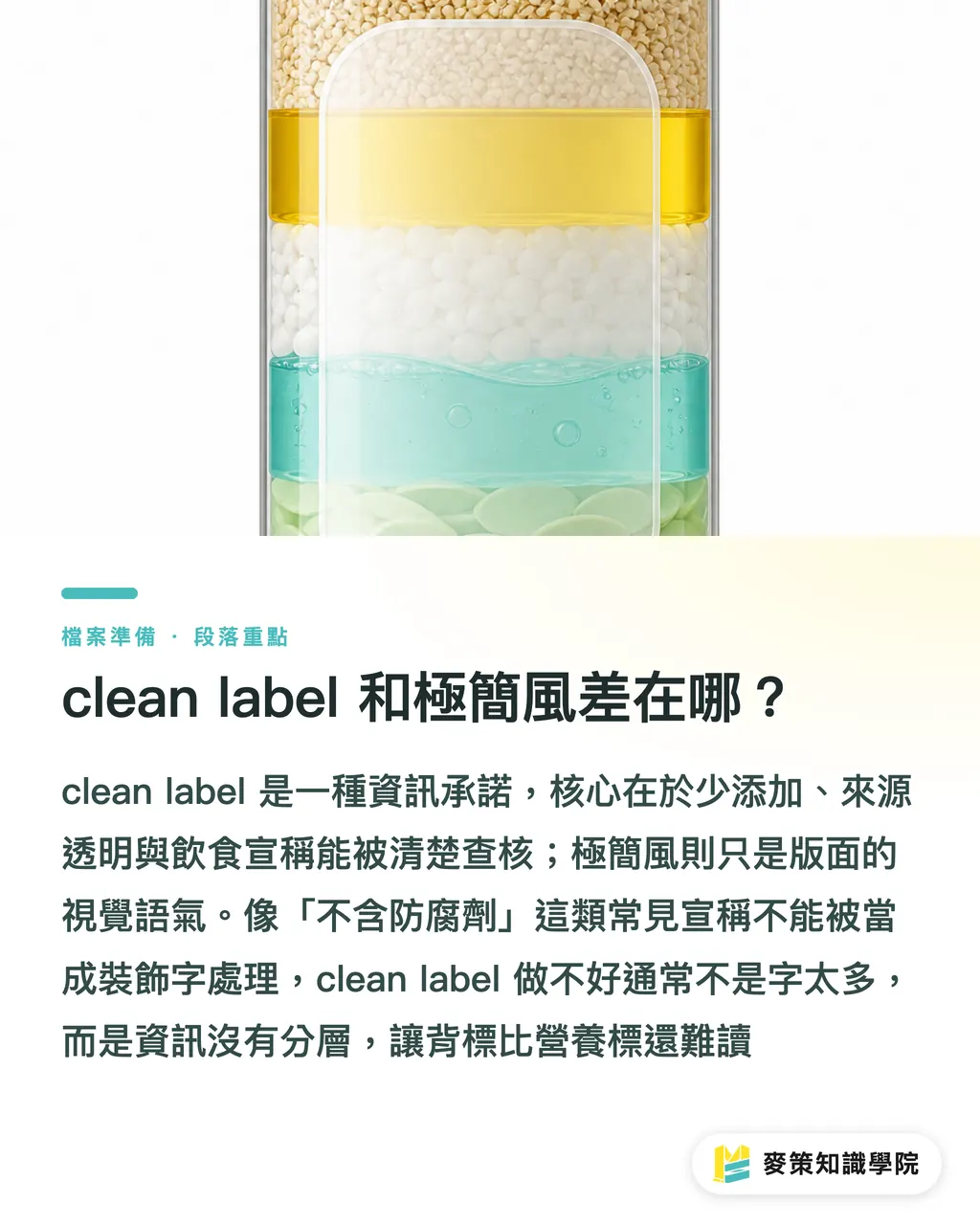
The difference between clean label and minimalist design is this: clean label is an information promise. Minimalist design is only a visual tone
clean label means turning fewer additives, transparent sourcing, allergy information, and dietary claims into verifiable text. It does not mean making the layout white, empty, and quiet
Packaging Digest notes that nearly 30% of new food and beverage products over the past year carried clean label claims, with no preservatives as a major claim. When designers handle terms like all natural, organic, non-GMO, and gluten-free, they cannot treat them as decorative type
The kind of final label file I worry about most is one where the front looks clean, but the back label is packed so tightly it is harder to read than the nutrition panel
clean label usually fails because the type has no hierarchy. Word count is only the second problem
How Should Tactile Materials Be Locked Before Final Artwork?
Tactile materials need to be decided before final artwork because embossing, foil stamping, spot varnish, and bottle curvature can change readability, registration, and scan results
premium packaging refers to packaging that uses materials, structure, finishing, and hand feel to make consumers perceive higher product value
Packaging Digest cites research from Clemson University, a U.S. public university that studies packaging and consumer interaction, and Cig: after touching premium packaging 2 times, consumers' purchase likelihood rose by 50%; after 4 touches, it could reach 90%; in comparison testing, it was chosen 3 times as often as non-premium packaging
On the print side, tactility has to be treated as a technical parameter:
・Embossing: keep it away from small text, barcodes, and variable-data areas
・Foil stamping: test curved-surface reflection first, so QR code contrast is not weakened
・Spot varnish: confirm the visual focal point. Do not spread tactile finishing into background noise
For small high-end trial runs of protein drinks, tea beverages, or mocktails, I would suggest using MINDS for material and finishing proofs, so hand feel, color difference, and scan testing can be checked together
How Should QR code Be Designed Together With Print?
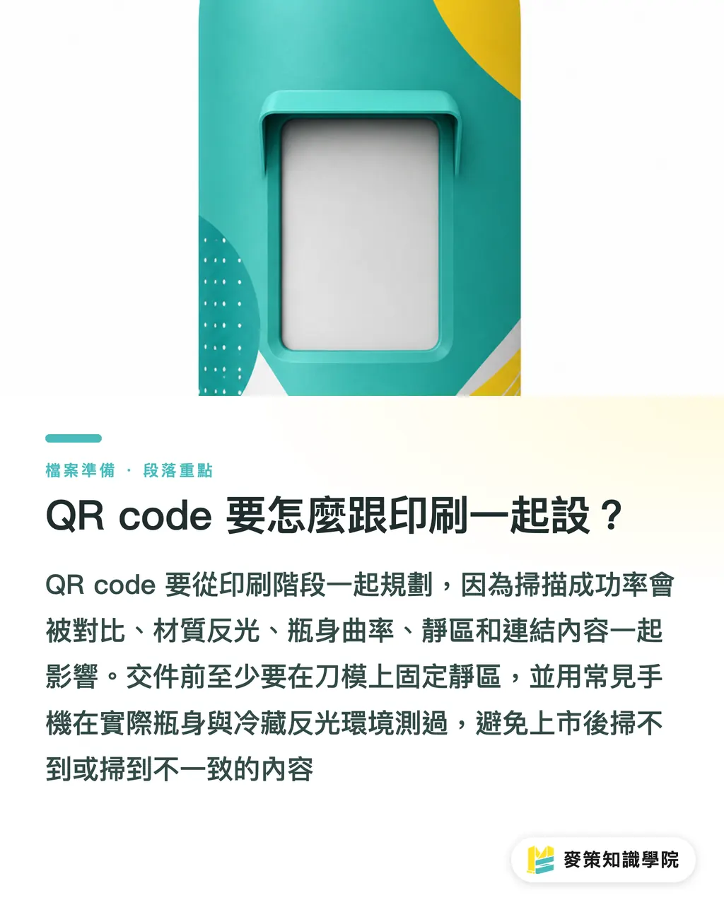
QR code needs to be designed together with print because scan success depends on contrast, material reflection, bottle curvature, quiet zone, and linked content at the same time
QR code, short for Quick Response code, is a two-dimensional barcode that phones can scan. In design, it needs recognition contrast, quiet zone, placement, and print tolerance
smart packaging means packaging that connects formula, story, membership, and freshness information beyond the bottle through QR code, NFC (Near Field Communication), AR (Augmented Reality), or sensors
Packaging Digest mentions that sensing technology can monitor temperature, humidity, and gas composition. My view on QR code is very direct: once a QR code goes live, it carries the feel of a contract. The content it opens cannot clash with the front-panel claim
Before handoff, run this self-check:
・1. Fix the QR code quiet zone on the dieline, keeping patterns, gradients, and foil stamping out of the recognition area
・2. Include the test link, short URL owner, and expiration strategy at handoff, so the package does not scan to a blank page after launch
・3. During proofing, test with common phones, an upright bottle, and refrigerated reflective conditions
If a test-market label puts cost and speed first, standard paper stock and regular sticker specs can go to Mai Printing first. Scan risk still needs to stay on the proofing checklist
Key Takeaways
・Set the reading order for beverage packaging before talking about style
・Functional claims get one lead position only. Everything else must lower its volume
・clean label has to be verifiable. White space cannot replace content
・Tactile finishing must serve reading, not just make the photo look good
・After launch, QR code still serves the customer. Someone has to own the link at final artwork stage
Further Thinking
Print manufacturers can turn Mai Strategy's three print-handoff gates into order-intake fields: main claim, material finishing, and digital entry point all need to be filled in before quoting. On the design side, the Illustrator and Adobe PDF handoff package should be split into dieline, white ink or finishing plate, and QR code test checklist. AI should first be used for copy comparison, claim consistency, and barcode checklist review. It cannot endorse regulatory compliance. SaaS (Software as a Service) is well suited to recording versions, link expiration dates, and proof approvals. These small fields can spare small and midsize print shops a lot of back-and-forth before launch
Further Reading
FAQ
- What should go first on the front of beverage packaging?
- The front of beverage packaging should first show the functional claim consumers most need to judge. Packaging Digest notes that protein has moved into water, tea, coffee, and functional drinks, so gram counts like 15 grams or 22 grams need to sit in the main sightline
- Can clean label just be done as minimalist design?
- No. clean label is about arranging verifiable ingredients and claims. Minimalist design is only a visual tone. Terms such as no preservatives, organic, and non-GMO need hierarchy. They cannot be shrunk down and hidden
- Is it enough to put QR code on the back label?
- QR code can go on the back label, but bottle curvature, reflective materials, and quiet zone need to be checked first. smart packaging links to formula, brand story, membership, or freshness information. If it cannot be scanned, the connection is broken
- Should small brands do tactile finishing or QR code first?
- Small brands should first confirm the front-panel claim and QR code content, then decide on embossing, foil stamping, or spot varnish. The premium packaging research cited by Packaging Digest gives a strong signal for touch, but finishing still has to serve readability
Related articles
The Print × AI weekly
The print and AI know-how designers, brands and enterprises can use before they commit — one email, every week
MINDS Free Tools
Imposition calculator and preflight file check — free prepress tools, right in your browser.
MINDS Group
Need actual printing or gifting services?
From premium printing to online ordering and festive gifts — the MINDS Group sister brands take it from here.