
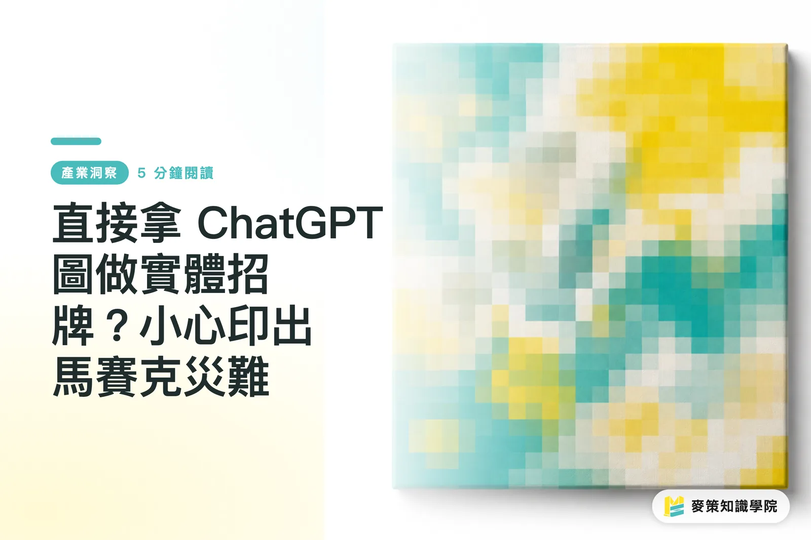
Why Are So Many Pixelated AI Signs Popping Up on Streets Lately?
Many shop owners unfamiliar with print production simply save whatever ChatGPT spits out onto a phone or flash drive and hand it over for large-format output. They completely skip the two essential prepress checkpoints: resolution and color mode
Over the past month or two, both on our production floor and browsing international design forums like Reddit's graphic design board, I have seen the same bizarre phenomenon. Plenty of brand-new shops feature signs with completely blurry illustration edges and distorted fingers on characters. Trying to save on design fees by brainstorming concepts with AI is completely understandable
The real problem stems from the default output specs of AI tools. Images generated by ChatGPT or most AI tools are typically optimized for displays at 72 dpi (dots per inch), with small physical dimensions. Large-format storefront signs easily span two or three meters across. Forcing a tiny image dozens of times larger turns those smooth lines into heavily pixelated, jagged blocks

Raster vs. Vector: What Is the Difference for Storefront Signs?
Raster images blur when scaled up, while vector graphics stay razor-sharp at any size. That is the core format difference in large-format printing
Images created by ChatGPT or Midjourney are raster graphics made of tiny pixel blocks. When producing storefront signs or logos that demand extreme scaling, the industry standard prepress format is vector graphics. Vectors record lines and color shapes using mathematical formulas, so they are never bound by pixel limits
Here is how these two formats work in practice:
・Raster: Common extensions include JPG, PNG, and WEBP. These work well for detailed photos and smooth gradients. Their drawback is that stretching them past their original pixel count inevitably leads to blurry distortion
・Vector: Common extensions include AI, EPS, and SVG. These are ideal for geometric shapes, logos, and physical signage. The upside is that whether you print them on a business card or a building-sized canvas banner, edges remain perfectly smooth
How Can You Fix AI Artwork Before Sending It to Large-Format Print?
You must convert the AI raster image into a vector file or use specialized software to generate missing pixels so the artwork meets minimum quality thresholds for large-format printing
When clients walk in with a JPG generated by ChatGPT, we typically take one of three approaches based on image complexity:
1. Vector tracing: For illustrations or logos with clean lines, we use the Image Trace feature in Illustrator to turn defined pixel edges into crisp vector shapes. This works best for minimalist graphics
2. AI upscaling software: If the image has too much detail for vector conversion, you have to use Gigapixel AI or similar upscalers to boost the pixel count. The goal is to bring the resolution up to at least 100 dpi or 150 dpi at the actual physical print size
3. Professional prepress help: If you cannot handle this yourself or the file has too much compression damage, you can ask the Mai Strategy Knowledge Academy consulting team to review your file. Sometimes, instead of struggling to rescue an ultra-low-resolution image, having a designer redraw the AI concept into a proper vector file is much simpler
Why Does It Look Vibrant on Screen but Dull on a Printed Sign?
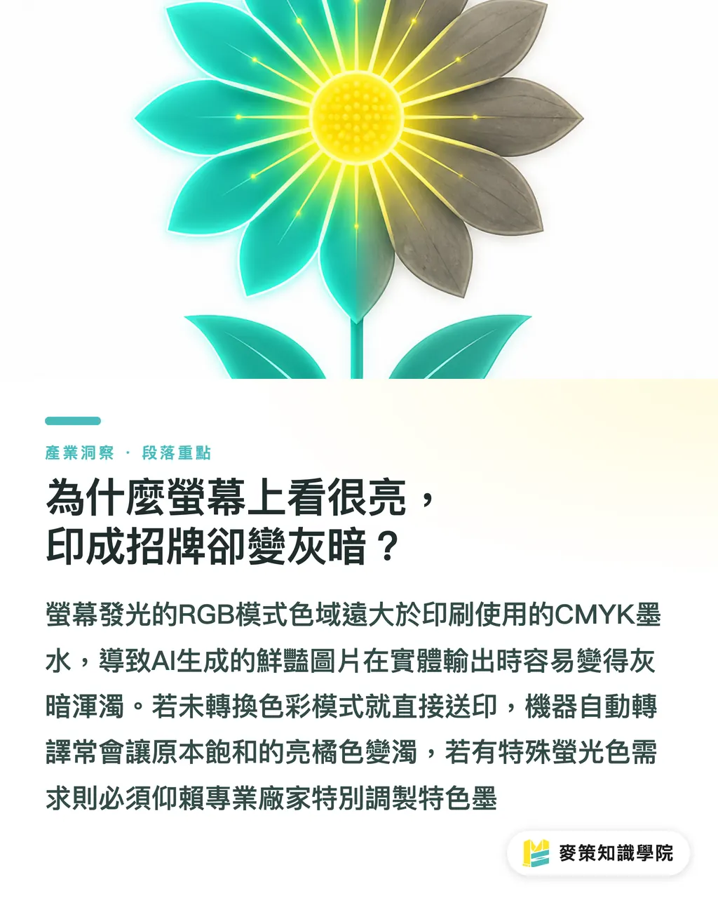
Screens emit light in RGB, which has a much wider color gamut than the CMYK model used in printing. Neon tones and ultra-vivid colors generated by AI simply cannot be reproduced with standard printing inks
This is the most common customer complaint on the print floor, and it is the second trap with AI-generated art. The files ChatGPT produces are all in RGB mode, with rich saturation and high brightness. Large-format printers, however, build colors by overlaying four inks: CMYK (Cyan, Magenta, Yellow, Key/Black)
If you send files to print without converting the color mode, the machine's RIP (Raster Image Processor, think of it as the printer's translation engine) forces an automatic conversion. The result is usually dull blues and muddy oranges. If your sign design relies heavily on piercing neon green, standard large-format printing alone will not cut it. You may need to consult a printer like MINDS that handles spot inks (specially mixed standalone inks) to evaluate real-world feasibility and costs
Key Takeaways
AI tools output raster images by default, and enlarging them dozens of times for signs will inevitably create blurry, distorted prints
The standard format for large-format printing is vector graphics, which requires tracing the image or having a designer redraw it
On-screen RGB colors cannot be fully reproduced by CMYK inks, so always check for color shifts before sending files to print
Food for Thought
AI certainly lowers the bar for brainstorming concepts, but ideation and prepress production are two completely different disciplines. Using AI as an early sketching advisor and bringing that visual concept to a designer or print shop to discuss your desired style is the safest route. Bridging the gap between the screen and physical print still requires hands-on human expertise with materials, resolution, and color control
Further Reading
FAQ
- What is the minimum resolution (dpi) required for large-format printing?
- Storefront signs and large banners are viewed from a distance, so 100 dpi to 150 dpi at actual print size is usually enough. For posters or lightboxes that people inspect up close, you should aim for the standard 300 dpi
- If I only know how to generate images with ChatGPT, how can I tell if an image is printable?
- Zoom in on the image on your computer screen to 100% or even 200%. If edges already show obvious pixelation and jagged blocks, printing it on a huge sign will only look worse
- Can I convert an image to CMYK using basic image viewers or Paint?
- No. Basic software typically does not support accurate CMYK color management. You need professional tools like Illustrator, Photoshop, or the free web app Photopea to convert color modes and verify color values properly
Related articles
The Print × AI weekly
The print and AI know-how designers, brands and enterprises can use before they commit — one email, every week
MINDS Free Tools
Imposition calculator and preflight file check — free prepress tools, right in your browser.
MINDS Group
Need actual printing or gifting services?
From premium printing to online ordering and festive gifts — the MINDS Group sister brands take it from here.