

Why Does Converting Pantone Spot Colors to CMYK Cause Major Color Shift?
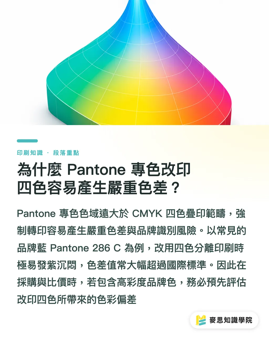
Spot-to-process color distortion comes down to a fundamental physical reality: the color gamut of Pantone inks exceeds what CMYK subtractive four-color overprinting can reproduce. Pantone, a standardized spot color system developed by Pantone LLC, mostly uses pre-mixed single-pigment inks, whereas CMYK relies on overlapping four-color halftone dots
High-chroma neon, metallic, and certain deep royal blue shades simply cannot be blended perfectly using CMYK. Take the common brand color Pantone 286 C as an example. When separated into four colors, C and M ratios are pushed high to hit the needed chroma. On paper, it easily shifts to a dull purple, pushing the color difference ΔE (a measure of color difference) well past 6, exceeding tolerance limits defined by ISO 12647, the international print color control standard
The logic is simple
When comparing quotes, buyers cannot look at unit price alone. If a project includes high-chroma brand colors, evaluating brand identity risks from switching to CMYK is essential upfront
How Print Buyers Evaluate Which Spot Colors Work in CMYK
Evaluating whether a spot color can be converted to CMYK comes down to three factors: color complexity, run-length cost allocation, and paper absorbency
Many corporate buyers assume getting a magic set of CMYK values makes everything foolproof. That is the single most common trap on the press room floor. Photos, complex gradients, and multicolor illustrations suit CMYK separation well. If absolute accuracy is needed for logos, corporate standard colors, or safety markings, adding a spot color plate saves the most time and hassle
The MINDS procurement assessment framework screens project requirements through three core focus areas:
・① Gamut comparison: Check Pantone swatch books in advance against 4-Color Process simulations to verify if color variation falls within client acceptance limits
・② Press run and cost math: For large runs, adding a dedicated spot color plate drops unit costs to negligible levels across thousands of sheets. For short runs, switching to CMYK saves wash-up and plate charges
・③ Paper testing: Coated paper (like gloss art paper) yields rich colors. Uncoated paper (like woodfree paper) absorbs ink heavily, causing CMYK chroma to drop sharply and making distortion far more obvious
Paper stock exerts a huge impact on CMYK spot color simulation:
・Coated paper (art paper grades): Smooth surface with excellent color payoff, yielding roughly 80% to 90% accuracy for CMYK spot simulations. Ideal for color catalogs and high-impact promo pieces
・Uncoated paper (woodfree grades): Fibers absorb ink and dry quickly, causing color saturation to drop by about 15% to 25%. Converting spot colors to CMYK often looks dark and muddy
・Specialty paper (fancy paper grades): Base paper tint and texture create heavy variations, making CMYK overprint color tolerance hardest to control. Running a press proof first is strongly recommended
When planning procurement workflows, feel free to consult the Mai Strategy Knowledge Academy Advisory Team for professional guidance on gamut matching and paper selection
Workflow Steps to Avoid Pitfalls When Ordering Spot-to-CMYK Jobs
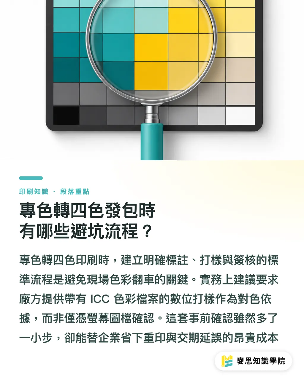
The secret to preventing spot-to-CMYK press crashes is turning artwork annotations, ICC digital proofing, and sign-off standards into a standard operating procedure
In practice, running print procurement through the MINDS Three-Gate Checkpoint system keeps job quality tightly controlled:
・① Clear artwork labeling: Define colors explicitly as CMYK simulations in Illustrator or InDesign files, and state 'CMYK spot simulation used for this job' on quotes and job tickets
・② Color-calibrated digital proofing: Request color-matched proofs built with ICC Profiles (color characterization files published by the International Color Consortium) rather than relying on screen files
・③ Archiving signed proof samples: Keep signed digital proofs as benchmark samples for press room color matching, leaving zero room for verbal disputes during acceptance
During quoting, buyers should check whether the printer follows FOGRA PSO, the ProcessStandard Offset certification from the German Printing and Media Industries Federation, to ensure four-color dot gain remains within standard limits
Hold on a second
Though adding a quick verification step, this process saves companies massive losses from re-prints and missed delivery deadlines
Color Matching Standards for Quoting and Acceptance
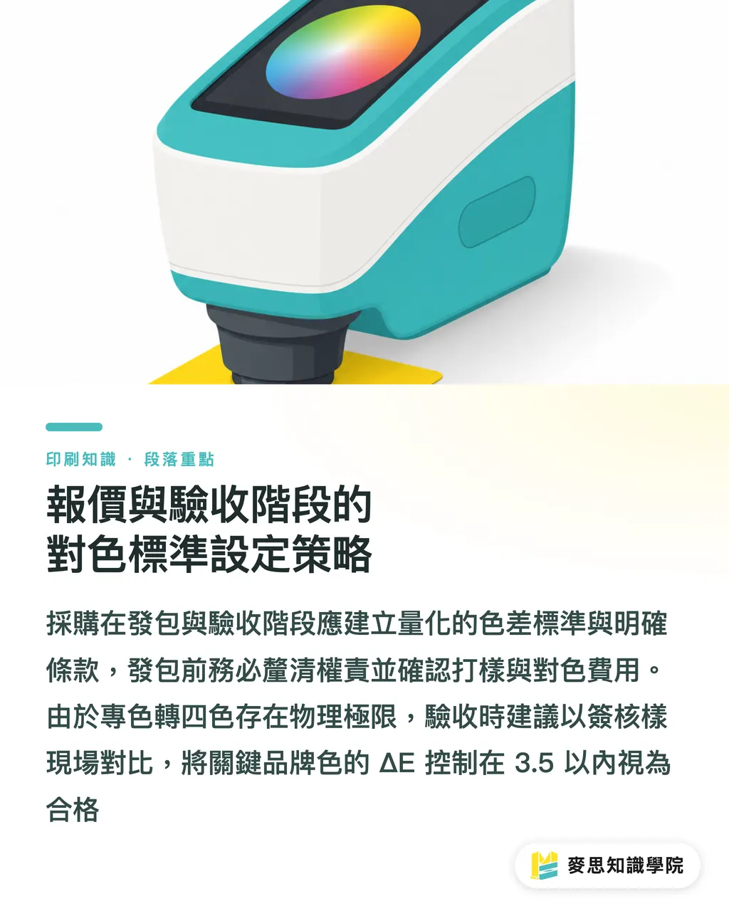
Buyers need quantitative color tolerance limits and clear contract terms during quoting and acceptance to protect both parties
Converting spot colors to CMYK comes with physical limits. Expecting a 100% zero-difference match is unrealistic. Standard industry CMYK printing typically allows a ΔE range between 3.0 to 5.0. If converted brand colors exceed this range, buyers should speak with design teams and clients before ordering to decide if budget should be added for a spot color plate
Procurement ordering and acceptance checklist:
・Must-ask quoting terms: Confirm whether quotes cover CMYK conversion proofing fees and press-side color adjustment labor
・Acceptance standards: Compare on-site against signed proofs. Passing grade keeps key brand colors within ΔE 3.5
・Liability terms: If unannotated artwork causes the plant to split plates directly, responsibility for losses must be spelled out before ordering
To keep building print buying and artwork prep skills, subscribe to the Mai Strategy Knowledge Academy Newsletter for real-world press room insights
Key Takeaways
・Spot-to-CMYK conversion is viable, but high-chroma royal blue, metallic, or neon shades hit strict physical gamut limits
・Paper absorbency magnifies color shifts. Converting to CMYK on uncoated paper drops saturation by roughly 15% to 25%
・Run the MINDS Three-Gate Checkpoint before ordering, setting acceptance benchmarks through clear labeling and ICC proofs
・Quote evaluation cannot look solely at unit cost. Switching short runs to CMYK saves plate fees, while adding spot colors on long runs protects quality
Final Thoughts
For corporate buyers and graphic design teams, print buying goes far beyond price comparisons; it is a calculated tradeoff between brand identity and production costs. With modern press equipment and color management widely adopted, spot-to-CMYK conversion has become a highly mature alternative. However, success requires quantitative matching benchmarks and clear artwork specifications set upfront. When tackling major visual projects, buyers who jump into gamut evaluations early during design and insist on color-matched digital proofs will cut massive hidden costs from line adjustments and rejections while keeping brand colors consistent across every medium
FAQ
- Can royal blue shades like Pantone 286 C be printed directly in CMYK?
- Pantone 286 C is a high-chroma deep royal blue that shifts easily to a dull purple when overprinted in CMYK, with ΔE often exceeding 6.0. If color accuracy is essential for the brand, staying with a dedicated spot color is strongly advised
- Why do identical CMYK conversion values look so different on different paper stocks?
- Coated paper (like gloss art paper) has a smooth surface for strong color payoff. Uncoated paper (like woodfree paper) has high fiber absorbency that cuts chroma by 15% to 25%. Conversions must use matching paper ICC Profiles for proper color compensation
- How should buyers decide between spot color and CMYK process printing when ordering?
- For short runs with diverse colors, choosing CMYK process printing saves wash-up and plate charges. For long runs or standalone high-chroma brand colors like logos, adding a spot color plate yields minimal per-sheet cost and delivers the most stable quality
- How should color tolerance standards be set for spot-to-CMYK print acceptance?
- Standard CMYK print contracts can set key brand color ΔE tolerance within 3.5, using certified digital proofs signed off in advance as the press-side matching benchmark
Related articles

The Print × AI weekly
The print and AI know-how designers, brands and enterprises can use before they commit — one email, every week
MINDS Free Tools
Spine width and imposition calculators — skip the manual math, free in your browser.
MINDS Group
Need actual printing or gifting services?
From premium printing to online ordering and festive gifts — the MINDS Group sister brands take it from here.