

Why Are Spot Colors in Packaging Printing Always Off?
Spot color shifts usually stem from aging physical swatch books and on-site manual ink mixing based on guesswork, which fails to standardize spectral behavior on different plastic films or composite papers
Over the past few years, I often see this on prepress floors: designers pick a Pantone spot color on screen, but the final print looks way off from the swatch sample held by the brand client. Most of the time, it is not bad presswork, but flawed communication tools from the start. Physical paper swatches fade over time. Plus, PET, PP, or metallized films commonly used in labels and flexible packaging have ink absorption and refractive properties completely different from standard coated paper
Global ink giant Siegwerk announced an investment of over 300 million euros over the next five years to drive coating and color stability tech transformation, teaming up with color authority X-Rite Pantone to launch the COLORWERK FastMatch Cloud system. This partnership directly links spectral data with digital ink databases, letting print shops accurately predict spot color outcomes right at prepress
Spot Color Data Management replaces traditional paper swatches and visual inspection with CxF/X4 spectral data and cloud formulation libraries. It digitizes color rendering curves, substrate properties, and ink film thickness to keep color deviation at a minimum across different plants and presses
To keep flexible packaging color on point, get in touch with the MINDS Printing team early in design to align spectral data, turning blind trial printing into a controllable digital process

What Do Cloud Ink Formulas Save for Prepress and Designers?
Cloud color formulation systems handle spectral-level matching and correction during prepress, skipping the lengthy waste of repeated washdowns and trial adjustments on press
In the past, when making flexible packaging for personal care or food products, printing a satisfying brand spot color required press operators to mix ink, run a trial, draw down a sample, and tweak colors by gut feeling. Each run took over half an hour and wasted dozens of kilograms of pricey film and high-performance ink
By combining X-Rite Pantone color science with the Siegwerk database, the cloud platform puts ink formulation, real-time correction, and QC all in one place. Prepress staff enter the client's spectral target values into the computer, and the system automatically calculates an ink formula with the lowest ΔE based on available base inks and film materials
This means designers no longer have to suffer through battles where print shops claim a color can't be printed and ask to change it. Color feasibility gets verified at final prepress layout, and press setup color calibration drops from 45 minutes to under 15 minutes
How Designers Can Self-Check Spot Colors in Three Steps Before File Handover
The key for designers to create accurate spot color files is standardizing spot color names, importing proper spectral libraries, and delivering vector specs complete with transparency and bleed boundaries
Based on my long-time observations across production lines and client setups, many flexible packaging prepress rejections and color shifts trace back to details in final artwork files. To avoid finding color banding or layout overlaps on press, designers should strictly run the three-step prepress checklist from MINDS Printing (MS, mid-to-high-end fully customized commercial printing) before file submission, ensuring prepress RIP software parses everything cleanly:
・1. Standardize spot color naming: In label and flexible packaging files, never allow duplicate names generated by different software like Pantone 185 C and Pantone 185 CVC for the same spot color. This prevents the output RIP from splitting them into separate plates that overprint on top of each other
・2. Set up white ink spot plates correctly: Flexible packaging often uses transparent PET or foil substrates. You must create a dedicated spot color layer named Spot Color White and turn on Overprint to prevent white ink from masking color graphics or leaving gaps in background fills
・3. Export standard PDF/X-4 files: Ensure complete CxF spectral data and vector boundaries are embedded in the file, then hand it over to the Mai Strategy Knowledge Academy Advisory Team for real-time digital preflighting to catch transparency and overprint conflicts ahead of time
These three steps look simple, yet they eliminate massive time sinks from back-and-forth file edits and re-proofing

Traditional Press Proofing vs. Cloud Color Management: Where Is the Difference?
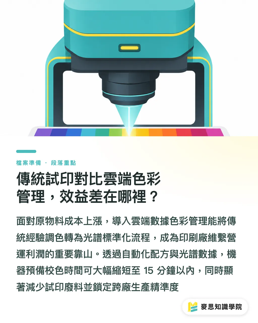
For printers and brand owners to implement digital color management, they must convert gut-feel color mixing into standard operating procedures measured with spectrophotometers for ΔE tolerances
Driven by sustainable packaging shifts led by American Packaging Corporation (APC) and global GS1 Sunrise 2027 barcode standards, print buyers demand tighter lead times for short runs and stricter color control. Matching colors by hand can no longer keep pace with modern supply chains. Here is how the two operating modes stack up:
・On-site manual color mixing: Relies on physical paper swatches and press operator eyesight. Each press calibration takes about 45 to 60 minutes. Trial runs waste 20 to 50 kg of plastic film and ink. Cross-plant color deviation is hard to keep within ΔE < 2.0
・Cloud digital color matching: Based on CxF/X4 spectral data and automatic cloud formulation. Press setup calibration drops under 15 minutes. Dramatically reduces trial scrap and solvent washdown usage. Cross-plant and cross-device production locks into standard spectral tolerances
Re-evaluating prepress workflows through digitization isn't just about precision. It is a vital safeguard for packaging print shops protecting profit margins against rising raw material costs
Key Takeaways
・The core of spot color digitization is ditching visual matching and locking in color standards with CxF spectral data and cloud formulas
・Cloud color management systems integrate formulation, color calibration, and QC, cutting press setup time to under 15 minutes
・Designers preparing final artwork should strictly enforce uniform spot color names, white ink overprint setup, and PDF/X-4 exports
・Aligning ink and spectral data early is key for labels and flexible packaging to slash trial scrap and ensure cross-plant consistency
Further Thoughts
Siegwerk's 300 million euro investment over the next five years shows how packaging printing is shifting fast toward functional coatings and digital color management. For Taiwanese SMB print shops and brand designers, now is the tipping point to move away from gut-feel color mixing and embrace digital color communication. Design teams should establish CxF spot color libraries and standard white ink specs right at project kickoff. Print shops should adopt spectrophotometers and cloud ink formulation tools as soon as possible. Digitizing prepress color communication is the only way to stay competitive with high quality and top efficiency amid demands for shorter runs, diverse product lines, and sustainability
Further Reading
FAQ
- Why can't flexible packaging printing just use CMYK process colors to simulate brand spot colors?
- Flexible packaging materials like PET film or metallized substrates have limited color gamuts. CMYK overprinting easily causes dot gain and moiré interference. Using spot colors with spectral data ensures solid area saturation and batch-to-batch consistency
- What does setting white ink spot layers to Overprint do when designers prep final artwork?
- When printing on clear films or metallic substrates, white ink acts as an undercoat to boost the vibrancy of colored inks on top. Checking Overprint ensures the white ink plate and color plates automatically overlap during prepress RIP output, avoiding unwanted white gaps along edges
- If a print shop hasn't adopted a cloud color system, how can it reduce spot color trial print scrap?
- Start by setting up internal spectrophotometer measurement workflows and requiring clients to include CxF spectral data along with ISO 12647 tolerance standards in submitted files. This reduces how often operators manually adjust inks on press by trial and error
Related articles


The Print × AI weekly
The print and AI know-how designers, brands and enterprises can use before they commit — one email, every week
Tool Library
RGB↔CMYK conversion, ΔE color difference and brand color print analysis — free color management tools, computed right in your browser.
MINDS Group
Need actual printing or gifting services?
From premium printing to online ordering and festive gifts — the MINDS Group sister brands take it from here.