
Why do downloaded business card templates always fail during cutting?
To use business card templates without looking tacky, the key is to ditch random online stock libraries. Request a standard die-cut template directly from your printer and focus on information hierarchy and paper pairings
This is the advice I give most often, based on my decade-plus of prepress experience
Through handling countless custom projects at MINDS, we have developed a check system called the 'MINDS (MS, mid-to-high-end fully custom commercial printing) Layout Triple-Check.' This helps you turn ordinary templates into premium physical business cards
Many junior designers or administrative staff instinctively search for free online templates when they run out of inspiration
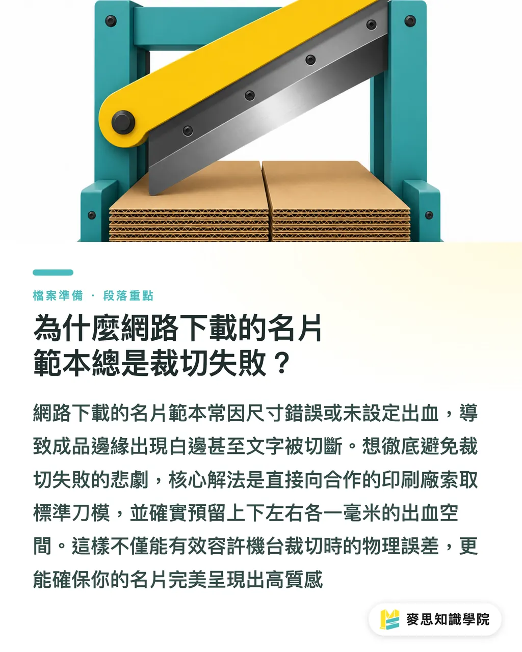
Lately, I've worked with many small and medium-sized business clients who brought flashy templates downloaded from the internet. The sizes were wrong, and there was no bleed. Printing them anyway resulted in white borders or cut-off text
Bleed refers to the extra background color or pattern extended beyond the design border. The standard in Taiwan is typically 1 mm added to all four sides, which accounts for the physical margin of error during machine cutting, preventing white edges on the final product
Instead of blindly downloading unverified assets online, get a standard die-cut template from your printer first. It will save you from the tragedy of editing files late at night
How do you use business card templates without making them look cheap?
A template is just a skeleton. To wash away the cheap feel, you need layout design to elevate the style
You can review your design directly using our internal training method, the 'MINDS (MS) Layout Triple-Check':
① Restructure the information hierarchy: The font size and spacing in a template are fixed, but your information is dynamic. Make the name larger, align the contact info neatly, and create a clear hierarchy so everything doesn't look cramped
② Remove unnecessary decorations: Decisively cut out those color blocks and gradients that exist only for the sake of decoration. Brave use of white space keeps the focus on key information, which is a technique favored by high-end brands
③ Adjust the bilingual logic: When handling Chinese-English bilingual cards, English abbreviations and fonts should match international practices. Don't squeeze them directly under the Chinese text. Slightly widening the line spacing shows more professionalism
How do you print a business card to give it a premium feel? How should you match paper stock and thickness?
This is the most common question I get from the production side
Let me give you a direct answer: 70 percent of a business card's premium feel comes from the paper and thickness, and 30 percent comes from the finishing techniques
Many people think that applying a flashy layout is design. In reality, the high-end business cards you hold in your hand often have very simple layouts. They stand out because of the texture of the paper
・Paper selection: Avoid the most common glossy coated paper (like standard glossy art paper). Switch to textured watercolor paper, warm-to-the-touch cotton paper, or uncoated fine paper with a slight gray tone
・Thickness setting: Thickness defines the weight of the first impression. A typical business card is around 250g. If you want to project a solid and professional image, you can try 300g or even higher weights
・Spot finishing: Add a low-profile emboss or matte foil stamping on the logo or name. Just a touch of embellishment is enough. Never make the entire card look like a shiny sheet of gold
If you are unsure about paper characteristics, talk directly to the mid-to-high-end custom consulting team at MINDS. We can help you find the best material combination to match your industry's tone
If you just want to quickly order standard products, you can also use the MYS online retail platform
What are the critical pitfalls you must check before sending files to print?
No matter how beautiful the layout is, if the file format is wrong, it is all for nothing
Before sending your files, be sure to perform the 'MINDS (MS) Prepress Triple-Check'
From my long experience troubleshooting on the production line, things will definitely go wrong if these three steps are missed:
① Convert the color mode to CMYK: Screens emit light in RGB, while printing layers ink in CMYK. If you forget to convert the color mode, the vibrant blue you designed will turn into a dull grayish-blue when printed
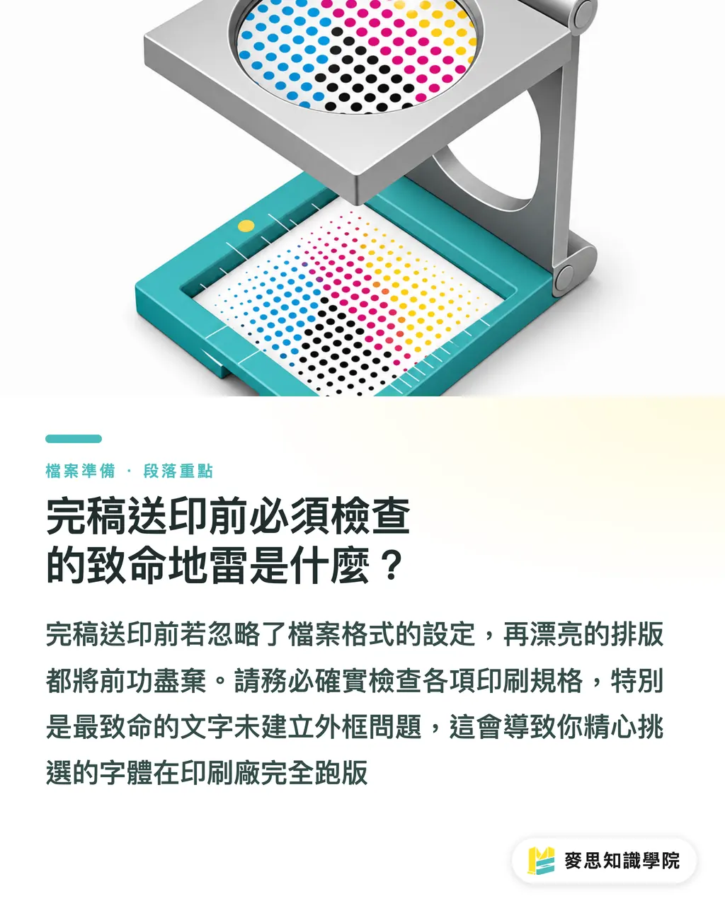
② Convert all text to outlines: This is the most critical issue. Even if you have a beautiful font installed on your computer, the printer might not. Without converting to outlines, the font will break and revert to a default font
③ Confirm image resolution is 300 DPI: If you include headshots or product photos on your business card, make sure the original image resolution meets the standard. Designing with thumbnails downloaded from social media will only result in blurry, pixelated blocks when printed
Key Takeaways
・The safest starting point for finding a business card template is to get a standard die-cut template directly from the printer, completely resolving size and bleed anxieties
・The determining factor for a premium feel is 70 percent paper thickness and 30 percent post-press finishing, not flashy or rigid patterns
・A template is only a skeleton. Using a clear information hierarchy and proper white space is the only way to make your business card look like a bespoke design
Further Reflections
A business card is the first impression during a face-to-face meeting
Instead of wasting time fixing sub-standard online assets, establish a standardized prepress checklist. Investing your energy in fine-tuning materials and layouts is the smart way for small businesses and designers to elevate brand quality
FAQ
- Where is the safest place to download business card templates?
- Avoid downloading random assets online. The safest approach is to request a standard die-cut template directly from the printer you plan to work with, ensuring that the size and bleed settings perfectly match their machine specifications
- What are the standard dimensions and bleed settings for business cards?
- In Taiwan, the common finished size for a standard business card is 90 x 54 mm. When setting up your file, you must add 1 mm of bleed to all four sides (making it 92 x 56 mm) to prevent white edges after cutting
- How do you make a simple business card template look high-end?
- The key lies in the paper stock and thickness. Even with a minimalist, text-only layout, choosing an uncoated fine paper of 300g or more will instantly elevate the premium feel through the weight and texture in hand
Related articles





The Print × AI weekly
The print and AI know-how designers, brands and enterprises can use before they commit — one email, every week
MINDS Free Tools
Imposition calculator and preflight file check — free prepress tools, right in your browser.
MINDS Group
Need actual printing or gifting services?
From premium printing to online ordering and festive gifts — the MINDS Group sister brands take it from here.