
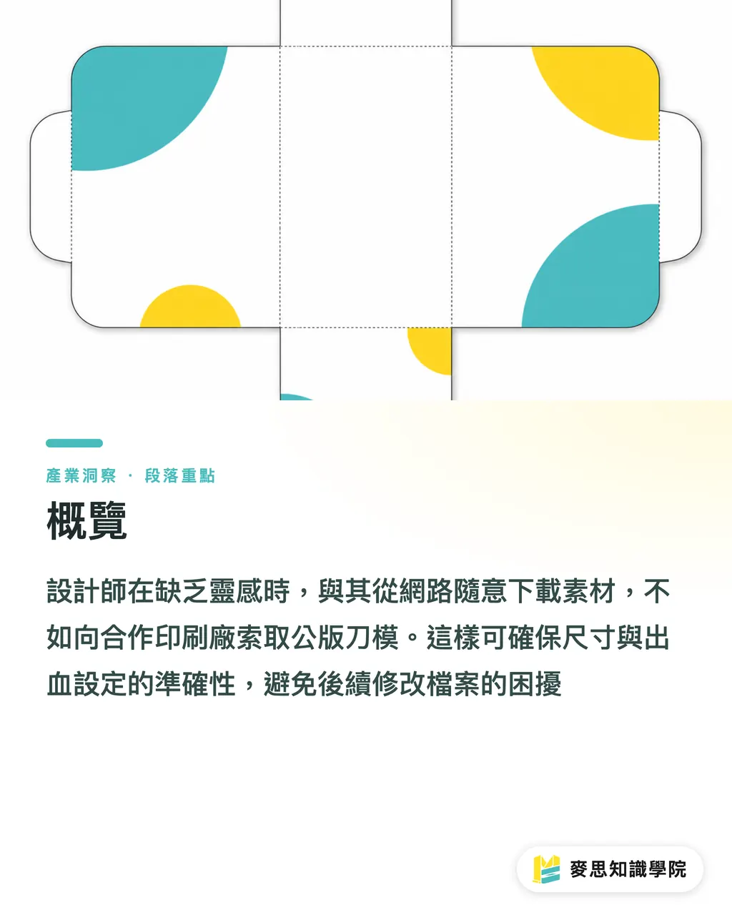
Overview
When designers are short on inspiration, rather than randomly downloading unverified assets online, it is better to request standard die-cut templates from your partner print shop
This ensures accurate dimensions and bleed settings, helping you avoid the endless abyss of post-design file revisions
How to Choose Business Card Templates Without Pitfalls
Beginners often seek out business card templates to solve anxiety over dimensions and bleeds
The safest and most effective way to find templates is to use the standard die-cut files provided directly by a print shop
Stock assets from online galleries often fail to account for actual cutting tolerances, making it easy to accidentally cut off important graphics or text
・Size Confirmation: The most common standard business card size in Taiwan is 90x54mm
・Bleed Settings: A bleed area of 1mm to 2mm must be added to all four sides to ensure no white edges appear after trimming
・Color Mode: Final files must be converted to CMYK to prevent the vibrant RGB colors on your screen from appearing dull and lifeless on paper
Key Design Considerations by Industry
Every industry requires a vastly different image and information delivery, so designs must align with specific industry characteristics
Having reviewed enough business cards to stack higher than Taipei 101, I have categorized them into design mindsets for three major industries
Tech and finance industries emphasize rationality and trust, focusing design on white space and clear visual hierarchy
・Tech Startups: Prefer 90x50mm or 85x54mm Western-style dimensions, often paired with black, white, gray, or cool tones to maintain a minimalist visual
・F&B Industry: Needs to convey warmth and memorability; suitable for warm tones and papers with tactile texture, such as ivory card or Laid paper
・Creative Industry: A battlefield for showcasing personal style. While you can boldly experiment with special sizes, embossing, debossing, or foil stamping, avoid cluttering elements that cause the focus to be lost
Matching Special Styles with Printing Materials and Finishing
A business card is a brand's first handshake. Good materials and finishing can instantly upgrade this impression
For foil stamping alone, there are dozens of variations including bright gold, matte gold, rose gold, and antique bronze, all of which must be selected based on the design style
・Minimalist Style: Suitable for pairing with high-gsm premium cards or cotton paper, letting the weight of the paper provide the texture; spot UV can be used on text to increase depth
・Retro Style: Kraft paper is the top choice. When paired with single-color black ink or white ink, it presents a strong sense of craftsmanship and nostalgia
・Luxury Style: Dark base colors paired with gold or silver foil stamping. Edge painting (gilding) can be considered; it is recommended to choose pre-colored paper for foil stamping to avoid white edges from the paper core
Critical Details to Check Before Sending Files to Print
No matter how beautiful the design is, it is useless if it cannot be printed
Many clients and designers often overlook minor details, which not only costs money for re-prints but is a pity for missing the first impression during a business card exchange
・Font Size: Never use text smaller than 6pt and avoid ultra-light fonts, otherwise they may blur or break during printing
・Line Weight: All line settings should not be lower than 0.2pt; overly thin lines may fail to print in screen or offset printing
・Create Outlines: Be sure to create outlines (convert text to paths) for all text before sending to print to avoid layout shifts caused by missing fonts at the printing plant

Key Takeaways
・When looking for business card templates, request die-cut files directly from the print shop; do not rely on online assets to avoid bleed and sizing errors
・Industry attributes dictate design direction: Tech emphasizes clarity, F&B requires warmth, and creative sectors compete on material and finishing
・Special finishing must be paired with suitable paper; Minimalist styles rely on high-gsm paper, while Luxury styles are safest with dark, pre-colored paper and foil stamping
・Before sending to print, ensure fonts are larger than 6pt, lines are thicker than 0.2pt, and all text has been converted to outlines
Extended Reflection
A business card is more than just a piece of paper; it is the starting point for connecting physical networking with digital channels
For designers and print purchasers, it is recommended to seek integrated services like MINDS Printing, which provide complete advice from prepress file health checks to material finishing
Establishing a standardized ordering process and design specifications can absolutely save countless hidden costs in communication and trial-and-error
Further Reading
FAQ
- Why do business cards downloaded online show white edges after printing?
- Because most stock assets do not reserve a 1-2mm bleed area; even a tiny tolerance during cutting will reveal the original color of the paper
- What is the minimum font size for a business card to be legible?
- The safest setting is for body text to be no smaller than 6pt. For reversed-out text (white text on dark background), it is recommended to be at least 7pt and use a bolder font to prevent the ink from blurring
- How should I choose the base color for gold-stamped business cards?
- It is recommended to use dark-colored or pre-tinted art paper for foil stamping directly. If you print a full-bleed dark color on white paper and then attempt foil stamping, the trimmed edges are prone to showing white paper, which affects the overall quality
Related articles
- Temporary Tattoo Printing Guide: Material Analysis and Printing Cost Estimation
- Heinz's Glass Bottle Counter-Attack at Walmart: The Logic of Premium Pricing through Nostalgia Amidst Inflation
- How to Legally Print Compliant Food Labels: A Guide to Avoiding Pitfalls from Materials to Nutritional Information