What Are the Most Common Poster Sizes in Taiwan?
The direct answer: Taiwan posters primarily use two sizing systems — the international ISO A-series (A
・0, A
・1, A
・2) and the traditional print kai-shu system (4K, 8K, kiku-full, kiku-half)
These two are often used interchangeably, but they have very different origins
The A-series follows ISO 216 international standards, with a fixed aspect ratio of 1:√2 (approximately 1
・1
・414) — fold it in half and the proportions stay the same, so A0 folded once becomes A
・1, A1 becomes A2, all maintaining the same slender ratio throughout
Common specs:
・A0: 841 × 1189 mm — roughly the visual weight of a single mattress mounted on a wall; the go-to for exhibition hero graphics and large-scale event posters
・A1: 594 × 841 mm — the most common size for in-store display stands, election signboards, and enrollment posters
・A2: 420 × 594 mm — the everyday standard for in-store notices, lecture announcements, and community bulletin boards
The kai-shu system is the traditional language of Taiwan's print industry, rooted in how a full sheet of paper is cut down
The number of equal pieces cut from a full sheet gives you the name: one cut = half-sheet (對開), another = 4K (四開), another = 8K (八開)
Here is a critical concept that trips up many designers: kai-shu dimensions vary depending on the parent sheet size
Taiwan print shops most commonly use two parent sheet sizes: kiku-ban (approx. 25 × 35 inches) and si-liu-ban (also called kiku-bai, approx. 31 × 43 inches)
So the same 4K from a kiku sheet is roughly 27 ×
・39.5 cm, while 4K from a si-liu (kiku-bai) sheet is roughly
・39.5 ×
・54.5 cm — a substantial difference
Assuming a 4K quote maps to a fixed size is one of the most common mistakes you can make
What Is the Difference Between the A-Series and Kai-Shu? Which Should You Use?
Clients often ask me: why do some printers quote in A1, while others say kiku-half?
The answer comes down to equipment and application
Digital output and large-format inkjet printing almost always use the A-series, because the equipment runs on metric millimeters — A0 and A1 are universally understood
Traditional offset printing tends to use kai-shu because costs are calculated from the full parent sheet, and the kai-shu number directly maps to paper utilization efficiency on press
My recommendation is simple:
・Small quantities, large format, fast turnaround (1–50 sheets): go with large-format inkjet and communicate in A-series dimensions
・High volume, cost-sensitive (typically 500+ sheets): go with offset printing and communicate in kai-shu — always confirm whether they use kiku-ban or si-liu-ban
A common real-world example: a client needs 1,000 A2 posters. If laid out on kiku sheets, one full kiku sheet fits exactly 4 A2-sized panels with almost no waste. But if the dimensions fall in an awkward spot, you might only get 3 per sheet, and the rest becomes scrap — which immediately drives up the unit cost
That is why confirming the size before getting a quote always saves more money than quoting first and adjusting the size later
How to Set Bleed, Resolution, and Color Mode Without Making Mistakes
Getting the size right is not enough — if these three specs are not set correctly before you send the file, the printed result will still be a disaster
First: bleed
If your design has any color or imagery that runs full-bleed to the edge, add 3 mm of bleed on all four sides
That means an A1 poster (594 × 841 mm) should be set up at 600 × 847 mm — the extra area will be trimmed away during cutting
Why? Because the cutting blade can never be 100% precise; bleed provides a buffer for mechanical tolerance. Without it, you will get a thin white sliver along the edge that makes the finished piece look cheap
Second: resolution
Posters viewed up close (in-store displays, window graphics, A2 and smaller) should be 300 DPI — the industry standard for print clarity
But here is a commonly misunderstood concept: resolution should be determined by viewing distance, not set as high as possible
For large outdoor banners and exhibition backdrops viewed from several meters away, 100–150 DPI is more than sufficient. Pushing to 300 DPI just creates unnecessarily large files that are slow to transfer and slow down output
Third: color mode
Always use CMYK for print — never submit an RGB file
Screens emit light in RGB; printing uses CMYK inks. The two color gamuts are different
The most common heartbreak is that vibrant saturated blues and fluorescent greens that look stunning on screen will come out noticeably darker and muddier when converted to CMYK ink
The correct approach is to set your document to CMYK from the start of the design process — what you see is what you get — rather than converting at the end and staring in dismay at a ruined print
Also, always outline all text (create outlines / convert to curves). If the print shop does not have your fonts, the layout will break
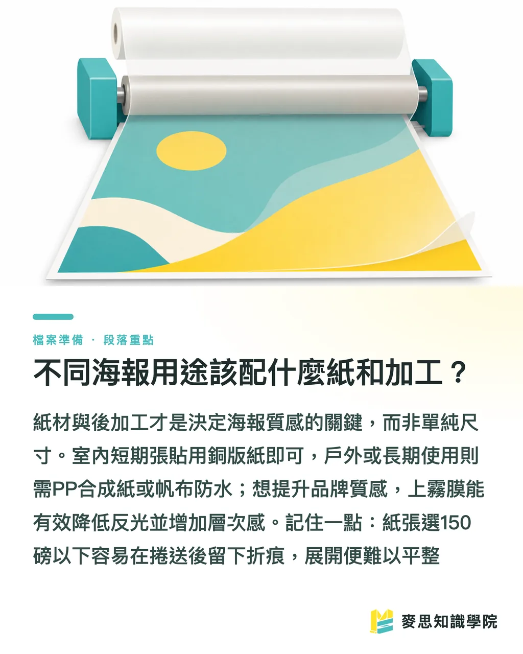
What Paper and Finishing Should You Use for Different Poster Applications?
Once the size and file are right, the final mile is paper and post-press finishing — this is what actually determines how a poster feels in person
Here are the combinations I use most often:
・Indoor wall posting, short-term events: 150–200 gsm coated or semi-coated paper. Low cost, fast turnaround — the most economical choice for posters replaced every week or two
・In-store display stands (freestanding): mount directly onto 5 mm or 10 mm KT board (foam board) or PP board to keep it upright
・High-end hero visuals, brand image walls: consider matte lamination (scratch-resistant, reduces glare) or spot UV coating to add depth and dimension to the artwork
・Outdoor, water-exposed: use waterproof PP synthetic paper or outdoor banner fabric. Coated paper disintegrates in the rain
A practical note: if the poster needs to be rolled for shipping or long-term storage, do not go too thin — paper under 150 gsm tends to hold rolling creases and develop wavy edges that will not lie flat when unrolled
Paper selection and finishing are actually what determine whether a poster looks expensive or not — the size is just the entry ticket
Key Takeaways
・Taiwan posters use two sizing systems: ISO A-series (metric, preferred for digital output) and kai-shu (the language of traditional offset printing) — always confirm which system the other party is referring to
・Kai-shu dimensions vary with parent sheet size. The same 4K can differ by nearly half depending on kiku-ban vs. si-liu-ban — always ask which sheet spec before quoting
・Full-bleed designs need 3 mm bleed on all four sides — an A1 file should be 600 × 847 mm; without bleed, cutting will expose a white edge
・Resolution is driven by viewing distance: 300 DPI for close-up viewing; 100–150 DPI is sufficient for large backdrops viewed from a distance — more is not always better
・Always use CMYK for print and outline all text — bright RGB colors will go muddy in print, and missing fonts will break the layout
Further Perspective
Most poster misprints are not caused by a lack of design skill — they happen because specs were not aligned before work began
My suggestion: turn size, bleed, resolution, color mode, and paper into a five-point pre-submission checklist that every designer runs through before sending a file. It catches about 80% of reprints before they happen
For design teams integrating AI tools, these five points are exactly the kind of process steps ideal for templating and automated validation: drop in the file, auto-check whether bleed is sufficient, whether it is CMYK, whether resolution is correct — freeing up human attention for the creative work
For clients, the most efficient path is to work with a vendor who can handle everything from size guidance and file checking through to printing and finishing — rather than coordinating between separate design, print, and mounting shops, where specs get lost in translation. That is the core value of what MINDS delivers through its integrated service: minimizing the communication cost of specs so you print it right the first time
FAQ
- What are the dimensions of an A1 poster?
- An A1 poster is 594 × 841 mm (59.4 × 84.1 cm) — the most common size for in-store display stands, enrollment posters, and election signboards. If the design runs full-bleed, the final artwork file should be set to 600 × 847 mm with 3 mm bleed on all four sides
- How big are 4K and 8K posters?
- Kai-shu dimensions vary by parent sheet size. Kiku-ban 4K is approximately 27 × 39.5 cm, 8K approximately 19.5 × 27 cm; si-liu-ban (kiku-bai) 4K is approximately 39.5 × 54.5 cm, 8K approximately 27 × 39.5 cm. Always ask the print shop which parent sheet they use before quoting
- How much bleed should I add to a poster design?
- Add 3 mm of bleed on all four sides for any full-bleed design. For example, an A1 (594 × 841 mm) file should be set up at 600 × 847 mm — the extra area is trimmed away during cutting to prevent white edges from showing
- What DPI should I use for a poster?
- 300 DPI is recommended for posters viewed up close (A2 and smaller, in-store window displays); for large outdoor backdrops or banners viewed from several meters away, 100–150 DPI is sufficient. Resolution should be determined by viewing distance, not set to the maximum
- Should poster design files use RGB or CMYK?
- Always use CMYK for print. RGB is a screen-emitted color gamut — saturated bright blues and fluorescent greens will come out noticeably darker and muddier when converted to CMYK ink. Set the document to CMYK from the beginning of the design process, and always outline all text to prevent font-related layout issues