

Overview
If a low-budget pack is supposed to read expensive, pull the budget away from what shoppers never notice and pile it onto the spots they touch, see, or open first. MS's three-gate pre-print checklist splits a low-budget job into three checkpoints, because a tight budget needs an order

Why does low-budget packaging look cheap?
On small-brand jobs, the cheap feeling almost always comes from the wrong sequence: visuals get finished first, paper gets picked later, and prepress gets patched at the end, so something has to get cut right before plates go on
In the How to Make Low-Budget Packaging Look Expensive video, Design print-ready packaging puts a low-cost project and expensive packaging inside the same question, and Desire Lacap's case points at something every press operator already knows: when the budget is tight, the first thing a designer should lock down is the production-ready order
Print-ready packaging means the design file already carries the die lines, bleed, color, substrate, and finishing marks, so the printer can quote, proof, and run it without going back and forth for missing files
On low-budget jobs I start with a 3-second shelf test
・Can the brand name be spotted first?
・Can the category be read in 3 seconds?
・Does the stock and whitespace hold the price tier?
Where should a small brand spend first?
Don't rush to ask how many special effects you can afford on a tight budget. I run the job through MS's three-gate pre-print checklist first; only after all three gates pass do we talk about added finishing
・Gate 1, layout: only one focal point on the front face, with brand name, product name, and required info on separate layers. Don't squeeze every selling line onto the carton
・Gate 2, substrate: when 4C printing can already carry the main image, put the budget into the paper's rigidity and surface feel. Shoppers feel the difference the second they pick up the box
・Gate 3, prepress: standard 3mm bleed on Taiwan folding cartons, with die lines, crease lines, and finishing files handed over on separate layers; actual values follow the printer's spec
If a brand is moving from sticker label to folding carton for the first time, the Mai Strategy Knowledge Academy advisory team can walk through these three gates before quoting, so the budget doesn't get burned on details shoppers never see and the line can't keep stable
Does more finishing always mean higher perceived value?
Not really. The biggest finishing trap is too many effects fighting each other. On a low-budget carton, one finishing hit placed well usually looks more solid than three effects crammed together
・Hot foil: put it on the brand name, a seal, or a small spot the light sweeps across. Don't tile it across a full face
・Embossing: put it on a main headline or graphic the hand will touch. Don't press through crease lines, cuts, or dense small text
・Spot UV: good for pulling out image depth, but if the base color is already busy or the spot area is too fragmented, it just looks dirty
Before pushing a 0.3mm hairline into foil or embossing, ask the shop first, don't wait for the proof to find out it's muddy. Sounds basic, but that's how the floor saves money
For mid-to-high-end fully custom commercial print that's already locked into special processes, a printer like MS that can control special finishing from proofing all the way through production registration is a safer bet than chasing the cheapest quote
How can prepress details save the money you shouldn't have spent?
On low-budget jobs, the hidden cost usually hides in three things the shopper never sees
・Back-and-forth files: when the design file isn't clearly layered, prepress just keeps chasing the designer with questions
・Re-proofing: when color and finishing positions aren't confirmed up front, the sample comes out wrong
・Re-cutting dies: when structural proportions aren't test-assembled first, the lid, tuck flap, or label area end up clashing
Before the designer hands off the file, I ask them to run through 5 checkpoints
・Die data: die lines on their own layer with clear names, not mixed into the print art
・Bleed: 3mm is common on Taiwan folding cartons, with body copy and the barcode pulled back into the safe zone. Actual spec follows the printer
・Color: lock brand colors as CMYK or Pantone early, don't hard-convert from RGB at prepress
・Finishing files: each finishing effect on its own plate, solid black for the foil or emboss mask, no shadows or gradients trying to fake the effect
・White sample: even for a 500-box test run, check first whether the structural closures crash into the artwork
How should Taiwan's small and mid printers handle this?
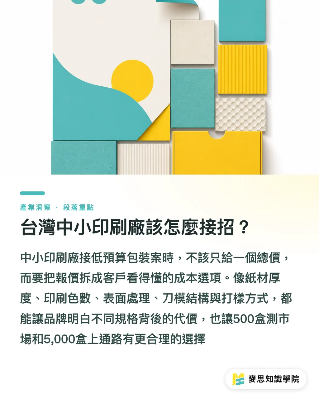
When Taiwan's small and mid printers take on low-budget packaging, the worst thing is a quote sheet that only shows a total price; clients can't see where the money goes, so they only ask if it can be lower
I'd tell printers to break the quote into 5 optional cost blocks
・Stock and caliper: let the client see where the hand-feel comes from
・Print color count: let the client understand 4C, spot color, and color-shift risk
・Surface treatment: let the client read the difference between matte film, gloss film, and spot effects
・Die structure: let the client know how much of the open-the-box experience eats up the work
・Proofing method: let the client understand that a screen proof, a digital proof, and a press proof are not the same thing
This split is fair to the brand too, because a 500-box market test and a 5,000-box retail run are naturally different specs. Designers can also build two price tiers on the same visual system, so procurement sees the trade-off clearly when comparing
Key Takeaways
・The first dollar on a low-budget pack should go to an information hierarchy that reads in 3 seconds
・Paper feel and structural proportion hold a small brand's price tier more reliably than piling on finishing
・One finishing hit placed well usually looks more budgeted than three effects crammed together
・The point of print-ready packaging is getting the design intent to land cleanly on paper, die, and press
Further Thinking
On the print production side, quotes can move from one total price to a five-column cost breakdown. On the design side, two price-tier versions can be built for the brand to compare. AI fits best in low-risk layout variants and image processing. SaaS fits best as a starting point for pre-print checks and quote breakdowns. A low-budget job isn't about being cheap; it's about making sure every dollar leaves a feeling in the shopper's hand
Further Reading
FAQ
- Should I do hot foil first on a low-budget pack?
- Not necessarily. Lock down layout order, paper feel, and prepress stability first; if those three aren't handled, foil just exposes the problems more clearly
- What is print-ready packaging?
- Print-ready packaging is a design file already prepped for press and production, including die lines, bleed, color, substrate, and finishing marks, so the printer can quote, proof, and run it without extra back-and-forth
- Where should a small brand cut first on packaging?
- Cut the decorative surface that shoppers never linger on, and keep the spend that drives hand-feel, structure, and production stability; that's how a low-budget pack avoids looking like a temp product
- How can Taiwan's printers keep low-budget jobs out of a price war?
- Break the packaging quote into 5 optional cost blocks so clients can see how each dollar affects hand-feel, color, structure, and proofing risk
- What should designers check before handing off a low-budget file?
- Before handoff, confirm 3mm bleed, die lines on their own layer, CMYK or Pantone setup, finishing black files, and a white-sample test assembly; these details directly drive prepress rejections and proofing cost
Related articles



The Print × AI weekly
The print and AI know-how designers, brands and enterprises can use before they commit — one email, every week
MINDS Free Tools
Imposition calculator and preflight file check — free prepress tools, right in your browser.
MINDS Group
Need actual printing or gifting services?
From premium printing to online ordering and festive gifts — the MINDS Group sister brands take it from here.