

Why Good Design Can Let an Ordinary Product Sell at Ten Times the Premium
To make low-budget packaging feel expensive, first move the budget away from places consumers do not understand, and concentrate it on details they can actually feel when they pick it up, look at it, and open it. This is exactly the answer we at MINDS most often give when helping brands upgrade
I recently watched that designer interview about the visual magic of going from $0 to $100,000. It pointed out that in a market crowded with lookalike products, design power can turn directly into business value
After more than a decade watching this from the production side, that hits especially hard
Many clients think a premium feel means throwing money at the job. In reality, if you understand current visual trends, such as minimalist white space paired with retro typography, then add special finishing materials with some finesse, you can sharply raise the perceived value of a product on the shelf
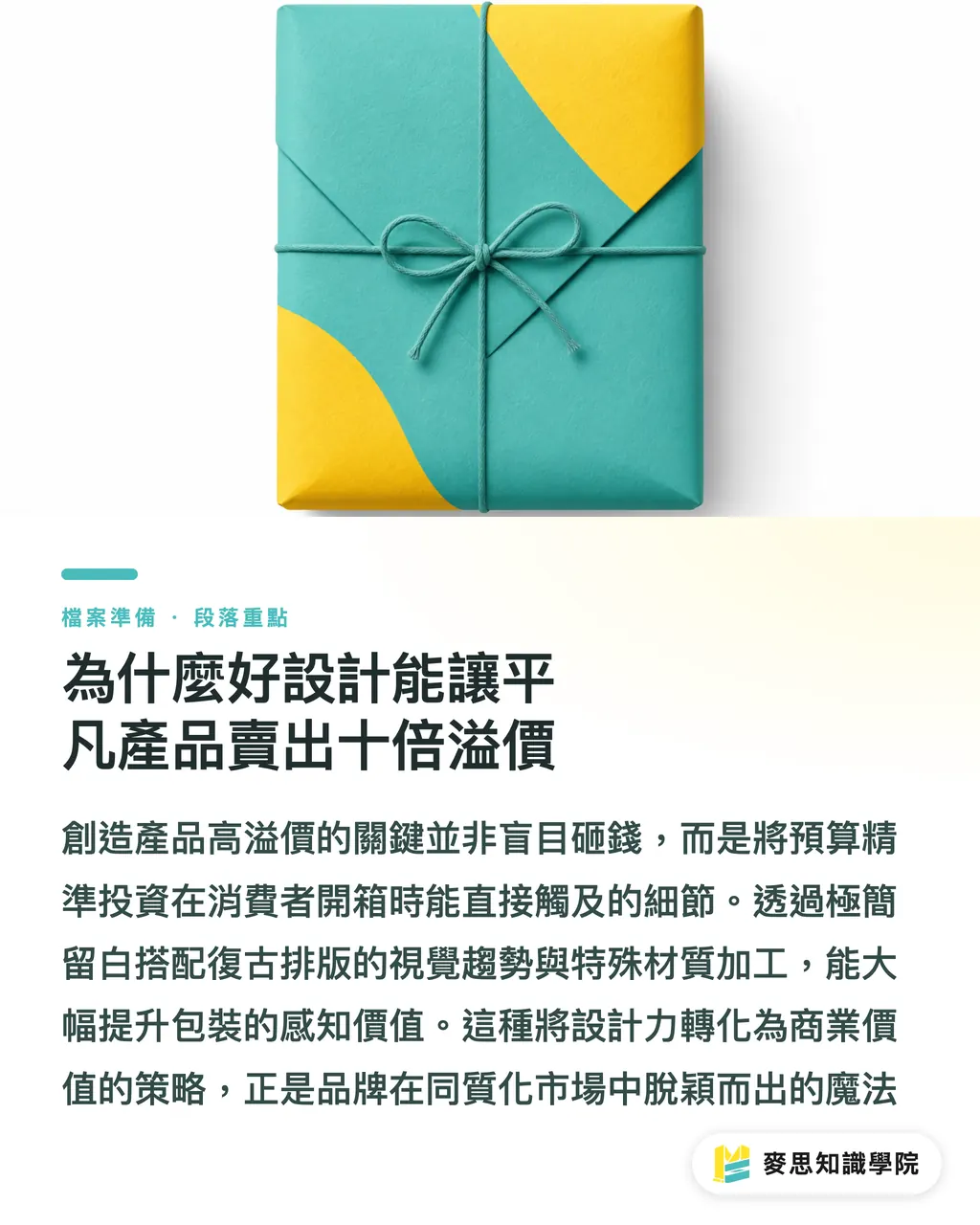
How to Create a Premium Feel on a Tight Budget
The biggest trap in low-budget packaging is spreading money evenly across every detail, until every part looks like a compromise
Internally, we have shaped this into the "MINDS (MS, mid-to-high-end fully custom commercial printing) three-gate print submission" method, built specifically for projects with very tight budgets
The first gate is cost shifting: save money from overly complex structures and die-cutting, then move it into an imported art paper with a distinctive hand feel
The second gate is visual subtraction: replace four-color overprinting with spot colors. The fewer the colors, the purer the look, and the easier it is to bring out a premium feel
・Gate 1, cost shifting: give up complex structures and put the budget into paper stock consumers can actually touch
・Gate 2, precise finishing: instead of large-area foil stamping, use local embossing at the visual focal point
・Gate 3, color subtraction: limit the number of colors and use spot colors to raise the overall visual purity
Do Sustainability and Premium Quality Really Clash?
Over the past few months, from European and American client projects to production-line discussions, the pressure around sustainable packaging has clearly become too strong to keep contained
Many people assume that talking about eco-friendliness means sacrificing texture and quality, but the century-old French perfume house L.T. Piver recently offered a strong example
They layered eco-friendly materials with luxurious print craftsmanship and successfully turned sustainability into brand equity that younger consumers are willing to pay for
On top of that, packaging has long since stopped being just a container. Coca-Cola used a single sticker to spark curiosity, which shows that future packaging design must also account for the interactive experience of unboxing
How Screen-Based Magic Lands on the Press
Designers can create visual magic on screen, but if back-end printing cannot carry it, it goes nowhere
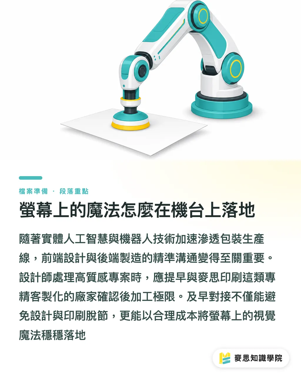
From the clear signals coming out of Automate 2026, physical AI and robotics are moving into packaging production lines at speed
That means communication between front-end design and back-end manufacturing has to be more precise than before
Blindly following trends is not enough. Designers and print shops in Taiwan need to connect earlier
If you have a project where texture and finish matter, work with a specialist such as MINDS, which focuses on mid-to-high-end custom commercial printing. Confirm the limits of post-processing early, so the premium feel you see on screen can land reliably at a reasonable cost
Key Takeaways
Move the budget away from complicated packaging structures and focus investment on tactile paper stock and targeted finishing
Stay on top of visual trends such as minimalist white space and retro typography, and turn design power directly into product price premium
Sustainable materials paired with luxury print craftsmanship are currently the best answer for convincing younger consumers to buy in
Designers must communicate with print shops early and confirm whether post-processing can actually be executed
Further Thinking
For small and midsize print shops in Taiwan and their brand clients, the future battleground is not whose machines print faster. It is who can translate design language accurately into production parameters the line can understand
SaaS practitioners can think about how to build more intuitive prepress preflight tools, helping designers avoid common artwork traps before sending files to print and lowering communication costs on both sides
Further Reading
FAQ
- Why did my packaging cost a lot but still fail to look premium?
- Because the budget was spread across structures or complicated details that consumers do not notice. It should be focused on things they see and feel immediately, such as paper texture, targeted foil stamping, and embossing
- What is the latest visual trend in packaging?
- The industry is currently paying close attention to minimalist white space paired with retro typography, along with sustainable materials combined with special printing techniques to create a premium contrast
- When is the best time for a designer to talk to a print shop?
- Do not wait until the artwork is finished. Bring in a specialist such as MINDS during the sketching and material-setting stage, so you can avoid the awkward situation where a design cannot actually be produced
Related articles

The Print × AI weekly
The print and AI know-how designers, brands and enterprises can use before they commit — one email, every week
MINDS Free Tools
Spine width and imposition calculators — skip the manual math, free in your browser.
MINDS Group
Need actual printing or gifting services?
From premium printing to online ordering and festive gifts — the MINDS Group sister brands take it from here.