

Why Coating Type Decides What Color Actually Looks Like
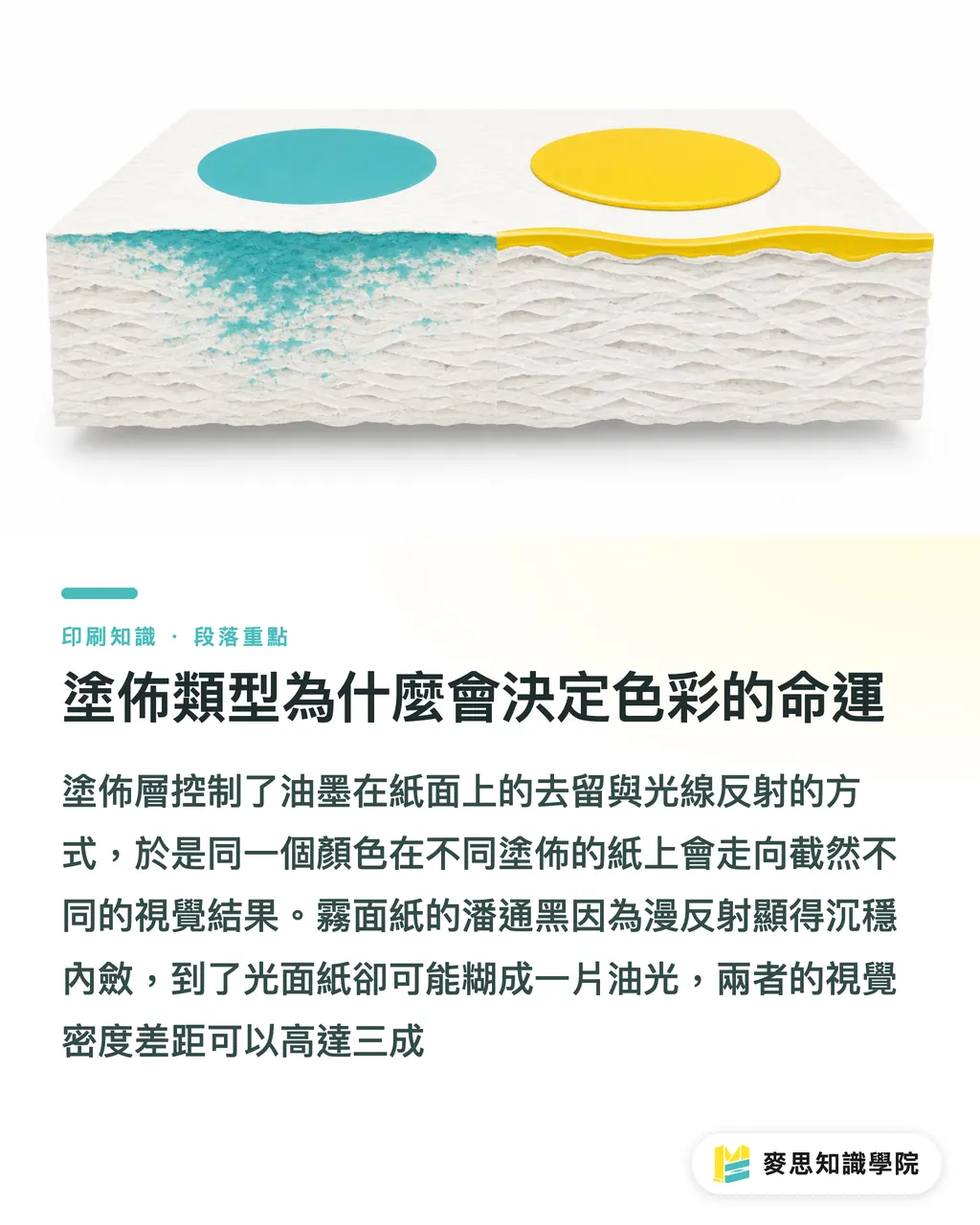
Color on paper comes down to two things: how much ink sinks in, and how much light bounces back to your eye. The coating layer acts like a valve on the paper fibers, deciding whether ink gets absorbed into the fiber or stays on the surface and dries into a film
・Gloss coated (high gloss): The coating is super-calendered, giving an extremely smooth surface. Ink stays almost entirely in the film layer. Light reflects like a mirror, producing high color saturation, deep blacks, and photos and gradients that really pop
・Matte coated (also called double-matte): The coating is equally complete, but the surface is de-glossed. Light scatters diffusely. The look is soft, glare-free, and text-heavy content reads best on it
・Velvet / soft-touch paper: A layer of special resin or tactile coating is added on top of the base coat. It looks matte, feels velvety, and falls into the decorative coating category
MINDS (MS, a mid-to-high-end fully custom commercial printing operation) has spent over a decade helping clients choose paper on the production floor. The phrase we hear most often: 'I thought it was just a brightness difference.' The gap goes much further than bright vs. not bright. Gloss and matte can differ by up to 30% in visual density for the same black. That beautiful Pantone black in your file might turn into a greasy smear on gloss stock, while on matte it reads as calm and authoritative
When Gloss Works, and When It Backfires
Gloss coated stock (also called bright coated or high-gloss coated) is built to make images pop:
・Product catalogs, promo direct mail, holiday flyers: when you need saturation and shelf impact, gloss is the first call
・Food, cosmetics, consumer electronics product shots: the gloss surface reproduces specular highlights accurately, making products look more premium
・Designs with spot UV finishing: gloss as a base, then adding localized gloss accents, gives the strongest layered effect
But gloss has a few downsides that get overlooked:
・Glare interferes with reading: under certain lights or page angles, text effectively disappears
・Fingerprints and scratches show up immediately: any light-colored large area reveals contact
・Small type becomes illegible: body text under 8pt easily blurs on gloss. This is the most common print disaster at trade shows
Bluntly put: gloss stock is shelf-appeal oriented, not reading oriented. The second before the product is opened, when it needs to grab attention on a shelf, gloss wins. Once the customer sits down to read the manual, switch to matte
Why Matte Is the Default for Luxury Brands and Annual Reports
Matte coated stock (also called double-matte or matte coated) has a full coating but a de-glossed surface. The result is color without glare:
・Luxury brand catalogs, annual reports, brand books: quality and readability in equal measure
・Long-form text (white papers, product manuals, getting-started guides): no glare, low reading fatigue
・High-contrast black-and-white photography: matte renders tonal transitions with more nuance. Gloss tends to collapse into flat blocks of dead black and white
Black on matte doesn't shine the way it does on gloss, but it feels denser and heavier. That's why luxury brands prefer matte: it's understated, but has real presence
My observation: matte actually demands more from designers than gloss does. Gloss hides color drift. Matte puts every tonal step on trial. If your colors aren't calibrated properly, matte prints will tell you exactly where things went wrong

Velvet and Soft-Touch Coatings: Beautiful, But Verify Finishing First
Velvet paper, soft-touch stock, and their relatives have become common on luxury packaging and invitation cards in recent years. Visually matte, with a velvety or rubbery feel, people pick them up and keep running their fingers across them
But that tactile experience comes at a cost:
・Poor ink adhesion: the low surface tension of specialty coatings means ink doesn't bond firmly. A thumbnail scratch peels it right off (the industry calls this the 'nail test')
・Finishing compatibility traps: foil stamping and spot UV on velvet stock typically bond far worse than on standard matte. Always run a proof before sending to press
・Longer drying time: ink dries slowly on non-absorbent surfaces, making overprinting and duplex printing prone to smearing
・Standard adhesives may not stick: when used for folded pieces or packaging boxes, adhesive bonding must be separately verified
Velvet paper belongs in decoration-over-information contexts: invitation cover pages, gift box outer wraps, book jackets, places you touch but don't read much. Using it for a 200-page product manual makes no sense. The cost and yield risk aren't worth it
A Pre-Press Paper Checklist for Designers
Pick the wrong paper and everything downstream becomes damage control. From what I've seen on the production floor, more than 60% of finished-goods complaints trace back to an information gap at the paper selection stage. At MINDS (MS), I walk clients through this checklist before sending to press:
・File color goal: photo-heavy and needs to grab attention → gloss coated; long-form reading or quality-first → matte coated; decorative accent → velvet
・Type size and leading: if body text is under 10pt, go matte first. Gloss glare will eat the detail
・Black settings: pure black (K100) on gloss tends to look shiny and greasy. Adding 40% cyan or magenta helps it sit. On matte, straight K100 is fine
・Finishing: foil stamping, spot UV, folding, saddle stitching, perfect binding. Confirm compatibility with your coating type for each one
・Proof and color samples: always run a digital proof or physical sample before the full run. Gloss and matte interpret the same color very differently
・Lead time and cost: specialty coated stocks typically add 2–3 business days to the schedule and run 30%–50% more than standard coated
If your file is finalized but you're still unsure about paper, bring it straight to MINDS for a consultation. You'll get paper recommendations based on what's actually in your file. For short runs of a few hundred prints or event flyers, you can order online at Mai Printing, where standard coated options are available as ready-to-go specs
How Coating Type Drives Finishing Decisions
The surface properties of coated paper directly determine what finishing is safe and what will fail:
・Spot UV: most stable on gloss. On matte, it creates a dramatic gloss-versus-matte contrast effect. On velvet, adhesion is poor
・Foil stamping (gold/silver): stable on both gloss and matte. Velvet requires a proof. Many clients only discover on their first velvet foil job that the foil won't stick
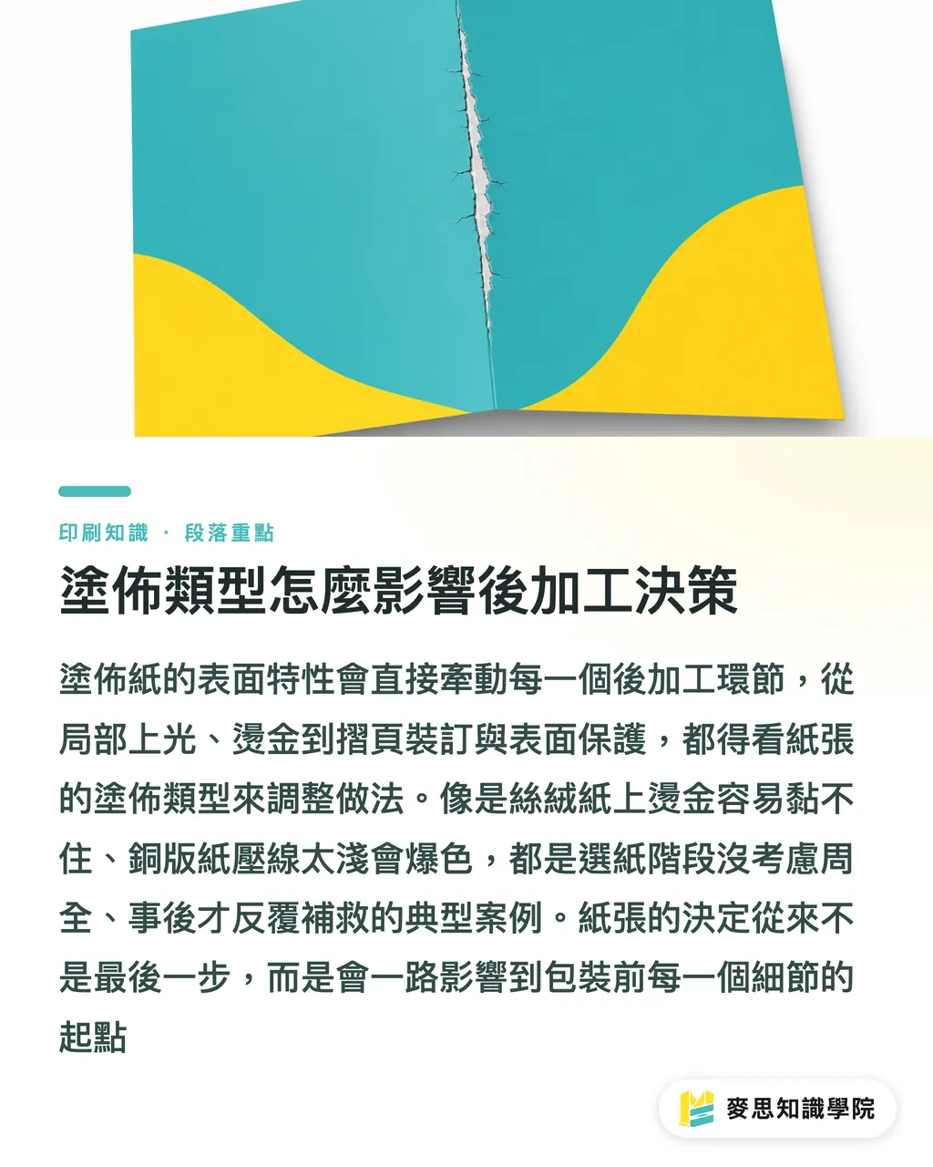
・Folding and scoring: coated stocks have a harder coating layer. Scores must be deep enough and fold margins wide enough. Otherwise the coating cracks and shows white, which the trade calls 'color cracking.'
・Perfect binding and saddle stitching: gloss pages are slick and the coating reduces adhesive bonding. Rough the spine edge when needed, or switch to PUR glue
・Water resistance and durability: gloss naturally resists dirt better. Matte picks up fingerprints and oil easily, so a protective laminate is usually needed
This is what I keep telling clients: paper isn't something you decide at the end. Coating type affects every step, from printing and folding to binding, finishing, and packaging. Get it wrong up front and you'll be cleaning up the mess all the way through
Key Takeaways
・The coating layer decides whether ink stays on the surface or absorbs into the fiber. Two mechanisms, two completely different visual outcomes
・Gloss coated: saturated color, deep blacks, but glare kills readability and small type blurs. Right for shelf-appeal work
・Matte coated: understated and easy to read, but demands precise color calibration. The default for luxury and annual reports
・Velvet paper: irresistible to touch, but finishing compatibility is poor. Decorative use cases, not informational ones
・Paper choice affects the entire finishing chain. Work through the pre-press checklist item by item before sending to press
Further Thoughts
In practice, choosing a coating type is a tug-of-war between design intent and physical constraints. Gloss looks on press exactly like it does on screen. Then the sales rep discovers that glare makes flipping through it in front of a client genuinely awkward. Matte looks 'less impressive' at the proof stage, but once it hits a full press run, color consistency is highest and customer retention is best. My advice to clients: start with 'where will this piece be used, who will see it, and how long will they hold it,' work backward to the paper, then from the paper to what adjustments the file needs. AI and automation tools can't do much in this particular step, because paper 'feel' is a combined tactile and visual experience that no RGB value on a screen can replace. If you want to systematize paper decisions, start by building a proof reference library: real printed samples with finishing records for each material, not just what the paper supplier's catalog shows
Further Reading
・Gloss Coated, Matte Coated, and Velvet Paper: The Real Impact of Coating Type on Print Visual Results (internal knowledge resource)
FAQ
- What's the difference between gloss and matte coated stock, and how do I choose?
- Gloss coated is super-calendered, giving a smooth surface with maximum color saturation and black depth, but the glare interferes with reading. Matte coated is de-glossed, low-glare, easy to read long-form, and has a restrained quality feel. Go gloss for shelf appeal. Go matte for readability and understated quality
- What is velvet paper, and what's it good for?
- Velvet paper adds a layer of specialty resin or tactile coating over the base coat. It looks matte and feels velvety. It belongs on invitation cover pages, gift box outer wraps, and book jackets, decorative over informational contexts. Not recommended for long-form reading or heavy finishing work
- Will colors look washed out on matte paper?
- Matte does produce slightly lower color saturation than gloss. That's physics, not a defect. Diffuse reflection is just how the surface works. If your file already has low saturation to begin with, matte will make the gap more obvious. The fix: calibrate your color references to matte stock at the proofing stage, not at the gloss stage
- How much does the same black differ between gloss and matte?
- Visual density can differ by around 30%. Pure black (K100) on gloss reflects and looks shiny and oily. On matte it reads as dense and grounded. If your file was proofed on gloss and you're switching to matte, add 40% cyan or magenta to the black to recover the visual weight
- Is proofing before press really necessary?
- Strongly recommended. Gloss and matte interpret the same color very differently, and finishing such as foil stamping, spot UV, and folding can run into compatibility issues. Run at least one digital or physical proof before the full run. It's the one step that prevents printing an entire batch wrong
Related articles



The Print × AI weekly
The print and AI know-how designers, brands and enterprises can use before they commit — one email, every week
MINDS Free Tools
Spine width and imposition calculators — skip the manual math, free in your browser.
MINDS Group
Need actual printing or gifting services?
From premium printing to online ordering and festive gifts — the MINDS Group sister brands take it from here.