
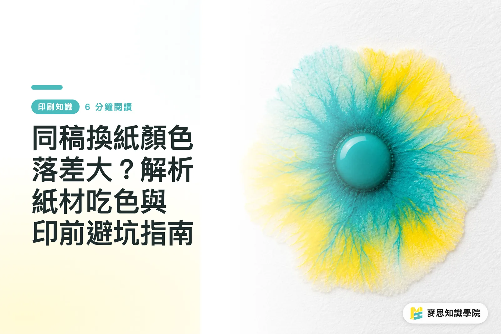
Why Does the Same Design File Look So Different on Different Papers?
A paper's coating structure and base white tone directly dictate the ink penetration path and light reflection
Many designers set up their CMYK color values on screen and assume that as long as the file doesn't change, the printed color will match perfectly. Yet printing that exact design on glossy coated paper yields high contrast and striking punch, while switching to woodfree or fine paper instantly covers the colors in a grey haze. This isn't bad press work or a faulty machine. It's pure physics
When ink transfers from the plate to the paper surface, dot gain occurs (Dot Gain: a physical phenomenon where ink spreads beyond the original design dot area due to paper absorption and mechanical pressure). Paper fiber density and surface coating determine whether ink stays on top or sinks into the fibers. The deeper it sinks, the more dot edges spread, and the more light gets absorbed through the ink film, causing visual saturation to drop sharply
According to ISO 12647-2 international color standards, gloss coated paper typically sees a dot gain of 10% to 15%, while uncoated woodfree paper often reaches 20% to 25%. That means a 50% midtone dot in your design expands straight to 70% or 75% on woodfree paper, turning fine detail into mush
Hold on
In pre-press discussions at MINDS Printing, clients often bring in a coated paper proof expecting an exact match on woodfree paper. Grasping the physical interaction between ink and paper is step one to avoiding line disputes and wasted proofing rounds

How Does Ink Absorption Differ Between Coated and Uncoated Papers?
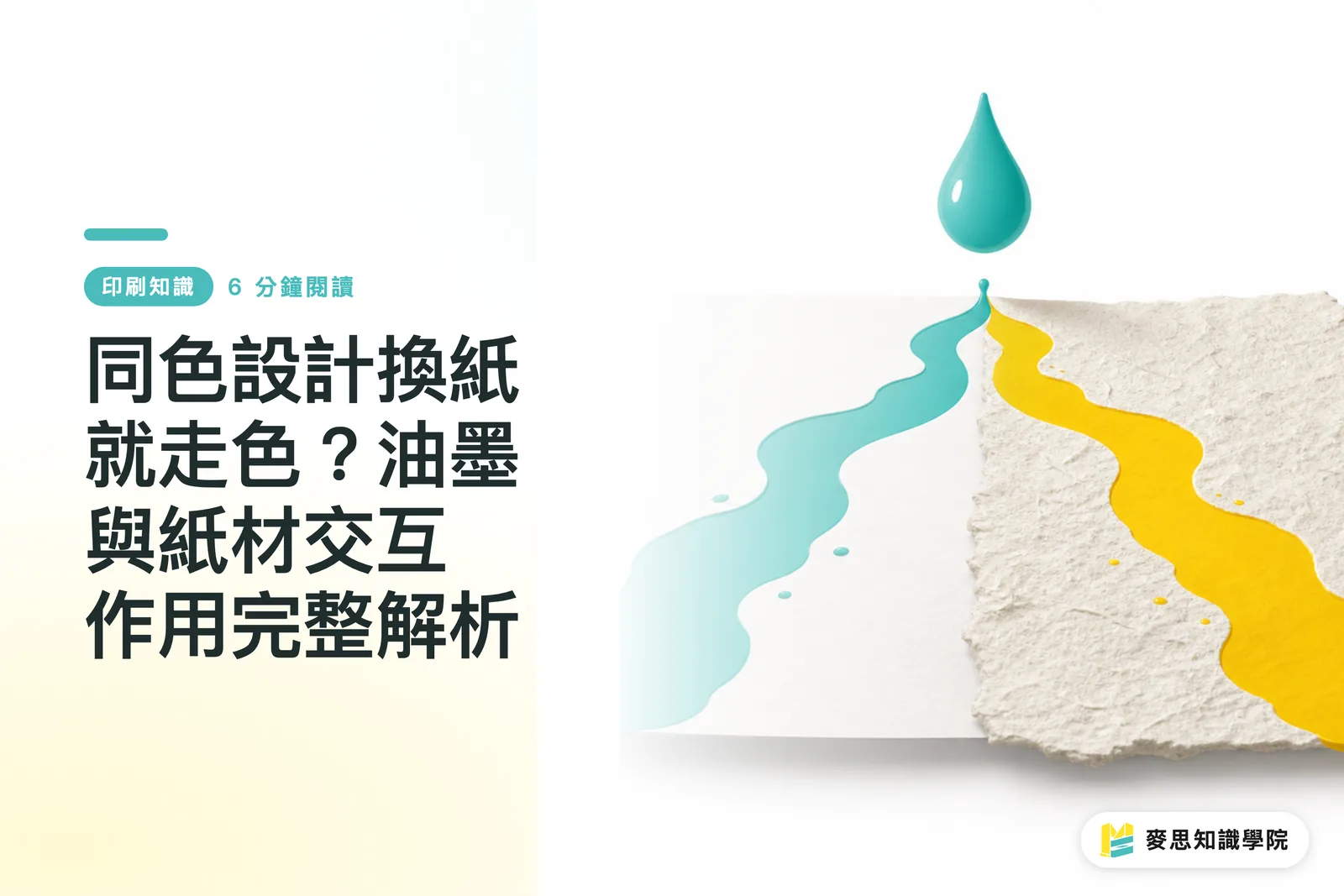
Coated paper blocks ink penetration with a top layer of kaolin clay and calcium carbonate to preserve rich saturation. Uncoated paper lets plant fibers soak up ink directly, scattering light and muting color
Whether paper gets a surface coating during manufacturing changes how ink settles. Coated paper carries an ultra-smooth mineral coating that seals tiny gaps between wood fibers. Uncoated paper keeps its raw fiber structure, leaving large pores and high absorbency. These two structures take in ink differently:
・Coated Art Paper: Features a smooth high-gloss coating that keeps ink right at the surface. High specular reflection creates vibrant, rich color with sharp dot edges
・Matte Coated Paper: Uses a light matte coating that matches art paper saturation without glare, making it ideal for art books and annual reports
・Woodfree Paper: Lacks protective surface coating. Large plant fiber pores cause ink to spread sideways and downward quickly, dulling visual saturation
・Cotton and Fine Papers: Rough fibers and loose structure soak ink fast, triggering dot gain and bleeding. Perfect for tactile, indie-style work
Beyond absorbency, base paper white tone acts as a hidden force behind final color. Some paper uses optical brighteners to produce a cool blue-white, while other paper keeps the warm yellow tone of raw pulp. Because printing inks are translucent, printing on yellowish woodfree paper pulls blue and purple tones off balance, something tweaking CMYK numbers alone cannot fix
How Can Pre-Press Setup Prevent Color Variations Across Papers?
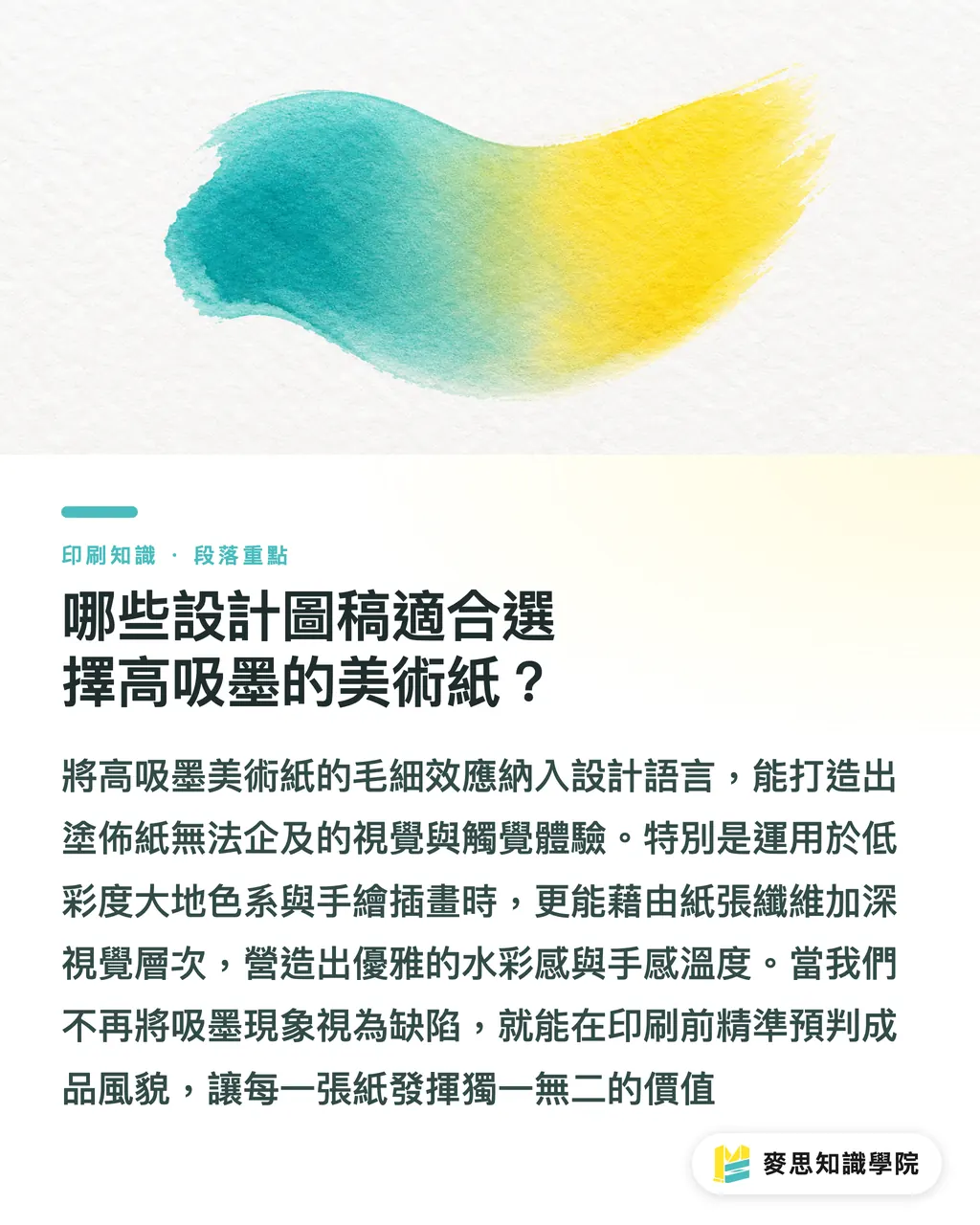
Preventing color shifts across paper types hinges on compensating dot gain and adjusting ICC Profile curves early in the design file via the MINDS Printing (MS, mid-to-high-end full custom commercial printing) Three-Gate Pre-Press Check
Keeping a brand identity or hero visual consistent across different papers requires a standard pre-press workflow rather than relying on on-the-fly press adjustments. Proven steps include:
・① Gate 1: Match paper whiteness and coating. Check if the target paper runs cool blue or warm yellow, then load the paper-specific ICC Profile into your design software for soft proofing
・② Gate 2: Adjust dot gain and total ink limit for the paper stock. For uncoated paper, keep CMYK Total Area Coverage (TAC) under 260% to 280% to avoid heavy ink buildup, dot mudding, and set-off
・③ Gate 3: Align proofing and mass production settings completely. Ensure proof sheets use the exact brand and batch of paper as the main run, using identical impression pressure
It's simple
Physical proofing is the smartest investment when a design team is unsure about stock output. For quick online tests on short runs, use the retail service at MINDS Print to print test sheets first, catching saturation issues before launching mass production
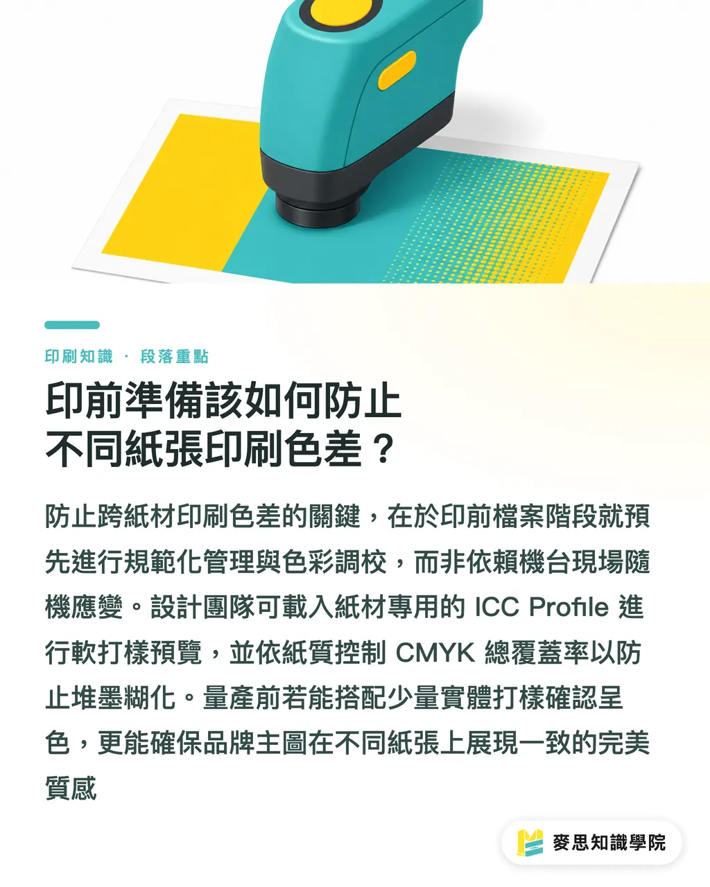
Which Design Artwork Fits High-Absorption Fine Paper Best?
Designs with clean lines, generous white space, or a warm human feel work best on high-absorption fine paper
Not every design needs peak saturation and intense contrast. Once you understand paper traits, you can lean into paper capillarity to build visual and tactile qualities that coated paper cannot match:
・High-contrast photos with heavy dark areas: Avoid woodfree or rough fine paper, as dark dot gain will bleed shadow details together
・Muted earth tones and hand-drawn illustrations: Uncoated fine paper uses fiber capillary action to deepen visual depth, adding a delicate watercolor feel and warm touch
・Commercial high-saturation catalogs: Stick to gloss or matte coated paper so light reflection accurately renders product textures and vivid colors
When you stop viewing uncoated paper absorption as a flaw and start treating it as part of your design language, you can predict the printed outcome accurately and let every paper stock showcase its true character
Key Takeaways
・Paper coating structure determines ink penetration paths and dot gain. Strong absorption in uncoated paper lowers natural color saturation
・Gloss coated paper sees a dot gain around 10% to 15%, while uncoated woodfree paper can reach 20% to 25%
・To prevent pre-press color shifts, follow the MINDS Printing (MS) Three-Gate Pre-Press Check and trim CMYK Total Area Coverage on uncoated paper down to 260%–280%
・High-absorption fine paper suits low-saturation illustrations and clean design, while commercial product lookbooks call for coated art paper
・Test proofs must use the same paper batch and press settings as the final production run
Final Thoughts
The goal of color management across paper types is not making woodfree paper shine like gloss stock, but matching materials with design language seamlessly. As AI pre-press inspection tools take off, systems will automatically read target paper ICC Profiles during upload and fix dot gain values instantly. Even so, understanding the physics of ink absorption and paper whiteness remains an irreplaceable core skill for designers and print buyers
FAQ
- Why do photos look dull and grey when printed on woodfree paper using the same file?
- Woodfree paper is uncoated. Plant fibers soak up ink directly, pushing dots outward. Combined with light scattering inside the fibers, visual saturation and contrast drop compared to coated paper
- How should pre-press be set up if a brand requests a rich black background on fine paper?
- Lower the total CMYK coverage (TAC) below 260% to 280%. This prevents heavy ink buildup from causing dot gain blur or set-off on absorbent fine paper
- What causes color differences between digital proofs and final mass production prints?
- The most common culprit is a mismatch in paper coating or base whiteness between proofing and production stock. Using the exact same brand and batch of paper across both runs is the only way to avoid shifts
Related articles



The Print × AI weekly
The print and AI know-how designers, brands and enterprises can use before they commit — one email, every week
Tool Library
RGB↔CMYK conversion, ΔE color difference and brand color print analysis — free color management tools, computed right in your browser.
MINDS Group
Need actual printing or gifting services?
From premium printing to online ordering and festive gifts — the MINDS Group sister brands take it from here.