

Why can't Pantone 877 just be printed in CMYK?
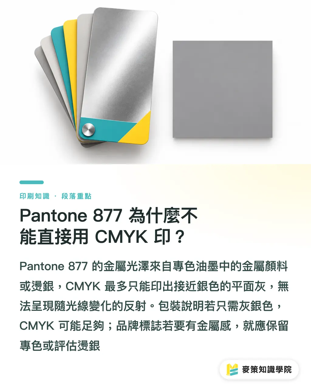
Pantone 877's metallic shine takes a spot ink with metallic pigment or silver foil stamping. CMYK alone can't do it. A metallic spot color is an ink loaded with metal pigment, printed on its own plate, and it reflects light in a way stacked CMYK can't reproduce
CMYK can mix a gray that looks close to silver, but it's a flat color with no metal flakes catching the light. Convert a Pantone 877 swatch to CMYK and it may look close on screen. On paper it usually turns out a dull gray-silver, and tilting the sheet won't give you any silver flash
Before prepress I always ask one thing: do you want a silver-gray, or do you want to see a glint when the light moves? For explanatory text on a packaging box, a gray-silver may be all you need and CMYK could do. If a brand logo needs to feel metallic, keep the spot color or look at foil stamping
How do you prepare the print file for Pantone 877?
Keep Pantone 877 as a separate spot plate in the file, and confirm paper and print method before submitting. Mai Strategy's three checkpoints run in order: effect, separations, physical proof. That way designers and buyers aren't arguing over a screen image
・①Effect check: say whether you want silver-gray or true metallic shine, then mark whether the silver is a full-bleed fill, fine text or a small logo. Don't just write "make it silver"
・②File check: keep the spot name Pantone 877 C in the layout file, look at the separation preview to confirm a separate spot plate shows up, and make sure the PDF export didn't convert the spot to CMYK
・③Proof check: tell the printer the paper and any finishing such as varnish or lamination, and sign off on a real proof. Don't judge the finished piece from a color block on screen
If the design also has images, black text or a background color, note whether the silver ink prints over them or knocks out. Metallic ink looks different when it sits over other colors. The printer can only check separations, registration and fine text once they have the file
How does paper change the look of Pantone 877?
Paper changes the brightness and look of Pantone 877, so choose it before submitting. The C in Pantone 877 C means the coated-stock swatch. Smooth coated paper usually shows silver ink shine more easily, while the texture of a fine art paper scatters the reflection
The same silver logo on smooth coated stock and on textured art paper won't look identical. The paper's own color matters too. If you're switching to dark stock, ask the printer first whether it needs a white underprint, then run a test on the chosen paper
Put the paper, the printed side, and whether there's varnish or lamination in the quote or the job notes. If a buyer swaps the paper after sign-off, reconfirm the effect, or the silver you approved won't match what comes off the press
Spot ink, silver foil or CMYK simulation: which should you pick for Pantone 877?
If you want metallic shine, evaluate Pantone 877 spot ink first. If you want a brighter foil look, consider silver foil stamping. If a silver-gray is all you need, go with CMYK simulation
・Pantone 877 metallic spot ink: suits text, lines and more complex graphics. The shine depends on the paper surface and press conditions, so look at a real proof first
・Silver foil stamping: a heated die transfers silver foil onto the paper, and the reflection is usually stronger. It needs a foil die and a post-press step, so test-stamp small text and thin lines first
・CMYK silver-gray simulation: fine for gray-silver text or backgrounds that don't need shine. The result has no metal flakes and can't be passed off as equivalent to Pantone 877
I pick the method with one question: do you need to see a glint when you tilt the sheet? Then I confirm the artwork, paper and finishing order. The three methods look different, and choosing by price alone is an easy way to get it wrong
What should you check when proofing and signing off Pantone 877?
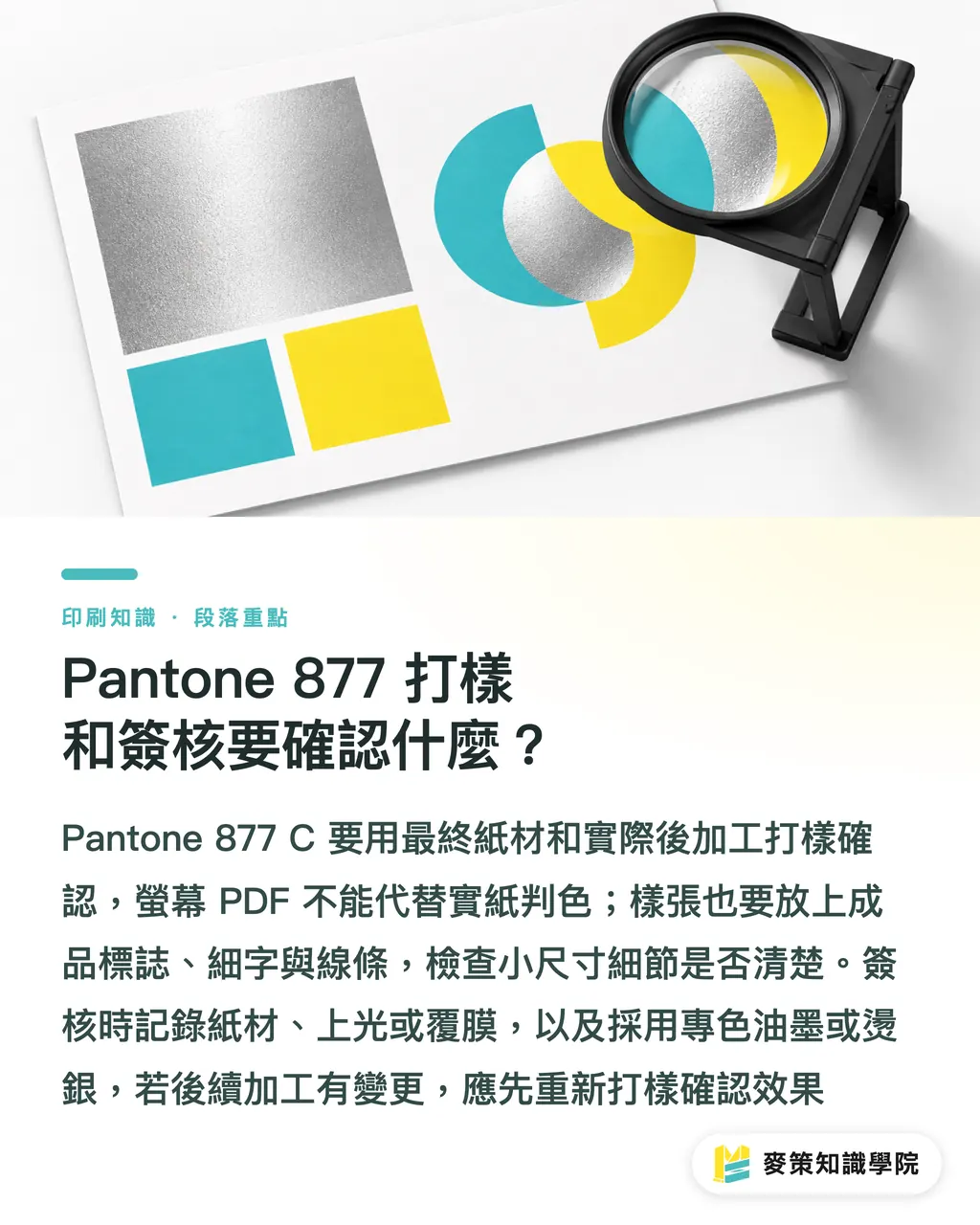
To confirm the Pantone 877 effect, proof on the final paper with the real post-press finishing. A screen PDF is fine for checking layout but can't stand in for judging color on real stock. Put a solid silver block on the proof along with the logo, fine text and lines the finished piece will use, so you can see whether small details stay clear
At sign-off, record Pantone 877 C, the paper, varnish or lamination, and whether you chose spot ink or foil. If lamination or spot varnish gets added later, the metallic reflection may change, so make a proof that includes that finishing and confirm again
If you're unsure on a first print run, bring a Pantone 877 C swatch, the planned paper and the actual artwork to the Mai Strategy Knowledge Academy advisory team and settle the method and proofing together. It's less hassle than arguing "why isn't it brighter?" after the run is printed
Key takeaways
・CMYK can make a silver-gray, but it can't make metallic shine
・For real silver shine, keep Pantone 877 as a spot color or choose foil stamping
・Pantone 877 C refers to coated stock, so if you move to art paper, look at a new proof
・Sign off swatch, paper and finishing together. A screen can't replace real stock
Further thoughts
Printers can add the Pantone 877 spot plate and paper stock to their job-intake checklist. Designers can attach the swatch and proofing requirements when they hand off files. AI or SaaS preflight can flag a spot color converted to CMYK, a missing paper stock or unmarked finishing, but the final metallic effect still has to be confirmed on a real-stock proof
FAQ
- Can Pantone 877 be converted to CMYK?
- You can simulate a close silver-gray, but CMYK has no metallic pigment, so it can't reproduce the shine of Pantone 877
- Does Pantone 877 have to be foil stamped?
- No. Metallic spot ink can give a silver metallic look. Consider foil stamping when you want a brighter foil finish
- Can Pantone 877 C be printed on art paper?
- Yes, but C is the coated-stock swatch. On textured art paper the reflection and look will differ, so proof on the actual paper
- How should I submit the print file for Pantone 877?
- Keep Pantone 877 C as a separate spot plate, tell the printer the paper and finishing you want, and sign off on the finished effect after proofing
Related articles




The Print × AI weekly
The print and AI know-how designers, brands and enterprises can use before they commit — one email, every week
Tool Library
RGB↔CMYK conversion, ΔE color difference and brand color print analysis — free color management tools, computed right in your browser.
MINDS Group
Need actual printing or gifting services?
From premium printing to online ordering and festive gifts — the MINDS Group sister brands take it from here.