

Overview
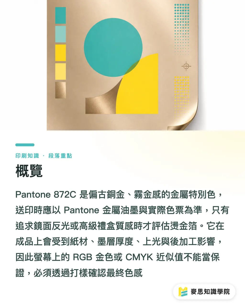
Pantone 872C is a metallic spot color with a bronze-gold, matte-gold feel. In real production, it should usually be printed with Pantone metallic ink on press. If the client wants mirror-like reflection or a premium gift-box feel, then foil stamping should be considered instead. At MINDS (MS, mid-to-high-end fully custom commercial printing), the three print-check gates start by confirming the swatch and paper, then choosing metallic ink or foil stamping, and finally locking the finished color through proofing
Slow down first
Pantone 872C may look gold on screen, but the print floor sees something else: this is a spot color heavily affected by paper surface, ink film thickness, coating, and finishing. The RGB gold or CMYK approximation in a design file cannot be treated as a guarantee of the final printed result
What Color Is Pantone 872C?
Pantone 872C is a commonly used metallic gold spot color in the Pantone Metallics series. The C in the code stands for Coated, usually referring to coated stocks such as art paper or matte coated paper. It is not a gold made by mixing ordinary yellow and black. Its metallic look comes from reflective particles in metallic ink
Spot color definition: A spot color is a specified ink that is mixed separately and printed on its own plate. It is often used for brand colors, fluorescent colors, metallic colors, and other colors that CMYK struggles to reproduce consistently
When I look at 872C, I first judge it as a "matte bronze gold," not a "bright gold." If the gold in the client's mind is like a trophy, gold foil, or a luxury box with a mirror shine, 872C metallic ink will usually feel more restrained than expected
A very practical way to judge it: the same 872C will reflect more on glossy coated paper, while on woodfree paper or cotton paper, the paper fibers will absorb part of the shine. The finished piece will land closer to a calm bronze gold or dark gold
Can Pantone 872C Be Converted Directly to CMYK?
Pantone 872C can be converted into a CMYK approximation in software, but that only finds a "somewhat close earthy yellow-brown" within four process inks. The metallic reflection does not come along for the ride. CMYK has no metallic powder, so the common printed result is dark, muddy, and missing the metallic glow
CMYK definition: CMYK is the cyan, magenta, yellow, and black halftone overprint system commonly used in printing. It works well for photos and general color images, but it cannot recreate metallic reflection through dots alone
I usually tell designers this: if 872C is just one small decorative color in the layout, a CMYK approximation may be acceptable. If it is the Logo, the main brand color, a cover headline, or an award-certificate border, converting it straight to CMYK means betting that the client's eyes will not be picky
MINDS (MS) three print-check gates apply directly to 872C:
・① Check the paper version: Confirm that the client wants Pantone 872C Coated. Do not take a C-version swatch and expect uncoated paper to look just as bright
・② Choose the process: For matte gold, bronze gold, and larger printable areas, use a metallic spot color. For mirror-bright gold, strong reflection, and a ceremonial gift-box feel, use foil stamping
・③ Proof to lock color: Before the formal run, make at least one proof on the actual paper, and confirm the paper, coating, lamination, foil plate details, and related finishing together
If your project involves a main brand color or a wide packaging rollout, I would suggest having the Mai Strategy Knowledge Academy consulting team review the file and production setup first. When Pantone 872C goes wrong, the issue is often not the color number. It is that the paper, finishing, and client expectations were never aligned
How Do You Choose Between Metallic Ink and Foil Stamping?
Metallic ink is suitable when Pantone 872C is being used as a "printing color." It can print details, integrate with the layout, and cover larger color blocks. Foil stamping is suitable when gold is being used as a "finishing effect." It reflects more strongly, but it requires a foil stamping die, pressure, temperature, and registration control
Foil stamping definition: Foil stamping is a finishing process that uses heat and pressure to transfer metallic foil onto paper. It is common on covers, gift boxes, business cards, and premium-looking packaging
I use 3 on-site questions to help clients choose:
・How large is the design area: 872C metallic ink works well for a Logo, headline, line frame, or small-to-medium background pattern. If the whole surface is full-bleed gold and consistent brightness matters, the paper and press ink control need to be checked first
・How strong should the reflection be: Metallic ink gives a muted shine with particle reflection. Foil stamping gives a sheet-like mirror reflection. Under the same light, the difference is obvious
・How fine are the details: Fine lines under 0.3 mm, tiny reversed-out text, and overly dense patterns are usually easier to control with metallic ink than foil stamping. Foil stamping also needs checks for filling in, foil loss, and registration
For business cards, 872C metallic ink can give the layout a steady gold tone. For wedding invitations, certificates, and luxury boxes, clients usually expect the instant shine of foil stamping. In that case, forcing 872C metallic ink often leads to the comment, "Why doesn't it look very gold?"
How Should Pantone 872C Be Set Up in a Design File?
Pantone 872C in the design file should be set as a Spot Color, not just filled with a set of CMYK values. When the printer sees a Spot Color, they know it is an independent spot ink that needs its own plate and its own ink pass
When handing off files, I ask designers to do 5 things:
・In Illustrator or InDesign, name the swatch Pantone 872 C and set it as a Spot Color
・Do not use 4 different naming variations—such as Pantone 872 C, PANTONE 872C, Gold, and localized aliases—in the same file, as the prepress RIP may separate them into different plates
・For products that need bleed, still leave 3 mm bleed. Metallic spot color objects that touch the trim edge also need to extend into the bleed area
・Do not make reversed-out text too fine. If small text under 6 pt sits on a 872C color block, the edges must be checked carefully during proofing
・If there is matte lamination, gloss lamination, spot UV, or embossing, mark those finishing layers separately so the printer does not treat effect layers as ordinary print objects
I have seen too many 872C jobs fail because of file naming and swatch management. The color itself was not wrong. The problem was that the file contained 2 golds that looked identical, which output as two plates. Then the troubleshooting started on the print floor
How Do Paper and Finishing Affect 872C?
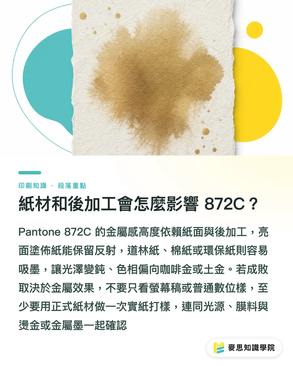
The metallic feel of Pantone 872C depends heavily on the paper surface. Glossy coated paper preserves more reflection. Woodfree paper, cotton paper, and recycled paper absorb ink, and once the metallic particles are wrapped by paper fibers, the shine turns dull. The color also tends to move toward coffee gold or earthy gold
Coating and lamination also change the expression of 872C. Gloss lamination may increase surface reflection, but it can cover the original texture of the metallic particles. Matte lamination often pushes metallic colors into a more understated look
Simple enough
If the success of this print run depends on the 872C metallic effect, do not look only at the screen proof, and do not rely only on a standard digital proof. At minimum, make one proof on the actual production paper and evaluate the light source, film, foil stamping, or metallic ink together
If your team often works with Pantone, spot colors, paper, and post-press finishing, subscribing to the Mai Strategy Knowledge Academy newsletter will help more than looking up a color value at the last minute. Print color matching does not come from one single answer. It comes from asking through the risks before every job goes to press
Key Takeaways
・If Pantone 872C needs to look metallic, treat it as a spot color. Do not expect a CMYK conversion to save the job
・Metallic ink gives matte gold and bronze gold. Foil stamping gives mirror reflection. They are not the same effect
・Paper tells more truth than screen color values. The same 872C can look like two different colors on coated and uncoated paper
・Manage 872C as a Spot Color in the design file. One messy swatch name adds one more prepress risk
・Important jobs must be proofed on the actual paper. Metallic color cannot be approved by PDF alone
Further Thinking
For printers, metallic colors like Pantone 872C should be moved forward into quotation and prepress discussions. Do not wait until the job is on press and make the press operator guess whether the client wants matte gold or bright gold. For designers, AI can help generate gold visual references, but production files still need to come back to 4 things: Spot Color, paper, plate separation, and proofing. For SaaS tools, if a PDF upload can automatically flag "872C has been converted to CMYK," "Spot Color names are inconsistent," or "metallic color objects are too fine," that would speak much more directly to the pain points of print buyers in Taiwan than simply displaying color values
FAQ
- Does Pantone 872C Have to Be Printed as a Spot Color?
- If you want a metallic feel, Pantone 872C should be printed with metallic spot ink. If you only want an ordinary visual that is close to gold, you can use a CMYK approximation, but the finished piece will not have metallic reflection
- Which Looks More Like Premium Gold, Pantone 872C or Foil Stamping?
- Foil stamping looks more like mirror-bright gold and suits gift boxes, wedding invitations, certificates, and premium packaging. Pantone 872C metallic ink looks more like matte gold or bronze gold, and suits Logos, headlines, line frames, and finer printed details
- Will Pantone 872C Look Bright on Woodfree Paper?
- Pantone 872C usually prints darker on woodfree paper than on coated paper because uncoated stock absorbs ink more noticeably, and the reflection from metallic particles is weakened by the paper fibers. If the metallic feel matters, proof on the actual paper first
- How Should Pantone 872C Be Sent to the Printer in the Design File?
- Set Pantone 872C as a Spot Color, keep the swatch name consistent, and mark foil stamping, coating, embossing, and other finishing layers separately. Do not hand the printer only a set of CMYK values and leave them to guess
- Can Pantone 872C Be Used Together with Matte Lamination?
- Yes, but matte lamination often makes metallic reflection more understated, and 872C may move closer to a calm dark gold. If the client expects an obvious sparkling effect, test 872C and matte lamination together on the actual production paper
Related articles



The Print × AI weekly
The print and AI know-how designers, brands and enterprises can use before they commit — one email, every week
MINDS Free Tools
Spine width and imposition calculators — skip the manual math, free in your browser.
MINDS Group
Need actual printing or gifting services?
From premium printing to online ordering and festive gifts — the MINDS Group sister brands take it from here.