
Overview
Pantone 6076C is a low-chroma, warm beige Pantone Coated color. It works well as a packaging base color, brand support color, and premium-looking layout color. For print submission, MINDS (MS, mid- to high-end fully custom commercial printing) recommends a three-gate process: decide the paper first, then decide spot color or CMYK, and finally review a proof. Do not place an order based only on screen color or an online formula
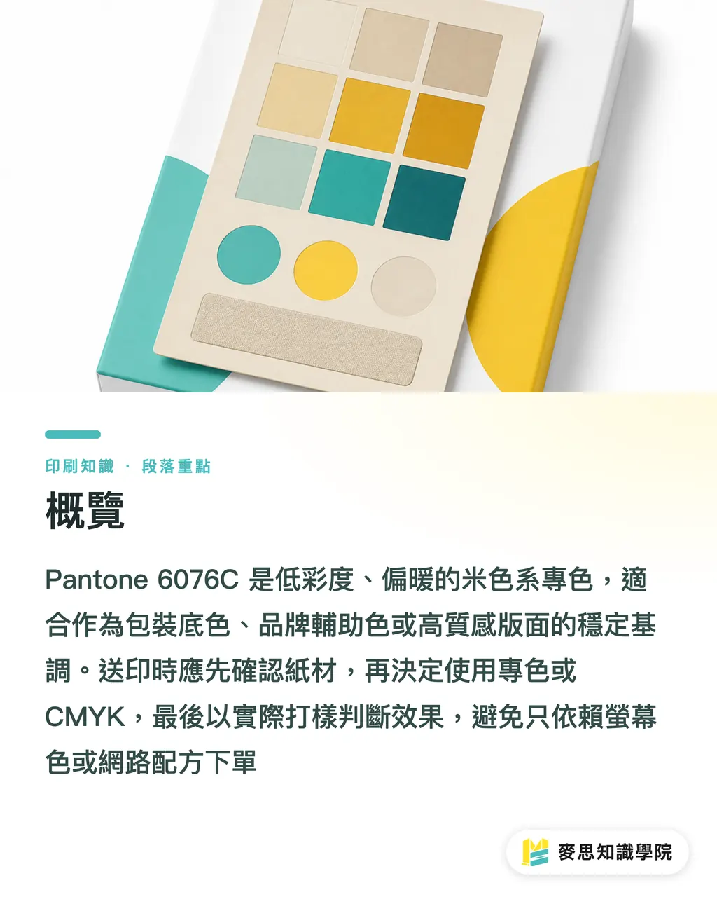
What Color Is Pantone 6076C, and Where Does It Work Best?
Pantone 6076C is a low-chroma, warm beige spot color in the Pantone Coated series. It is often used for backgrounds, packaging base colors, brand support colors, and refined layouts. It should not be judged by screen alone
I would put 6076C in the category of "quiet but process-sensitive" colors. It does not jump out with obvious color shifts the way a warm red like Pantone 032C can, and it does not turn visibly purple when converted to CMYK the way blues such as 286C or 293C often do. The trouble with 6076C is subtler. If it goes a little too yellow, a little too gray, or a little muddy, the client will feel the finish has lost quality
There are 4 common use cases
・Luxury packaging boxes, skincare boxes, and tea boxes, using 6076C as a large-area base color so foil stamping, black type, or a deep green logo can stand out
・Brand identity support color, used on the back of business cards, catalog section backgrounds, hang tags, and envelope liners
・Food, lifestyle, and cultural creative products, using 6076C as a "clean but not cold" background
・When SaaS or e-commerce visuals extend into printed materials, using 6076C to carry over the light-toned brand feel from online layouts
Beige is most at risk of fake sophistication. It may look gentle on screen, then turn into old newspaper color on paper. For 6076C to look good, the key is a clean paper base and stable print control
Can Pantone 6076C Be Converted Directly to CMYK?
Pantone 6076C can be converted to CMYK, but no single set of CMYK values should be treated as a universal standard. The same 6076C can produce different four-color ratios depending on the software color library, ICC profile, paper whiteness, and printing conditions
There is a real production issue when low-chroma beige is converted to CMYK: the color looks pale, but it often needs C, M, Y, and K plates working together. Once the screen dots on just 1 plate drift, the whole beige can shift gray, green, or red
For 6076C, I recommend using the "MINDS (MS) three-gate print submission process."
・① Decide the paper first: confirm whether it is art paper, matte art paper, woodfree paper, recycled paper, or colored paper. The C in 6076C means Coated. Once you move to uncoated paper, you cannot expect the same visual result
・② Choose the process first: for a main brand color, a large-area base color, or packaging that will be reprinted, consider spot color first. For short runs, limited budgets, or one-time marketing pieces, then assess a CMYK approximation
・③ Review the proof first: check at least 1 digital proof or press proof on paper close to the final stock. Do not confirm the beige only inside a PDF
If a designer asks me, "What exactly is the CMYK for 6076C?" I usually ask 3 things first: what paper is it printing on, how large is the printed area, and how much color difference can the client accept? Without those 3 answers, a CMYK formula is just a guess that looks professional
Why Does Low-Chroma Beige Look Dirty When the Paper Changes?
Low-chroma beige has very weak color strength. The paper's own whiteness, ink absorption, and surface smoothness directly change the look of the finished piece. With beige colors like 6076C, if the paper is yellowish or absorbs ink more deeply, the color can easily move darker, dirtier, and older
These are the 4 most common shifts I have seen on the print floor
・Art paper: the color is cleaner, and the warm beige of 6076C is easier to preserve, but gloss reflection can make the color look lighter
・Matte art paper: stable in feel and softer than gloss art paper, suitable for catalogs, cards, and outer packaging boxes
・Woodfree paper: ink absorption is more noticeable, so 6076C can darken. The contrast between small type and a pale background needs to be checked again
・Recycled paper or beige paper: the paper color will eat into the clean quality of 6076C. If beige still needs to be printed, it is best to confirm with a paper sample first
Here is a simple way to judge it: if 6076C is a layout background, the paper influence may be absorbed by the overall design. If 6076C is a specified brand color, the paper cannot be swapped casually, because every new paper adds 1 more variable to the brand impression
How Should Designers Prepare Files with Pantone 6076C for Print?
The design file needs to show the printer what role 6076C plays, not just fill a color block with a similar beige. When submitting files, clearly mark whether "Pantone 6076C is a spot color" or "Pantone 6076C is for CMYK reference only." These two are handled very differently on the production line
In practice, I ask designers to do 6 things
・Keep the spot color name in Adobe Illustrator or InDesign. Do not casually convert Pantone 6076C to process color
・If you decide to use a CMYK approximation, write clearly in the filename or notes: "Pantone 6076C simulated in CMYK, proof required for confirmation"
・Do not place very fine white text directly on a large beige background. Low contrast is harder to read in the finished print than on screen
・If there is foil stamping, embossing, or spot UV, confirm first whether 6076C is the base color, an overprint color, or should be kept away from the post-processing area
・When exporting the PDF, check Output Preview to confirm that 6076C is 1 spot color plate, or confirm that it has been correctly converted to 4-color process
・Do not mix "spot color 6076C" and "CMYK-simulated 6076C" in the same print batch unless you already accept that the two will not match exactly
If 6076C is part of a corporate identity or the main visual for packaging, send the paper, post-processing details, budget, and swatch photos to the Mai Strategy Knowledge Academy consulting team for assessment. Beige is not hard to print. It is hard to call accurately when the conditions are missing
How Should Small and Midsize Businesses Control Costs?
To control costs with Pantone 6076C, first separate whether this print job is a "brand asset" or a "one-time material." Brand assets are worth spending on color control. One-time materials can use a CMYK approximation with proofing to lower risk
I use 3 scenarios to decide whether to open a spot color
・Long-term packaging: spot color is recommended, because the same box may be reprinted 3 times or more. Once the color is set correctly the first time, later runs have a standard to follow
・Short-run event marketing materials: a CMYK approximation can work. Focus on consistent paper and proof confirmation
・Premium product catalogs: decide based on area. A color shift in a large 6076C background will be obvious, while a small support color can tolerate a looser approximation
The money small and midsize businesses most often save in the wrong place is proofing. Then, after 500 or 1000 finished sheets have been printed, they discover the beige looks muddy. With low-chroma colors like 6076C, it is better to pay for one proof first than to learn color management from an entire batch of finished goods
To keep receiving print-submission risk notes like this, you can subscribe to the Mai Strategy Knowledge Academy newsletter. I usually break down the details that designers, printers, and purchasers all trip over, because color difference is rarely one person's fault
Key Takeaways
・Pantone 6076C is a low-chroma beige. Whether it looks good depends on paper, ink, and proofing, not on a screenshot
・6076C can be converted to CMYK, but no CMYK formula works across papers, machines, and printing conditions
・If a large beige background is a main brand color, spot color makes it easier to build a long-term standard than a CMYK approximation
・Low-chroma colors are most vulnerable to paper color interference. Art paper, matte art paper, woodfree paper, and recycled paper will each print with a different character
・Print files must state clearly whether 6076C is a spot color or a CMYK simulation, so the production line knows how to control the color
Further Thinking
For a print shop, a color like Pantone 6076C tests communication, not ink mythology. For designers, beige starts with paper, then layout character. For SaaS and AI application teams, if online brand colors are later extended to business cards, packaging, catalogs, and trade show materials, the system should record 5 fields: "screen color, Pantone, CMYK, paper, proof result," instead of storing only one HEX code
FAQ
- What Color Is Pantone 6076C?
- Pantone 6076C is a low-chroma warm beige in the Pantone Coated series. It is often used for packaging base colors, brand support colors, catalog backgrounds, and refined paper product design
- Does Pantone 6076C Have a Fixed CMYK Formula?
- Pantone 6076C does not have a CMYK formula that works across all papers and printing conditions. Designers can start with a software conversion, but paper and proofing must be used for confirmation before final printing
- Which Papers Are Suitable for Printing Pantone 6076C?
- Pantone 6076C is better suited to stable-surface papers such as art paper and matte art paper. Woodfree paper, recycled paper, and colored paper can make the beige darker or dirtier, so paper samples should be checked first
- Should Pantone 6076C Be Printed as Spot Color or CMYK?
- If Pantone 6076C is a main brand color, large-area base color, or long-term packaging color, spot color is recommended. For short-run marketing pieces or one-time event materials, a CMYK approximation with proofing can be used
- How Should Pantone 6076C in the Design File Be Handed Off to the Printer?
- When submitting files, state whether Pantone 6076C is a spot color or a CMYK simulation, and include the paper, post-processing details, usage, and proofing needs so the printer can control the color correctly
Related articles
The Print × AI weekly
The print and AI know-how designers, brands and enterprises can use before they commit — one email, every week
Tool Library
RGB↔CMYK conversion, ΔE color difference and brand color print analysis — free color management tools, computed right in your browser.
MINDS Group
Need actual printing or gifting services?
From premium printing to online ordering and festive gifts — the MINDS Group sister brands take it from here.