
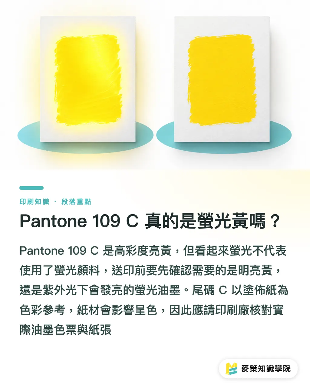
Is Pantone 109 C really fluorescent yellow?
Pantone 109 C is a high-chroma bright yellow spot color reference, but you can't assume it uses fluorescent pigments just because it looks "fluorescent." First clarify whether you want the visual effect of a vivid yellow or fluorescent ink that glows under UV light. They use different inks and produce different results
Writing "Pantone 109 C" on a print order still isn't enough. Ask the printer to check the actual ink swatch against the paper stock. The C suffix refers to the color reference for coated paper. On uncoated paper, the paper's whiteness, surface, and absorbency all affect how the color looks. I'd list the color reference, paper stock, and whether a fluorescent effect is required separately in the specifications, so "bright yellow" and "fluorescent ink" don't get treated as the same thing
Should you use spot color or CMYK for Pantone 109 C?
If Pantone 109 C is the main color on a logo or package, and the brand needs it to look consistent across print runs, choose a spot color first. CMYK is a better fit when cost or print conditions take priority and some variation in the yellow is acceptable
A spot color is ink mixed in advance for a specific color, then printed on its own plate. It doesn't rely on overlapping cyan, magenta, yellow, and black halftone dots, so it can match a specified swatch more directly. Paper and coating still affect how the finished color looks
・Spot color: The printer mixes Pantone 109 C spot ink. This is a good fit when brand color accuracy matters and you'll need to match the swatch in future print runs
・CMYK: Four-color halftone dots create a similar yellow. This works for multicolor artwork where some variation is acceptable, but it can't guarantee the brightness of a spot color
A screen emits its own light. Paper shows color by reflecting light, so a bright yellow on screen is no promise of the same result on paper
Can paper stock and coating change Pantone 109 C?
Yes. Pantone 109 C can look different on different paper stocks or after surface finishing. Coated paper has a smoother surface, so a coated-paper swatch is a better starting point for a color check. Uncoated paper absorbs more ink, which can make the yellow look less vivid
If the paper itself has a warm tone or a colored base, that changes the way the yellow looks too. Gloss lamination, matte lamination, and other finishes change how the surface reflects light, which can make the color look different. Don't rely on a digital mockup on plain white paper. Ask the printer to make a proof using the planned stock and finish
If the same brand will appear on different packages, choose the actual paper stocks first, then decide whether to standardize on Pantone 109 C. Place an old package beside a new proof and compare them directly. That makes differences caused by the paper or finish easier to spot than a discussion based on the color reference alone
How should you proof Pantone 109 C before printing?
Use Mai Strategy's three prepress checks to confirm the ink, materials, and color approval method before the press starts. That can head off the dispute of "same color reference, different-looking result."
・Ink check: Specify Pantone 109 C as a spot color in the file, and ask the printer to confirm whether they'll use spot color ink or a CMYK approximation
・Material check: Confirm that the paper stock and surface finish used for the proof will match the production run. If only a digital simulation is available, confirm upfront that it can't fully represent a spot color printed with actual ink
・Proof check: Approve the color on the actual paper stock under consistent viewing conditions. Keep the signed proof after approval as the reference for the production run and future reprints
A screen doesn't count as a proof. If the finished piece will be laminated, approve a sample with the finish applied too. A color that looks right on uncoated paper may not meet the brand's expectations after lamination
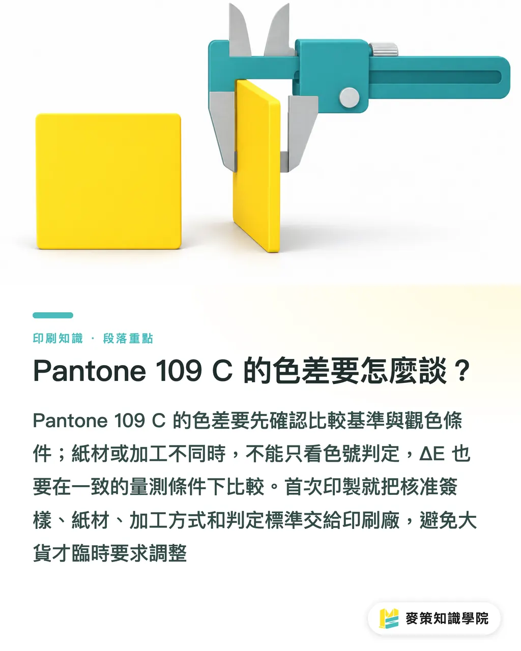
How should you discuss color variation for Pantone 109 C?
First decide what you're comparing and where you'll compare it, then agree on the acceptable color difference. If the Pantone swatch, approved proof, and printed piece use different stocks or finishes, the color reference alone won't tell you whether the result passes
ΔE is a measurement that expresses the difference between two colors as a number. A smaller value usually means a closer match, but the comparison needs consistent measurement methods and conditions. If the printer can measure color, confirm the reference sample and measurement conditions first. If not, keep the approved proof and agree to compare samples under fixed viewing conditions
If this is your first Pantone 109 C print run, don't wait until the full run is underway to ask, "Can it be a little brighter?" Give the printer the approved proof, paper stock, finish, and color evaluation method together. If the brand prints at multiple facilities, you can also bring your current specifications to the Mai Strategy Knowledge Academy consulting team to turn them into repeatable print requirements
Key takeaways
・Pantone 109 C is a bright yellow spot color reference. Its appearance alone doesn't prove that fluorescent ink was used
・If brand color consistency comes first, ask about spot color ink instead of assuming CMYK can reproduce it
・The paper's base color and surface finish both affect how the yellow looks. Proof as close as possible to the finished product
・Keep the approved proof, paper stock, and color evaluation conditions on file so everyone has the same reference for reprints
Further considerations
Designers can clearly specify Pantone 109 C as a spot color in the file and include the paper stock and finish. Print buyers can add the approved proof and color evaluation conditions to the order. AI-generated packaging mockups can help review the layout, but they can't verify how the ink looks on paper. To reduce back-and-forth, print SaaS order forms should save the color reference, paper stock, finish, and proof approval status
Further reading
FAQ
- Can Pantone 109 C be printed in CMYK?
- CMYK can produce a similar yellow, but it can't guarantee the vividness of Pantone 109 C. If the brand color must stay consistent, ask the printer about using spot color ink
- Is Pantone 109 C always fluorescent ink?
- You can't tell from the Pantone 109 C reference alone whether fluorescent pigments were used. Before sending the job to print, clarify whether you want a bright yellow effect or fluorescent ink
- Will Pantone 109 C look the same on uncoated paper?
- Not necessarily. The paper's surface, whiteness, and absorbency affect how the yellow looks, so proof it on the planned stock
- Will lamination change the color of Pantone 109 C?
- Surface finishing changes how light reflects and how the color appears. If the finished piece will be laminated, approve a finished sample and keep it as the reference for the print run
Related articles


The Print × AI weekly
The print and AI know-how designers, brands and enterprises can use before they commit — one email, every week
Tool Library
RGB↔CMYK conversion, ΔE color difference and brand color print analysis — free color management tools, computed right in your browser.
MINDS Group
Need actual printing or gifting services?
From premium printing to online ordering and festive gifts — the MINDS Group sister brands take it from here.